More than just a finished basement, this basement remodel is another captivating page in the overall story of the home.
Story by Ann Butenas | Photos by 29 Pixel Studio
What began as a simple request for a craft room has stunningly transformed into a highly functional living space that is perfectly balanced with the right amount of aesthetics.
When approaching any basement remodeling job, it is the express mission of Karen Mills, CEO of Interiors by Design, Inc., to disguise that the space is actually a basement. Instead, it should look as if it is a part of the natural flow of the home.
“My goal is to tell the story of the client, so when they walk in they feel that the home is an extension of them,” noted Mills. “I design spaces that soothe, calm and nurture so it is emotionally healing to the client. I not only transform their home; I transform their life.”
This particular basement remodel evidences a commitment to all Mills set out to accomplish. In addition to a craft room, the client desired another bedroom, bar and television area. Mills designed all the cabinetry from scratch and ensured all of the plug-ins were hidden. When it came to implementing color throughout the space, she deferred to the water-resistant luxury vinyl tile flooring.
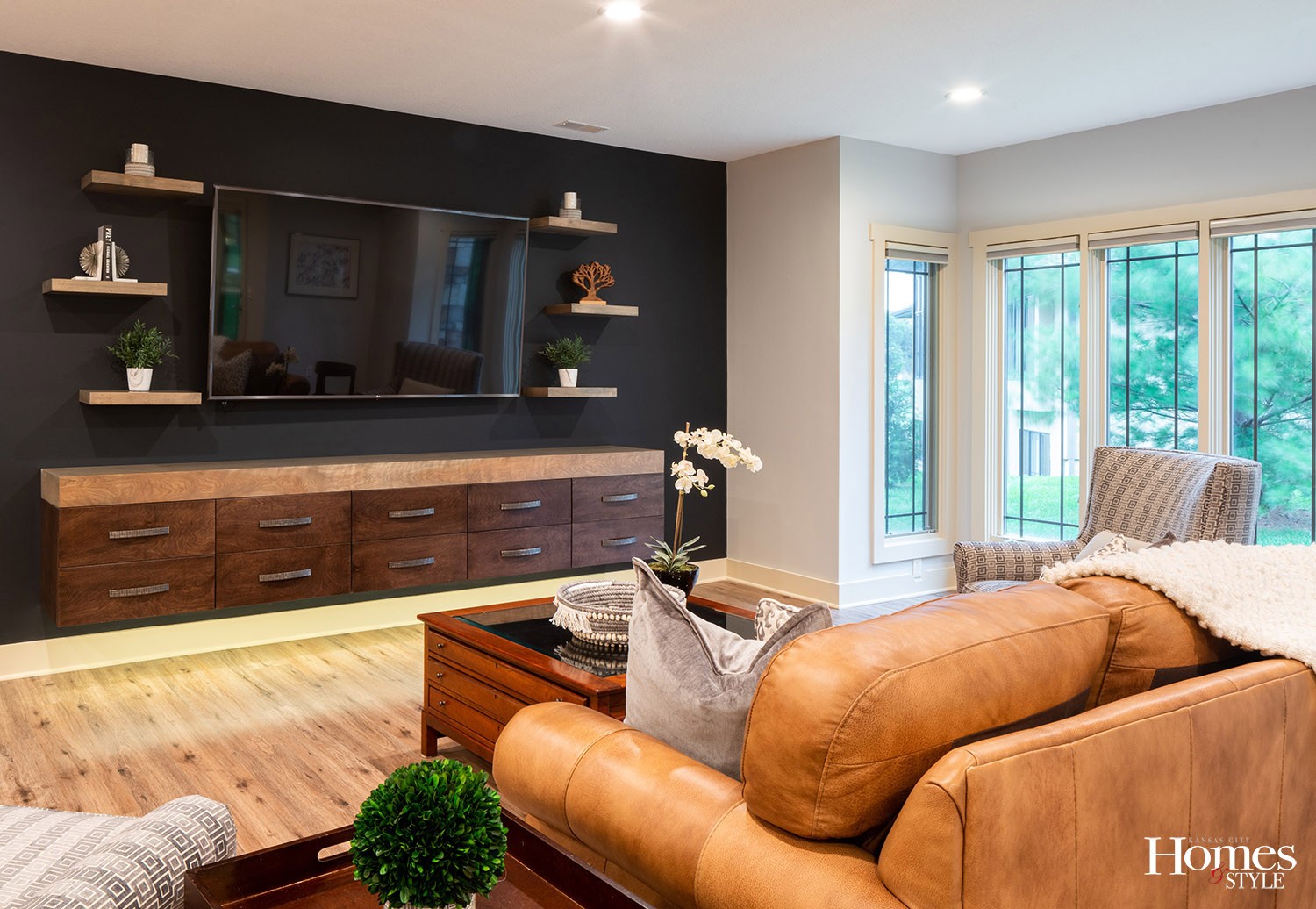
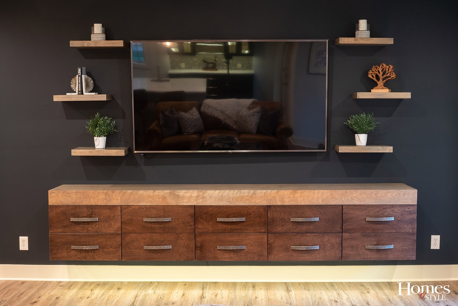
“I pulled all of the colors out of the flooring and brought them into the overall design,” stated Mills, who also added black for drama and repeated that color on the television wall as a way to artistically disguise the television. Mills then designed a 10-foot long cabinet under the television with a drawer in the middle that pops open.
“I tied in the color of a thick mitered top and stained the shelves with the same color,” expressed Mills, who likes to repeat colors in her designs. “I lit it underneath to accent the floating style, providing a more contemporary look as well as to make it lighter in appearance.”
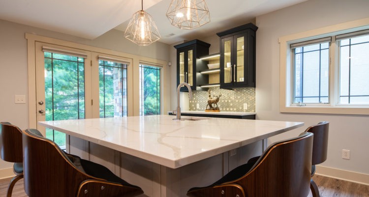
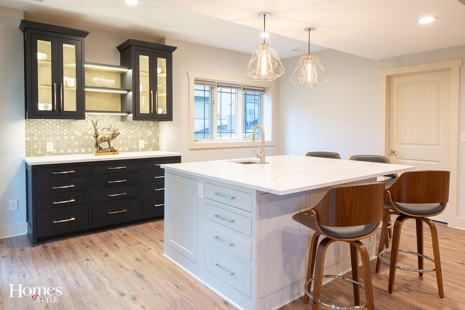
The island provides a strong testament to the benefits of space planning. Aside from its obvious aesthetic appeal, it offers ample storage, most notably through hidden pop opens, and also provides plenty of space on top for a variety of craft projects to be completed or refreshments to be served while entertaining family and friends.
The Calacatta white quartz countertops on the island and the nearby bar resemble marble, each displaying a nice, random movement that does not compete with anything else in the room. The beehive design in the tile backsplash adds a contemporary element yet is still warm and inviting in its presence. The geometric light fixtures above the island softly enhance the modern style of the space.
“I am a huge fan of lighting,” indicated Mills. “The white countertops bounce more light around the room, and the lights in the black cabinets add dramatic contrast.”
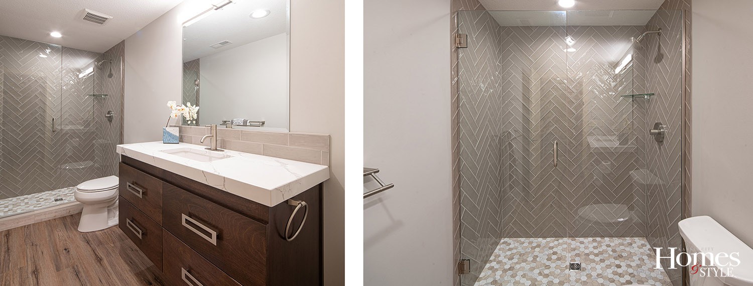
Although the bathroom has a relatively small footprint, its expansive personality shines through. The vanity was designed to fulfill the homeowner’s request for finished wood. Because the wood in and of itself would appear too heavy visually if installed directly on the floor, Mills opted to lift it as a floating feature.
The countertop on the vanity offers another mitered look, designed to create a seamless edge between the countertop and a second piece of material, in this case a piece of wood. Although the countertop is a quartz material, it gives the appearance of a thick slab of marble with a nice clean and rich appeal.
“The accompanying oversized pulls add a dramatic style element,” noted Mills, who credits the client for her invaluable input. “She has a very artistic eye, which allowed us to collaborate successfully together on every detail.”
The herringbone pattern on the back wall of the shower were thoughtfully designed and installed.
“I had to calculate where the tile would start and stop, so I initially sketched it all out so it would be laid correctly,” indicated Mills. The accompanying tile on the floor of the shower holds the same pattern as the backsplash on the bar area.
“To me, that particular tile is a modern version of a penny tile,” Mills said. A beveled mirror was incorporated above the vanity on purpose so as to not take up space visually.
Mills also takes her design cues from the outdoor environment. In this project, for example, there is a stone pillar just outside the door leading to the back patio which factored in to her vision for the basement in terms of color and texture.
“I took that into account with respect to flow. I did not want anything visible on the outside to clash with what is on the inside,” she explained.
By bringing together function, space planning, style, color scheme, cabinets and all of the finishes, this basement is a page-turning story of a successful remodeling project that speaks directly to how the owner uses the space.
Resources
- Interior Designer: Karen Mills
- Contractor: Gartman Remodeling
- Custom Cabinetry: Designed by Karen Mills and built by Weldy Woodworking
- Upholstery: Gearhart Upholstery
- Upholstery Fabrics: KDR Showrooms
- Flooring, Backsplash and Tile: R&R Flooring
- Window Treatments: Sebring Company
- Plumbing: Ferguson Bath, Kitchen and Lighting Gallery
- Lighting: Wilson Lighting
- Hardware: Locks & Pulls

