Story by Ann Butenas | Photography by Matthew Anderson
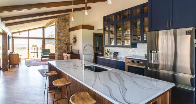
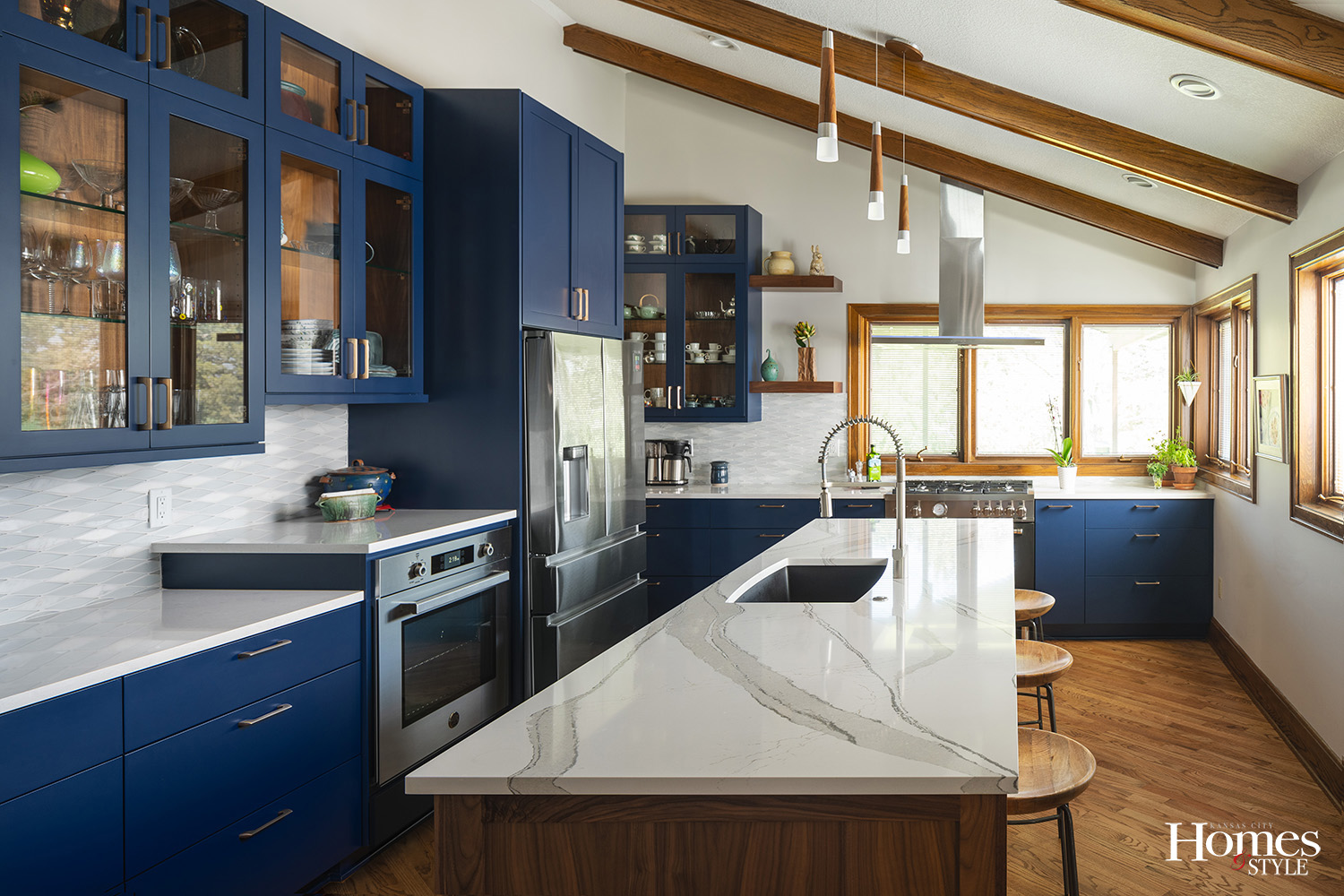
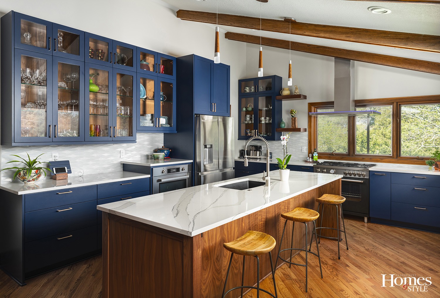
The spirit of imagination and ingenuity is alive and well in this whole kitchen remodel. One of the engaging highlights of the space is the captivating blue cabinetry.
“We used this color as it had to be something that stood out among the wood colors,” noted Ron Webster, CKBR and Design Consultant with Schloegel Design Remodel.
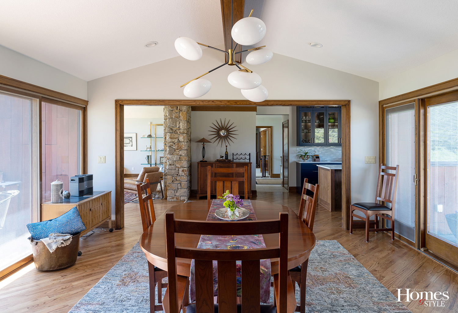
A mid-century modern home located in Spring Hill, Kansas, the biggest challenge for Webster was the redesign of the kitchen, which involved some minor structural changes in terms of opening the space between the kitchen and dining room and redesigning the kitchen ceiling, which in turn allowed for the overall dramatic composition of the space.
“We moved a wall to make the pantry smaller so we could create more cabinet and counter space,” explained Webster, who reconfigured the ceiling to accommodate the cabinets as well as the range hood.
“The original kitchen ceiling had a soffit that went across the whole kitchen and over the window,” he said. “We took it out so we could increase the height for the cabinets. We needed better scale with the taller cabinets on a big wall.”
The other structural challenge was the range hood, as it sits dead center by the window.
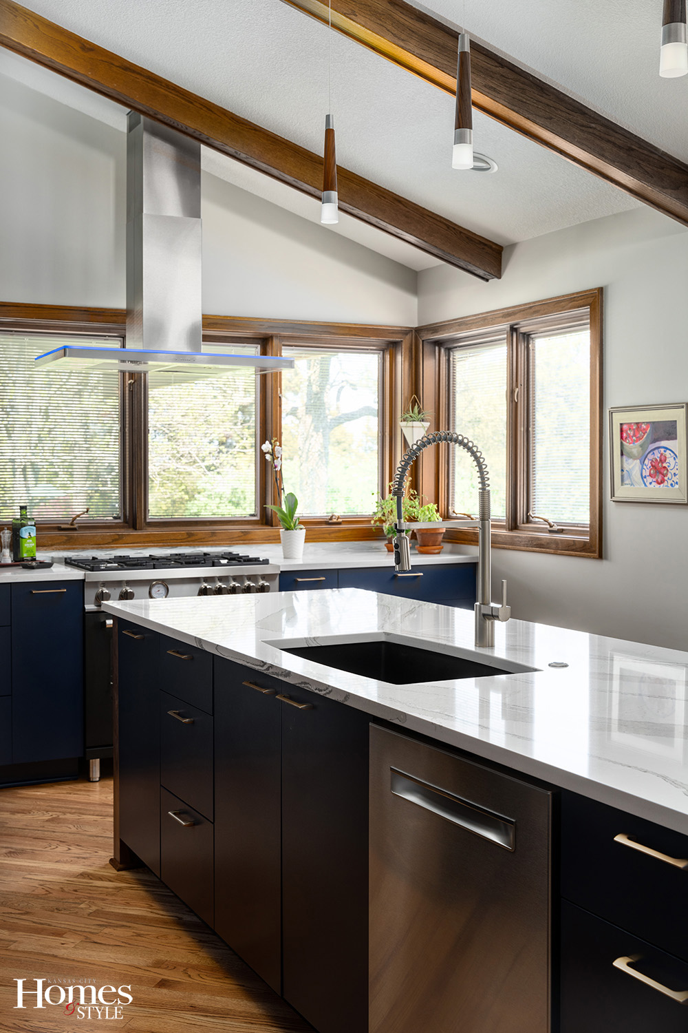
“We had to create the space so the hood could easily go in, as before the soffit was just at the top of where the highest floating shelf is now,” explained Webster. “It still has the necessary venting, but you can enjoy an unobstructed view of the outside while cooking. It also brings in a lot of natural light.”
In addition to the unique presentation of blue in this kitchen, Webster also lined the upper cabinets with walnut and installed backlighting to accent their beauty. This brings the wood color up and ties in with the original beams, trim and floor.
When creating the island, Webster wanted it to have some impact in the room. The Cambria quartz countertop with its wavy pattern pairs well with the warm wood base, creating a cool and colorful combination. The island is home to a dishwasher, a sink, a couple of drawer stacks and a tall double trash roll out.
The perimeter countertops, also of Cambria quartz, have more of a monochromatic pattern so as not to distract from the 3-D effect of the backsplash tile, which was laid horizontally instead of vertically so it flows well under the window above the range in seamless fashion. The backsplash design is a diamond-shaped glass and marble, flat in composition yet enhanced seemingly geometrically by the marble and frosted glass.
One interesting feature exists to the right of the range just under the window.
“We installed a pop-up outlet there,” expressed Webster. “All you have to do is just hit the countertop and it opens. We had to do that because of code requirements for an outlet to be within 24 inches of the range, and we had nowhere else to do it. The counter company specially cut the hole for us.”
Other elements addressed by Webster include the re-stained original beams and flooring. The homeowners also enjoy a new 36-inch Bertazzoni pro range. They wanted a double oven but not a huge one, so Webster installed the second oven within the perimeter counter space, raising it a bit and creating a higher counterspace so the owner could easily enjoy his passion for baking pies.
“We put in this raised area as it brings up its height so he does not have to bend down much. Plus it provides a great surface area on which to work,” indicated Webster.
Webster thoroughly enjoyed this project and it stands out as one of his personal favorites due to the unique nature of it all. Plus, the homeowners were amazing partners in the design process.
“They had a vision and we helped them with the process, working with them from design through construction, explaining what we needed and why we needed it,” emphasized Webster. “Our craftsmen and subs are among the best in the industry, and they all work as one big team with the same goals, which allows us to produce work like this and is a large part of why this particular kitchen looks the way it does.”
Resources
- Kitchen Design: Ron Webster, Schloegel Design Remodel
- Contractor: Schloegel Design Remodel
- Countertops: Cambria – Brittannica & Queensbury
- Tile Backsplash: Elysium Volga Carrara Mosaic
- Cabinetry: Crown Cabinets
- Sink: Blanco Performa

