
Explore 2026’s standout paint colors — calming greens, rich jewel tones, and timeless neutrals — learn how color shapes mood and brand loyalty.
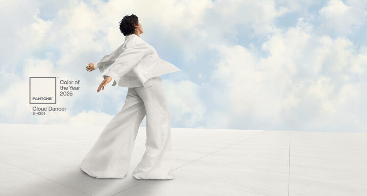
Story by Gloria Gale / Photo courtesy of Pantone, Cloud Dancer
Dip In
Color is everywhere – drenching products, packaging, and interiors – and it does more than decorate: it moves us. As one of the most immediate emotional cues, color can lift a mood, shape a first impression, and even influence buying decisions. Small shifts in hue can change how a room feels, how a brand is remembered, and how we behave. If you want to brighten a kitchen, calm a bedroom, or coax a smile from a surly relative, start with paint.
Color is a shortcut to feeling. Designers and marketers know that people form judgments quickly and often subconsciously; color is a major part of that instant reaction. Beyond aesthetics, color choices carry cultural and emotional weight – think Coca Cola red, Tiffany blue, or Starbucks green – colors that become shorthand for a brand’s identity and promise.
Choosing paint for your home is more than a purchase; it’s an emotional investment. The right color depends on a room’s purpose, the quality and direction of light, and how hues interact with furnishings and finishes. Paint companies help by curating palettes and naming a Color of the Year to guide trends – but the best choice is the one that fits your life.
Consider These Tips
Start with light. Observe the room at different times of day; natural and artificial light change how color reads.
- Consider scale and function. Small rooms can handle darker hues as accents; large rooms can carry richer tones.
- Test large swatches. Paint 2–3 big patches on different walls and live with them for a few days.
- Pair with neutrals. Even bold colors sing when balanced with a neutral base – think trim, ceilings, or upholstery.
- Trust your mood. If a color consistently makes you feel calm, energized, or cozy, it’s doing its job.
Worthy Palettes to Ponder
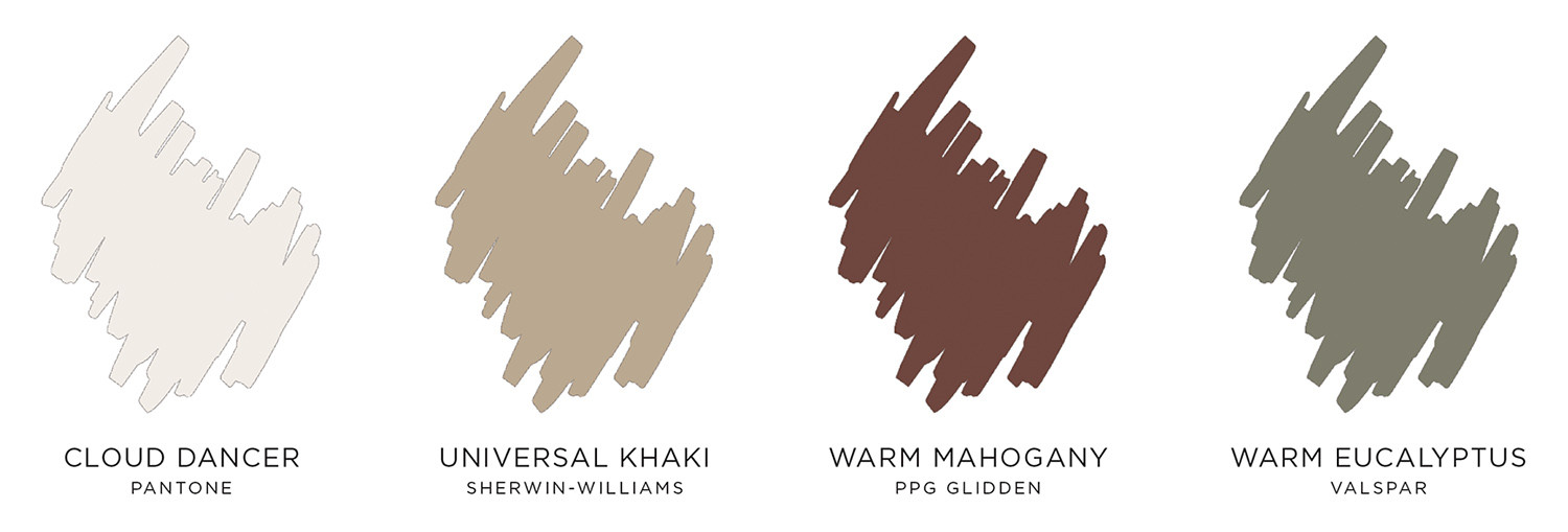
Pantone, a trusted source of everything ‘color’ has announced Cloud Dancer as its choice for color of the year. This is an embraceable go-to shade of white – a heavenly choice among most paint company palettes. Safe and ethereal, Cloud Dancer is the blank canvas to embrace. Think: goose down, pearls, snow and above all, the most minimal of neutrals.
Photo courtesy of Pantone
Tailored and versatile, Sherwin-Williams gives us Universal Khaki. Even the word universal provides comfort! Sue Wadden, Director of Color Marketing and Trend-sight Team Leader says, “For a warm, desert-inspired softness, Universal Khaki is an easygoing neutral that’s timeless in functionality. This nature oriented hue adds depth and sophistication to a space. Universal Khaki balances nicely with White Snow and Cream and Sugar – a clean white and a soft creamy tone that together create a subtle interplay of cool and warm.”
Photo courtesy of Sherwin Williams
Let’s face it, we all have moods. PPG Glidden recognizes our tendencies and gives us the antidote – Warm Mahogany. Wrap your emotions around this deeply satisfying red tone that embraces your mood. With drama and character that feels personal, this bold shade extends itself to you.
Take a leap and let your instincts capture that wish to venture out of your comfort zone. It will be a step toward expressing your individuality. Warm Mahogany will ramp up your appetite and look dashing in your dining room.
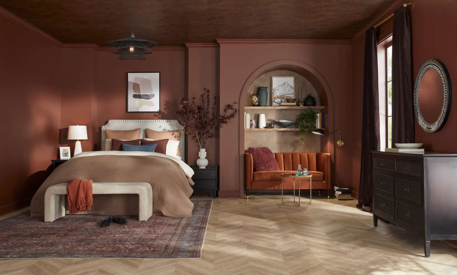
Photo courtesy of PPG Glidden
Valspar is counting on the restorative powers of color. Selecting Warm Eucalyptus for its 2026 Color of the Year, this shade is the epitome of a relaxing hue. Welcoming and perfectly content to remain as a backdrop for bolder complements, this silky, subtle greenish hue with warm gray undertones is satisfying and never overpowering. Wake up to this easy-going color from the kitchen to the bedroom.
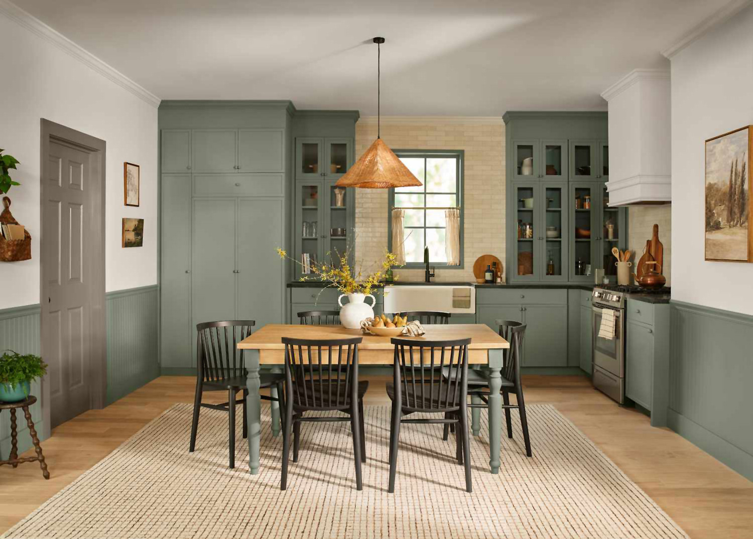
Photo courtesy of Valspar
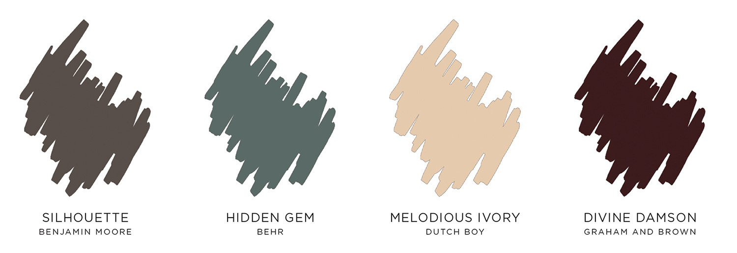
Benjamin Moore’s choice of Silhouette as its 2026 color of the year is confidence personified. Pure and simple, the color gurus mixed rich burnt umber with a sliver of charcoal – the result is luxurious. This rich, espresso color reminds one of tailored suiting. When combined with crisp whites, playful notes of blush or ethereal blues, the effect is irresistible.
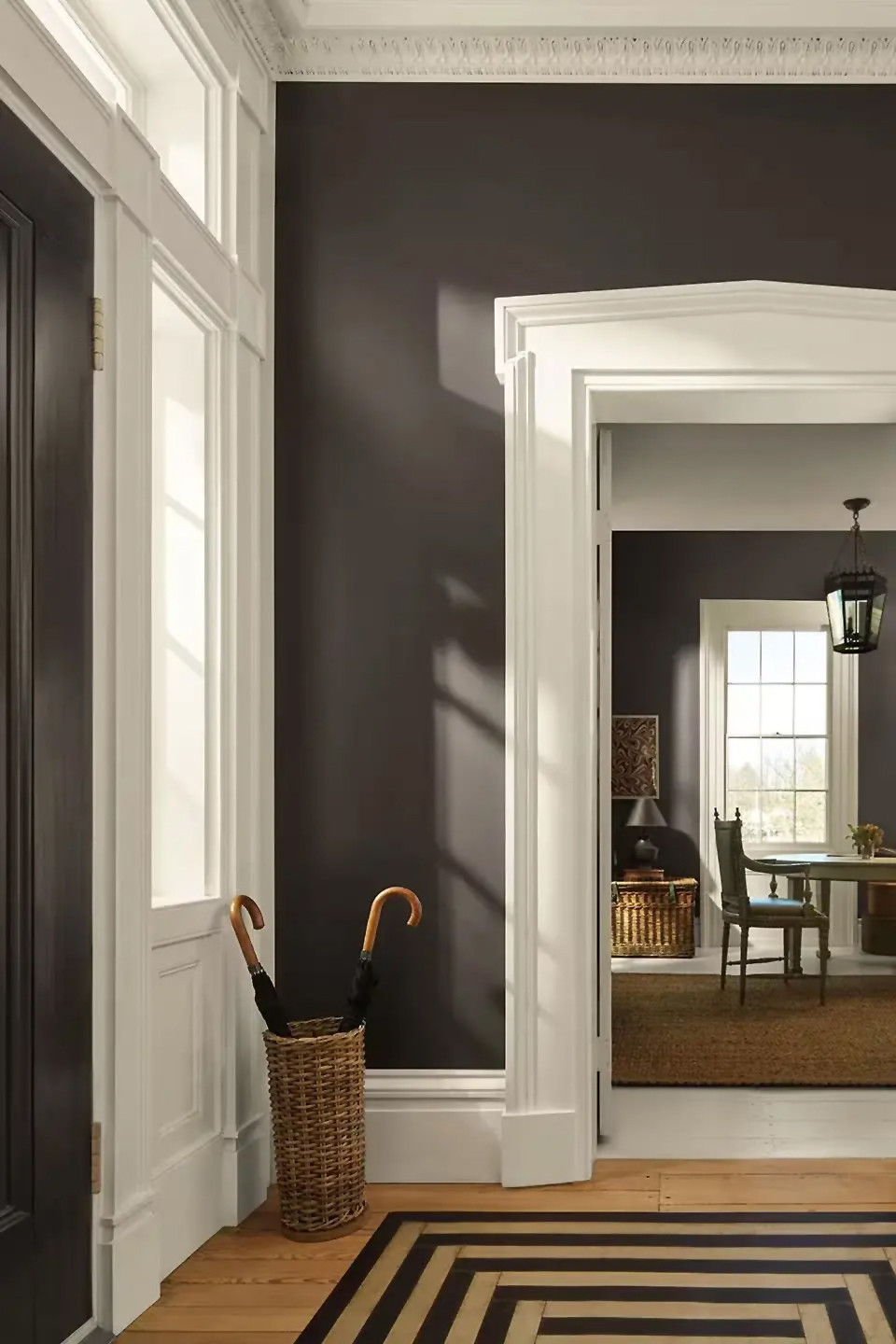
Photo courtesy of Benjamin Moore
Behr’s entry into 2026 list is Hidden Gem. A moody, blue-green that embraces deep, emotional color, turning any space into a ‘wow’ moment. There’s such presence with a jewel tone and this one easily makes a statement. It’s a saturated, heady shade with an ability to be the star, it doesn’t need other colors to make it sing. Hidden Gem does this on its own. Ready to dress up a room with a flourish, here’s a tone that’s ready to take a bow.
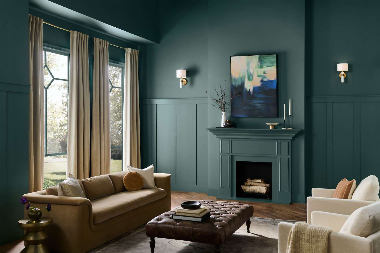
Photo courtesy of Behr
Melodious Ivory elevates your home decor with creamy elegance and cozy warmth. Dutch Boy welcomes this neutral with its unobtrusive nature. It goes with everything imparting a relaxed, homespun feel to furnishings. Painting your walls in this creamy shade won’t rock the boat. It’s all about harmony and this color is one you’ll be able to live with for a long time.
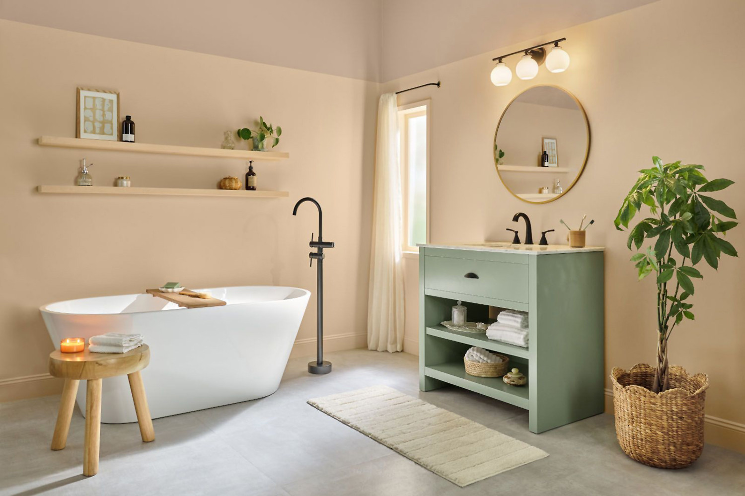
Photo courtesy of Dutch Boy
Wrap yourself in a sanctuary of comfort with Graham and Brown’s inspired Divine Damson. This highly saturated jewel tone featuring a juicy plum shade with crimson undertones. It’s a soothing vibe for any room where making a bold statement is in order – guaranteed to be a showstopper.
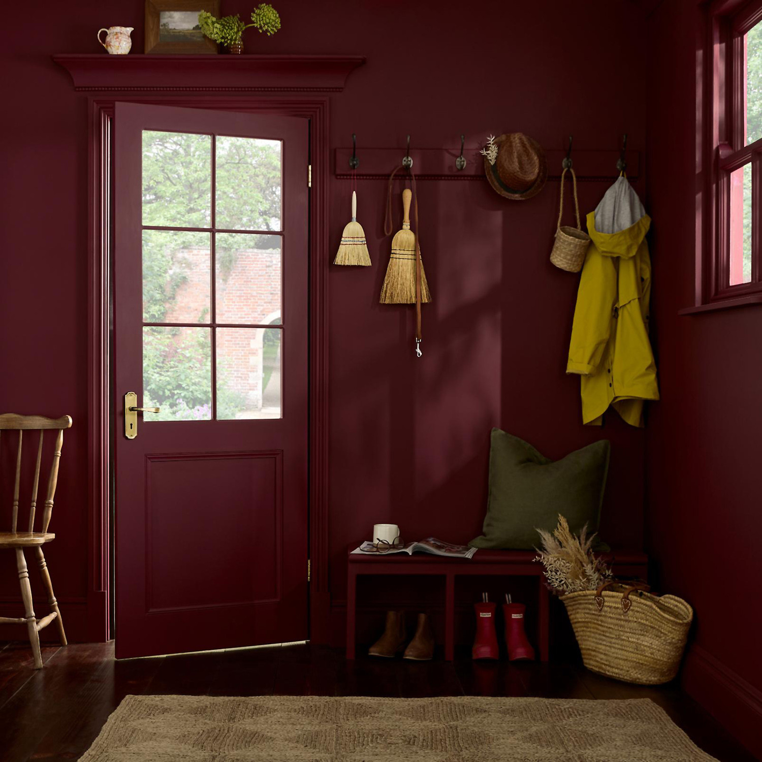
Photo courtesy of Graham and Brown
Color is a practical tool and an emotional language. Whether you crave the restorative calm of eucalyptus, the drama of mahogany, or the timeless comfort of ivory, the right shade can transform a room – and the people who inhabit it. Paint is inexpensive compared with renovation, but its impact is immediate and lasting. Color is a shortcut to feeling – choose it with intention.