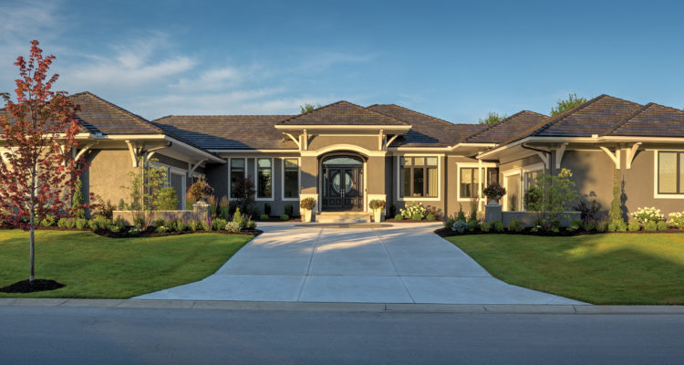
This Leawood residence proves that when designing a home, it’s not necessarily about sticking to a particular style that matters. What matters most is what works well with the client’s lifestyle.
Story by Ann E. Butenas | Photos by Paul Bonnichsen
Live a designer a blank slate and watch her go to town! When Carla Rieke, one of the design experts at Madden McFarland Interiors, was brought on to add style, class, elegance, sophistication and fun to this new Leawood residence, she embraced the opportunity to create a magnificent living space that truly caters to her client’s dreams, desires and lifestyles. However, the homeowner also knew what she wanted, and she came to the table fully prepared, making this project a total team effort.
“We knew what we wanted and met many times with Scott and John,” indicated the homeowner, referring to architect Scott Bickford of Bickford & Company and to John Geer of Woodbridge Homes. Additionally, the homeowner partnered with Craig Lindsay of Morgan Wightman, who was instrumental in providing the doors and windows.
After living in a three-level home in Overland Park with six kids between the homeowner and her husband, all of whom have grown up and left the nest, it was time for a change.
“It is just us now, and we wanted a home designed for what fits our current lifestyle,” she indicated. Since moving from their former traditional house in Overland Park into this more transitional home in November of 2015, the homeowners are making full use of all its amenities.
Among the priority elements desired in the new home included a floor plan that allowed for most of their living requirements to be all on the main level. They also wanted a four car garage that would allow for space for their vehicles.
“I wanted all of his stuff on his side,” laughed the homeowner. “He also now has a custom shop for his tools.”
The layout of the home includes two Master bedroom suites, situated on either end of the home, as well as a home office. The second Master suite serves as a guest room. There are two additional bedrooms downstairs, along with a “must have” golf simulator that was an endeavor in and of itself.
“We worked with Full Swing Golf in San Diego to install that project,” said the homeowner.
Other “must haves” include the center driveway adorned with a medallion in the middle of it, as well as a front door that has its own curb appeal personality.
When it came to designing and decorating the interior, the homeowner essentially began from the ground up.
“We purchased all new furniture,” she said, jokingly adding, “My kids cleaned me out of my former furniture!”
Working with a palette of pale purples and deep grays, the homeowner worked side-by-side with interior designer Carla Rieke of Madden McFarland to create a one-of-a-kind personality for the home, that is truly a transparent one.
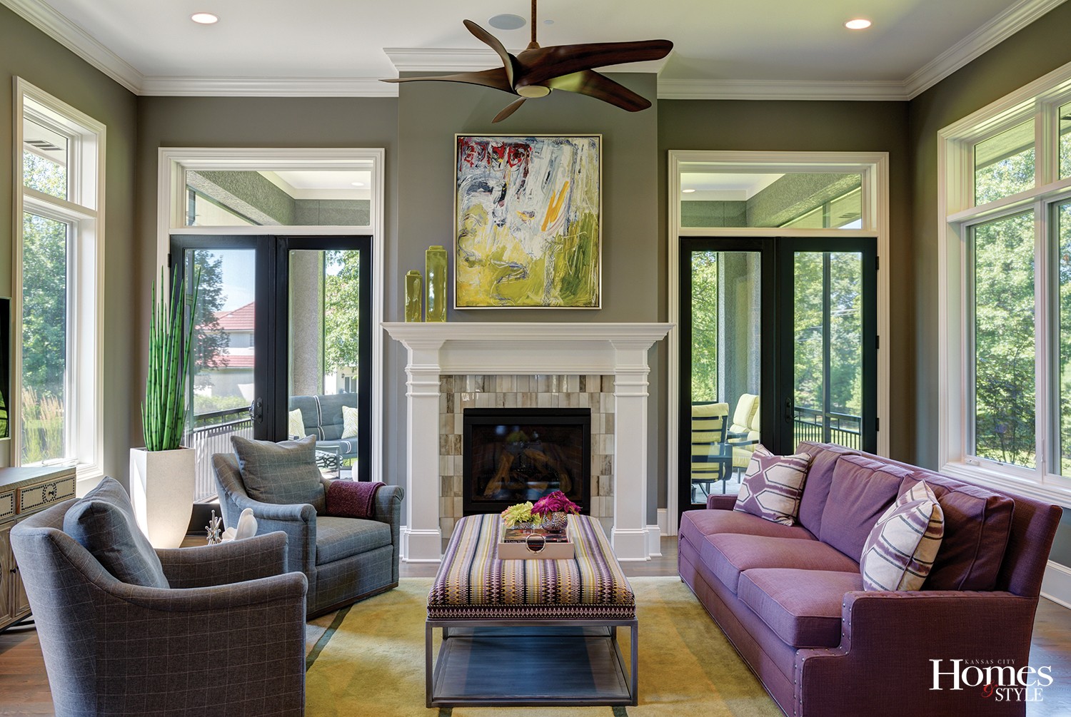
“From the entryway, one enjoys a stunning view of the fireplace and French doors, exiting to a back patio with an additional table for entertaining,” said the homeowner. As a result, this allows for an unobstructed view to the impressive fireplace and accompanying artwork at the back of the house, which is what the owner desired.
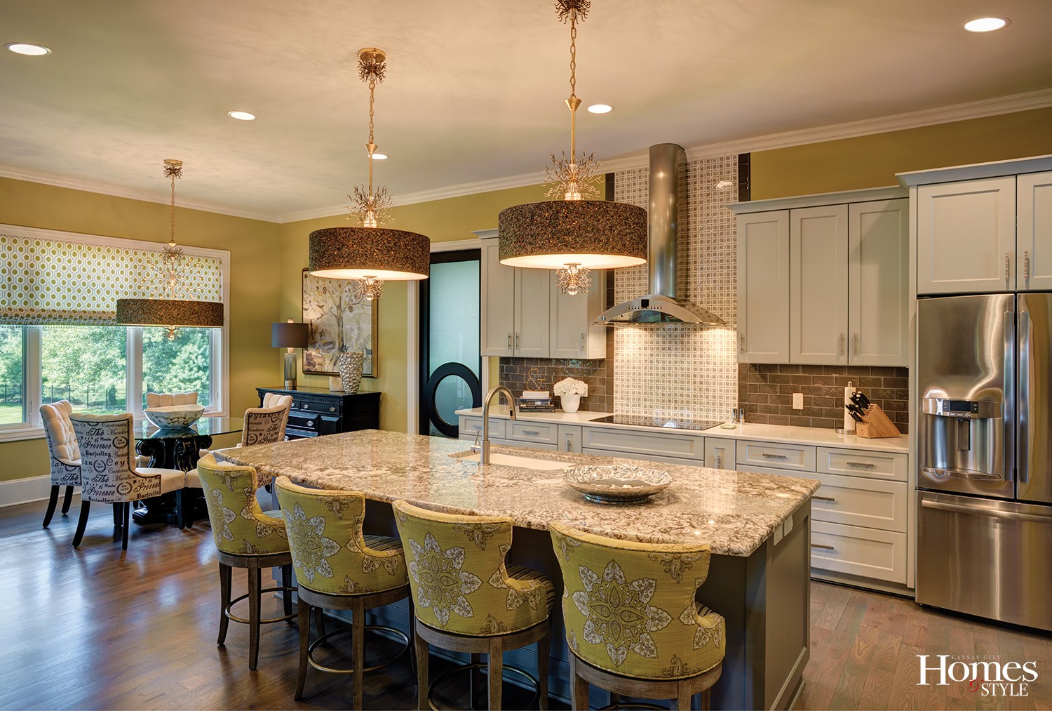
As a couple who enjoys entertaining, the kitchen is fully equipped with style and functional elements that makes gathering with their large extended family and friends seamless and effortless. Open to everything, the kitchen and the contiguous casual dining area can easily accommodate large crowds. There is also a small auxiliary kitchen within the pantry that is accessed through the opaque door near the breakfast nook. The pantry has an additional oven, refrigerator/freezer and built-in cookbook case. This has definitely allowed for more elbow room in the main kitchen while they entertain over the holidays.
The center island enjoys a natural stone countertop while the perimeter cabinets hold their own with Caesarstone quartz. The porcelain tile backsplash in dark subway tile complements the gray-toned cabinets. Pendant lighting above the island effortlessly matches the fixture above the table in the breakfast nook.
While the kitchen area is one of the favored spots in the home, the owner also enjoys the great room and her functional office that does more than just accommodate paperwork and business.
“We wanted a buffer between our bedroom and the great room, so that is where we put the office,” she indicated.
This extremely user-friendly home is also a top model when it comes to all of its exciting design and décor, with each room seeming like a mini art gallery in and of itself.
With her blank slate, Rieke took to the task and was thrilled to work with the homeowner.
“She had so many ideas and was selectively and discernibly easy to please,” emphasized Rieke.
Among the highlights of the home include the formal dining room, complete with a wooden circular table adorned with an ash grey finish on top coupled with a metal base. The chairs wear a primarily a grey foundation. Accent lighting along with eye-popping artwork add a bit of decided splash to the room. The homeowner knew she wanted something above the buffet/serving table, and Rieke discovered the three-panel piece that fit the bill.
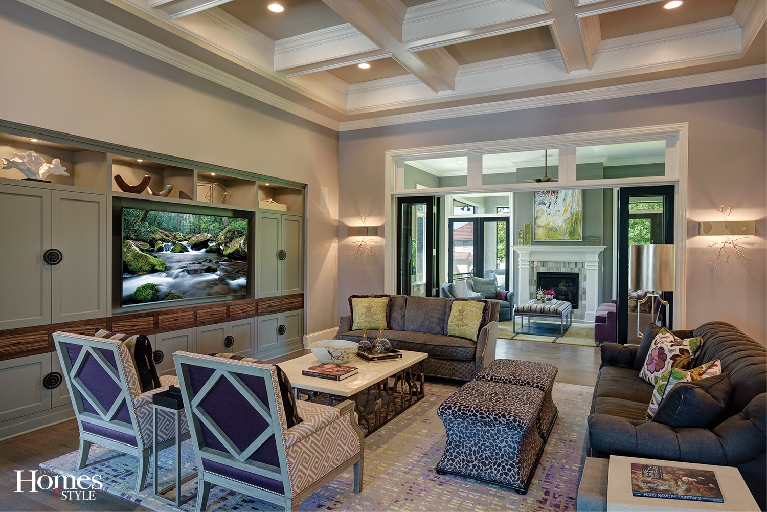
The living room enjoys the same color scheme and is home to a beautiful coffee table comprised of an onyx stone top with a hand-forged steel and bronze base. The cube ottomans add to the setting. The accompanying large and small sofas, the former with a strong gray presentation and the latter with a purple cast, complete the look and also play well with the sophisticated wall sconces and the grayed-purple wall color by Sherwin Williams called Mystical Shade.
In the adjoining hearth room, Benjamin Moore’s Chelsea Grey in a matte finish ties in together with the color of the living room cabinets, which were done in a satin finish.
“We tied colors together for continuity, allowing for layering without any abrupt changes to the flow of the space,” explained Rieke.
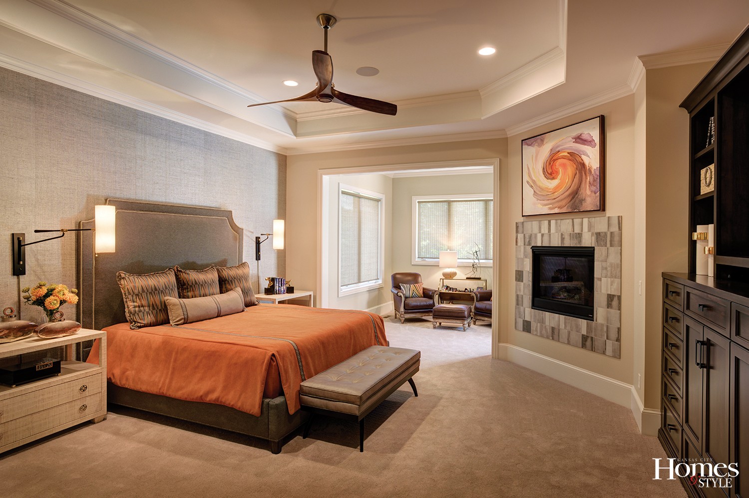
The Master suite, complete with a fireplace, presents in a neutral color on the walls with a feature wall done in Pearl Bay wallpaper by Thibaut, which serves to highlight the silver and gray components. The orange color in the bedding provides that added slice of fun.
“I really enjoy this room and love the Master bath,” said the homeowner. “It is nice and open and has a tub, a walk-in shower and even His and Hers toilets on either side.”
Not to be overlooked is the hardwood flooring throughout the home, which maintains its consistency with the gray color scheme, as it offers a hint of gray in its primarily brown finish.
“This home has a real feeling of elegance throughout, yet it is still livable,” noted Rieke. “It is a very transitional home, and during the process it transformed from where we began to where we are today. I like to remind clients that a house doesn’t necessarily have to have a particular style; it’s what works best for the client that is important,” indicated Rieke.
As the homeowner has settled into this beautiful residence, it is not lost on her that, yes, this truly was a team effort.
“We could not have done this without Scott, John, Carla and Craig,” she stressed. “Throughout the entire process, when we could not be here for the meetings, Carla and Craig were and we trusted them fully to represent us. You don’t always find that in this business, and we are so grateful for all they did.”
Resources
Builder: Woodbridge Custom Homes | Architect: RS Bickford & Company | Interior Designer: Madden McFarland | Doors & Windows: Morgan Wightman | Lighting: Wilson Lighting

