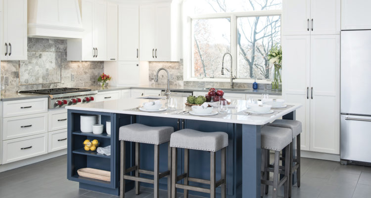
A dark kitchen undergoes an enlightened transformation.
Story by Andrea Darr | Photography by Matt Kocourek
When a home gets to a certain age, many homeowners question whether it’s time to move or remodel. The owners of this Shawnee residence had begun to consider starting over someplace new, but when they looked at the costs of a new house the same size and location as their current one, they simply couldn’t find a comparison. Staying put and renovating became the best option.
They got a referral for interior designer Laura Suhr, whom they initially sought to update the kitchen. Talks then evolved into redesigning the entire main level and some of the upstairs, as well as replacing windows and light fixtures.
“The scope of the project grew from just a kitchen remodel to a main-floor redesign,” Suhr says. “But it was due for a remodel and this allowed my clients to get the major construction done in one fell swoop.”
The homeowners were excited throughout the process and valued the ability to talk through the details of the proposed work. “They wanted to get it right the first time,” Suhr says.
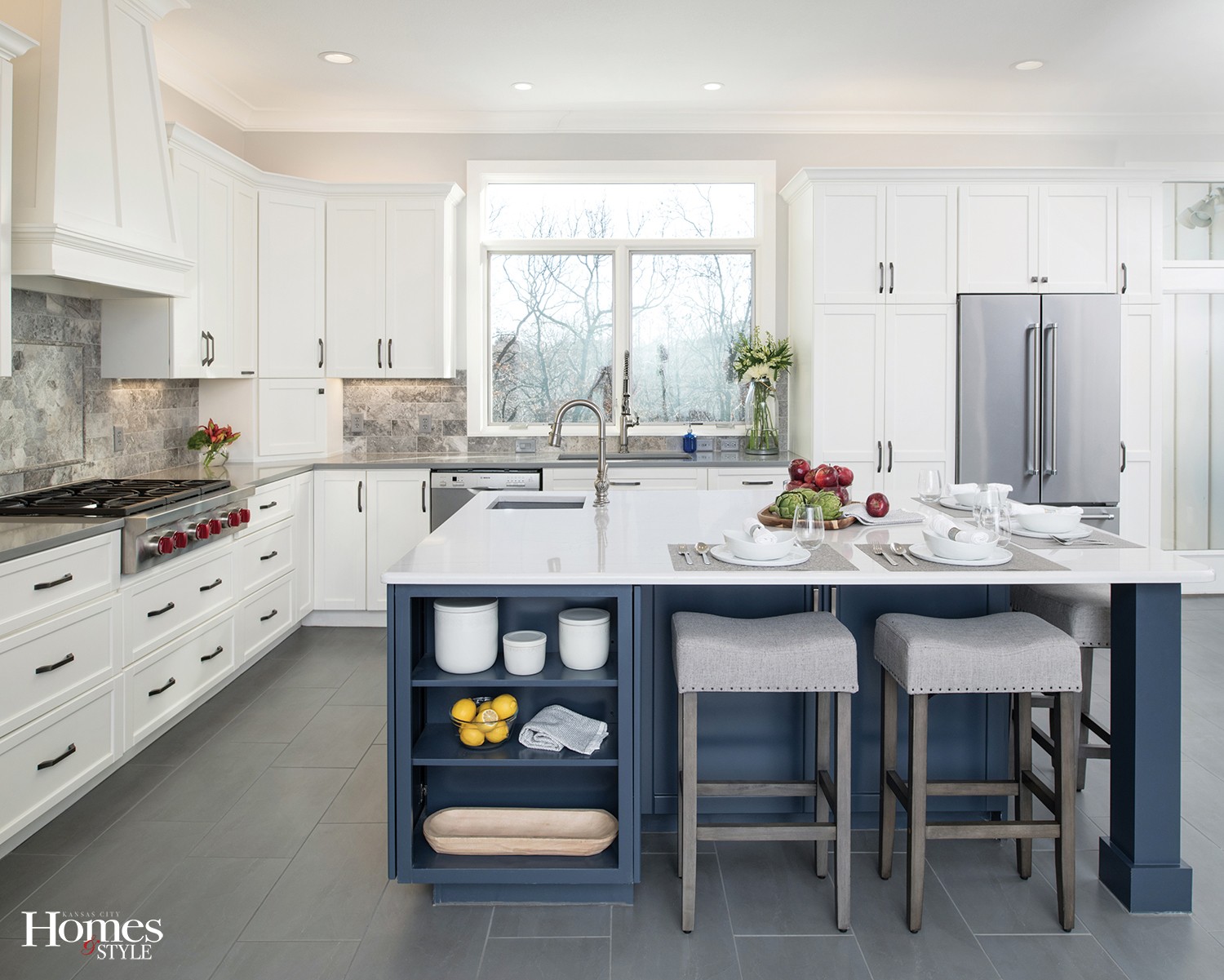
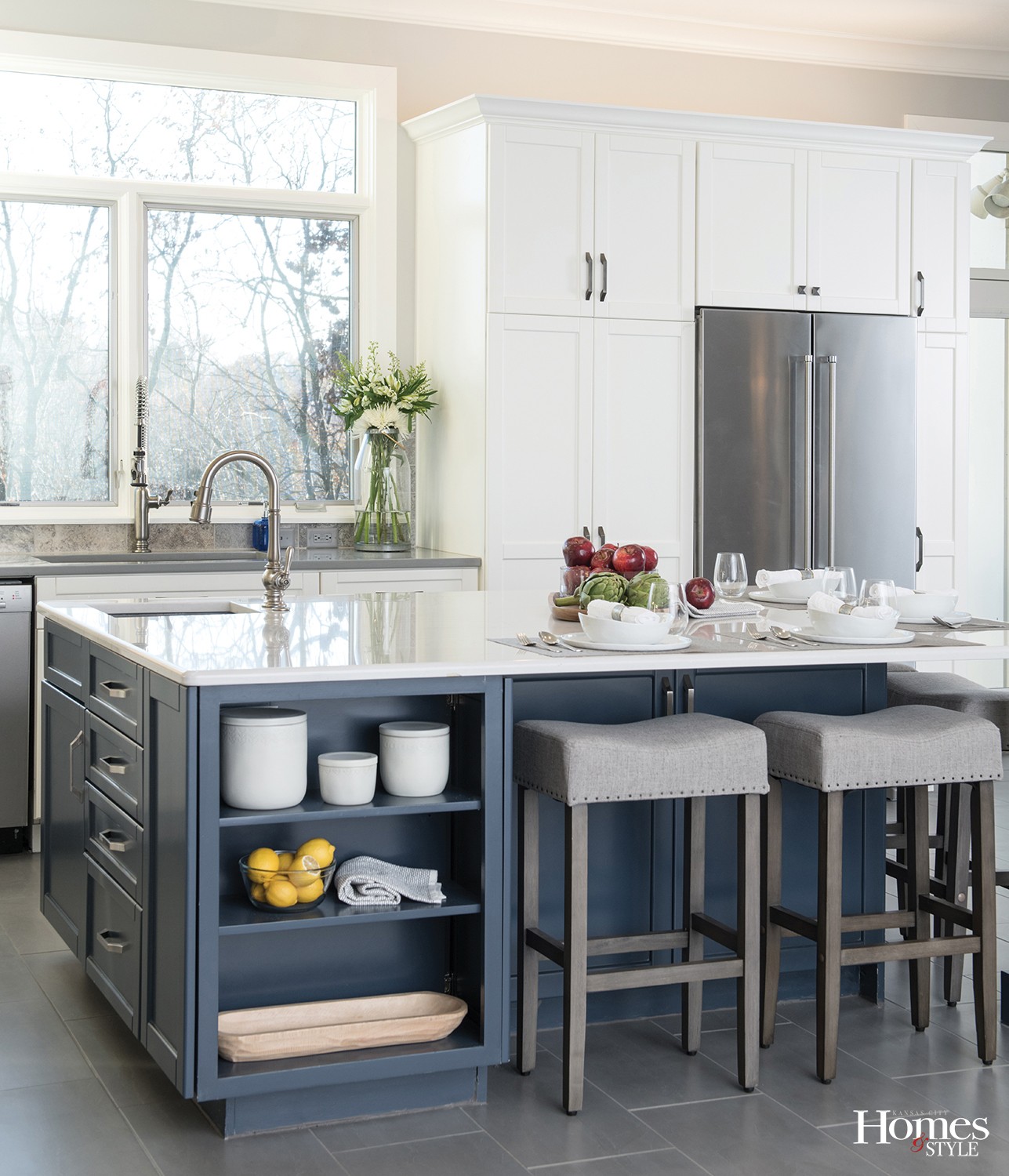
That’s because, with the changes to the kitchen, the entire feel of the home was about to turn 180 degrees. The previous look was of oak cabinets and laminate floors. There was very little natural light from one small window. “It was very dark and dated, so we went the opposite direction: light and white. We really wanted to open it up and brighten it up,” Suhr describes.
A major alteration included removing cabinets and a wall that divided the kitchen from the living room. “The challenge with open concept plans is where to put the appliances and still get all the storage you need,” Suhr says. “You have to balance openness with functionality.”
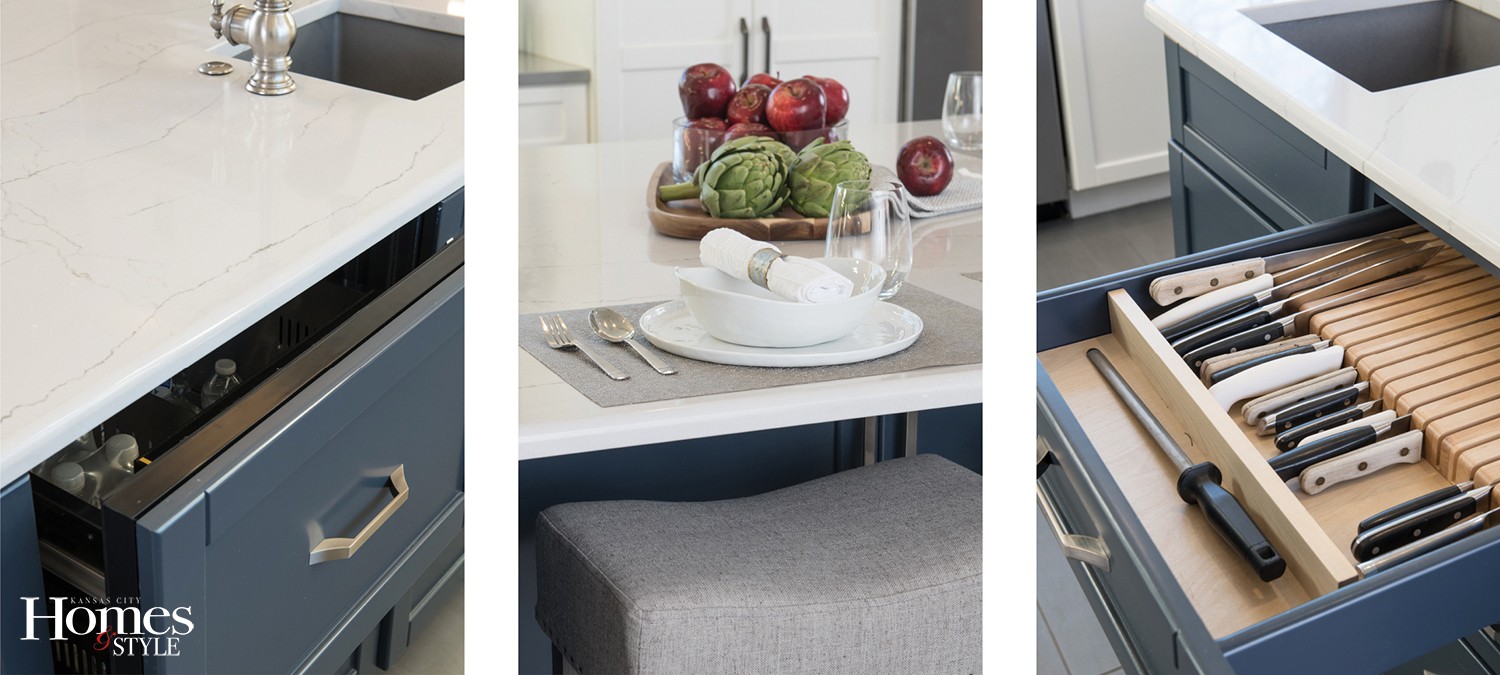
She achieved it with a large island that packs a lot of function. Besides its prep space and seating for four, it’s replete with a prep sink, fridge drawers, a trash pull out, and charging station. Hardworking Cambria quartz countertops in a white marble look complement the base, which is visually a standout in a pop of color.
“She wanted something different and fun on the island other than gray, so we picked out this gray-navy that I love and that turned out great,” Suhr says.
To make the cabinets work their hardest, Suhr incorporated specialty items, like a pull-out spice rack by the range and cutlery drawers. Because the perimeter doesn’t have a ton of counter space, she added an appliance garage in the corner to hide away items used daily that the owner wants easy access to.
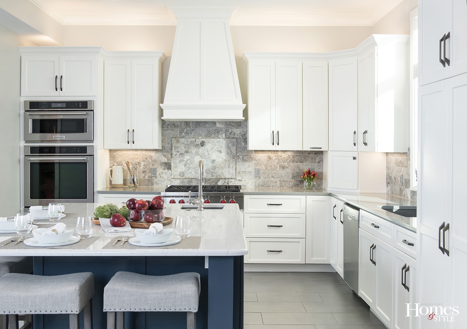
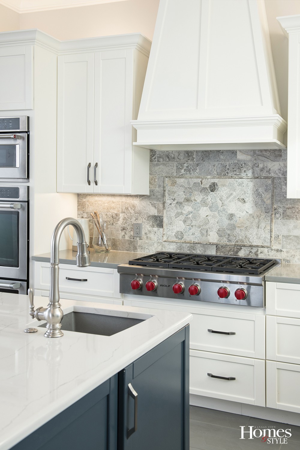
The homeowner had been inspired by photos of kitchens with marbly type backsplashes, but Suhr felt that was too overdone and selected a silver travertine backsplash for a natural stone look. “It adds a little more depth, movement and warmth, and it’s less expected,” she explains. Plus, she added extra detail with a hexagonal picture frame behind the range.
The 36-inch Wolf range offers increased cooking power to the kitchen, which, unbelievably, had only a two-burner cooktop before. “That’s definitely not something I see every day!” Suhr exclaims, “The upgrade was much deserved.”
To whisk away all the smoke and grease, Suhr custom designed a wood hood that both the homeowners could agree upon. “They both liked different features of different hoods, so this is a mix to make everyone happy,” Suhr says.
Suhr stacked double ovens and relocated the microwave above them to put the rest of the cooking power in one corner.
One recommendation Suhr encourages of all of her clients is to install a counter-depth fridge because a regular one tends to take over the space. These homeowners agreed, and that’s why the island features the addition of fridge drawers. “It’s overflow, and it keeps everyone out of the main fridge when the cook is working,” Suhr says.
The owners updated paint and flooring. Whites and grays pull together nicely and ground the space in its new natural light, while large-format tile flooring in a neutral 12 x 24 size doesn’t steal the show but provides a supporting role.
After making do with with their former kitchen for two decades, the homeowners are happy with their decision to give their home a makeover rather than move. They hadn’t realized the potential of just how beautiful and functional their old house could be.
“I aim to make myself proud with all my work, but it’s pretty striking to see this transformation,” Suhr says.
Resources
Kitchen Company: Suhr Interior Design
Contractor: Marten Construction
Plumbing Fixtures: Kohler
Sinks: Blanco
Countertops: Cambria
Paint: Sherwin Williams
Tile: Key Distributors
Cabinet Pulls: Hardware Resources

