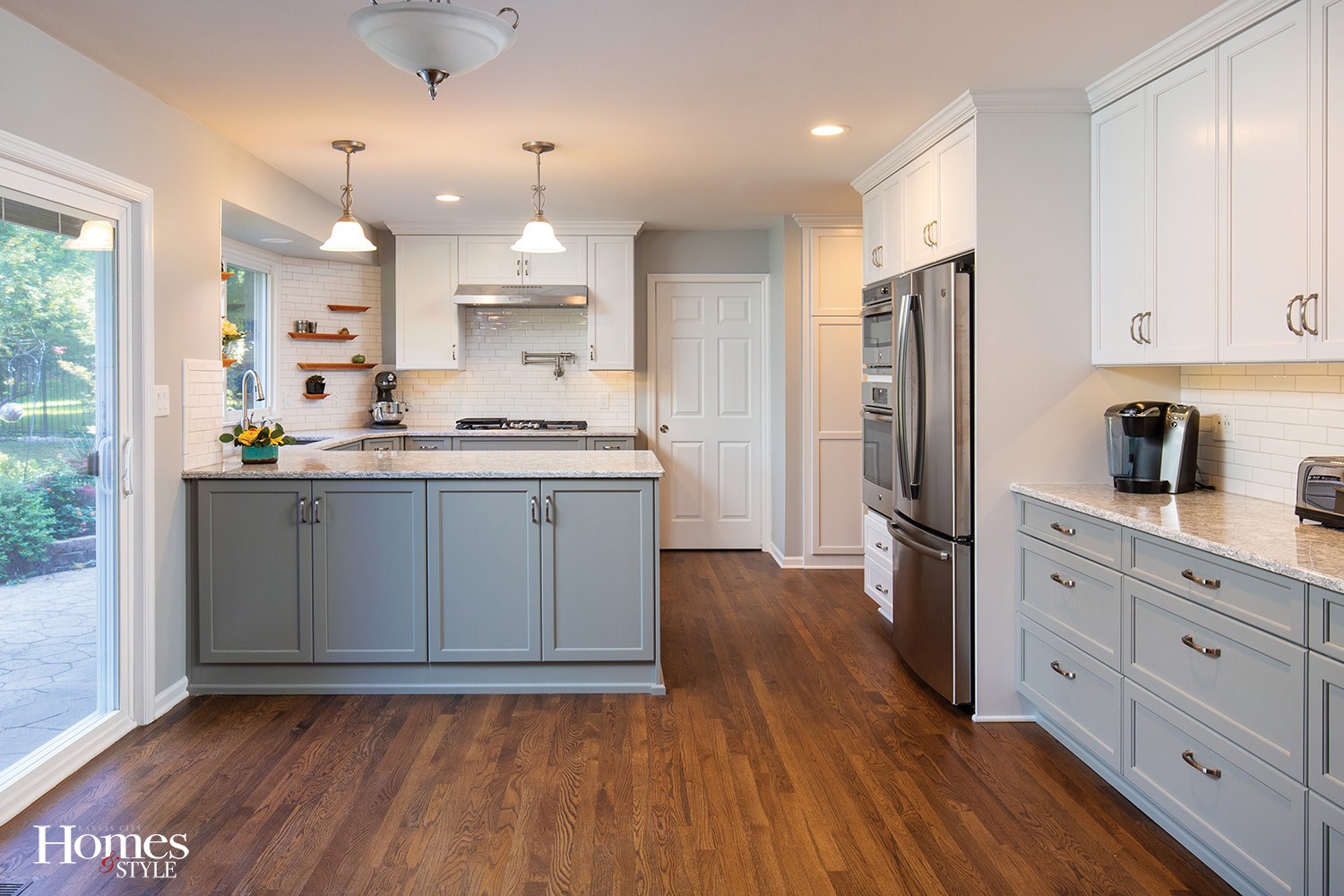
Taking out an existing wall opened up a functional and inviting gathering space for this Prairie Village kitchen.
Story by Ann Butenas | Photos by Matthew Anderson
Open living spaces tend to take the lead in interior home designs and floor plans these days. This concept allows for more legroom without changing the entire footprint of the home, while also easing the flow of traffic throughout the house. Additionally, it invites more natural light and gives homeowners a chance to enjoy more of their home, as is the case for this Prairie Village home built in 1967.
When it was time for the homeowner to breathe new life into her kitchen design, she knew the first step would be to take down the wall that separated the family room from the kitchen. But first, a call to the experts at Heartland Kitchen & Bath was in order.
“We changed the kitchen completely around,” explained Barringer Hansel, owner of Heartland Kitchen & Bath. “This was a complete kitchen gut and we then started from scratch, as the homeowners requested an entire kitchen makeover.” And removing the wall that seemed more of a barrier to interaction then an open invitation to enjoy one another’s company was an integral part of creating the change desired.
“No one wanted to sit in the family room, but when we all gathered in the kitchen, it was just too crowded,” expressed the homeowner, who further indicated the original wall also made the original dark-colored kitchen feel darker and heavier. “It was time to brighten up the space, and when my husband said it was time to tackle the kitchen, I was ready.”
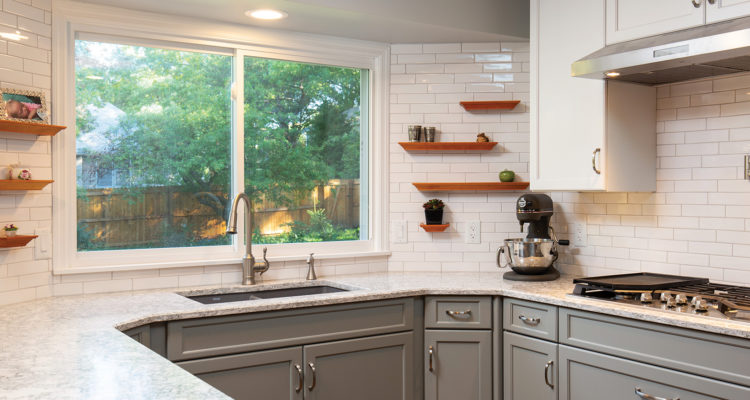
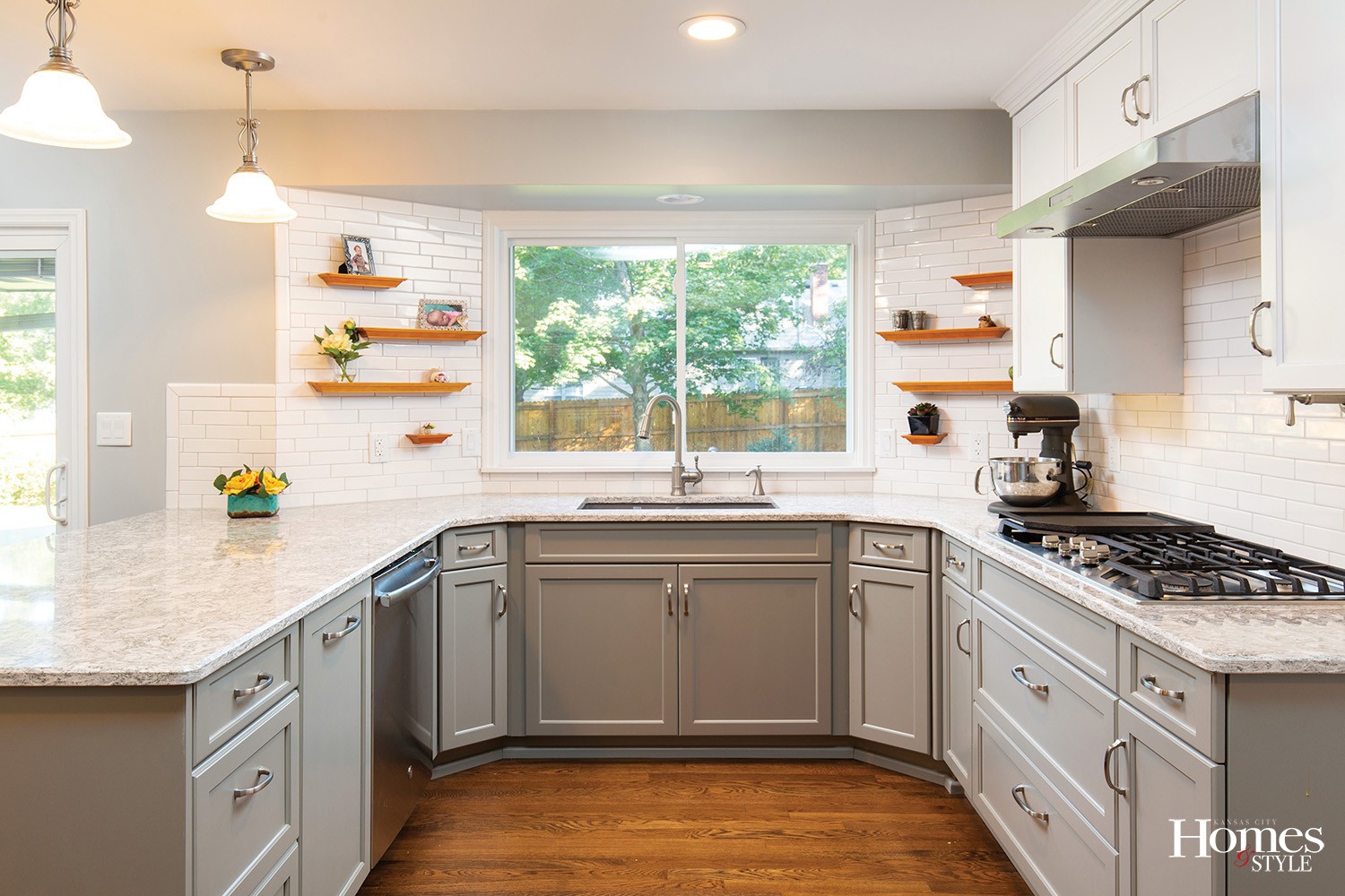
Now, it is almost as if this kitchen has opened up its eyes, as so much natural light cascades through the new windows located above the sink. Prior to installing the windows, that area was wrapped entirely in cabinets.
“I love the way the light flies into my kitchen now,” smiled the homeowner, who can finally enjoy a pleasant view into her backyard garden as she stands in the kitchen.
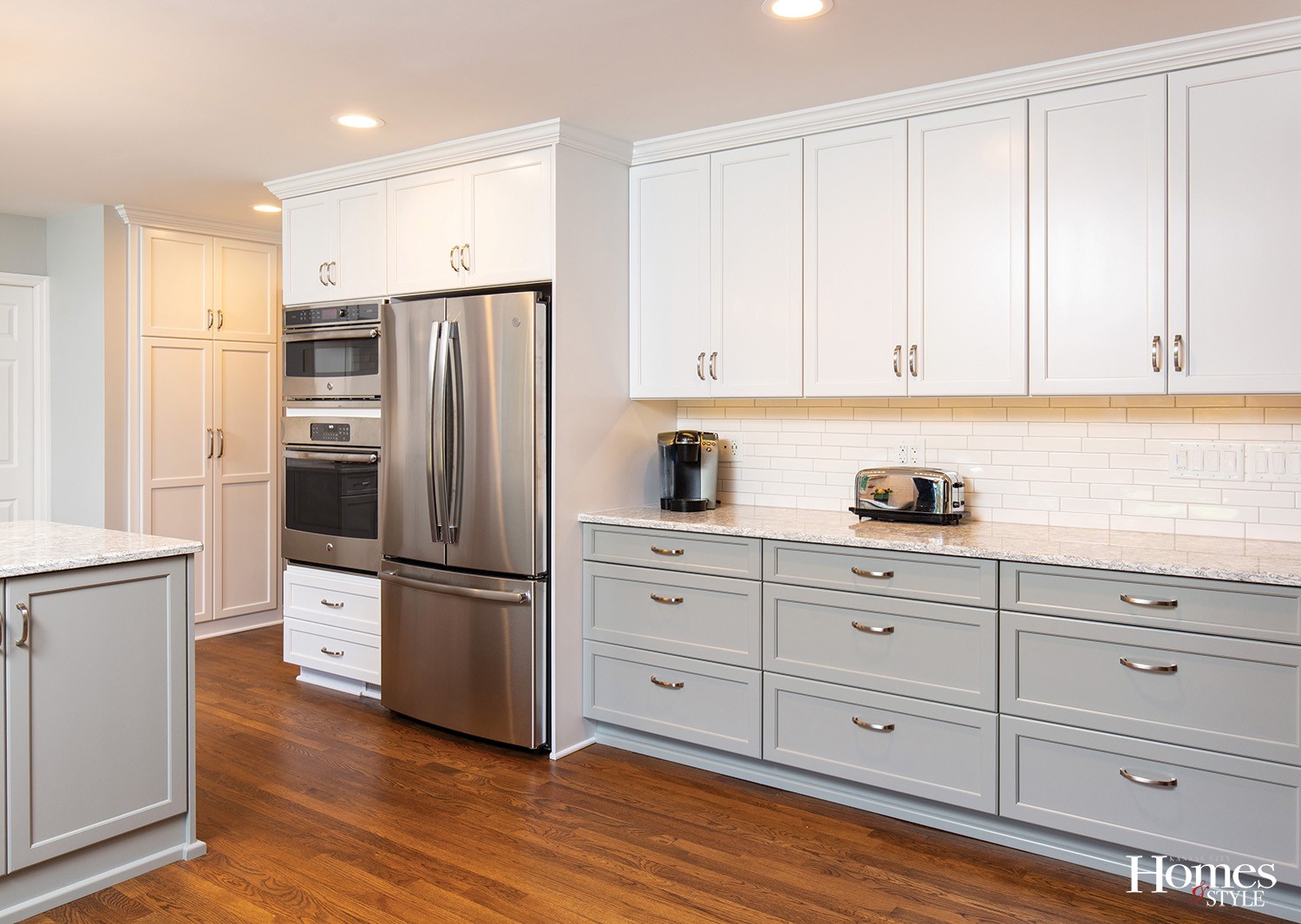
When opting for just the right color scheme for the kitchen, the homeowner had initially considered dark charcoal grey cabinets, then transitioned to the idea of something a bit lighter until she finally settled on the current color.
“Sometimes when the light hits the cabinets a certain way, they will appear to be a different color,” indicated the homeowner.
A new buffet space sits where there was once a desk and a pantry, which made it the perfect place to serve food this past holiday season when entertaining guests. All new appliances also helped serve up tasty meals for family and friends.
“The gas range is a GE Café with five burners, including a boil burner and a griddle on one side,” noted the homeowner.
The grey-toned quartz countertops with a green undertone to them play well with the lustrous subway tiles, which are hand-crafted crackle.
“These are not your typical subway tiles, as they are a bit bigger than standard tiles,” explained Hansel. “You can do different sizes than the standard 3” x 6” tile.”
To complement the tile, the homeowner enjoyed creating a different kind of shelving option around the sink area. Instead of taking the cabinets all the way up to the ceiling, the new design incorporated several floating shelves.
“I like different shapes of wood, which I have throughout the house, and they are great for placing photos, flowers and knick knacks on,” smiled the homeowner. “Plus, they help keep the countertops open and clean.”


