Turning this Plaza condominium bathroom into an updated extravagant retreat required some thoughtful planning.
Story by Ann Butenas | Photos by Matt Kocourek
When Sue Shinneman’s clients requested a master bathroom with a decided spa-like ambiance, she knew precisely how to make that desire come to life. This Country Club Plaza condo eagerly shed its traditional design in favor of a look that could make the most luxurious and inviting of hotel bathrooms envious.
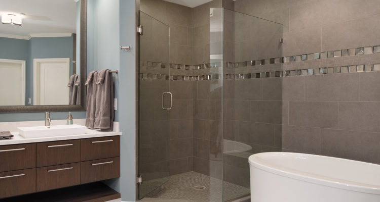
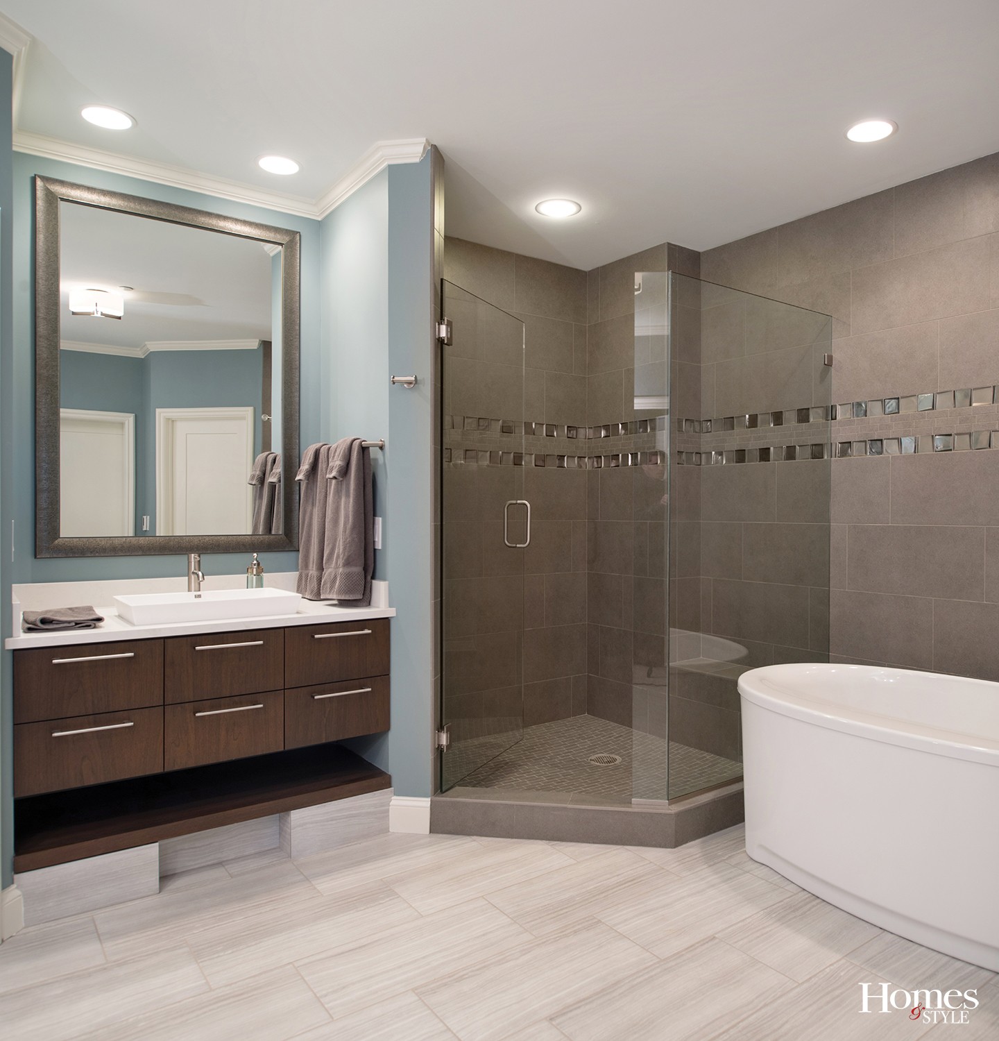
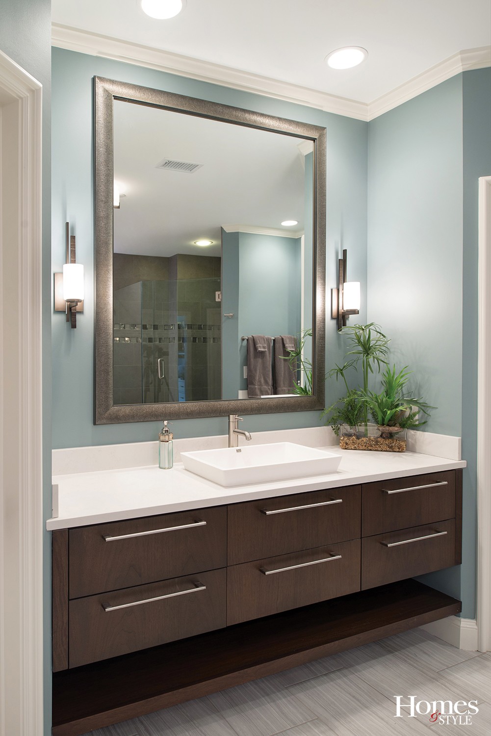
As co-owner of Kitchen Studio: KC, Shinneman took to the task as her team completely gutted the space before installing what is now a dream-come-true. With a harmonious color palette of warm walnut, soft teal blue and grey accents, a luxurious layer of warmth envelops the room. The porcelain tile designed to give the appearance of wood flooring partners well with the quartz Caesarstone counter tops on the two separate vanities, each adorned with an eye-catching mounted sink.
A decided focal point in this bathroom is the generous shower space, a veritable masterpiece in and of itself with its unique design details.
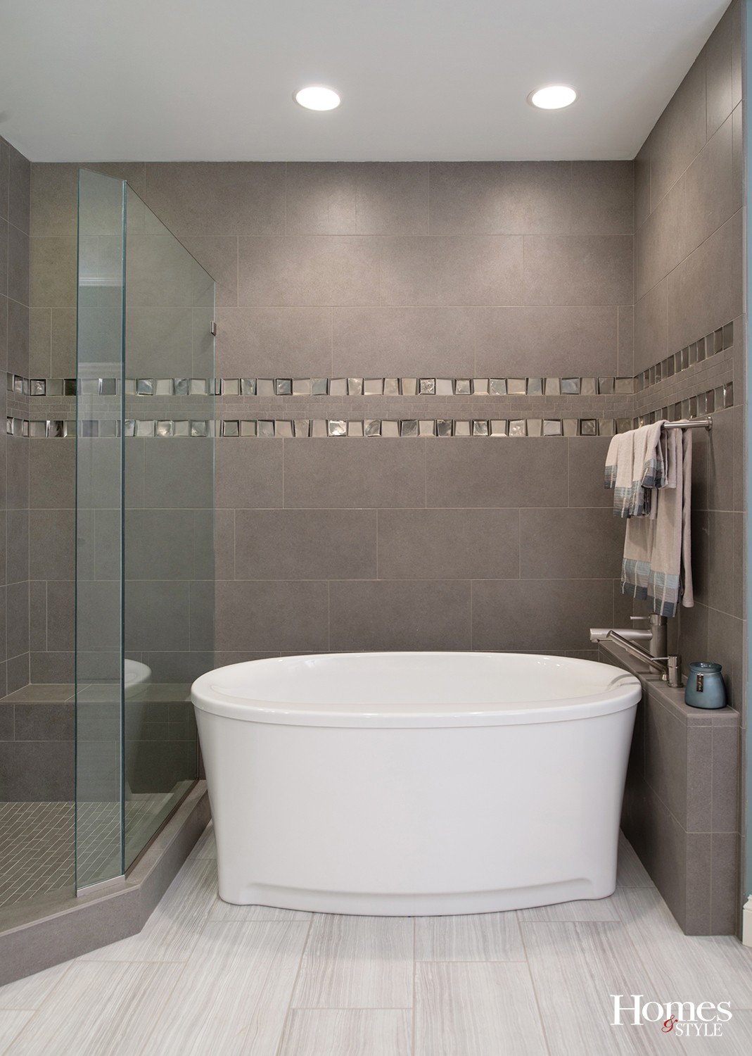
“We installed accent tile squares that give the appearance of metal and glass, and some are iridescent and frosted for contrast,” noted Shinneman.
The porcelain grey 12” x 18” format tile of the remaining walls complements the scene. What is now a glass panel was formerly a full wall, originally closing off the shower.
“We took out that wall and installed glass instead to add to the open look,” stated Shinneman.
The original built-in tub, which had a deck around it, was replaced with a soaker tub, complete with a nearby ledge for a place to set bathroom belongings.
“By removing the old deck and installing the new tub, we were able to make the space seem larger,” explained Shinneman.
Both vanities are accented by decorative mirrors and cozy lighting. The new LED recessed can lights add to the effect.
Of course, working in an older condominium building did have a few challenges, most notably with respect to the plumbing.
“The smaller vanity required a tile shelf put underneath to hide the plumbing stack that could not be moved,” said Shinneman. “The tub also had to set a certain way to route the plumbing properly.”


