Maximizing Space
The Perfect Ingredient for a Small Kitchen Makeover
Kitchen Studio: Kansas City created a winning recipe for transforming this small Prairie Village kitchen into a functional masterpiece.
Story by Ann Butenas | Photography by Bob Greenspan
This stunning new design with its simple yet sleek façade gave this kitchen not only its aesthetic appeal, but also multiple opportunities for success in terms of functionality. This is the type of kitchen where every square inch has a job to do, and the end result is nothing short of harmonious.
Despite its small footprint in this Prairie Village ranch-style home, the kitchen clearly had so much potential. It just had to get out of its own way in order to do that. Thanks to Katie Ott, CKD and the team of experts at Kitchen Studio: Kansas City, what was once a seemingly challenging space to navigate, and certainly one without much breathing and storage room, has now become the heartbeat of the home for this busy family of five.
“Before we remodeled this kitchen, the homeowners kept a lot of their kitchen items in the basement or in the home office, as there just wasn’t enough room for them in the kitchen cabinets,” stated Ott, whose new design has insured that everything has a space and that all is well within arm’s reach. “It felt a bit cluttered to the family before, and they just wanted a space for everything right in the kitchen.”
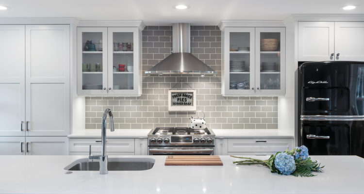
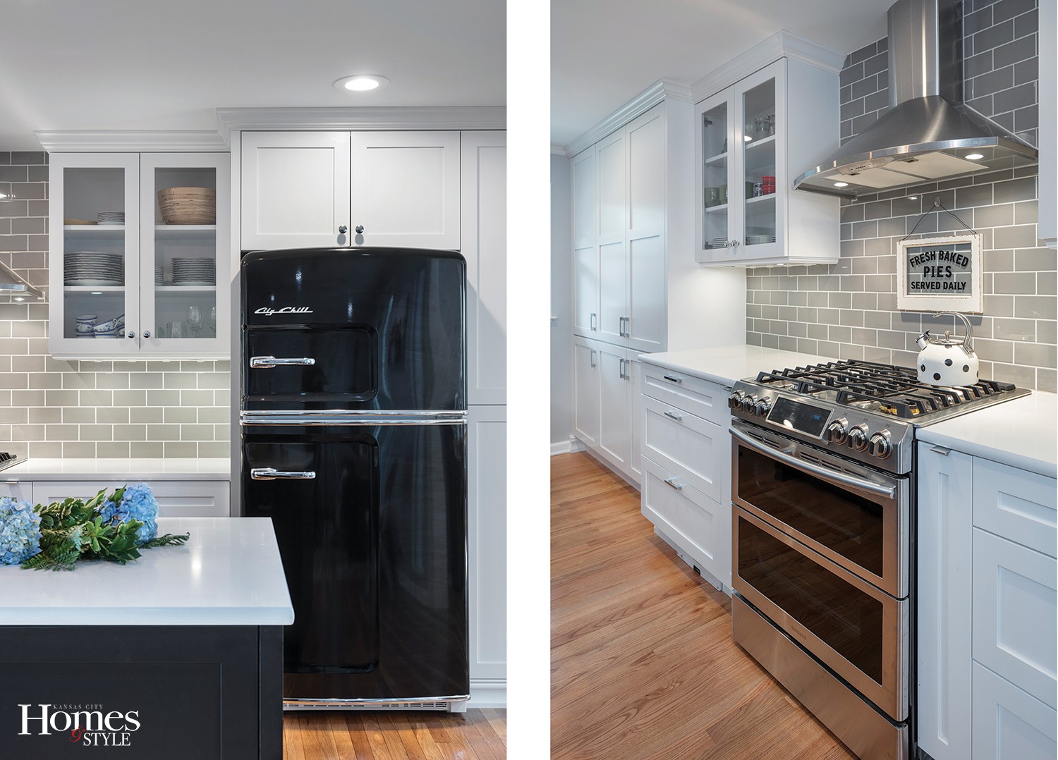
Relying on a color palette of white, gray and black, the new look boasts a modern day appeal with a retro-style vibe. While there are certainly many different functional elements within, the black retro style refrigerator by Big Chill, is an eye-catching focal point, but it won’t take away from all the other key players in the picture who make the scene complete.
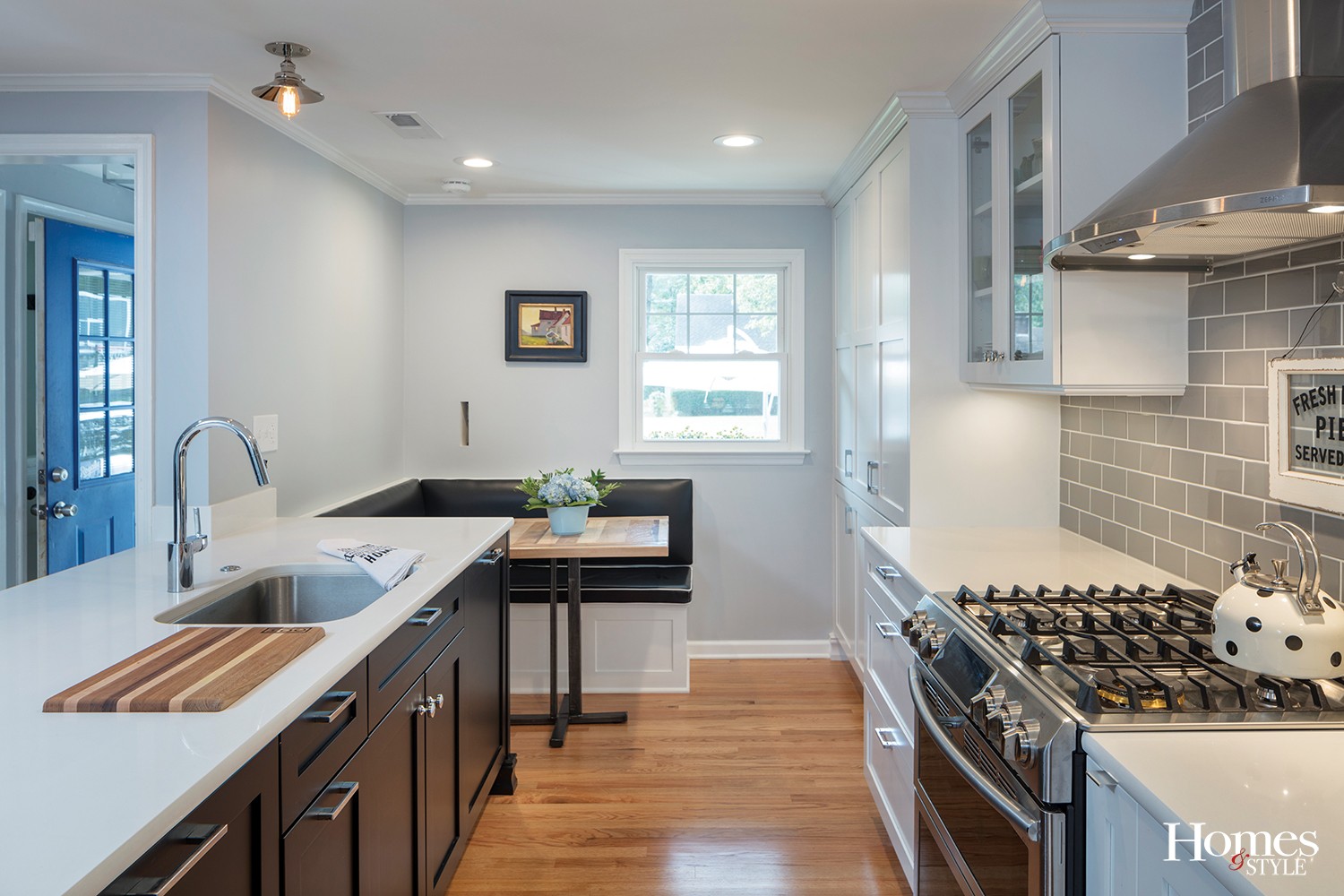
The whole design scheme required tearing down a wall, allowing for more storage space. Everything was torn down to the studs in order to usher in this exciting new look. The original sink, once located under the window, was relocated within the new peninsula. Brand new appliances were installed and retro-style lighting was incorporated above the peninsula, something the homeowner found and decided would work well with the new design. The old flooring was torn out and replaced with hardwood that extends into the adjoining family area for a seamless transition.
In striking contrast to the black cabinetry encompassing the peninsula are the Caesarstone countertops, referred to as a “blizzard” color. The same countertops grace the perimeter cabinets. Although there is a dining table just off the kitchen, the homeowners opted for a delightful built-in booth by the window so they can sit and watch the kids play out in the front yard. The bench part of the booth also doubles as additional storage space underneath. Even the tabletop was designed with intention.
“The homeowners have a collection of unique cutting boards, so they hired a local craftsman to create a tabletop for the booth to match those cutting boards,” noted Ott, who indicated the booth was made on-site and enjoys a black upholstered vinyl with white piping, adding to the retro vibe of the space.
The cutting boards can easily be used on the counter top by the sink, as that part of the countertop has a half-inch deep cut-in, easily allowing the board to settle into the counter for stable cutting while simultaneously allowing for ease of removal for cleaning purposes and for swapping out different boards.
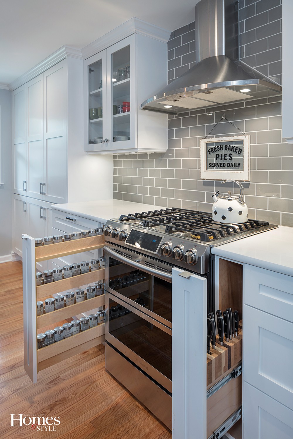
Other highlights include a spice pullout and a knife pullout on either side of the range; two paneled dishwashers, one to the right of the sink and one to the left of the trash pullout next to the left side of the sink. On the backside of the peninsula are three cubbies with hooks inside and which are designed for the addition of adjustable shelving for more storage.
“Each of the kids has a cubby to put store their backpacks and other items,” noted Ott. “The fourth cubby is home to a charging station for all of their electronics.”
To the right of the refrigerator is a broom closet, also complete with hooks to hold additional items, and the storage area above the refrigerator has tray dividers, perfect for storing cutting boards and cookie sheets.
“We maximized the functionality of this kitchen in every way possible,” expressed Ott.
One final touch? Just under the toe kick next to the range is a small independent vacuum, into which crumbs can easily be swept. This self-contained unit comes equipped with a small bag that can be dumped out when full.
“Although this kitchen is small, it is now very functional for the entire family,” stated Ott.
Resources
Kitchen Company: Kitchen Studio: KC | Contractor: Woodward Construction | Kitchen Table: Porter Furniture | Cabinets: Crystal Cabinets | Countertops: Caesarstone | Countertops: Dimensional Stoneworks | Sink: Blanco | Faucet: Moen | Hardware: Atlas | Hood: Zephyr | Booth Seating: Forte Upholstery


