

Stunning Bathroom Renovation Packs a Punch of WOW!
Story by Joan Bellinghausen | Photography by Matt Kocourek
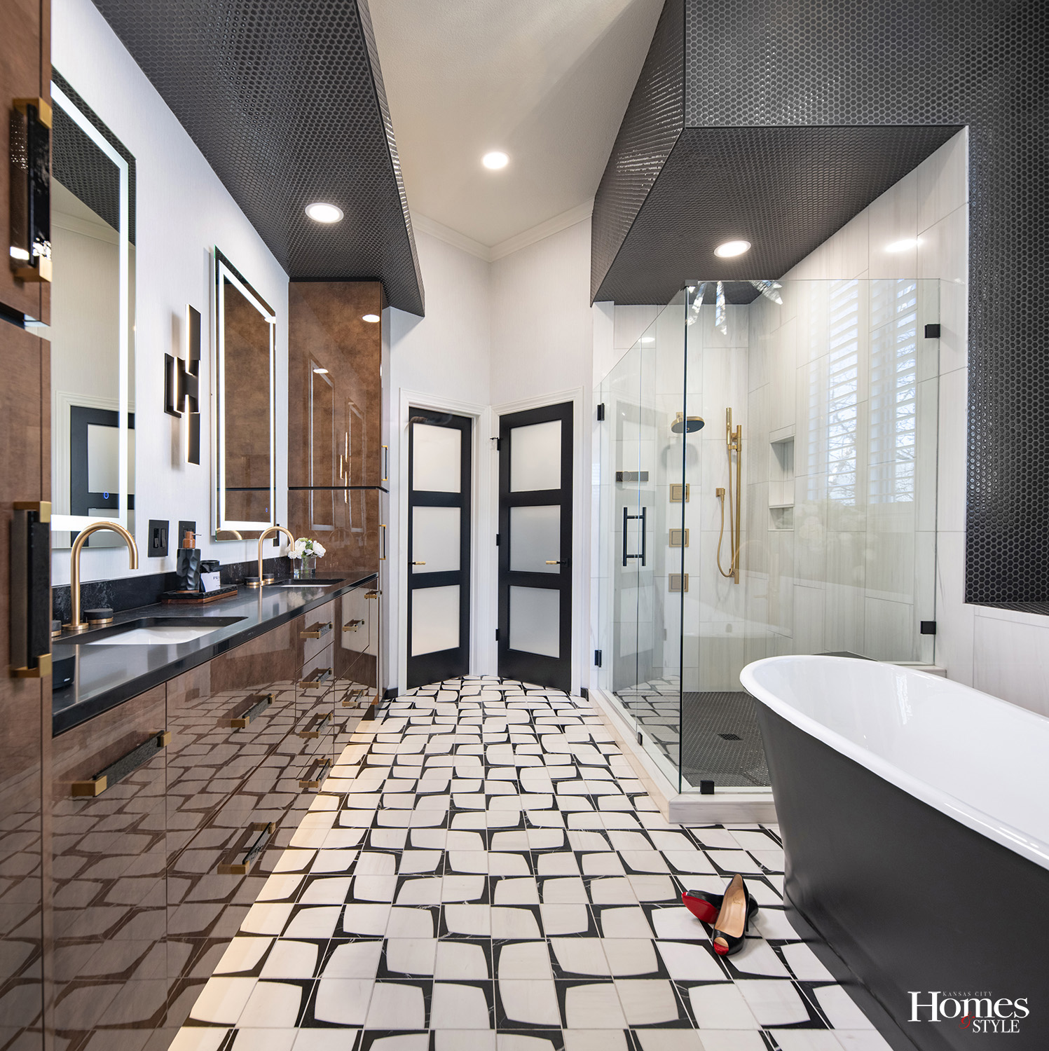
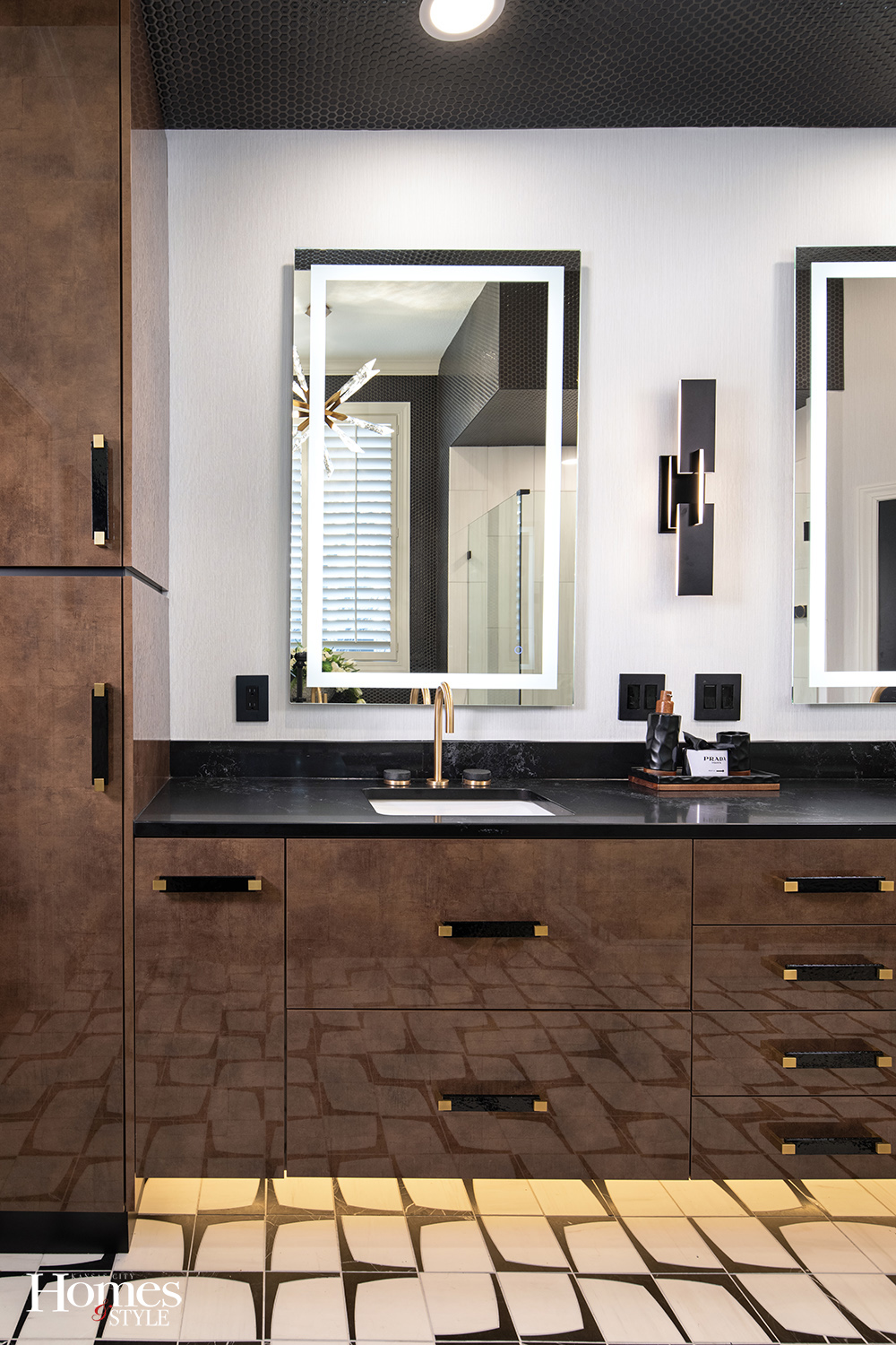
High gloss surfaces, patinaed copper tones, and the high contrast of black and white come together beautifully in this eye-catching bathroom, resulting in a showstopper of a renovation.
The dramatic space began with Bath Designer Lisa Otterness with Kohler Store, taking the homeowner’s desire for “a big wow factor” and bringing the homeowner’s ideas to life.
“The homeowner really wanted a space that was a statement,” says Lisa.
The client brought many inspiration photos to the drawing board, but some elements could no longer be sourced, so Lisa got creative.
“We started with those gold tones and highly reflective surfaces and developed our design from there,” she says.
The renovation, part of a primary suite remodel in a Leawood home, transformed a dated bathroom plagued with functionality issues and visual challenges. The old bathroom had very high vaulted ceilings with odd angles, leaving the bathroom feeling cavernous and oversized.
“We cleaned up those lines by adding soffits above the vanity and above the shower,” says Lisa. “Essentially, we humanized the scale of the room, giving a sense of scale that’s more proportional.”
The cabinetry features a high gloss lacquer called Cuzco Oro, the color of patinaed copper. Initially, the plan for the floor-to-ceiling cabinets at both ends of the vanity “had an issue because of the high gloss material’s size limitations,” Lisa explains. So, she borrowed an architectural trick of incorporating “shadow lines” or black bands to fill in some gaps, integrating them into the cabinetry.
“We essentially turned the black bands on the cabinetry into a design element,” she explains. “Because we did the black there, we decided to put the hexagon tile on the soffits and on the walls. It’s a really unusual treatment for soffits.”

The dark hexagon tile also proved to be the perfect solution for making the space behind the soaker tub feel intentional.
“Before, the ledge behind the tub felt disconnected and awkward,” Lisa says. “Once the ledge and area around the recessed window were tiled, it felt much more purposeful.”
Finally, the hexagon tile helped counterbalance the dramatic black and white pattern on the floor and provide an overall cohesion to the black and white aesthetic throughout the space.
“Finding the perfect floor tile proved to be a big challenge, but once we found it, we were ready to go,” Lisa says.
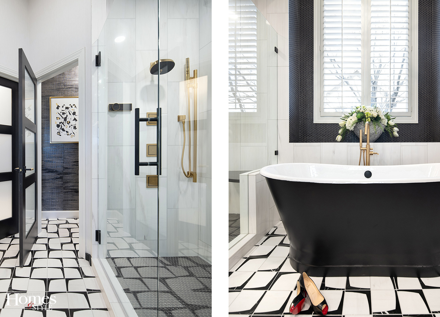
The tub itself even joins in on the black and white motif.
“Having the outside of the tub in black provides a great reversal from the floor tile, showing a lot of black with a little bit of white,” she says.
Lisa made all the major selections for the cabinetry, tile, and countertops, and partnered with the homeowners on the plumbing selections.
The bathroom features a state-of-the-art automated showering system from Kohler. A touch of a button controls temperature, rain head, wand, and body sprays.
“It was a fun creative process,” Lisa says. “The homeowner was very adventurous. The result is definitely bold!”
Resources
- Bath Designer: Lisa Otterness, CKD, Kohler Store
- Interior Designer: Caroline Wake
- Contractor: David Wood
- Installation: Paul Short
- Cabinets: Richelieu Cuzco Oro
- Countertop: Central Surfaces ~ Caesarstone, 3CM Empira Black
- Wallpaper: Phillip Jefferies
- Tile Floor: Eames Waterjet Mosaic
- Tile Shower: Snow White Marble
- Tile Accent: Soho Simple Charcoal Hex
- Shower Fixtures: Kohler Anthem and Statement in Vibrant Brushed Brass