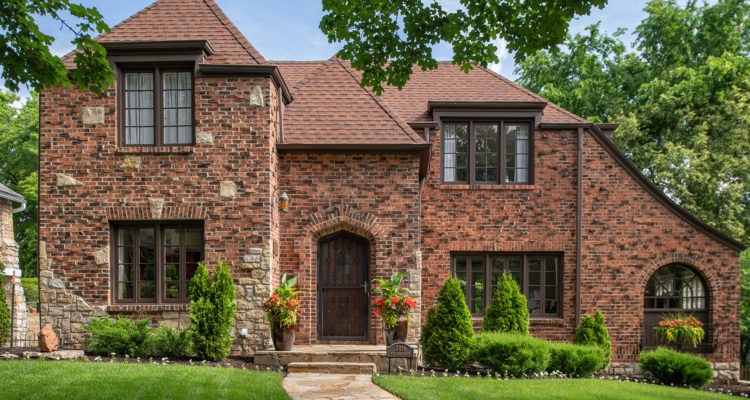
Inspired by a mix of modern Asian and Hollywood glam influences, a San Francisco design duo revived their 1920s brick Tudor in Westwood Hills.
Story by Jeanne de Lathouder | Photography by Matt Kocourek
Recent California transplants, Cheryl and Mike Hill were smitten by a home that caught their eye in the charming Westwood Hills setting of Johnson County. What appealed to them most was that this home — a 1927 Klinker brick Tudor — was poised befittingly in a historic neighborhood yet had all the amenities of a modern home inside, including central air and new plumbing. Both design professionals from San Francisco, the couple could immediately see the property’s potential and began visualizing a complete overhaul. They called on Karen Mills, founder of Interiors by Design and former host of the renowned Living Large design show, to help guide them through the process.
“Until we met Karen, we thought we wanted a Tudor-style living room,” laughs Cheryl. “Thankfully, she proposed a light and airy feel — not what we were originally thinking.”
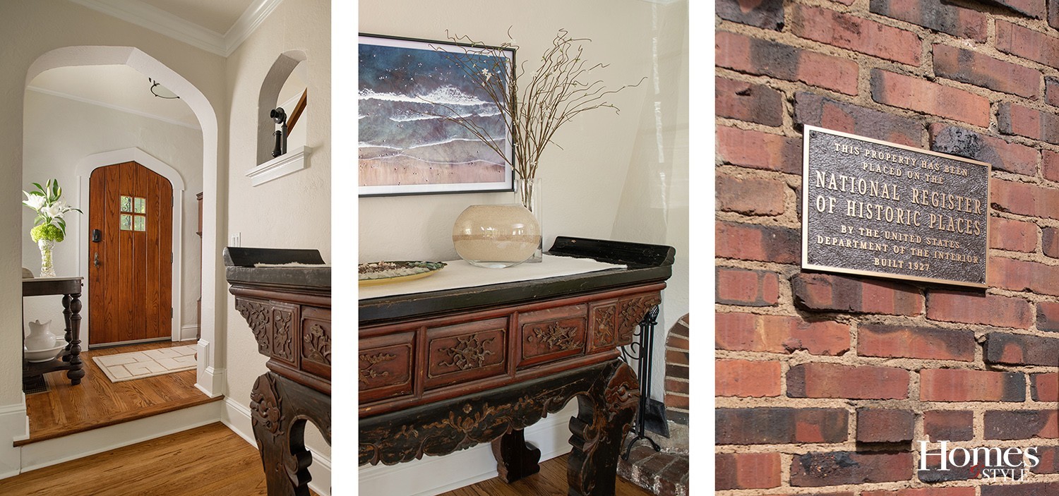
A step back in time, the stunning brick and stone Tudor home, listed on the National Registry of Historic Places in Westwood Hills, often mesmerizes passersby with its fabulous curb appeal that looks like a setting for a fantasy adventure movie.
“The homeowners get credit for the curb appeal,” notes Karen. “They added exotic landscaping, a winding stone path leading to the front door, exterior lighting, and additional brick on the exterior.”
“As far as the exterior, we loved the limestone foundation so much that we removed the shrubbery to reveal it,” Mike explains. “We also redid the curved stone wall at the driveway to embrace the new Serbian spruce tree that we loved for its cartoonish Dr. Seuss aesthetic.”
When the Hills first purchased the house, much of the interior had not been updated. Karen and her firm helped the couple successfully transform their living experience into a place where they wanted to live — a timeless, inviting space showcasing both their design aesthetics while also melding seamlessly with the home’s original architecture.
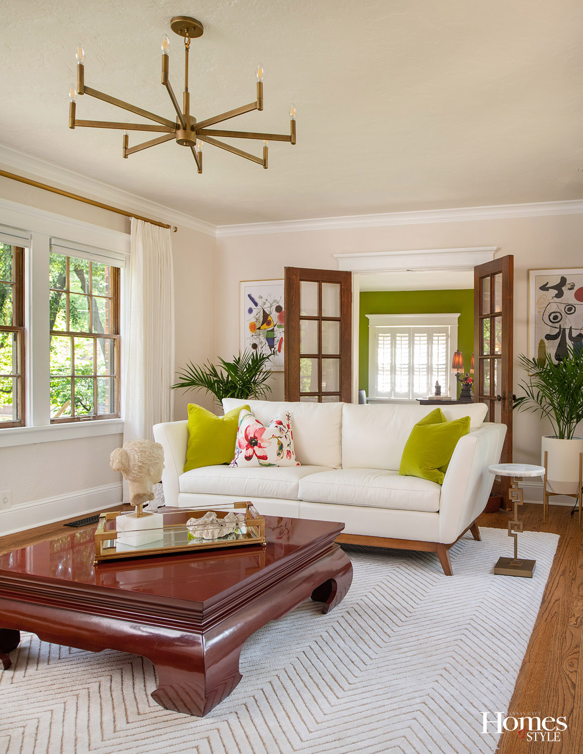
The entrance to the home is methodically orchestrated with a stone path that echoes the lighter stonework on the front exterior. Visitors are greeted by a curiously shaped arched antique wooden door that has been meticulously mimicked in the brickwork. Stepping into the cozy entry filled with family antiques and a graphically embellished white custom rug, you are instantly drawn into the light-filled living room beyond. This sunny space, with its double row of antique windows that line both the front and back of the house, welcomes you with beautiful views in both directions.
“When we initially began the design process, the Hills requested that we retain much of their existing furniture, including a red Indonesian altar around which we built their color scheme,” says Karen. “The calming light neutrals juxtaposed against bold colors—citrine green, fuchsia, red, blue, and black — create an interesting vibe of East meets West with a mix of Asian, mid-Century modern, traditional, modern, and Hollywood glam as you walk through the home.”
For the main living space, the team began by layering in a modern chevron-style creamy white wool and silk rug underneath a custom-upholstered white leather sofa and a citrine-green velvet chair. Next, they introduced interesting tables, including a vintage Asian coffee table they found online, and the Hills’ beloved Asian altar topped with a glass bowl filled over the years with layers of sand from their trips to Hawaii. Custom creamy white draperies and gold curtain rods create another textural layer at the windows without disrupting the view.
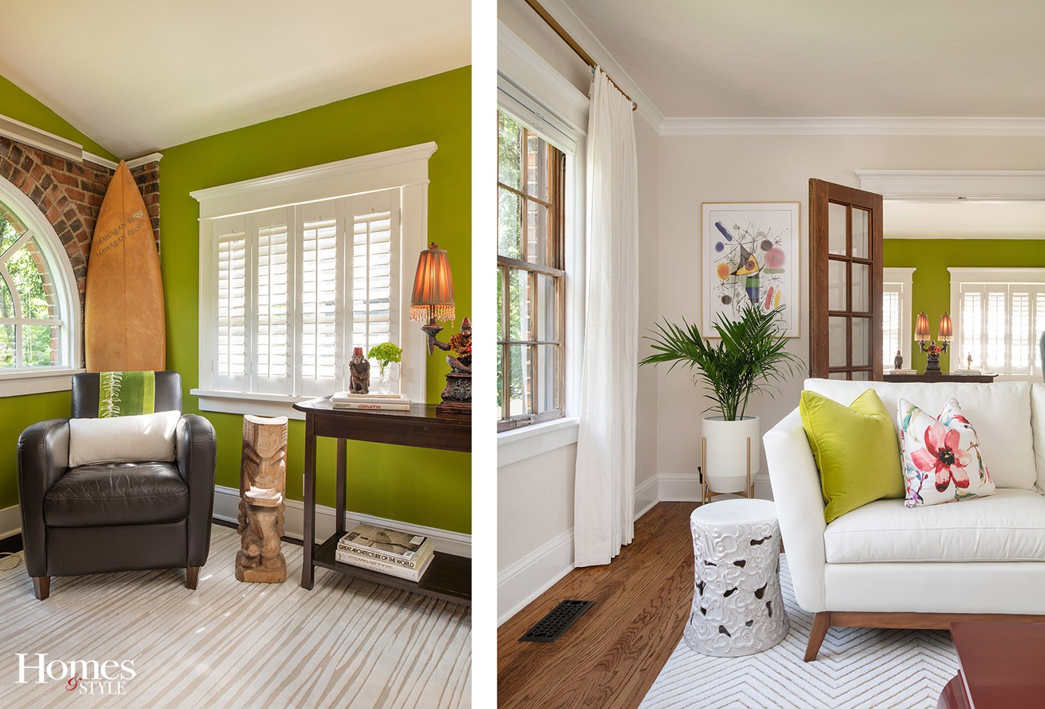
“Cheryl loves the dreamy aesthetic of glamour, fresh flowers, and especially the color white reflected in the chandelier, sofa, rug, and drapes,” notes Karen. “In contrast, Mike’s vibe leans more toward rugged with warm, inviting furnishings, unusual collectibles, and a love of the outdoors, creating an interesting merge of styles in this one-of-a-kind interior.”
Behind the sofa, two Joan Miro prints flank the antique French doors leading to Mike’s study, where the vibrant citrine color is repeated on the walls. A surfboard peeks out from behind his chair in the corner — a reminder of one of his favorite hobbies.
“Mike has collected several surfboards, and one of them—a vintage 1967—is a gift from Mike to Cheryl for their 25th anniversary,” Karen adds. “We are currently in design review for a new double garage that will house Mike’s car collection of 1950s hot rods and 1960s muscle cars. As a designer, I believe that diving deep to create a nurturing healing environment that reflects our clients’ personalities is key to our success, along with ensuring the spaces are well organized and extremely functional.”
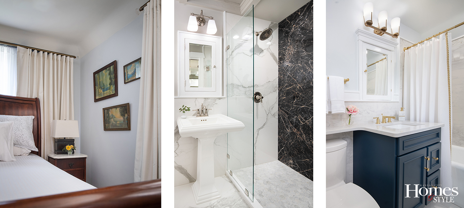
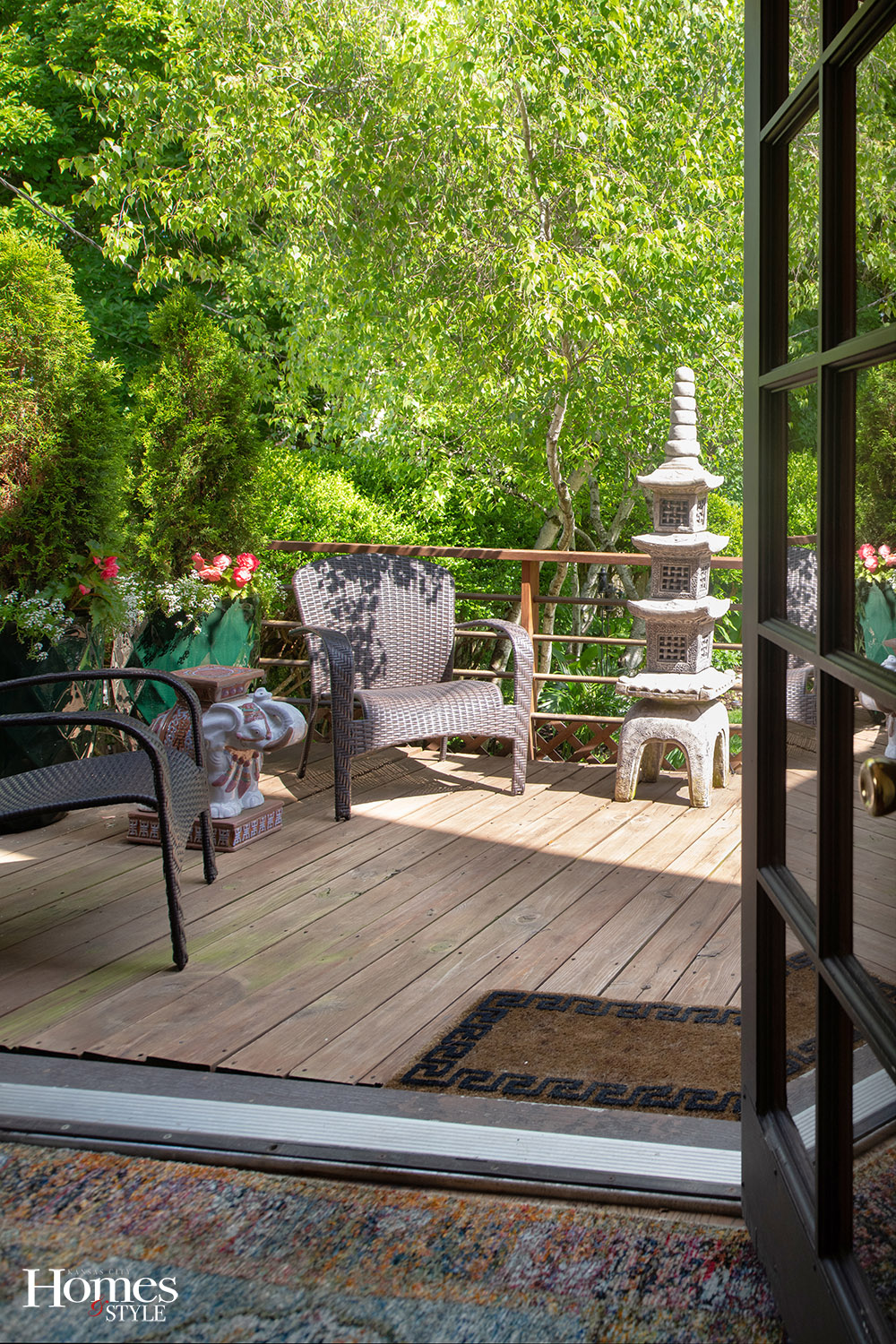
The kitchen features an adjoining dining area with French doors leading out to the back deck and garden. The upstairs area contains two bathrooms and two bedrooms, the largest of which serves as the couple’s family room, Cheryl’s creative workroom, a guest room, and a solarium.
“My orchids love the eastern exposure, and we spend most of our time up there,” Cheryl says. “We love our entire house and enjoyed working with Karen because she came up with fresh and dynamic ideas that we would not have thought of ourselves. We still cannot believe this is our home — every time we walk by the sunken living room, it’s like a dream.”
Resources
- Interior Designer: Karen Mills
- Contractor: Jed Birdsong
- Rugs: The Rug Studio, Designers Library
- To the Trade Furniture: KDR, Designers Library
- Coffee Table: Chairish
- Custom Drapes: The Workroom
- Hardwood Floors: SVB Wood Floors
- Curved Stone Walls, Walkway: J.G. Stone & Masonry
- Curtain Rods and Curtains: Bob White Installations
- Exterior Lighting: Chris Lighting Co
- Tub and Sink Refinishing: Michael’s Resurfacing

