Story by Judy Goppert | Photography by Matthew Anderson
“A house is made of walls and beams; a home is built with love and dreams.”
This quote by Ralph Waldo Emerson sums up the connection these homeowners have to their beloved Waldo home. With loving detail, this couple worked with their designer to create a bathroom space that enriches their lives now and will stand the test of time.
Andrea Breer, Schloegel Design Remodel, took the lead as their partner in this intensely detailed process of converting their outdated downstairs bathroom into a more spacious, usable, inviting space.
“My job gives me the opportunity to use my creative skills to help homeowners achieve what they need to function in their home and have a truly wonderful lifestyle,” Andrea noted.
She explained that they looked at some neat shower designs, and this couple brought their own ideas to set the stage and bring all areas of the home together. As an artist, the homeowner is adept at lovely creations, and through this process, she presented Andrea with a watercolor of the bathroom she imagined in her dreams.
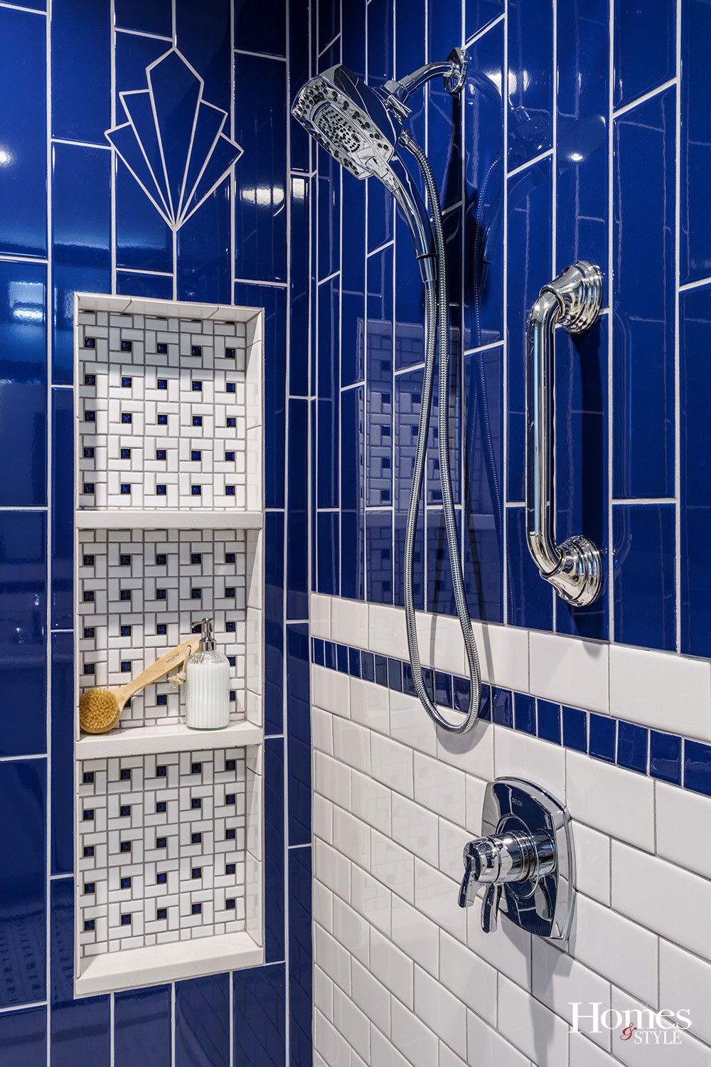
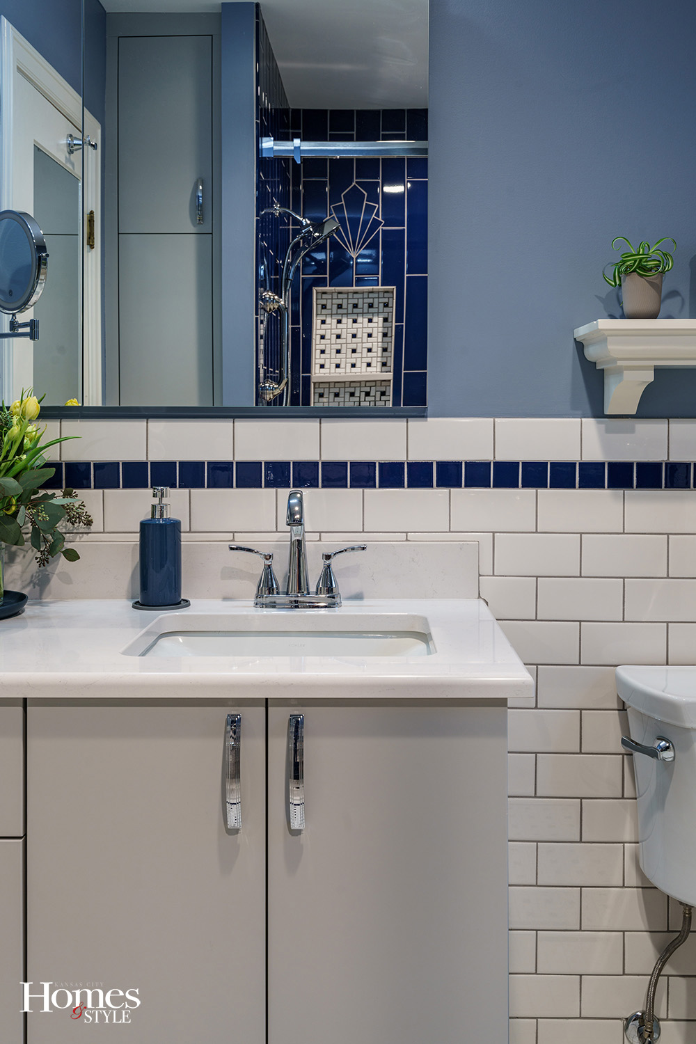
The “flourish” above the niche is a motif used throughout the house on the original doorknob backplates on all the interior doors.
“After we bought the house, we got married. We used that flourish in our wedding rings and invitation,” the couple smiled. “We also incorporated it into the upstairs bathroom during a previous remodel.”
They have both lived in the Kansas City area for over 30 years and rented this home in 2000 before purchasing it in 2008 because they fell in love with it and each other. Both have careers in technology companies.
The Tudor-style house was built in 1934. It has the original honey oak hardwood floors and trim on the first floor, and the original built-in china cabinet / butler’s pantry just off the kitchen.
“We did a previous remodel of the kitchen and upstairs bathroom in 2014 with a different contractor, and some structural repairs such as masonry repairs, a new roof and fresh paint along the way,” they continued. “The downstairs bathroom had not been updated since the house was built, except for easily replaceable things like the vanity, toilet, etc.”
The reasons to remodel this bathroom are many, and the after is perfect! No longer does it have a small closet-sized shower, a mostly unusable storage cabinet and a large flat mirror.
Gone is the original lavender and black tile and dark green paint.
Andrea said the couple found her and Schloegel, so they invited them into the showroom to help them understand their process and what a design build company can do.
Both are fans of art deco, and this resonates in the new bathroom design.
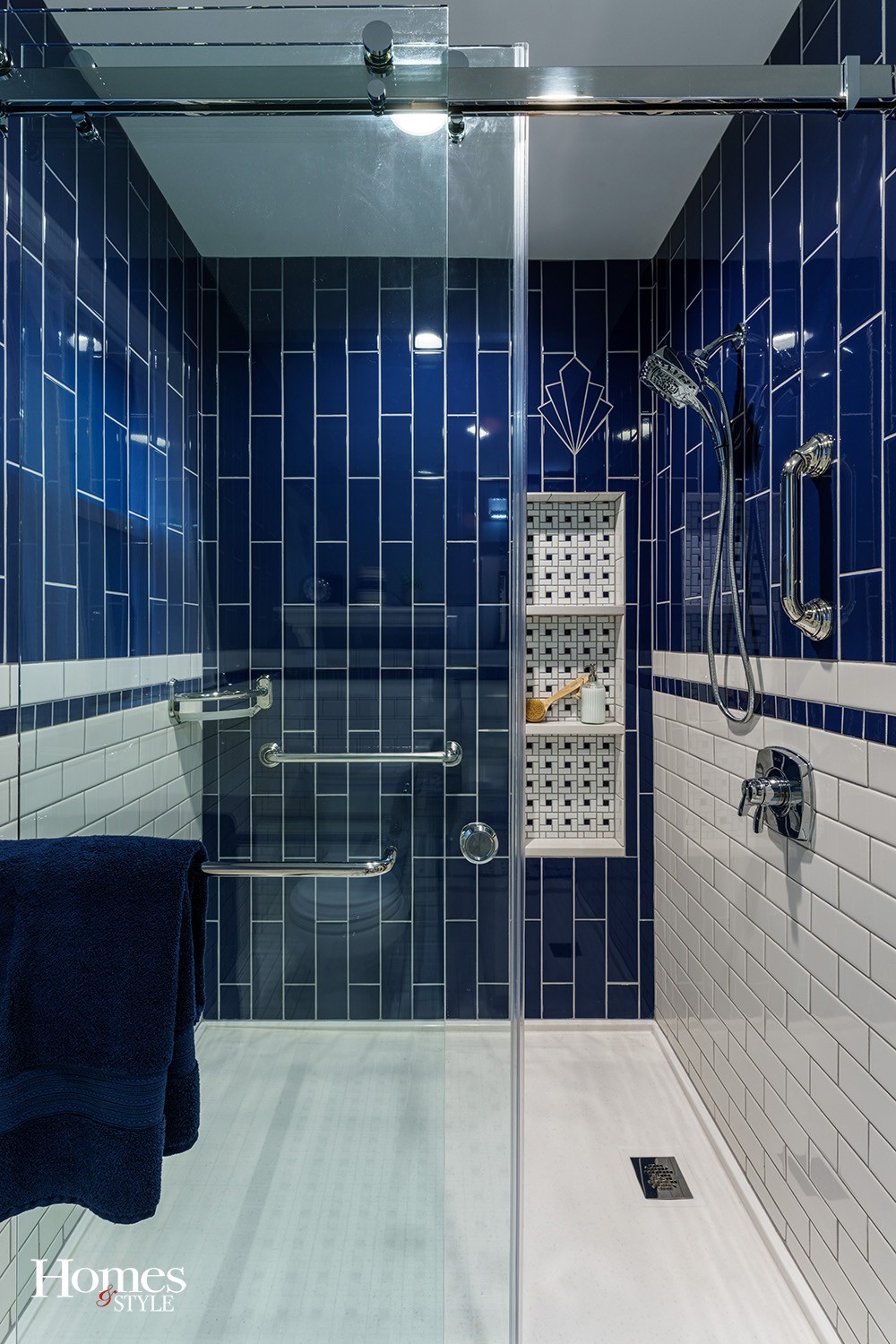
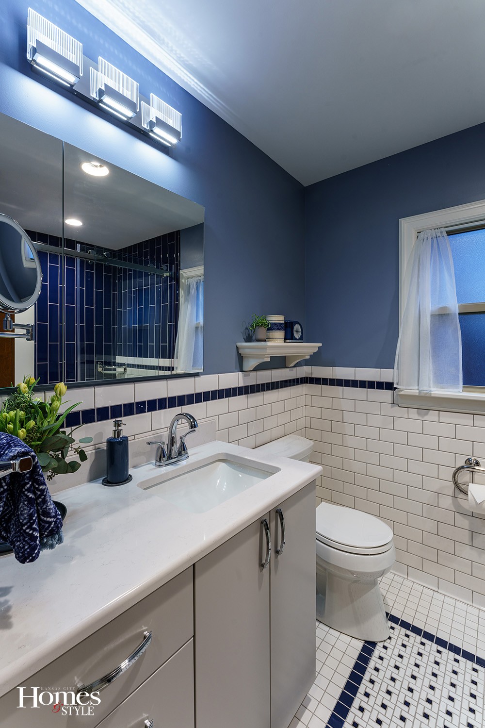
They wanted a design in the spirit of the time the house was built, and the tile design echoes the previous remodels in the kitchen and upstairs bathroom. Both have white subway tile in the traditional orientation. The kitchen also has a design feature with the subway tile-oriented top to bottom, creating an illusion of height. The tile design makes the downstairs bathroom feel bigger.
“I worked with the inspiration pictures she had and took that and made it a grander vision for them,” Andrea confirmed. “I really love the tile floor rug we were able to incorporate, the show wall, the wainscotting going into the shower wall, the design is all hand custom done. The shower doors, plus the larger shower pan and the low-curb entry means they can age in place with this as their primary bathroom.” The homeowners like that the shower is big enough to accommodate a person, a bench, and a caregiver should the need arise.
Andrea worked with the homeowners to find the perfect shade of gray for the cabinetry and maximize the space with a custom linen closet. A vanity light, ceiling fan light, and a light in the shower provide plenty of lighting. Andrea also chose the right size and location for grab bars that double as a towel rack and toilet paper holder.
Through this process, experts removed asbestos and lead from the basement and walls.
As stated, space was at a minimum, and the homeowners are so happy that Andrea’s design added more.
“She moved the original door to the hallway about two feet, allowing a larger shower footprint and room. The room itself was not enlarged, yet with the old lathe, plaster, cement, tile and a vent pipe removed, we gained a few inches,” the homeowners said. “Also, we have two young cats and they watched Rohn, who was the project leader, as he worked!”
Andrea reiterated, “I was excited to rework this home with such uniqueness to it, and work with this couple to maintain the rich history yet give it a facelift.”
The homeowners are amazed at how much bigger the room feels, and love that it is now modern and efficient, yet has the spirit of the time the house was built.
“We will enjoy our home for many years to come,” she smiled.
Resources
- Builder/Contractor – Schloegel Design Remodel
- Interior Designer – Andrea Breer, SDR
- Plumbing Fixtures – Ferguson Bath, Kitchen & Lighting Gallery
- Cabinets / Wine Cellar – WW Wood Products Inc.- Shiloh Cabinetry-Light French Gray
- Countertops – CKF, Miami Vena
- Mirrors – Ferguson Bath, Kitchen & Lighting Gallery, Kohler K-99008
- Lighting – Ferguson Bath, Kitchen & Lighting Gallery, Eurofase Lighting
- Tile – ProSource

