A new neutral on cabinets makes for a calming and classic kitchen.
Story by Andrea Darr | Photography by Matt Kocourek
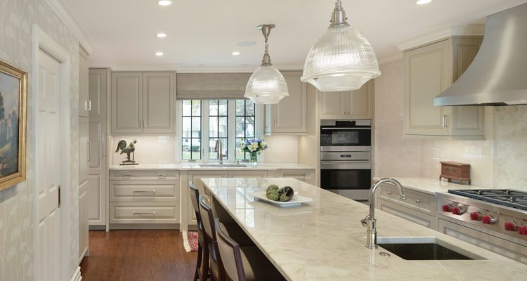
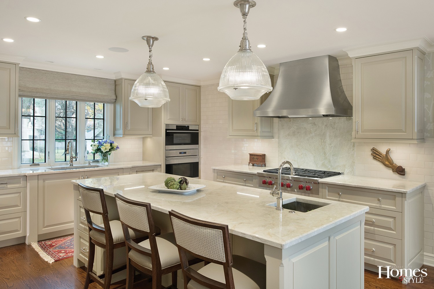
A mid the plethora of white kitchens in the world, a new classic emerges in this Mission Hills home. At once neutral and calming, it’s none other than an olive khaki. Technically, Sag Harbor Gray by Benjamin Moore.
A color more typically found on chinos rather than cabinets was a leap of faith in the project’s interior designer, Kurt Knapstein. “The homeowner and I were both like, really?, but he had a vision for it,” says Sue Shinneman, CKD, owner of Kitchen Studio: KC. “It’s a very calming color and changes with the light throughout the day.”
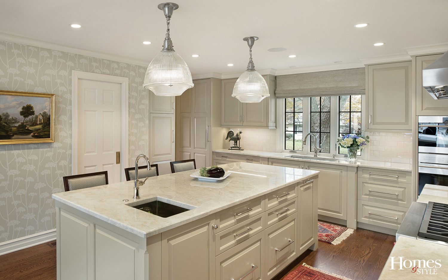
Another unique treatment in the space is a patterned wall courtesy of wallpaper. “We are seeing it coming back more and more; not all over, but as an accent,” Shinneman notes.
One final cosmetic detail that adds a subtle punch is a fully tiled wall behind the range. With cabinets dead-ending there, the space would feel lacking. A mix of long and short creamy, ceramic tiles — 3 x 3s and 3 x 9s — make a great connection.
“I think it’s fabulous,” Shinneman says. “It made that whole wall, which could have been just a plain section. It gives it more personality than paint or even wallpaper.”
The homeowners, both Hallmark retirees who had lived in the house over 25 years without remodeling, wanted more than just a cosmetic lift. When they finally decided to dive in, it was a major overhaul, including gutting the entire first floor of the home. The couple moved out during the construction and returned to a new home, specked to the last detail.
The remodel included an addition to the master suite, but no extra space was necessary in the kitchen. “They had space for what they wanted, it just wasn’t configured properly,” Shinneman says.
Two decades ago, peninsulas were the design rage, but today, people prefer the open flow of an island. The owners wanted the added flexibility of prep and serving space, as well as a place to sit and eat.
The team of collaborators ran through several layout options, including whether to keep a half bath in the space. It didn’t make the final cut. Instead, a pocket door now opens to a walk-in pantry.
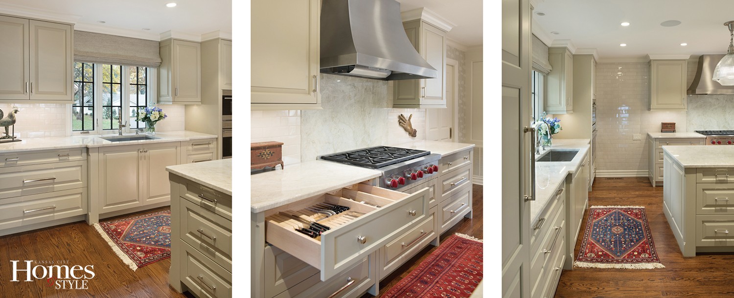
The reconfigured space now dedicates one wall to the cook top and vent hood, with access to a mudroom behind it. To the right of the sink and prep counter are a stacked oven and steam oven; to the left, a split 36” fridge column and 24” freezer column flanking the entry to the back study. The two Sub-Zero appliances face each other.
“The project is one of symmetry and balance,” Shinneman says. “Everything is centered.”
Beyond flow, the homeowners had specific requirements for storage. “She was very organized when she came to me with how and where she wanted things to go, and she had a list of everything she owned,” Shinneman says.
The homeowners’ detailedness assured that every belonging would have a proper place — that is, hidden behind closed doors and not cluttering countertops. There is a shallow 8-inch-deep cabinet for canned goods, double-tiered silverware drawer, spice cabinet and spice overflow cabinet, and cookie sheet and platter dividers.
In fact, the owners were highly meticulous with both researching products as well as who would be part of their team. Talks with potential builders and architects began in 2011.
The wait was worth it. When anyone walks into the new kitchen, “It’s mellow,” Shinneman says, “It’s a truly calming space that makes you let your breath go and just relax.”
Resources
Kitchen Company: Kitchen Studio: KC
Contractor: Cornelius Homes
Interior Designer: Knapstein Design
Appliances: SubZero-Wolf
Hood: Vent-A-Hood
Countertops: Dimensional Stoneworks
Plumbing Fixtures: Ferguson Enterprises
Tile: International Materials of Design
Tile Installation: Mike Brown


