Exceedingly smart and stylish attic renovation makes the most of a diminutive space.
Story by Gloria Gale | Photography by Matt Kocourek
Sure, bungalows are enchanting, at least this one is owned by talented graphic designer, Jan Tracy. Nonetheless for all its flourish, carving out unused space without adding a bigger footprint is tricky.
“I love this old house,” she says but what it makes up for in charm, pushing its boundary up, not out was something she hadn’t considered.
Up!
Throughout the years, Jan eked out most of the 1,200 square foot floor plan updating with new construction that entailed renovating two bedrooms, one kitchen, and then expanding the backyard deck. Everything was added to keep the integrity of this vintage home except increasing the original floor plan.
Her husband John, explains, “While I loved having a view of the street from my desk, situated in the living room, I asked Jan what she thought of renovating the attic.”
She read between the lines, then opened the door leading upstairs. Except there was no upstairs … just the attic complete with cobwebs and storage.
Shapeshifter
To Jan, another project was tempting. “I crossed my arms and quietly mused what I figured we could do with a long, narrow space, little natural light, and slanted ceilings.” Her mantra,“Why not make it so livable you never want to come down.”
And that’s exactly what happened.
She hired a space planner, a contractor with a demo/prep crew then along, with her husband, they rolled up their sleeves.
Once the plaster lath from the ceiling and walls was removed, drywall was applied. Raw wood planks were replaced with blond vinyl flooring then the HVAC zone and room for storage installed.
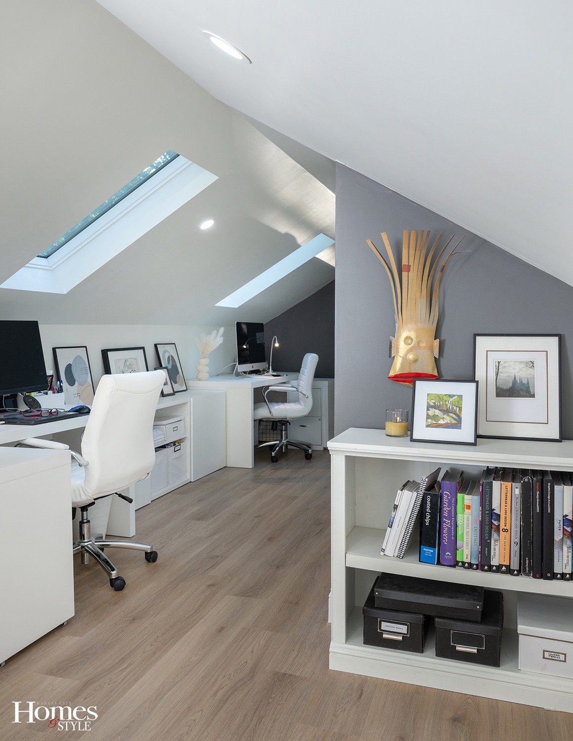
From the start, the meager natural light from mullioned windows both in the rear and front of the 48-foot space was a dim reminder that more light would be necessary. The solution was installing two skylights augmented with 14 recessed can lights.
Clean, Open and Airy
Throughout the five month renovation, what emerged from the cobwebs was a space that echoed what John and Jan proposed. They knew they wanted a cozy hideaway and this simple, slender space made the most of their vision. “In fact, it’s better,” says Jan.
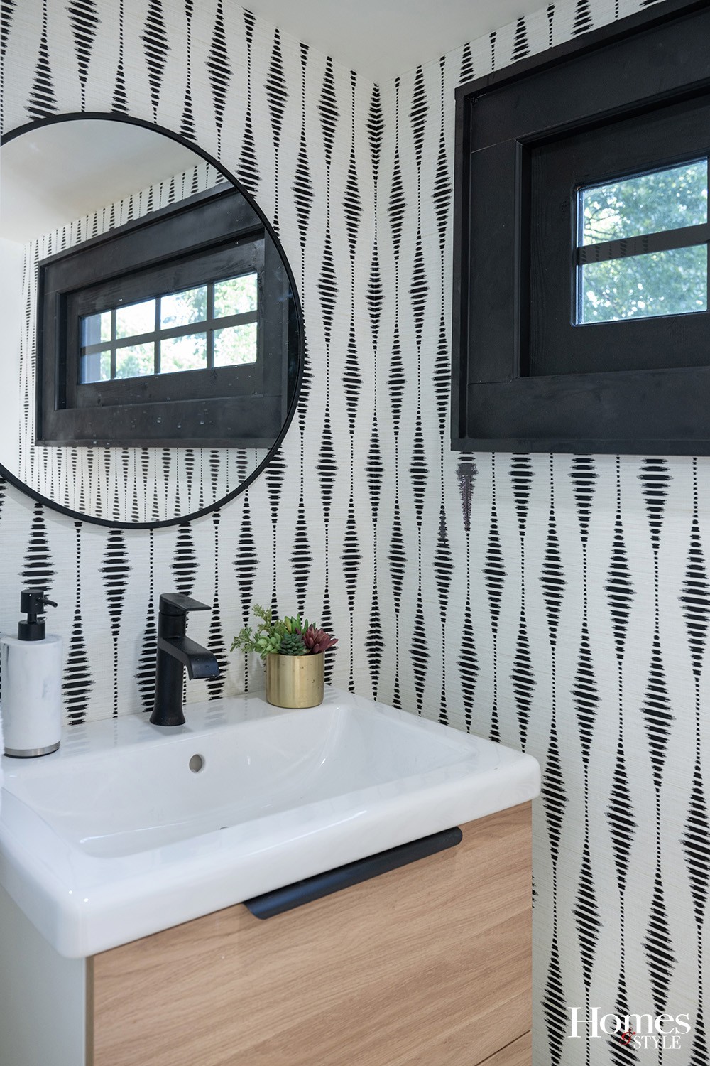
After the construction was complete, Jan used her innate sense of good taste to design a spiffy half-bath neatly tucked under the eaves. A step away, John and Jan bought two desks for their tandem work zones.
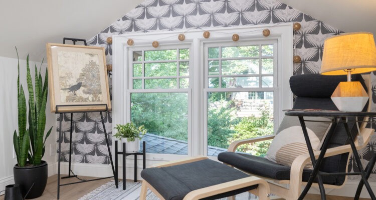
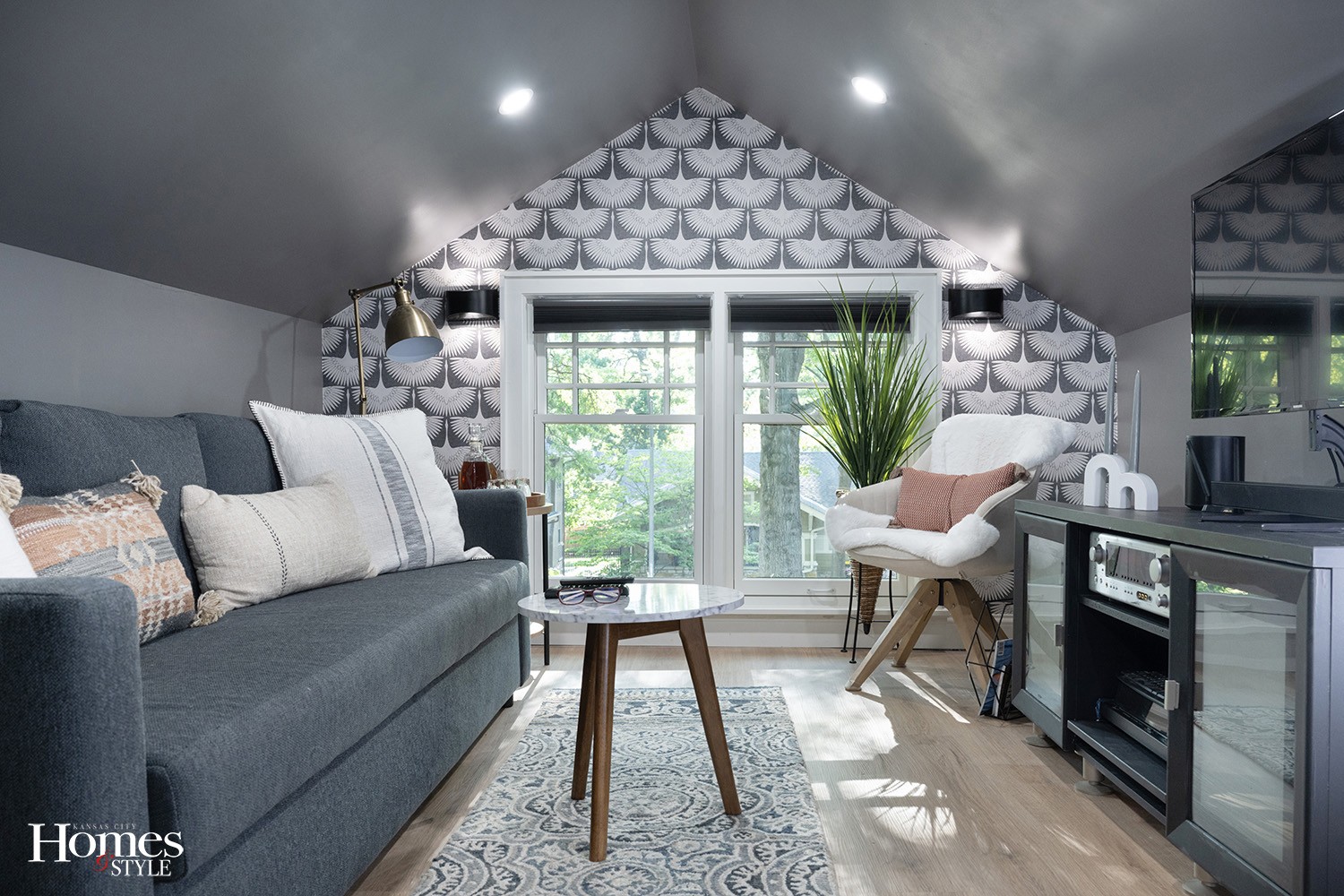
Anchoring the East end of the room is a comfy conversation area wallpapered in a classic motif.
Before exiting the space Jan adds, “I even have a tiny niche at the top of the stairs for my art studio.”
Overall, what was once simply a forgotten space is now a functional renovation.
“It’s like a snug-hug,” Jan says, amused with the successful solution.


