Space, Color, Custom Design, Balance, Mood…
Story by Judy Goppert | Photography by Matt Kocourek
Eat, drink, and be merry! That is what kitchens inspire people to do, especially when created with thoughtfulness and attention to detail.
Jill Painter, CKD, Certified Kitchen Designer at Bella Kitchens, worked with the homeowners who are friends with her previous clients, to ensure they achieved their goals.
“They were ready for a change and improvement in function and aesthetics,” she noted. “Their children are young adults now and they all enjoy large family gatherings.”
Painter explained the kitchen had an outdated layout with an awkward six-sided, angled island top. They discussed a major overhaul including taking out the wall between the kitchen and dining room and doubling the size of the kitchen. Since they enjoy cooking and entertaining and their daughter is an avid baker, this would give them plenty of island space.
“The plan changed, however, and we scaled back on the expansion and instead decided to close off the door going into the dining room and then maximize the existing footprint,” she continued. “This created quite a space planning challenge and I absolutely love space planning! I still needed to fit an island for prep, pantries and a bar within the current kitchen walls. By adding hardwood floors, we converted the front sitting room into the new dining room making it more accessible from the kitchen.”
About that space planning, it took some fine tuning and a lot of thought. As there was so much the homeowners wanted to include in the new kitchen, it involved scrutinizing all aspects from a practical standpoint, such as dedicated workspaces and traffic patterns, aisleway widths, and storage requirements.
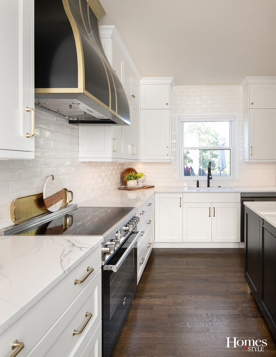
The beauty is in the details, including brushed brass hardware with a faceted design to give a dressed-up look, and the wood tabletop features waterfall ends on the wood top to close in the bar stools and give the look of furniture. Include in that the lighting and electrical. The outlets and under-cabinet lighting are built into the bottom of the wall cabinets with panels for a clean, uncluttered tile backsplash. She searched for just the right lights over the island; the perfect shape, style and finish. By taking the cabinets to the ceiling, it creates a finished look that draws the eye up so it doesn’t look like a small space.
To fit a prep island, the cabinets on the angled wall needed to be shallow so pantries were made. She didn’t want a solid wall of cabinets so decided that’s where a bar would be popped in and become the focal point of that wall. “I paneled the built-in refrigerator so it blends in with the pantry cabinets. The black quartz top and black marble mosaic in honed and polished shapes make the perfect backdrop to the stunning custom-designed, solid brass shelving feature,” Painter continued.
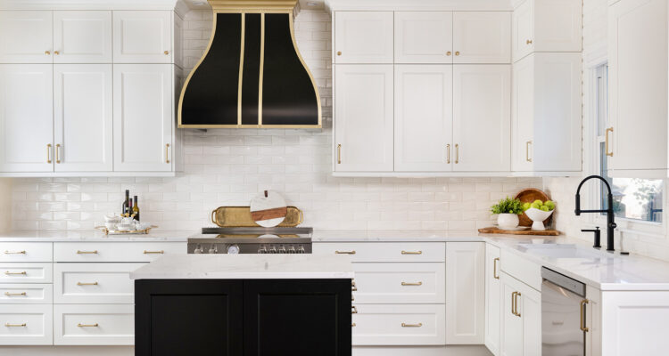
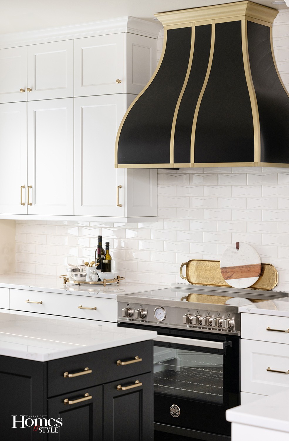
“In the main part of the kitchen, the quartz countertops have dramatic veining in black and gold which is a perfect complement. The custom-designed hood is a beautiful focal point of the range wall and breaks up the line of white cabinets. The black induction pro range is the perfect base for the hood to shine.” The tile is a relief pattern that reminds Jill of a bowtie which she believes fits the feel and aesthetic of this kitchen, as if it’s all dressed up and ready to entertain in!
The small prep island is packed with storage and details from the built-in microwave to the trash and recycling bins along with the pull-out bin for dog food. It’s dressed up with brushed brass feet and open below to make it look like furniture and not take up as much visual space.
The kitchen table was replaced with another island for added storage and a beverage refrigerator out of the main traffic pattern of the kitchen. By adding cabinetry in that space, it expands the kitchen and makes it feel larger while giving it its own unique look and personality. “I custom designed a beautiful walnut top for seating and conversations. A touch of wood always grounds a room and adds texture and pattern,” Painter added.
The drawers were packed with convenient spice racks, knife blocks, partitions, and plate storage.
The homeowner’s request was for a classic white and black kitchen. The brushed brass warms it up as the perfect accent. “It’s important to have a good balance of the black and white so it all looks proportional and cohesive. Studying the proportions of each area is so important because it lays the foundation for the beautiful materials, colors and patterns I layer in to create balance and a space they love to spend time in.”
Resources
- Design: Bella Kitchens
- Cabinets: Bridgewood Cabinetry
- Countertops: Central Surfaces
- Wood Top: Varsity Construction
- Appliances: Factory Direct Appliance
- Plumbing Fixtures: Kitchens & Baths by Briggs
- Tile: International Materials of Design, Dal Tile


