Story by Ann Butenas | Photography by Matt Kocourek
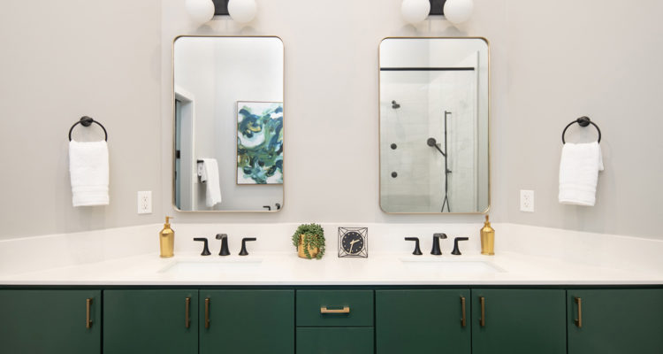
While this bathroom has myriad appointments to inspire and delight, one can’t help but notice one of the most daring aspects of the space: the deep emerald tone of the cabinetry that truly gives grand appeal to the room.
“This is possibly my favorite thing,” beamed Laura Suhr, owner of Suhr Interior Design who worked with the homeowners to turn this dated master bathroom into a head-turning masterpiece. “The bathroom was screaming for some color with all of the black and white. My client was hesitant but they decided to be brave and go for it. I feel like it takes the whole design to the next level. It’s a definite ‘wow’ factor!”
Aside from bringing the bathroom up-to-date and away from its former look that was influenced with very basic original builder finishes, the homeowner wanted a large shower with body sprays, a soaker tub, and a more modern look throughout the space.
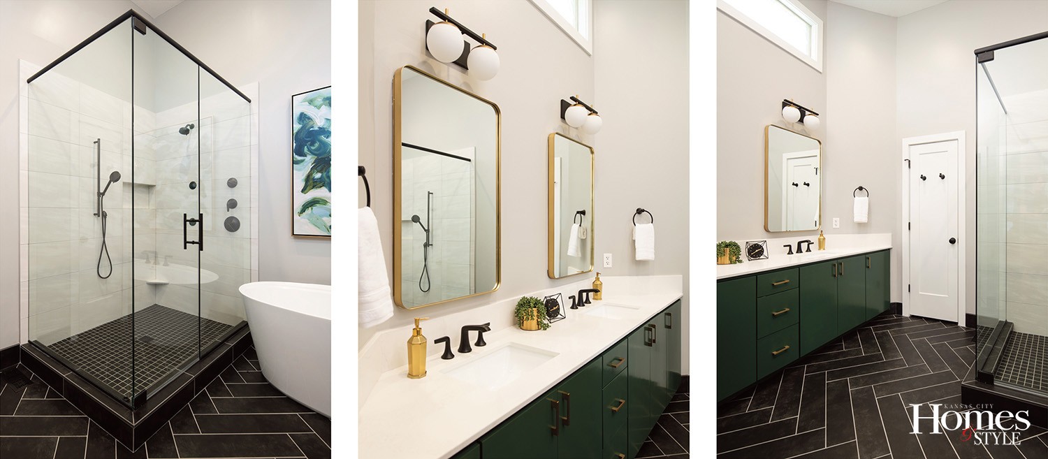
“The original design was a good size bathroom, but with a smaller shower and a dated angled tub with beige tile and southwest accents, none of which the client liked,” expressed Suhr, who ended up swapping out the oversized corner tub with a new spacious shower and installed a soaker tub where the small shower originally stood. Suhr incorporated long plank tile in a soft black color to create a large scale herringbone pattern on the floor.
“The herringbone is a more classic pattern but in a larger scale black tile, it feels more modern,” noted Suhr. “Since the floor was a clear focal point, I kept the shower very sleek and clean using large polished 12×24 tile with a subtle gray/white marbled look on the walls. To make it appear even more streamlined, we straight-laid the tile. The matte plumbing fixtures pull the whole look together.”
The windows above the vanity and the vanity itself are original. Because the layout worked and the cabinet boxes were in good shape, Suhr chose to maintain the frames and had new doors and drawers built, painted them, and ultimately accented them with new matte gold hardware. A quartz countertop adorns the vanity.
The painting was a “happy find,” according to Suhr, who happened upon it when another designer in her studio ordered it. Suhr found its green and gold colors, along with its perfect size, would make a great showcase piece hanging above the tub.
In reality, the green and gold accents were essential to softening the high contrast and boldness delivered by the black and white color scheme. The accompanying art, color and bits of gold add a subtle layer of softness to the bold flooring and matte black fixtures.
Resources
- Designer: Suhr Interior Design
- Contractor: ReDesign KC
- Countertops: Braco Stone
- Tile Installer: Integrity Tile and Remodeling
- Vanity Light: Rensen House of Lights
- Pulls: Locks & Pulls
- Artwork: “Labyrinth” by D’Alessandro Léon


