
Sherwin-Williams’ color gurus announce “Color shapes the emotional content of just about everything.”
Story by Gloria Gale
Color is the personalization of us expressing our moods, joys and heartfelt intimacy. Surrounding ourselves with color defines and aligns us, ourselves and our world.
Collectively, the elements in this colorful stew yield delectable palettes; something industries across the board rely on to ultimately deliver goods that sell.
As we grasp the immediacy of how we live and confront the growing need to be more inclusive and sustainable, Sherwin-Williams is helping people choose colors that connect us to our homes, magnify our individuality while embracing community.
Ashlynn Bourqe, Designer Marketing Manager with Sherwin-Williams, addresses the shift in ideologies that are impacting everything from climate change: and education to mental health and technology. “Color, is one of the most tangible and dynamic ways we can reach out to make a change in our lives.”
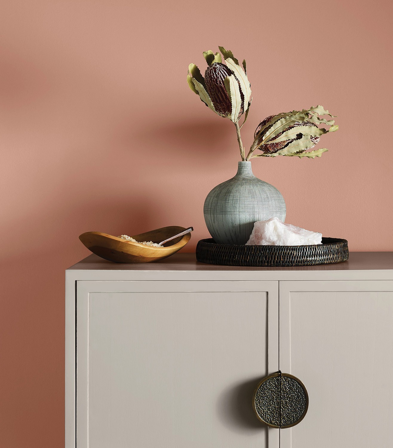
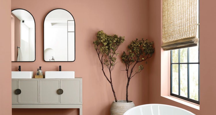
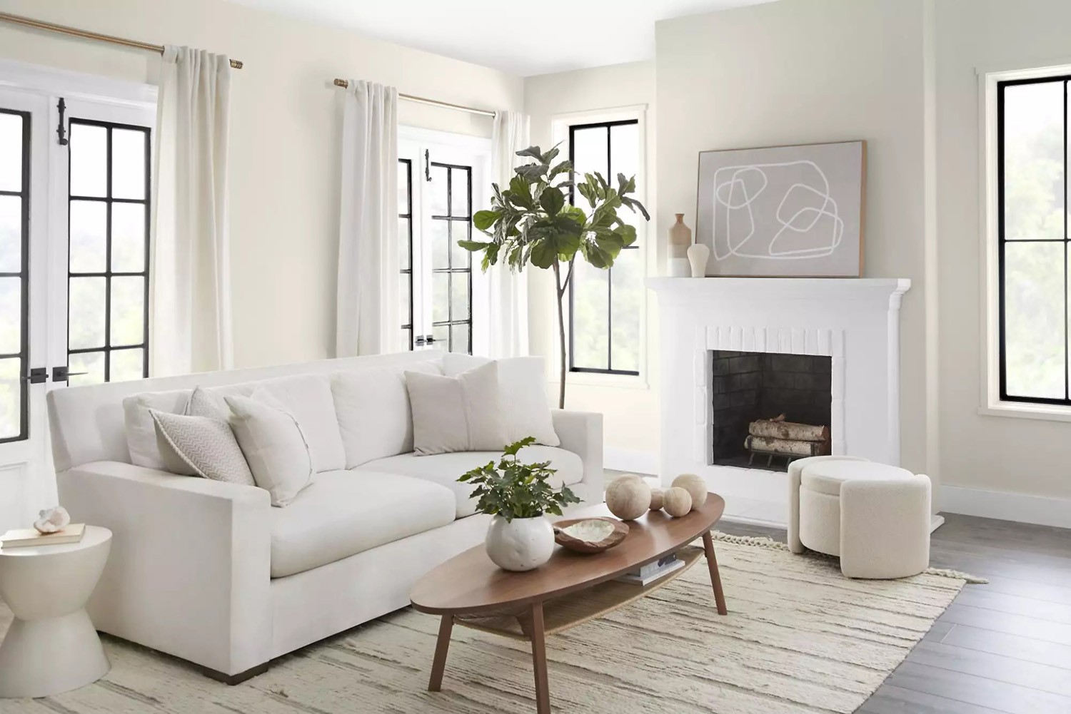
Redend Point (SW 9081)
The color marketers: Alchemists of Inspiration
Color is so vital in our lives, imagine a world without it. A gloomy gray impales emotion. But vibrant hues such as lemon yellow or tropical orange lifts and exhilarates.
Sherwin-Williams has announced TERRA, a collection of four curated palettes, as the color trends for the upcoming year. Redend Point (SW 9081), a soft-soulful neutral, leads as the 2023 Color of the Year.
According to a Sherwin-Williams statement, “These palettes consist of 40 color trends inspired by the interaction between people and their space.”
Sue Wadden, director of color marketing at Sherwin-Williams, along with a Global team of industry professionals, conducts extensive research to determine the most influential trend palettes for the upcoming year.
Palettes defined by: Balance, Presence, Support and Joy
Biome is the first of four palettes. Expressing balance reaching toward integrating our ever-changing ecosystem. Biome’s hues range from Evergreen Fog to woodsy, Antler Velvet. These shades accentuate peaceful and earthy connections. Biome celebrates our world and how we interact with it.
Lore projects hues of ancient lands: often bold, or softly rendered, this palette reaches across cultures and time. You’ll find the exotic Blue Peacock, classic jewel tones, or a saturated beige found in the weaving of a Dhurrie rug among the colors in Lore.
Nexus underscores our communal well being. Looking inward, we dream of a quieter, community – a connected world. Serenity is the by-product of Nexus giving us ‘maker’ spaces rendering natural clay, sun baked sands and, soulful whites. All soothing hues; all to cocoon within your space.
Finally, Origin explores our inner emotions and outer joys. It’s a palette filled with exciting color. Fabulous Grape, Chartreuse, and lively Peppery embolden this palette. It’s both energizing and free-spirited – an affirming presence.
Sherwin-Williams seeks an antidote for these turbulent times with color that promotes community and connection.
Open a can of paint – it’s affordable, reliable and most of all… transformative.
![]()
2023 Colors and Palettes of the Year
2023 brings about comfort and relaxation in the trending paint shades. Indulge in some self-expression with this year’s hues.
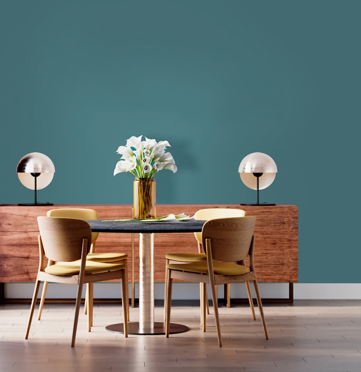
Vining Ivy by PPG Paints
Incorporating nature continues into 2023 as PPG introduces this “bluish-greenish-something-in-betweenish” color, serving up versatile vibes, and making it an on-trend addition to any room. Vining Ivy’s enchanting deep aqua represents contemporary and traditional styles, perfectly marrying a touch of the past and a taste of the future.

Raspberry Blush by Benjamin Moore
A vivacious shade of coral tinged with pink, the electric hue of Raspberry Blush 2008-30 is the definition of charismatic color. “People are ready to bring back color into the home, taking a step outside their color comfort zones” ~ Andrea Magno, color marketing and development director.

Viva Magenta by Pantone
A bold pinkish red, Viva Magenta 18-1750, Pantone refers to it as “an unconventional shade for an unconventional time. Vibrating with vim and vigor, this shade is rooted in nature descending from the red family demonstrating a new signal of strength.” For those loving bold, this is your color.
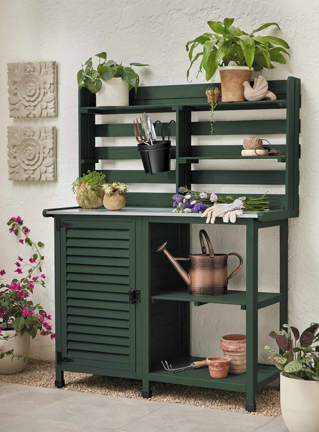
Spanish Moss by Krylon
A subdued hue exuding sophisticated comfort, Spanish Moss on a geometric, decorative divider turns an ordinary outdoor space into a serene, yet casual retreat. “This midnight green has a strong connection with the richness of nature, dense forests and mossy terrains. Rooted in the renewing power of green, it can balance with warm and cool accents” ~ Ashley Banbury, Senior Color Designer.
Blank Canvas by Behr
Inspired by the growing wellness movement, Blank Canvas DC-003’s off-white with undertones of gray and brown is designed to evoke feelings of welcome and renewal. This year, Behr was looking for a color that reflected a feeling of well-being and relaxation, shared Erika Woelfel, vp of color and creative services.