With a deliberate use of color, texture, and clean lines, this Leawood home defines what it means to be contemporary, modern, and sophisticated.
Story by Ann Butenas | Photography by Paul Bonnichsen
There are homes that have style. There are homes that have personality. And then there are homes that have style, personality, and the unwavering confidence to successfully pull it all off. This Leawood residence manages to pull it off…and then some. All it took was a homeowner who knew precisely what he wanted and a designer who paid keen attention to that specific aesthetic.
Dani James, owner of Crossroads Interiors, was that designer who artfully collaborated with the homeowner on the interior composition of this stunning residence. Having worked with the owner in the past, she was familiar with his preferred style and design voice. As such, James was already on full throttle when it came to executing the desired elements and surrounding appointments.
The interesting thing about this home, however, is that one could essentially take a photo of any of the spaces, frame that photo, hang it on the wall, and call it a work of art. In a sense this home has broken its mold. It displays clean and simple lines with a strong nod towards bold and expressive colors. Further, it places an emphasis on individuality while at the same time bringing together each of the spaces to fully define the message this home intends to convey about its character and identity.
Located in Leawood, Kansas within the Hallbrook Villas, this two-story home boasts roughly 3,500 square feet of living space. Described as modern and eclectic by James, it has four bedrooms, each with its own bathroom. There is also a dramatic kitchen, a show-stopping staircase, and a master suite that can rival most any high-end resort.
The sleek surfaces, cutting-edge art, and crisp furnishings set the overall tone in this home. Equally inviting and head-turning, the stunning design components integrated into all of the spaces work together to create rooms that invoke drama, style, personality, and, yes, livability. Outfitted with all new furniture, the home remains intentionally uncluttered and minimally populated in this regard. In a sense, the “less is more” philosophy takes the lead here. Neutral shades are the cornerstone of many of the spaces within this home, as well, offset by the occasional burst of bold and vibrant color.
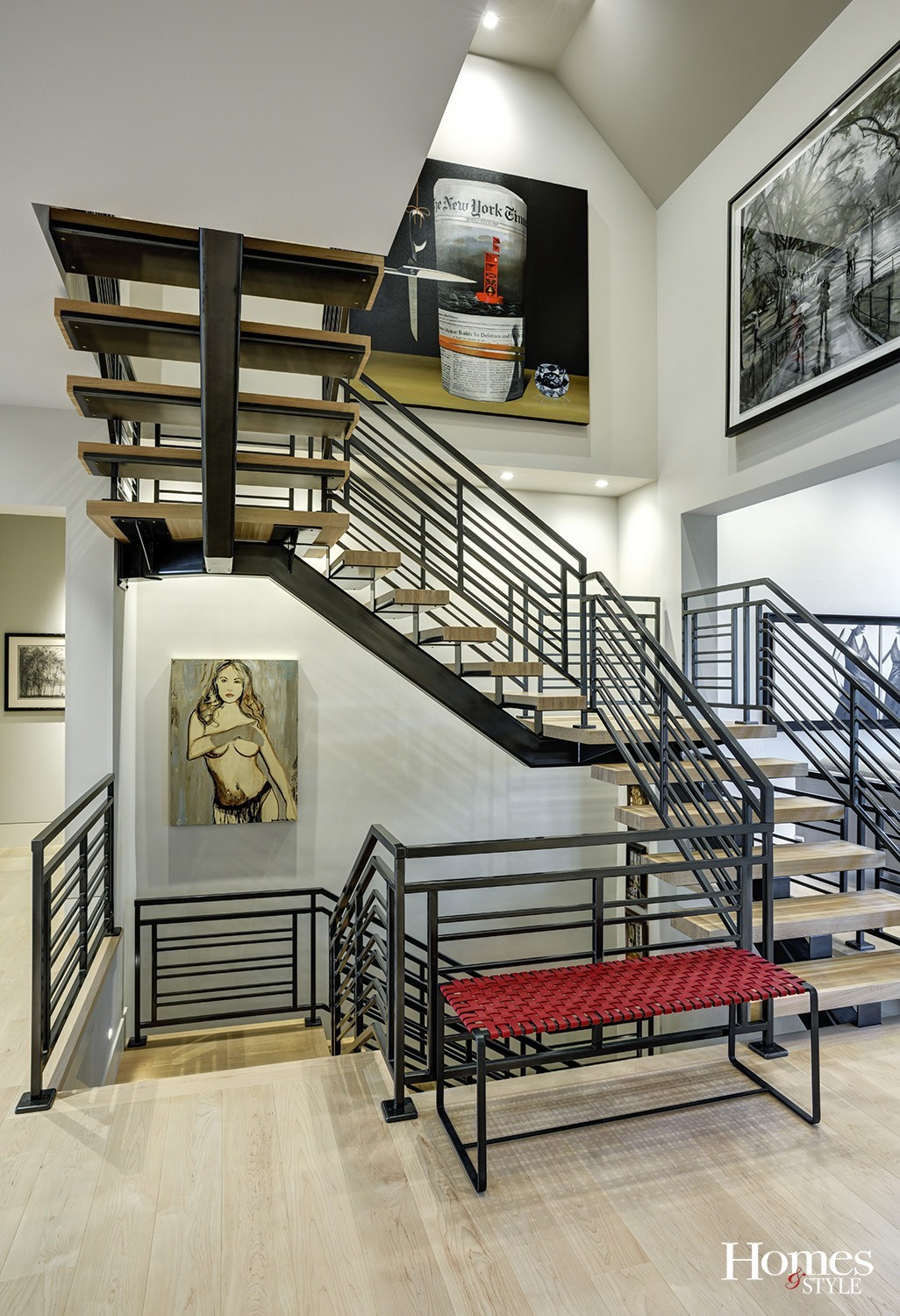
The staircase stands as a key player in this home, creating structure for the space and also acting as a primary focal point with its open design and fabricated iron railings.
“The staircase was my idea,” noted James. “I love the context of supporting it underneath and the resulting geometry.”
The artwork hanging in the epicenter of the staircase was created by various artists, giving the area a gallery effect of sorts, along with the red bench that provides that deliberate pop of color.
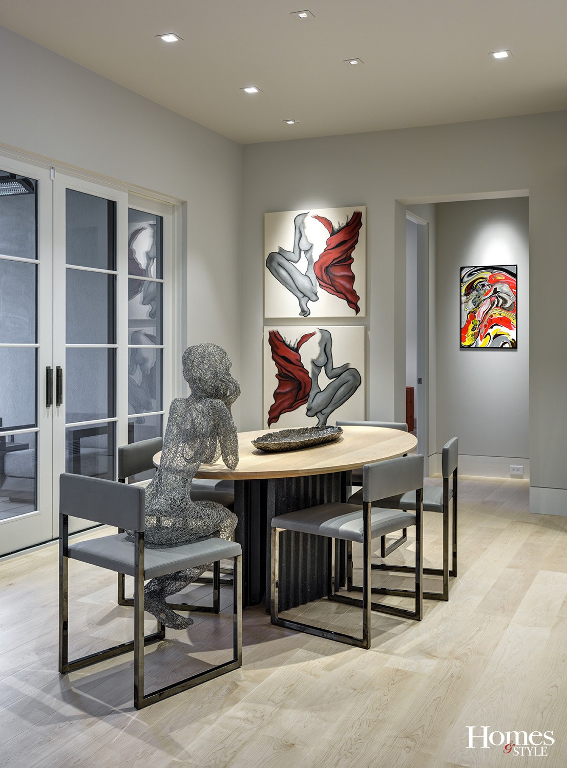
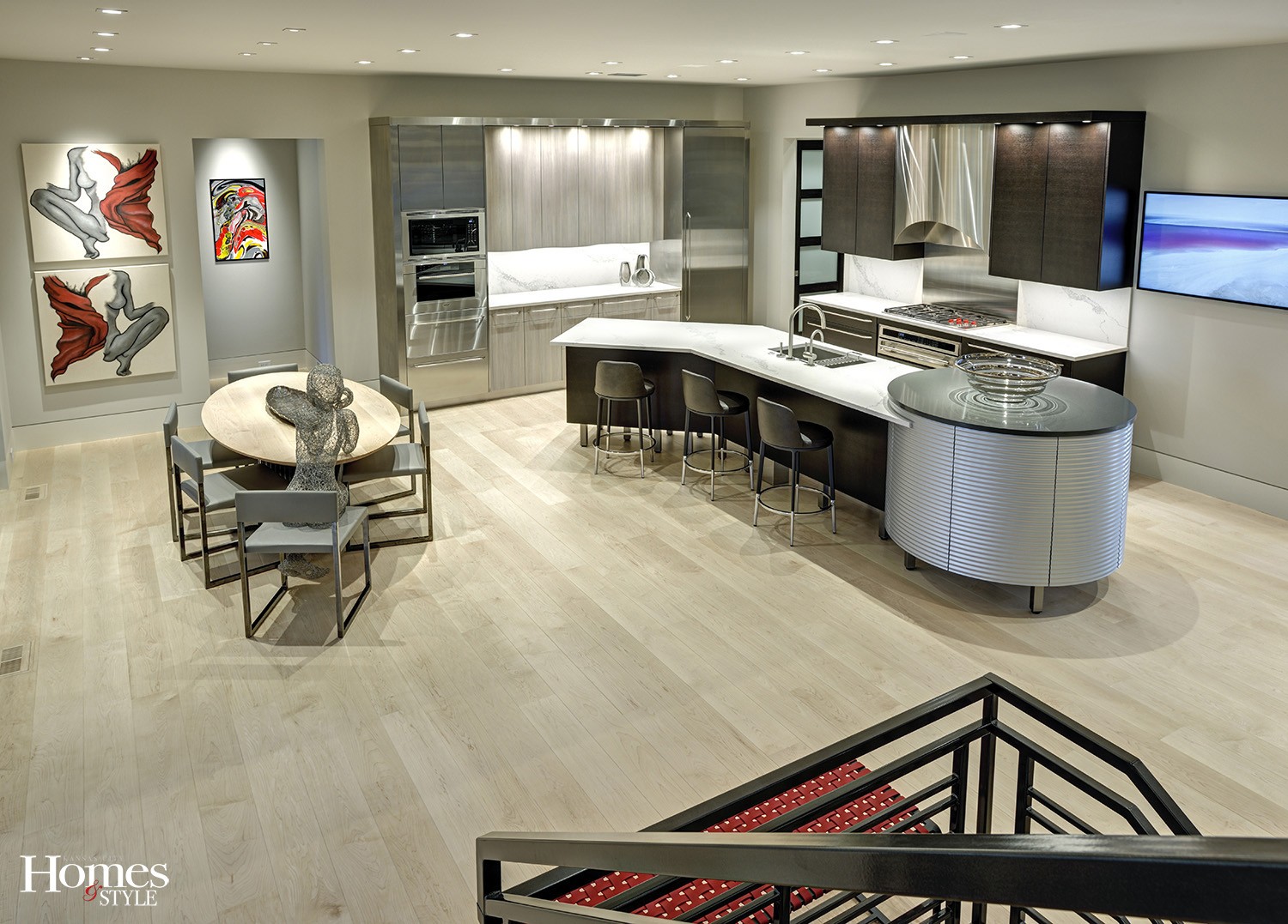
Transitioning to the kitchen, the wire sculpture at the table defines the mood for this unique space. The base of the table and carved stone were created by artist Matt Castilleja.
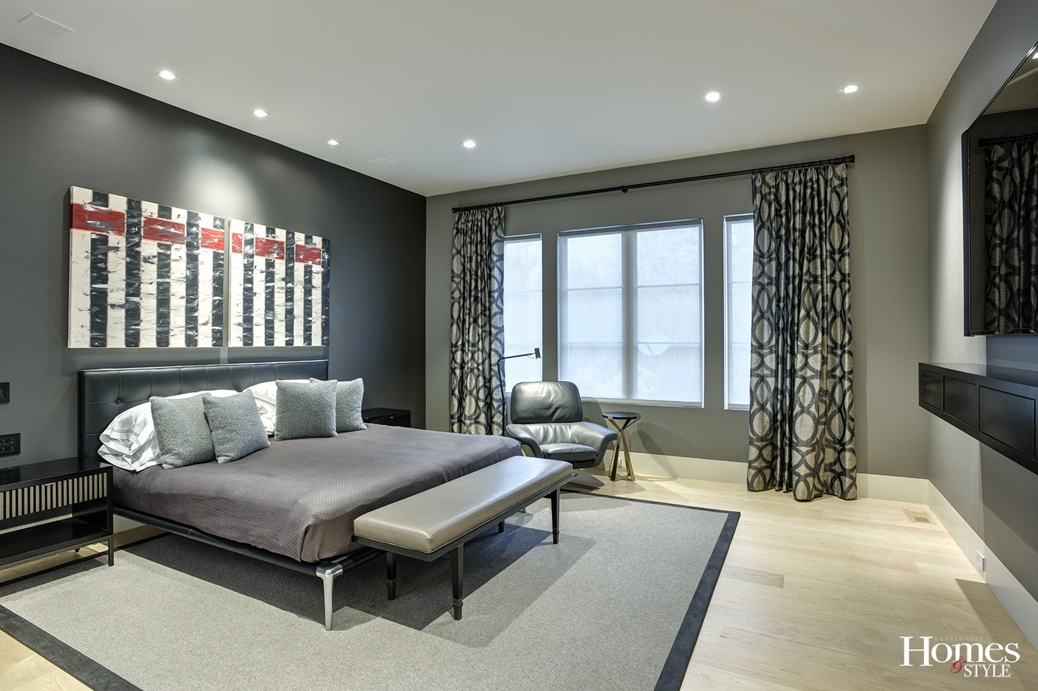
“The owner obtained the sculpture along with the two pieces of art hanging on the kitchen wall and the one that hangs over his bed from artist Sasha Kahn,” said James.
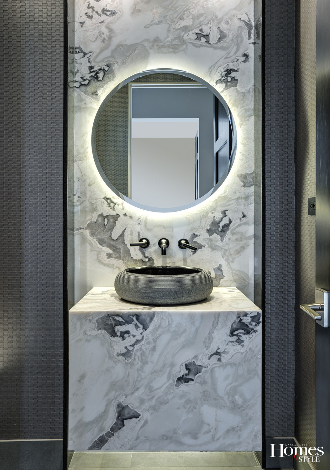
The nearby powder bath was designed and created by Genevieve Hamel of Kitchens by Kleweno. The sleek marble countertop and vessel bowl sink adhere to the strong aesthetics of the home.
One of the bedrooms is used as a study and is unsurprisingly referred to as the orange room. Perhaps this space is proclaiming, “Yes, I am a bit dramatic,” but it works within the architectural framework and design requirements of the home. The full bathroom contiguous to this room enjoys horizontal tile in a brick pattern, along with some dark brown doors and cabinetry to balance the area.
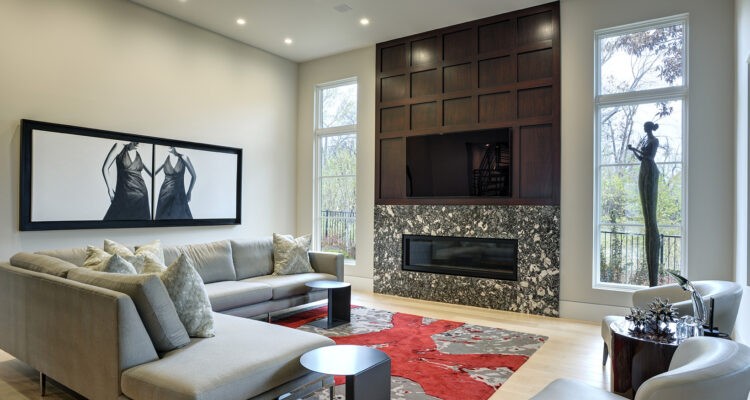
In the great room, one of the key elements is the paneling framing the fireplace, which was designed to fit the size of the television. The linear gas fireplace is surrounded by a solid Cambria surface, adding a layer of warmth to the space, offset by the custom-designed rug by Brady Legler. The painting of the two women on the wall, procured by the homeowner, echoes the sentiments of the Tom Corbin bronze statue of the lady holding the apple across the room by the window.
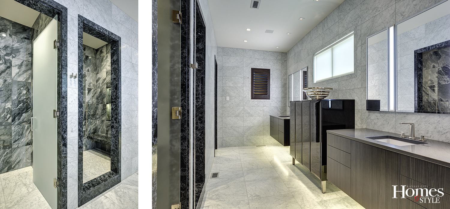
The master bedroom is paradise redefined. Following the neutral color palette of the home with layers of black, white, and grey, it is dramatically enhanced with a splash of red. In the master bathroom stands a linen cabinet between the two vanities, strip lighting in the mirrors, and a commitment to clean and simple lines and neutral colors throughout the space. An added bonus? The flooring is heated – even in the shower!
“We played the lighter colors off the darker ones in this bathroom,” emphasized James, who incorporated black marble elements alongside white marble elements. “We framed the shower in black. Overall, this is a very geometric space.”
James had a spectacular time working on this project but appreciates the team approach involved to bring it all to fruition.
“I enjoyed the meeting of the minds and the ability to create the entire environment with the builder, the architect, Kitchens by Kleweno, and then finish the project with a selection of furniture and accessories,” expressed James, who was given full creative license but appreciated the collaborative efforts of everyone involved. “We worked together from A to Z. The owner is so easy to work with, and because we have worked together in the past, I understood him so well.”
Resources
- Builder: RM Standard
- Architect: NSPJ Architects
- Interior Design: Crossroads Interiors
- Staircase Railings: Metal One
- Tile: Mike Brown Contractors, Inc.
- Kitchen, Powder Bathroom & Master Bathroom Designer: Kitchens by Kleweno

