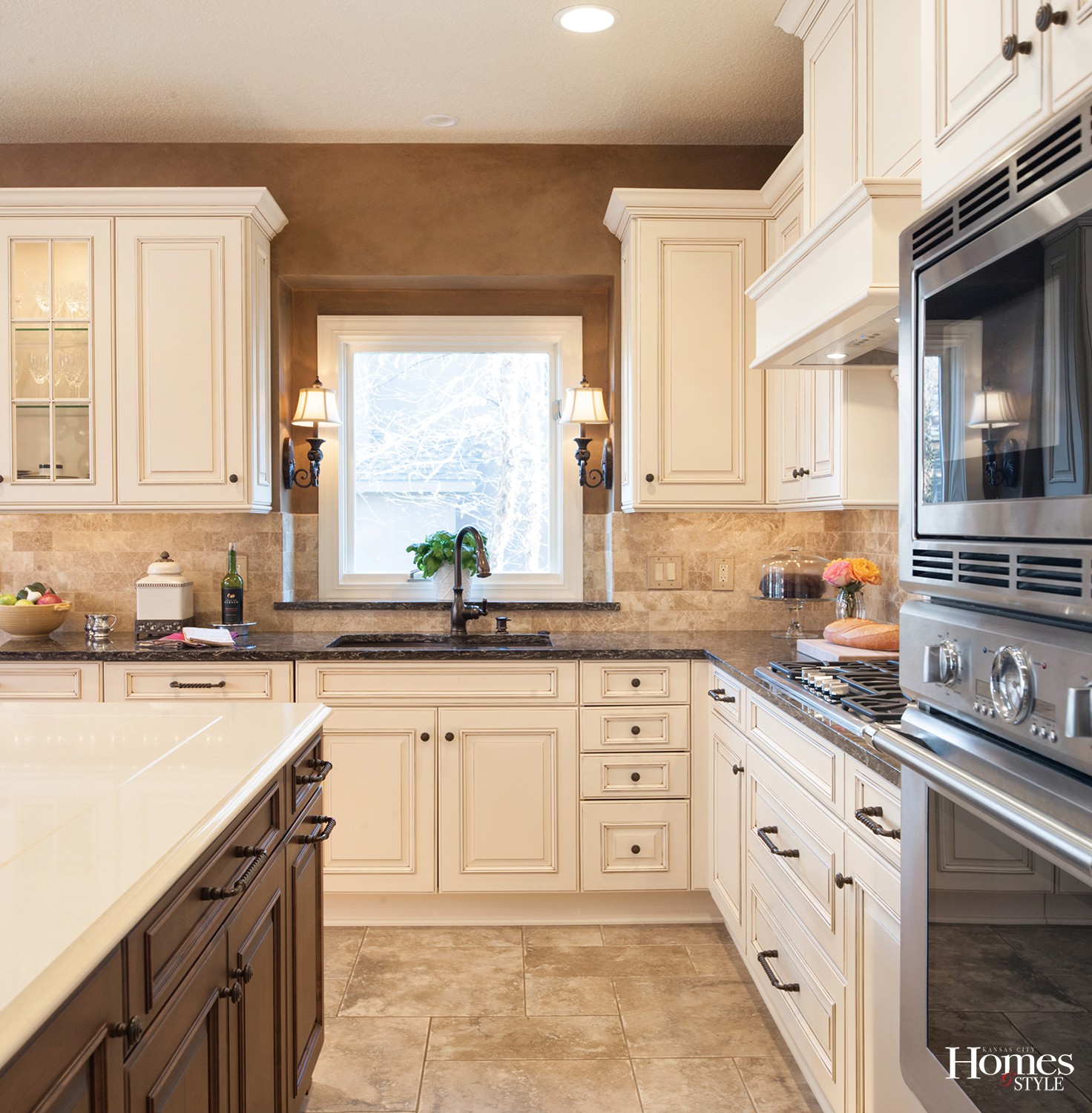
Incorporating furniture-like styling and design partnered with French country influences give this Overland Park kitchen its own sense of purpose.
Story by Ann Butenas | Photos by Matt Kocourek
When you first walk into this Overland Park kitchen, you may sense a unique presentation in that so much of its style lends itself more to other parts of the home than simply just a kitchen. From the integrity of the cabinetry and the confidence of the center island, the furniture-like influences that abound in this space create a decidedly warm and inviting ambiance. This is a place where the owners truly feel right at home.
As part of a multi-part remodeling project in the home, this kitchen enjoys a stunning new look, factoring in not only some of the French country influences that are found in other parts of the home, but also catering to the family’s need for the use of materials that would not agitate their allergies.
“It was very important to the homeowners to use materials that were allergen-free, as many of the family members suffer from allergies,” noted Pam Vernon, designer with Classic Kitchens Design Studio. “This included using certain quartz materials in the countertops, for example.”
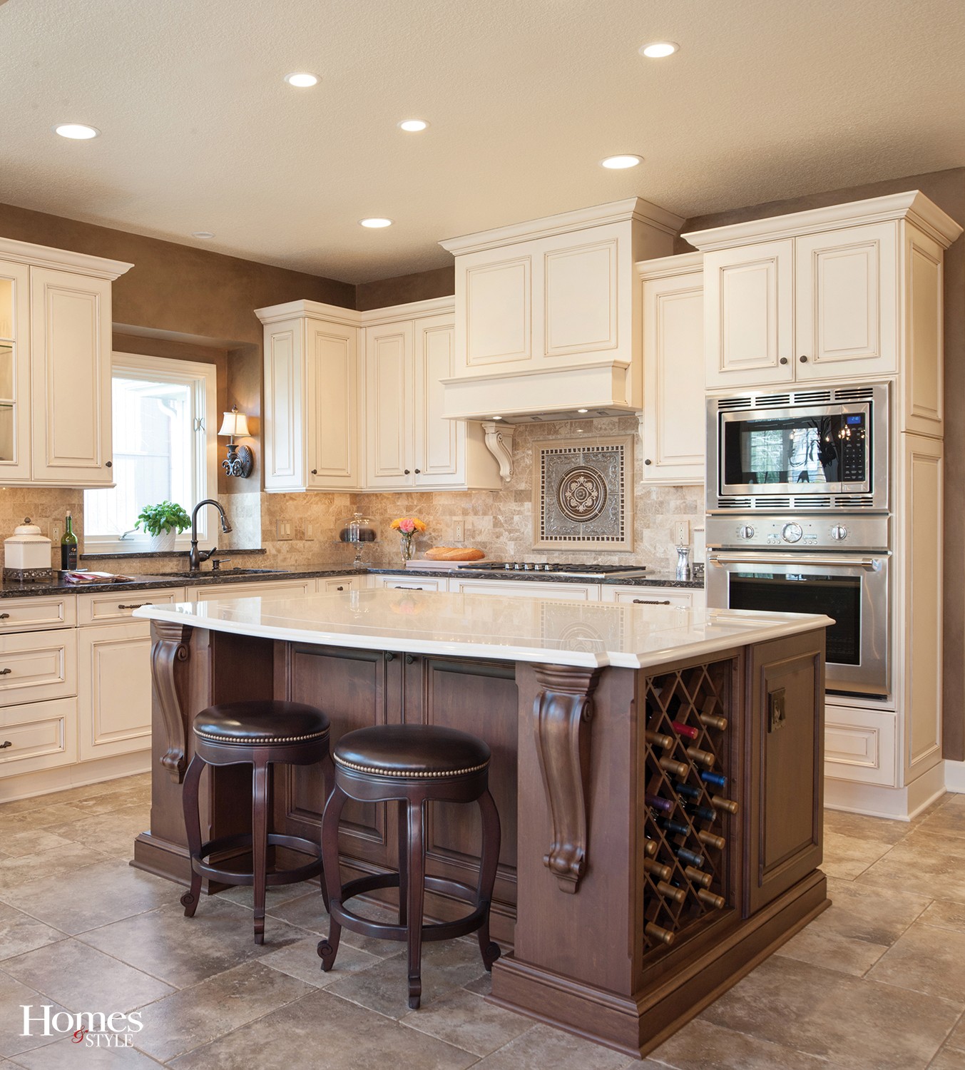
Every aspect of this kitchen begs you to want to know more, but it’s no secret that the center island is the main star of the show.
“The original island was smaller and sat on the diagonal,” said Vernon, adding that it really did not offer much functionality to the overall footprint of the original floor plan. “We doubled its size and squared it up with the perimeter cabinetry, also adding seating space to it.”
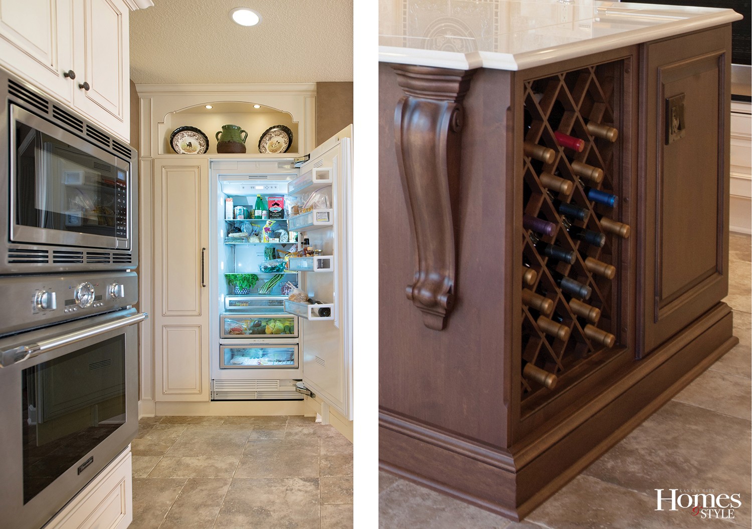
To avail the kitchen to more space, a cabinetry-paneled refrigerator, also a part of that furniture-like vibe, now stands where upper and lower cabinets used to take up space.
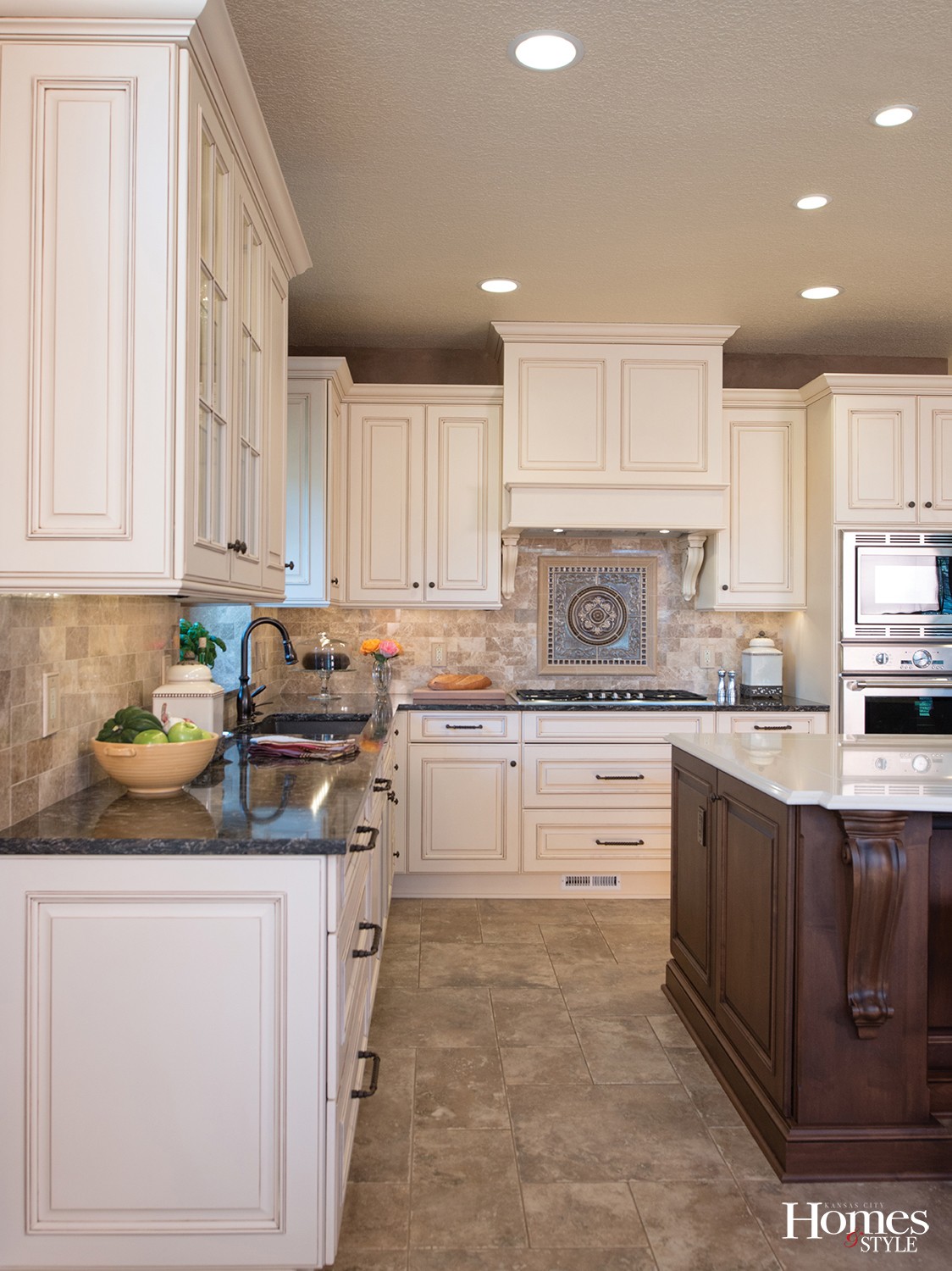
“That opened up an area to incorporate a cabinetry hood above the range,” stated Vernon.
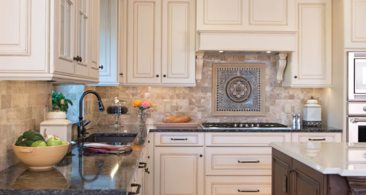
Unique to this kitchen remodel is the use of contrasting colors. The perimeter cabinets are white, offset by darker countertops, while the island enjoys a dark stain, offset by a lighter countertop. The antique white finish with an espresso glaze is a great complement to the darker stain of the island. To invoke the furniture-like appeal to the island, the dark brown stain was partnered with a black gaze and a bit of distressing.
The countertop on the island was a project in and of itself. Requiring a top larger than a single slab of material could accommodate, Vernon provided a decorative seam around it with a groove where the seam comes together. This kept it from having a seam run down the middle and also provides a nice decorative touch. The Cambria Quartz material of the countertop replicates the look of limestone. The darker perimeter countertops are also made of a Cambria Quartz material.
Other finishing touches include the travertine backsplash tile in a subway pattern and the Montrachet plaque with mosaic trim and framing around, showcasing like a fine work of art resting just above the range; lamp-like wall sconces on either side of the oversized sink; all new appliances; a decorative shelf above the refrigerator; wine rack and trash pull-out in the island; and some glass-front cabinetry with glass shelves and interior lighting for added effect.
“This kitchen represents quite a change for the homeowners from the original one,” noted Vernon. “This has been transformed into a very custom room that they really enjoy for gatherings with family or for entertaining larger groups of friends.”
Resources
Project Designer: Classic Kitchens Design Studio
Cabinets: Brookhaven (Winterhaven Raised door style)
Appliances: Thermador
Plumbing: Ferguson (Moen faucet and Blanco sink)
Hardware: Top Knobs
Countertops: Cambria from Trendstone
Backsplash: Dal-Tile and International Materials of Design

