There’s no place like home for a couple who left the city behind and returned to the wife’s hometown of Lawrence to start a family in a spectacular house infused with Mid-Century Modern style.
Story by Jeanne de Lathouder | Photography by Matthew Anderson
After experiencing life in the city, a young couple decided to come home to build their own nest. They were ready to start a family, and New York’s cramped living conditions prompted their decision. Upon returning to the Midwest, they were drawn to a secluded property in Lawrence for its spacious proportions and decided this was the place.
“Once inside, we instantly recognized we could transform this house into our home,” says the homeowner. “Our number-one desire was to make the kitchen a focal point — we always loved a European-style kitchen, and the space was perfect for it. This is a modern house, so even though my husband and I have a more traditional style, we stayed true to the home’s original architecture and went with a Mid-Century Modern aesthetic.”
Before starting their renovation journey, the couple enlisted award-winning international interior architect and designer Carol Way Cisco, Allied ASID, LEED AP, owner of Signature Design + Studio. Relocated from Aspen, Colorado, Carol has more than 30 years of experience in residential, commercial, and hospitality design with offices in both Snowmass, Colorado, and Lawrence, Kansas.
“The owners pointed to a design they liked on the SDS website — a clean look with pastels,” says Carol. “That set the direction, and the couple’s appreciation for quality design and furnishings, noticing details, and recognizing that the home had an ‘almost Mid-Century style’ struck a chord. I was personally thrilled because it’s one of my favorite design periods.”
The final element that sealed the relationship was when they all met at an Aspen home that Carol had recently completed to give the homeowners an idea of the quality of design and construction that would put their home over the top. The couple’s appreciation of that project brought them even closer together to embark on their wonderful journey of creating a new chapter in their lives.
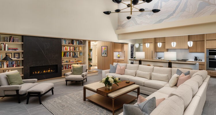
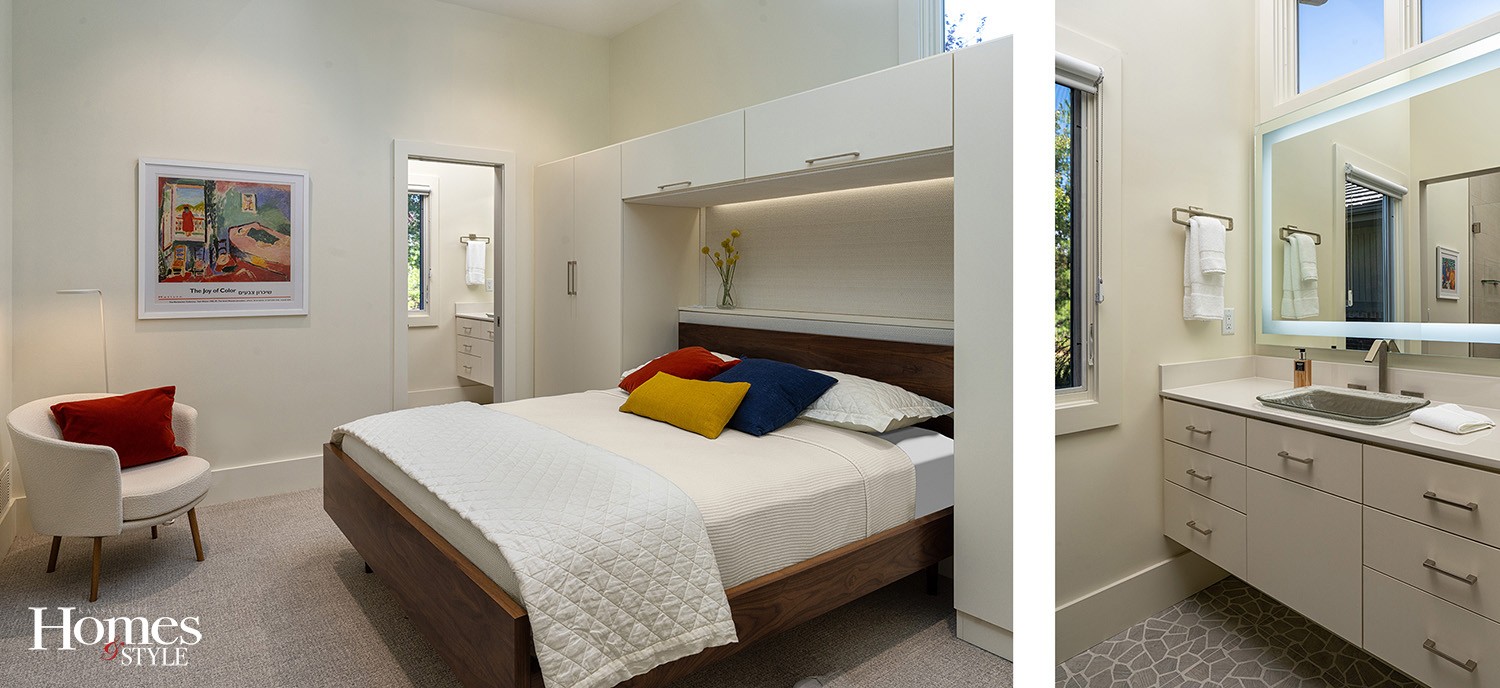
As you approach the home, the exterior architectural style emits a clean, minimalistic Mid-Century aesthetic with a strong presence of angular lines. The interior boasts wide-open spaces with a vaulted ceiling and floor-to-ceiling windows that invite the outside in. “It’s in the interiors where the sense of Mid-Century architecture starts to take shape,” notes Carol. “Working with a soft pastel palette of creams, blues, pinks, and greys, the spaces feel like an artist’s canvas with splashes of color. Many of the furnishings are classic and authentic 1950-1956 Mid-Century pieces by Florence Knoll, Milo Baughman, and Paul McCobb’s iconic Planners Group collection.”
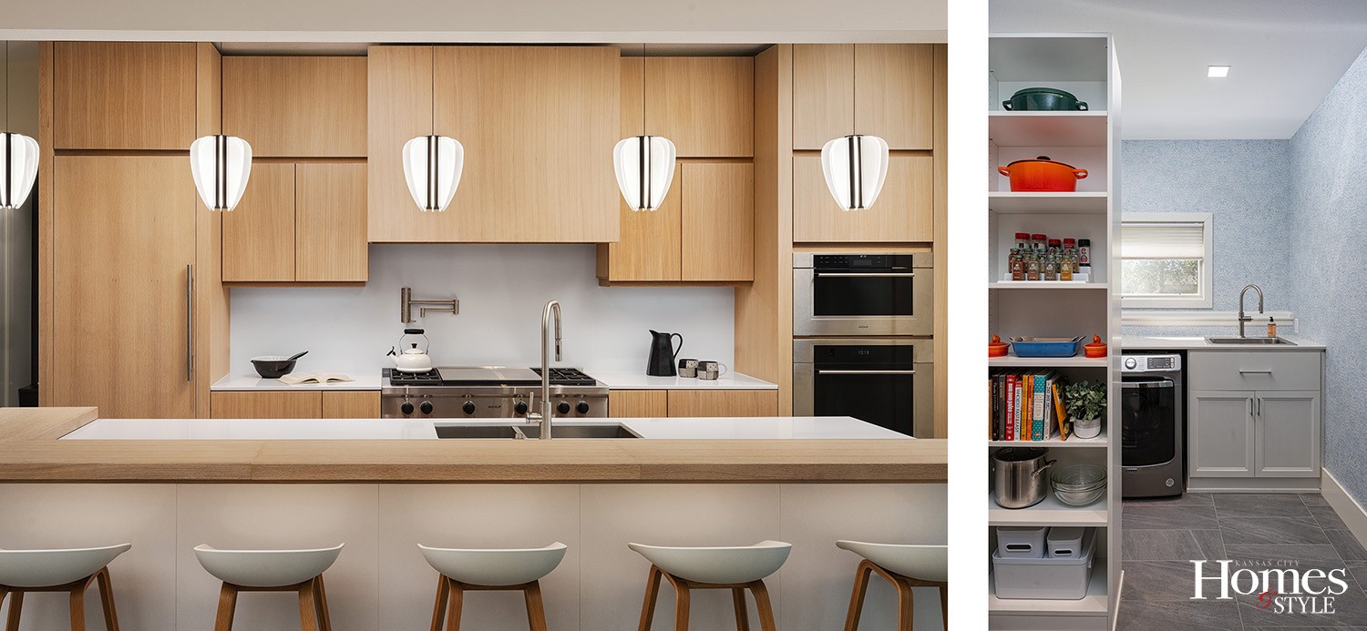
The homeowners wanted to take advantage of the dwelling’s creative potential. A large kitchen was a must as both homeowners cook — often at the same time. A deep and long island with plenty of prep space on each end with counter seating for five was essential. To complement their lifestyle, they wanted their guests to be part of the cooking process. Thus, an open plan connecting the kitchen and great room offered the ideal solution.
“The existing kitchen was wholly inadequate and outdated,” says Carol. “And interior architectural anomalies created a disjointed look and feel. And therein lied the biggest challenge, but also the solution to the success of the design and its impact.”
Opening up the kitchen involved removing a wall section and installing a longer steel beam to expand the opening of the existing area. Adding a 12-foot island centered with the TV in the adjacent great room created plenty of space for cooking and entertaining, plus optimal functionality. “Rift-cut white oak placed vertically made the kitchen feel open and emphasized the nine-foot ceiling height, and a column-style refrigerator, freezer, and oven built-ins contributed to the sense of volume and height in the space.”
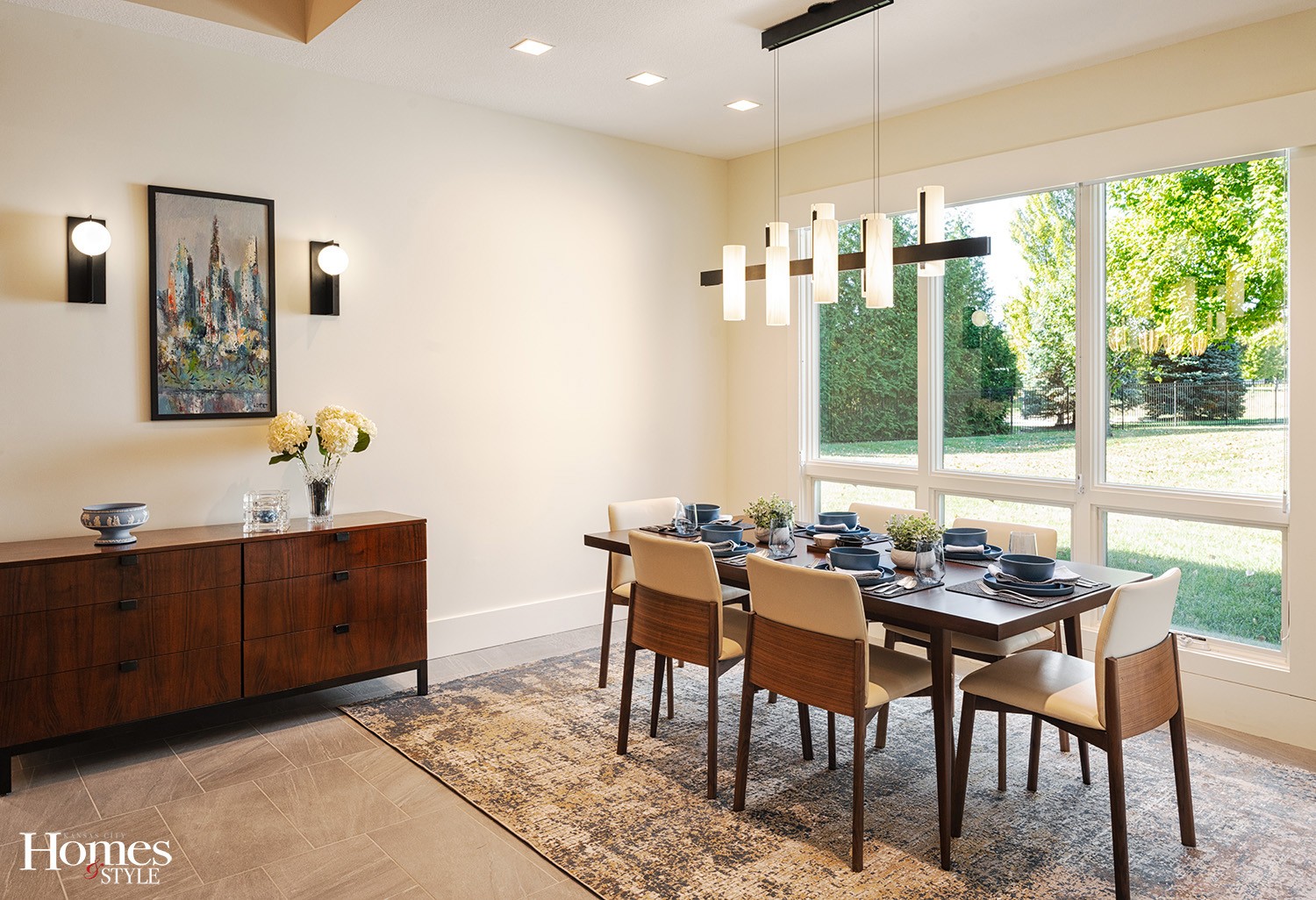
In the dining room, it was important to the homeowners to have a Mid-Century Modern motif with an emphasis on authentic furnishings and plenty of room to expand seating for larger groups. Carol started by replacing an offset window with a new one that was centered to create a feeling of symmetry. At the time of the remodel, supply-chain issues were causing such unreasonable delays that Carol encouraged the couple to look for readily available antiques and collectibles.
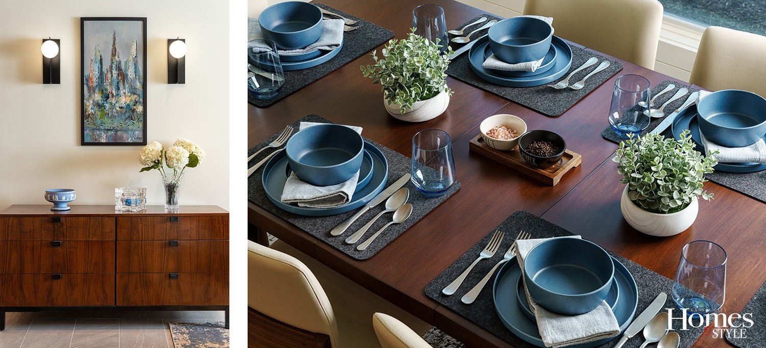
“Much to the owners’ delight, we were able to locate some authentic Mid-Century treasures,” says Carol. “For example, the dining table is a ‘real deal’ 1956 Paul McCobb expanding walnut piece in mint condition. We acquired a circa 1954 Milo Baughman walnut buffet in perfect condition to complement the table. Then, we embellished the design with some in-stock walnut dining chairs from Design Within Reach.”
New lighting includes a pair of wall sconces flanking the buffet and a “piano keys” chandelier from Spain over the dining table. In addition, a fully integrated LED lighting system allows the owners to select any mood or ambiance they wish for the entire home.
“Carol was the captain of the ship,” says the homeowner. “She always ensured we did not stray from the design plan. There were times when we tried to bring in some traditional style, but while Carol always listened to our opinion, she always had something that was a better fit for the project.”
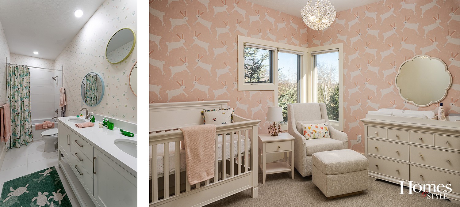
An adorable nursery and a kid’s bathroom were projects of joy and happiness initiated by the fact that the homeowners were expecting their first child. Carol admits to having the most fun with the bathroom. She opened up the space immensely and used simple white large-format tiles for the walls and floors to make the room feel brighter and bigger. She decorated with fabrics, wallpapers, and area rugs illustrated by Yuval Zoomer, an award-winning British author of children’s books. “Toss in a few ducks and frogs, and we have a whole lot of fun and joy,” adds the designer.
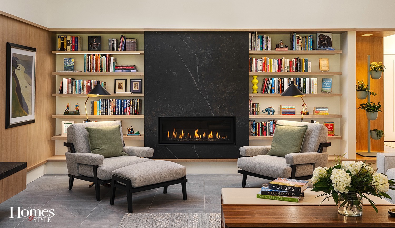
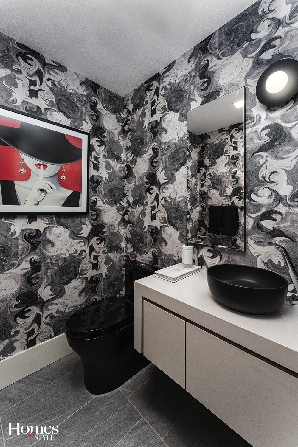
Bold touches, such as the living room’s elegant black stone fireplace surround and painted wall mural, plus a glamorous black and white powder room, infuse just the right amount of drama into this Mid-Century Modern design. “The husband selected the powder room wallpaper, and the white floating vanity is clad in a thin Dekton material,” notes Carol. A chic Kelly Wearstler sconce next to the tall vertical mirror punctuates the room’s asymmetrical layout.
“The thing we enjoy most about our home is coming home to it,” says the owner. “Walking in and feeling and seeing the open space is so inviting. The living room and kitchen are where we spend time with family and friends. We love to cook, so having the family over and sitting around the dining table is always a memorable occasion — the exact reason we moved back to Kansas.”
Resources
- Design Firm: signature design + studio
- Interior Designer: Carol Way Cisco, Principal | Allied ASID | LEED AP
- Contractor: Berger Construction
- Architect: Delvon Nemechek, Partner | AIA
- Millwork/Cabinetry Fabrication: William Ohs, Classic Kitchens Design Studio
- Mural: Fromental UK – Cathy’s Wallpapering
- Fabrication & Installation: Lusso Porcelain & Design
- Paint: Benjamin Moore – Superior Painting
- Powder Bath Wallpaper: Poppy Print Studio – Cathy’s Wallpapering
- Decorative Lighting: Circa & Lightology – Power Solutions
- Recessed Lighting: American Electric Topeka – Power Solutions
- Lighting Integration System: Mercer Zimmerman Lighting & Controls
- Sectional: Lexington Home Brands
- Reading Chairs: Kimberly Denman
- Coffee Table / Ottoman: Troscan
- Original Mid Century Furniture Pieces: 1st Dibs
- Bar Stools & Dining Chairs: Design Within Reach

