
Seeking an easier, more effortless style for the next chapter of their lives, a Kansas City couple preserves the 50s flair of their renovated home with a modern touch.
Story by Jeanne de Lathouder | Photography by Gary Rohman
When their house hunting journey began, Julie and Vance Kempin weren’t necessarily looking for a renovation. They were merely looking for a change. After raising a family in the same home for 26 years, they wanted to find a house more suitable for their new empty-nester lifestyle. As a seasoned real estate consultant with ReeceNichols for 22 years, Julie is well versed in viewing homes of all different kinds, in all conditions. This particular house, situated in Kansas City’s charming Mission Hills neighborhood, caught her eye because of the location and the square footage.
“It was not too big and not too small, and we knew we wanted to be closer to the city,” Julie recalls. “We had recently updated and redesigned our Leawood center-hall two-story home with the help of Howard Fischer, owner of Howard Fischer Design — who I had met on a flight to LA in 2017 and instantly developed a friendship. I knew he had helped other clients select homes to renovate to meet their changing lifestyle, so I had Howard, Meadow Lane Partners, and my husband look at the home to see if it was worth the effort,” she adds.

Howard showed the couple how they could rework the entire floorplan and helped them envision a home that had both traditional and modern elements. They decided to blend Julie’s eclectic style — mid-century modern and transitional — with other features that embodied a modern aesthetic. Their primary ambition for this renovation was to create a house that emits the same feel as a 1954 home yet with a fresh, contemporary layout.
“Our prior home did not have a floorplan that allowed us to see through the entire house — it was more separated,” Julie explains. “We wanted to redesign this house to be open, where the rooms could flow together seamlessly. My clients — myself included — always want to walk into a home and just buy it in perfect design, but in today’s market, this just doesn’t exist with a 1954 home,” she laughs. “I previously loved Ralph Lauren’s style, but I knew I wanted to go a little more modern for this home. Howard introduced me to Kelly Wearstler’s style, and coincidently I stayed at the Austin Proper Hotel that she designed. I fell in love with all the color!”
Julie used a combination of what she saw at the hotel and the 1950s original marble flooring in the entry as her starting point and color palette. She also left the existing peachy marble around the fireplace. When selecting materials and finishes, the couple chose those that conveyed a 1950s modern sensibility in neutral hues. They opted to leave the original brick on the exterior and chose Sherwin Williams Urban Bronze, Porpoise, and Iron Ore for a dark grayish look that provided a color scheme to build around.
“In compact spaces, Howard likes using darker colors, especially when they open to light-filled rooms,” explains Julie. “In this home, for instance, we did that in the entry, which really made the artwork and marble flooring pop. We also replaced all the windows in the house with a similar muntin-pane configuration. However, we did them a bit larger than standard to create strong graphic visual appeal,” she adds.
The homeowners meticulously selected all the trim, doors, and hardware to look as though they could have existed in the original 1954 structure. Every embellishment demonstrates a beautifully balanced restraint that creates a luxurious yet simple feel. Understated door and floor trims provide an unobtrusive backdrop for artwork, unique furniture pieces, the textured stone fireplace, polished marble flooring, and streamlined window treatments. The overall look works together to create a traditional 1950s home with a nod toward modern.
“Another important must-have for our home was having strategically placed TVs throughout,” says Julie. “We are an avid sports family — our son Jonathan was a goalkeeper for Sporting KC, currently playing for DC United — and having TVs around the house without them becoming main focal points was important. This is why we proposed to have the living room fireplace painted in a dark shade so the TV blends right in and doesn’t detract from the beauty of the fireplace. We also love having a TV placed in the outside patio area — our favorite spot,” she notes.
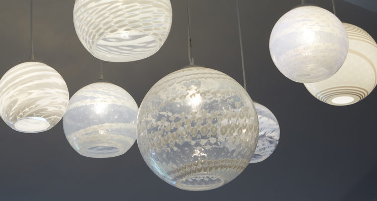
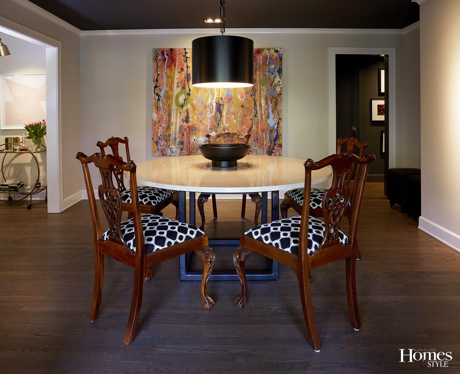
In the living room, they finished the vaulted ceiling to replicate a 1950s style. Howard and Dierk Van Keppel with Rock Cottage Glassworks teamed up to design a visually dynamic glass bulb sculpture for a showstopping accent. Howard also designed a marble dining room table on an iron base to blend with the homeowners’ traditional Henredon furniture. The space was designed to look like a formal dining area, but the table functions more like a durable kitchen table.
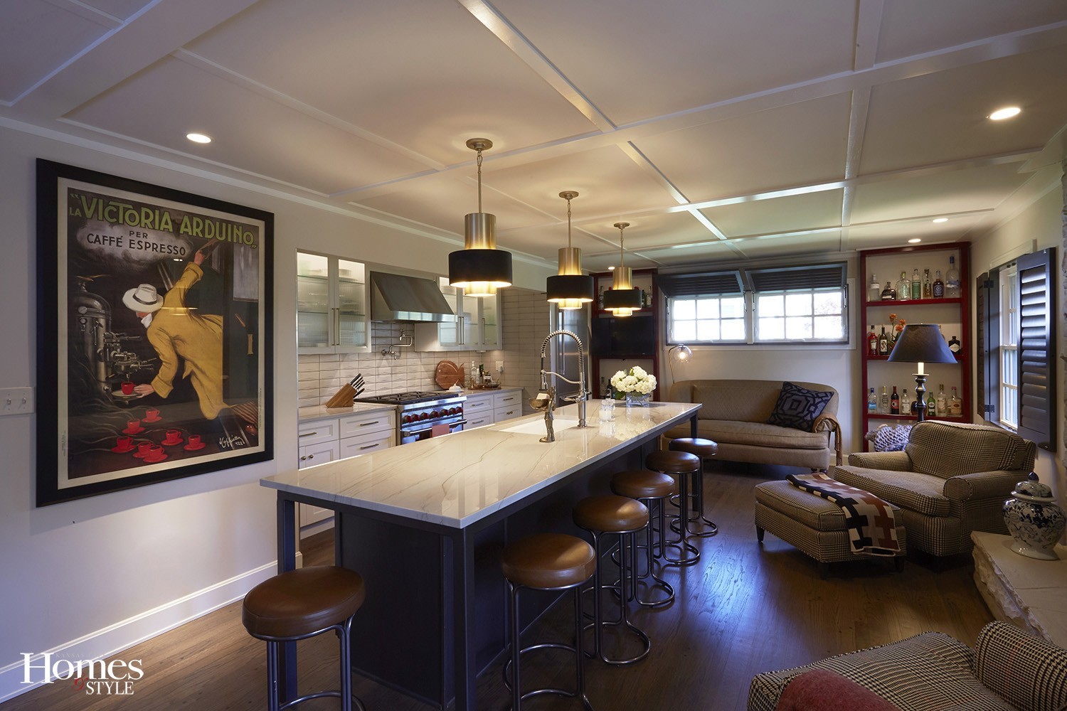
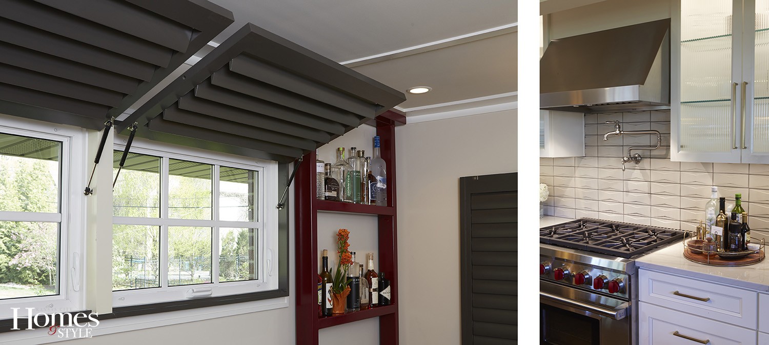
“We positioned our kitchen in the space that was formerly a separate family room,” Julie explains. “This gave us enough room to accommodate a large island, backlit glass cabinets, a sofa, and two chairs. The steel-supported island, like the dining table, doubles as a large table and lends a cleaner, more modern look that’s atypical of traditional islands. Bahama plantation-style shutters above the sofa befit the space perfectly, and the colorful bar, also made of steel, brings another stunning focal point to the kitchen,” she adds.
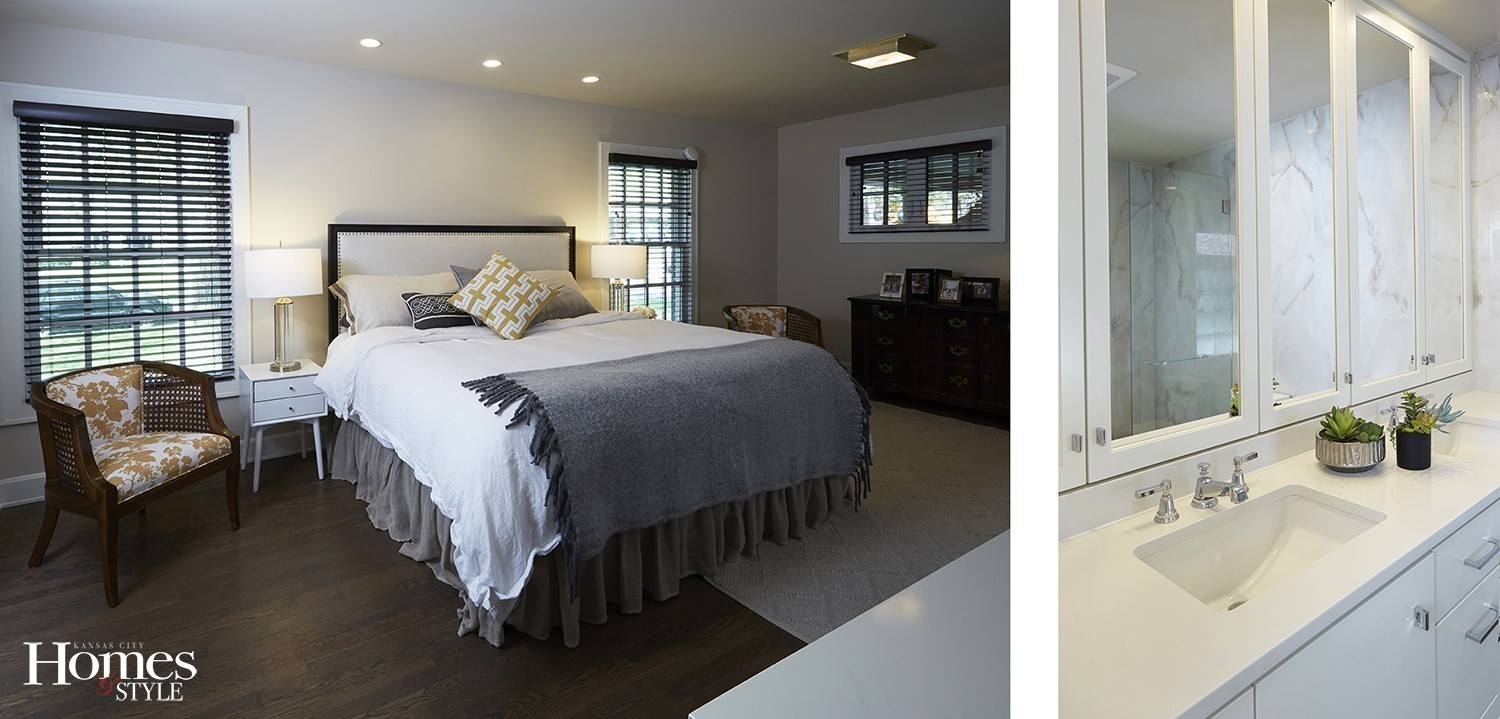
Bathed in soft neutral hues, the master bedroom is intentionally spare and designed with minimal furnishings to align with the mid-century modern aesthetic that permeates the entire home. An upholstered headboard embellished with nailhead trim and a rich layering of plush bed linens creates a serene retreat for the homeowners. A sizeable woven area rug underfoot further softens and anchors the space. The small master bathroom was particularly challenging, so the couple clad the walls with floor-to-ceiling marble-like slabs. The material’s beautiful reflective quality creates a clean, sleek look that opens the room up considerably. In addition, medicine-like cabinets were installed behind the mirrors to create more storage.
“We utilize all of our spaces now,” says Julie. “It is so effortless to entertain in our home now. The outside area is so connected to the inside spaces, and we spend a lot of our time in the warmer weather enjoying the patio,” she adds. “The best thing is, we absolutely love our location and proximity to the Plaza, Brookside, Westport, the Crossroads — and all those vibrant areas have to offer.”
Resources
- General Contractor: Meadow Lane Partners
- Interior Designer & Design Concept: Howard Fischer Design
- Appliances: Alexander and Ray TV & Appliances
- Artwork: Pink Antlers
- Custom Cabinets: Shamrock Cabinets
- Custom Dining Room Artwork: Howard Fischer Design
- Custom Iron ~ Island, Shelving and Table: Custom Cut Metals
- Custom Living Room Lights: Rock Cottage Glassworks
- Dining Chair Upholstery: Cover Up Interiors
- Dining Table Marble Top: Carthage Marble
- Furnishings: Nell Hills & West Elm
- Hardware: Locks & Pulls
- Lighting: Wilson Lighting
- Quartz Countertops: Rock Tops