Clean-lined and full of detailed design work, this ultra-sleek residence celebrates modern architecture with a view of the downtown skyline.
Story by Andrea Darr Gekas | Photography by Matt Kocourek
After living in a condo at The Ravello north of the river, David Johnston and Chad Doza came to realize a few things about the way they wanted to live. First, they wanted a more centralized midtown location; second, a single-family residence with a floor plan that wasn’t just one big open space; and third, a complete departure from their traditional style.
Inspired by Tom Ford and the House of Gucci, David and Chad liken their new ultra-modern home to “the perfect little black dress.” It’s sexy and can function for several purposes.
“This house is comfortable; I think of it as a luxurious recliner,” David says. “I feel pampered wherever I go.”
Clearly, considerable thought and detail went into its creation, starting with its primo location. Four undeveloped lots south of downtown that were previously zoned commercial opened to residential, with acres of open land downhill behind them.
“It feels like it’s perched on top of a canyon,” David says.
And their vista ahead: the Kauffman Center for the Performing Arts and the T-Mobile (Sprint) Center.
With such untapped potential in their hands, the couple began amassing ideas and visual boards to present to Mark Sumada, owner of SUMA Design & Construction. Knowing Mark from the real estate industry, the couple sought him out as their first and only choice for the project.
“There were so many things we wanted to include in this house that we knew we needed a design/build firm so that nothing would be lost in translation during the process,” Chad explains.
Plus, David knew Mark to be an aficionado of modern architecture.
“Mark has built lots of contemporary homes, but the exteriors tend to be more transitional to fit into subdivisions,” David says. “When we showed him what we wanted to do here, his face lit up. He said, ‘I’m on board for whatever you want to do.’ It was fun to see him get excited.”
Mark confirms that he has always aspired to go all-in on a home like this.
“This is what I love to do,” he says. “I appreciate the chance for us to fully express ourselves. It worked out well for both of us.”
Passion for the project was needed to get through some of its toughest design dilemmas — and there were quite a few.
“We threw curveballs at him left and right,” Chad notes.
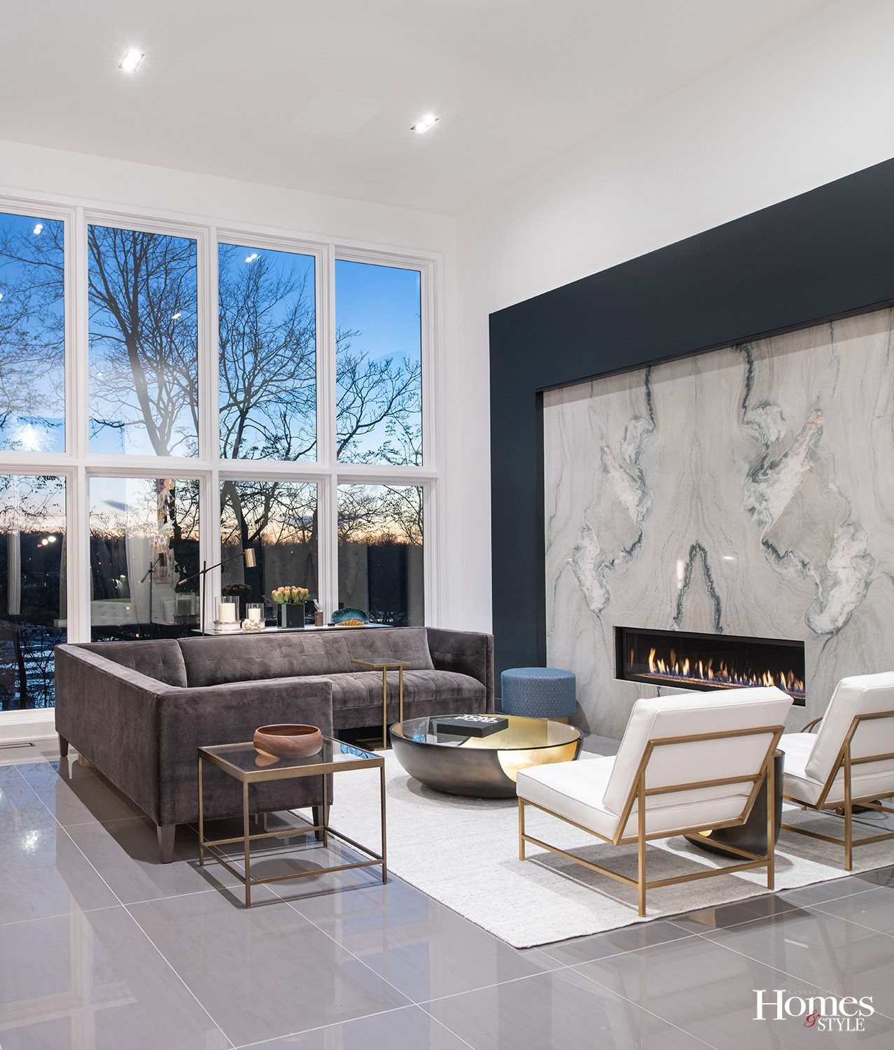
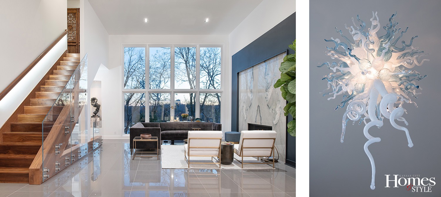
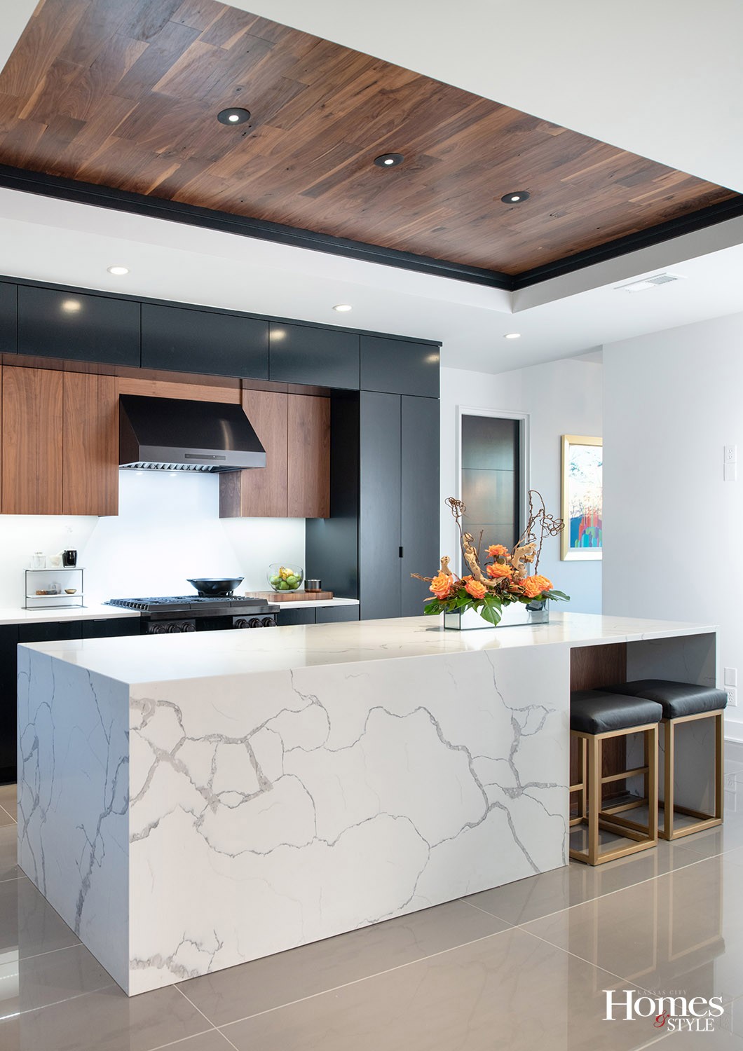
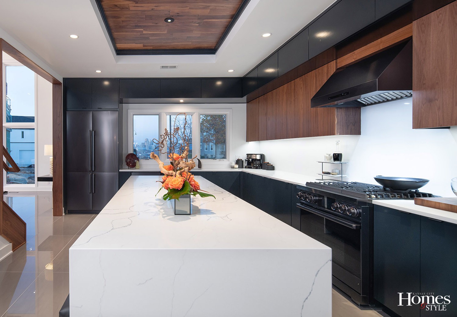
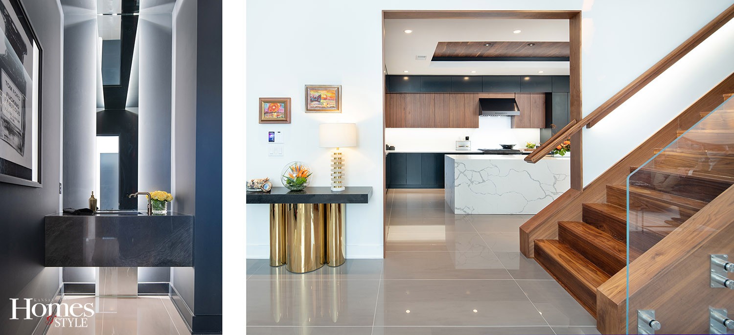
Mark navigated each request, from smaller jobs, such as custom kitchen cabinetry and milling window trim boards on site to create the slimmest profile possible, to larger engineering challenges, like bookending two 700-pound granite slabs for the fireplace surround and installing an all-glass staircase featuring exposed escutcheon joints and downlighting on the handrail.
“We joke that it’s ‘The Pinterest house that Mark built,’” Chad says.
One of the house’s most significant features is the 14’ x 16’ window walls on front and back that Mark and son Ben manufactured on site to capture views both directions.
“It has the look and integrity of an all-glass wall without the commercial price,” Mark says.
“There are so many details put into this house that turned out really cool,” he adds. “This definitely was not an easy house to build, but everything worked out.”
And it’s all so meaningful to the couple.
“There’s a story behind everything in this house, and the weird lengths we took to get it,” Chad says.
The tile alone sent them on a treasure hunt to four different manufacturers. But it was worth it. The high-gloss 24” x 48” pieces in the great room meet the grand scale and give the room a polished foundation.
“It’s counter to what most people in KC do, so obviously that’s what we wanted!” Chad says.
Every line in the house is pure for a purpose; every material is an investment piece unto itself.
“Overall, we wanted to keep everything very clean, which would be conducive to either displaying art or be the art itself,” Chad says. “In each space, one is more focused on than the other. We were intentional in how we did it.”
The chandelier in the entry stirs the most attention. The five-foot tall, 80-piece light fixture sensationalizes the open space.
“It really is hand-blown glass, but it is not a Chihuly,” Chad emphasizes.
A crisp black and white palette carries throughout the house, even to the mother-in-law suite that currently functions as a home office. David and Chad experimented with the headboard wall to create a design using wood and painted the whole thing black for dramatic effect.
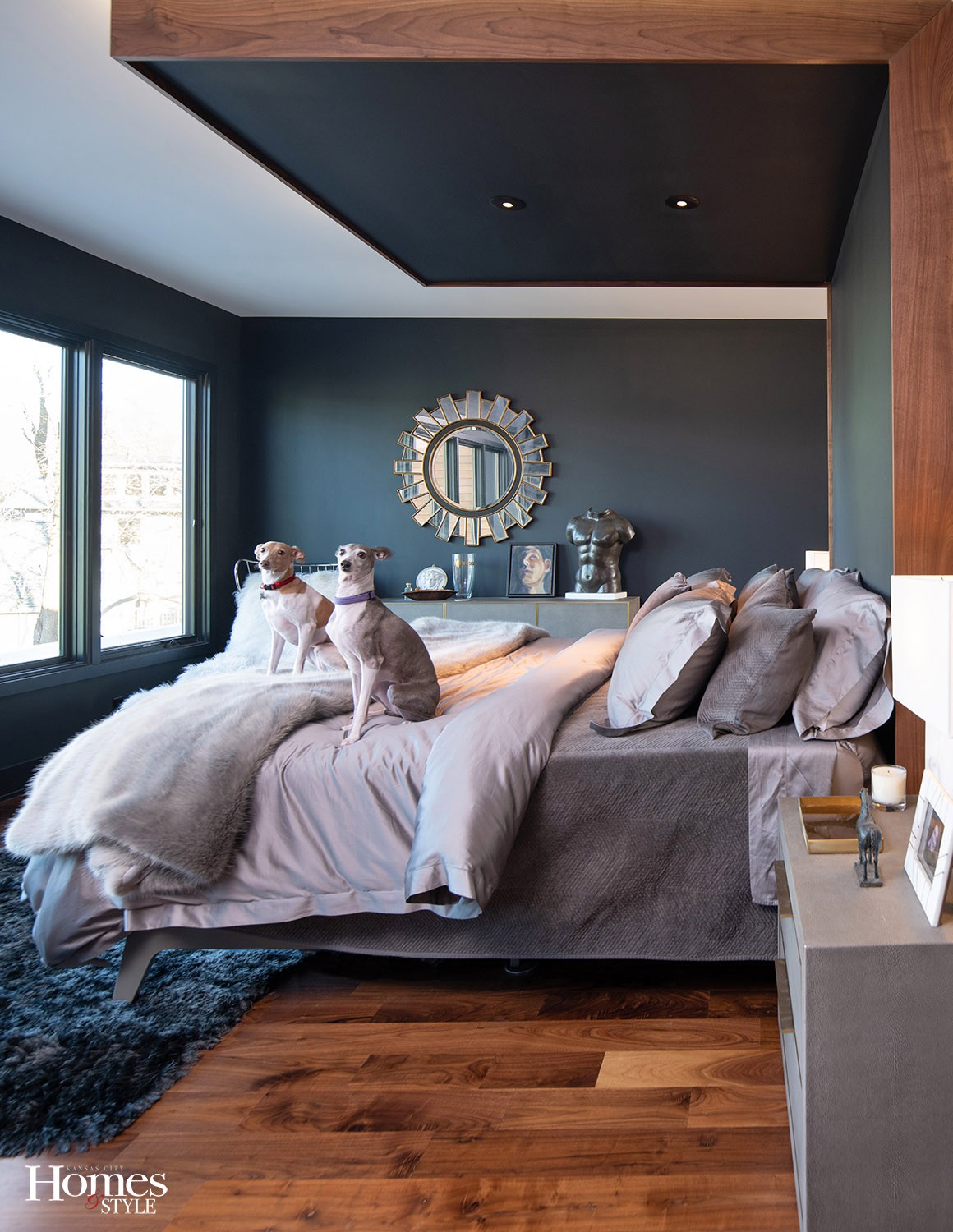
They took it further in their bedroom, slathering all the walls black.
“That caught our friends off-guard. When we told them we were doing a black bedroom, they thought it was risky. They would say it’s ‘interesting’ or ‘a bold choice,’ but when they saw it, they were awed,” Chad says. “It doesn’t feel too overbearing. There’s a lot of light coming from six big windows.”
And they successfully used black in the much smaller, windowless half bath, too. With its floating sink and narrow backlit mirror up the wall and across the ceiling, the space feels amplified rather than closed.
David and Chad also made alternative decisions regarding floor plan flow. For instance, they added a partition wall between the dining room and kitchen.
“The condo was an open-concept floor plan; I hated that,” David says. “I didn’t always want to be looking at dirty dishes. Here, we wanted spaces that are divided but flow well.”
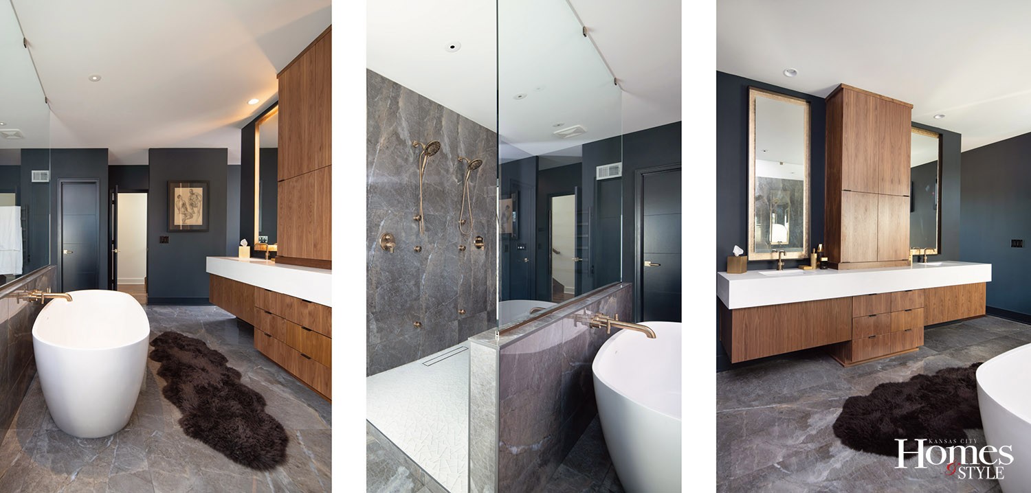
Their personal quarters reside on their own level, up a set of walnut stairs. Its extra-efficient design incorporates dual access to the bathroom from behind a backlit bed canopy.
“It was important to us to not be crisscrossing each other or feeling boxed in with only one way in,” David explains.
The entry to the shower functions identically, with each man having his own shower head and custom-placed body sprays.
“It was a fun day when we stood against the wall and they measured exactly where we wanted the spray heads to go,” Chad adds.
They completed the spa-like experience with a heated towel rack and a freestanding tub.
“David insisted on a tub; I’m tall, so I insisted on a tub I can fit in!” Chad interjects.
Even being so tailor-made for David and Chad, the house feels meant for more than two people. In fact, it’s being prepared for bigger things to come.
Up a half set of stairs from the second floor master bedroom is the rooftop deck and its uninterrupted views of downtown and out west as far as the Kansas Speedway. A floating deck featuring a fire pit and a bar is on the couple’s 2021 to-do list.
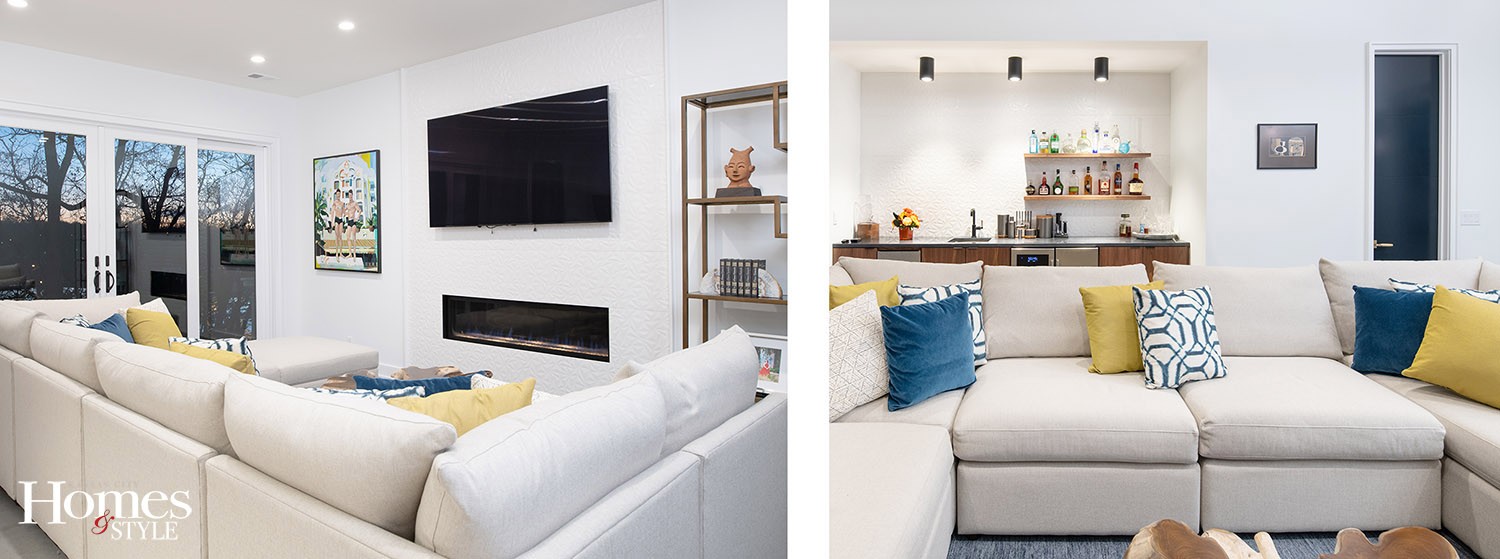
The lower level media room currently is the place they go for comfortable in-home entertainment, propping up on a big sectional with their rescue Italian greyhounds, Gianna and Sasha. This most private, casual space in the house is also about to undergo a transformation.
Next summer, David and Chad hope it will be a summer hub, sliding open the 12’ x 8’ doors to the deck and stepping out to a four-foot-deep narrow cocktail pool.
“I’m not much of a swimmer, but I can drink a margarita,” Chad says.
Someday, post Covid, the couple will open their doors to share in these most delicious spaces. It’s been some time since they’ve hosted 60+ guests, but they continue these projects to be ready when the world opens back up. Until then, it remains a swanky shelter in which to hunker down.
Resources
- Architect/Builder/Contractor: Suma Design & Construction
- Appliances: Factory Direct Appliances
- Art Hallway: Cassandra Shock, Living Room: Hugh Miller, Dining Room: Kevin Deen
- Cabinets: Shamrock Cabinets
- Countertops: Kansas Granite and Tile
- Doors: Owen Lumber
- Drywall: High Definition Drywall
- Electrician: Clayco Electric
- Excavation: Downing Construction
- Fireplace: Midwest Fireplace
- Flooring Carpeting: Carpet Source
- Flooring Hardwood: Kenny’s Hardwood
- Florals: Studio Dan Meiners
- Foundation: Pope’s Foundation
- Framing: BenMar Construction Co.
- Furniture: Keith Wardlaw Designer, Mitchell Gold, Leawood
- Garage Doors: Builders Overhead Door
- Glass & Mirrors: The Hayes Company
- Hardware: Locks and Pulls
- Heating & Cooling: Midwest Heating and Plumbing
- Light Fixtures: Wilson Lighting
- Lumber: Owen Lumber
- Paint/Painter: Gecko Painting
- Plumbing: Miller Plumbing
- Roofing: Imperial Roofing
- Sculpture: Artist Jacob Burmood Leopold Gallery
- Sprinkler System: Atlas Landscaping
- Staircase Railings: Westport Glass
- tucco Company: Elite Stucco
- Tile: Emser Tile
- Tile Installer: Calvert Flooring
- Trim Work: Shane Kittle Construction


