Designing this beautiful new Leawood residence required an “all hands on deck” approach, but the journey did what it intended: It took this family home.
Story by Ann E. Butenas | Photos by Matt Kocourek
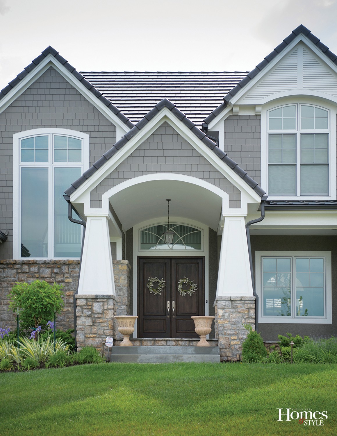
With over 5,000 square feet of living space, this stunning south Leawood residence has so much to offer, and upon crossing its threshold, it’s wonderfully apparent that its purposeful design behind the beautiful architectural canvas suggests that the heart of the home beats perfectly in the main living areas. Built by Tim Cunningham, this custom home has sophistication, class, and elegance written all over it while simultaneously partnering with a “C’mon in and make yourself at home” vibe.
Homeowners Boyd and Emily, along with their three young sons, Cooper (5), Cameron (3) and Carter (nine months), and their 100-pound red Labrador Dutch, recently moved into this home and credit designer Amber Gardner with her expertise in creating a place that overflowed with their personal style yet remained fully functional for their family.
“She was very meticulous about the placement of things such as light switches and the layout of the spaces. She helped us facilitate designs for three boys that would work for the next 20 years,” noted Emily, who joked that even though she and her husband provided differing points of views at times, they managed to come together and build this home relatively unscratched!
“My voice won out a lot of the time,” she laughed. “But Boyd really does know what he likes and was very involved in the design elements.”
While building a house and combining personal tastes can be a challenge for many couples, Boyd and Emily tackled this with finesse, both taking the liberty to speak their mind and enjoy the results when it came to what they truly desired in a home. It was a decided and ultimately victorious team effort.
“Both of us were very hands-on throughout the process,” elaborated Emily. “Boyd is unafraid to voice his opinions about something and he has a good eye for detail and certain design elements. Unlike myself, however, he is more willing to take risks while I tend to stick to a classic look through and through. With this project, however, we managed to meet in the middle and it turned out wonderfully.”
Everywhere you turn in the home, there is something that catches the eye and warms the heart, but it doesn’t take long to understand that its primary accessories are family, friends, love and fun, and all of those pair well with Emily and Boyd’s focus on a classic and timeless style.
“We want this to be our forever home,” noted Emily. “That is why we went with the style we chose. We wanted to find stuff we will never grow tired of and don’t want to have to worry about redecorating over the years. I do, however, enjoy adding and swapping out various accessories for fun.”
With hardwood floors throughout the main level, except for the carpeted master bedroom, this home will most assuredly stand the test of time as the three boys grow from rambunctious toddlers to active teenagers. (And will certainly hold up to Dutch’s antics, as well!)
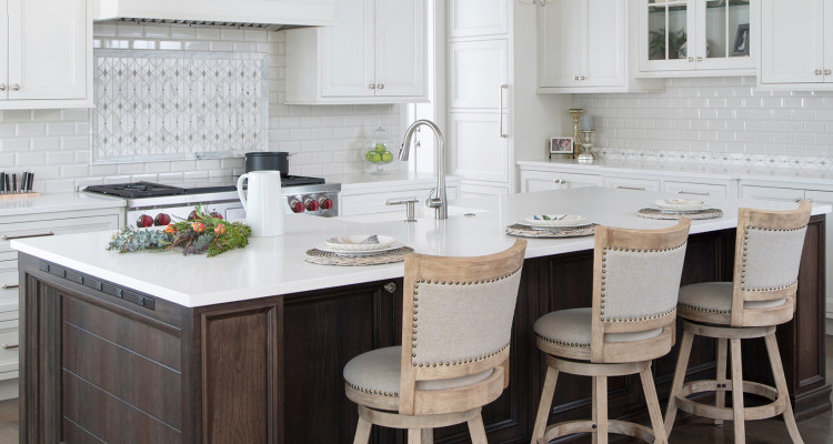
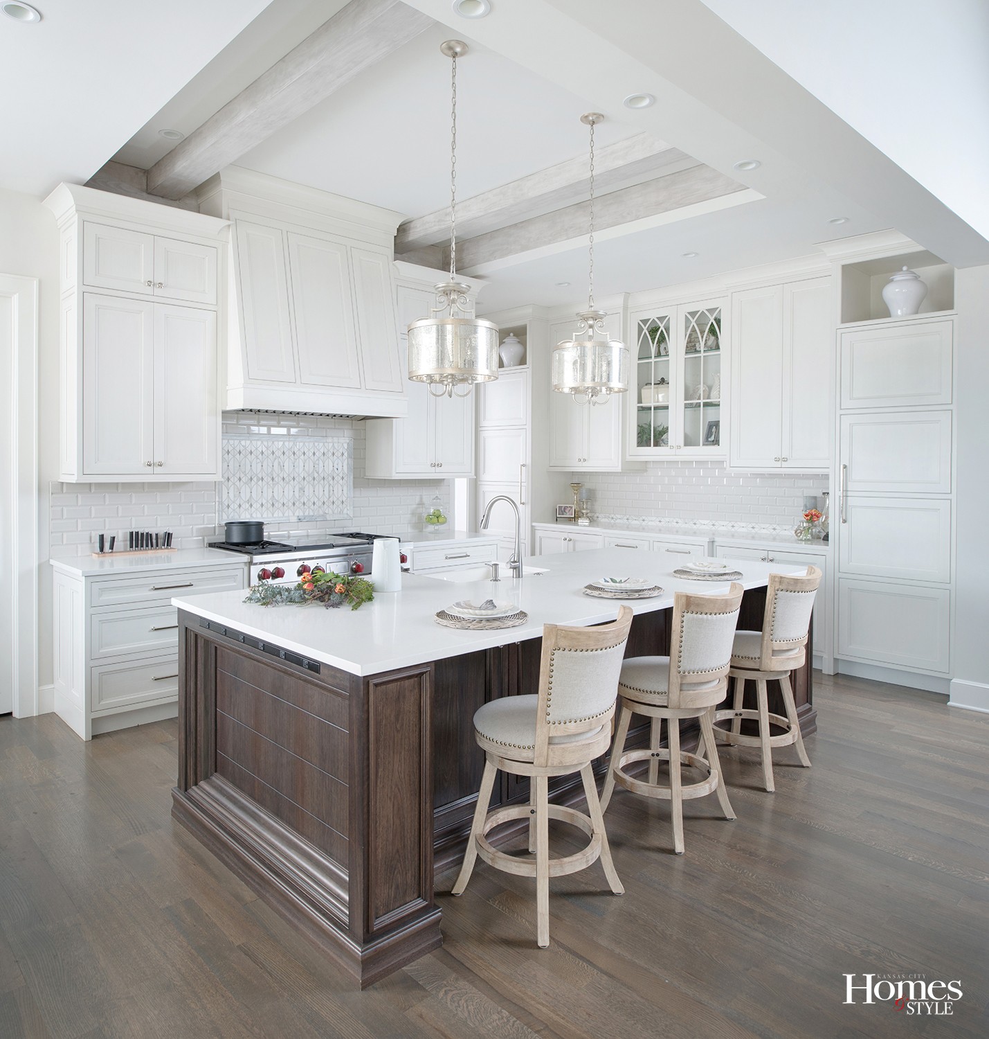
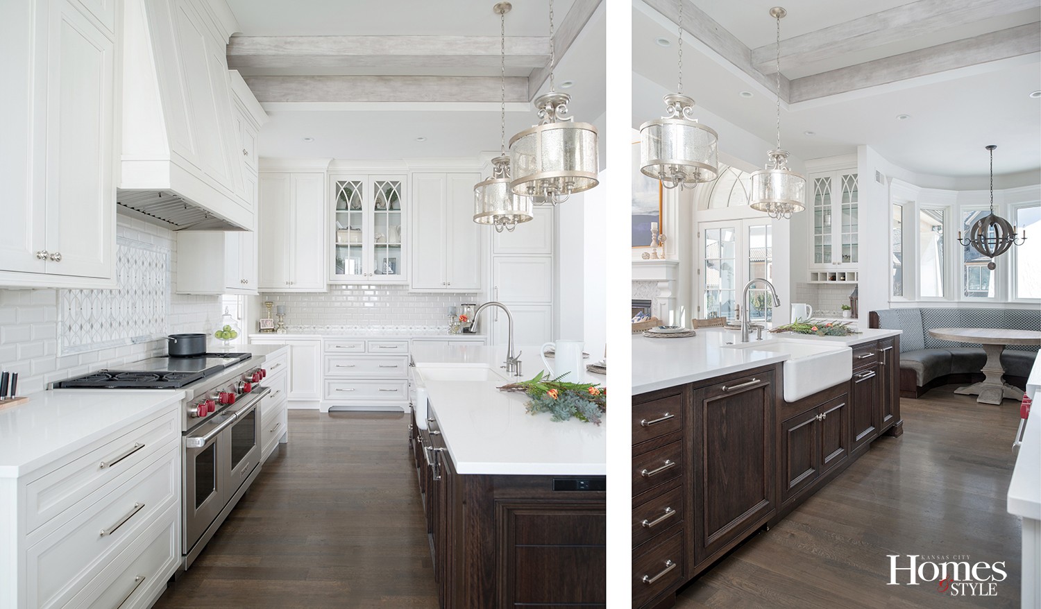
Beginning in the kitchen, which was designed by Kitchen Studio: Kansas City, the striking yet subtle color combination of grey and white give testament to the classic style, yet the dark walnut stain of the island offers a great contrast for a relaxing pop of warmth.
“We wanted this space to feel fresh, inviting and comfortable,” said Emily. “We wanted a home, not a house. We didn’t want people to feel as if they could not touch anything and the balance of the darker floors and accents provide that homey touch.”
Amber was the perfect partner for this family to set the stage for what will certainly become a place where memories are made for this young family. She assisted Emily and Boyd with navigating their way through all of the details that give this home such personality.
Among the perfect touches in the kitchen include the subway backsplash tiles, the quartz counter tops, pendant lighting and wooden hood above the gas range, all of which add a personal touch without overwhelming the senses. The charming built-in dining nook is the perfect place for a casual dinner for this family of five.
“We used an outdoor fabric on the seating to make clean up a breeze,” said Emily. The accompanying round wooden table complemented the alcove seating. Next to the nook is the cocktail bar, which houses various glasses, tumblers and entertaining accessories always at the ready when company drops by.
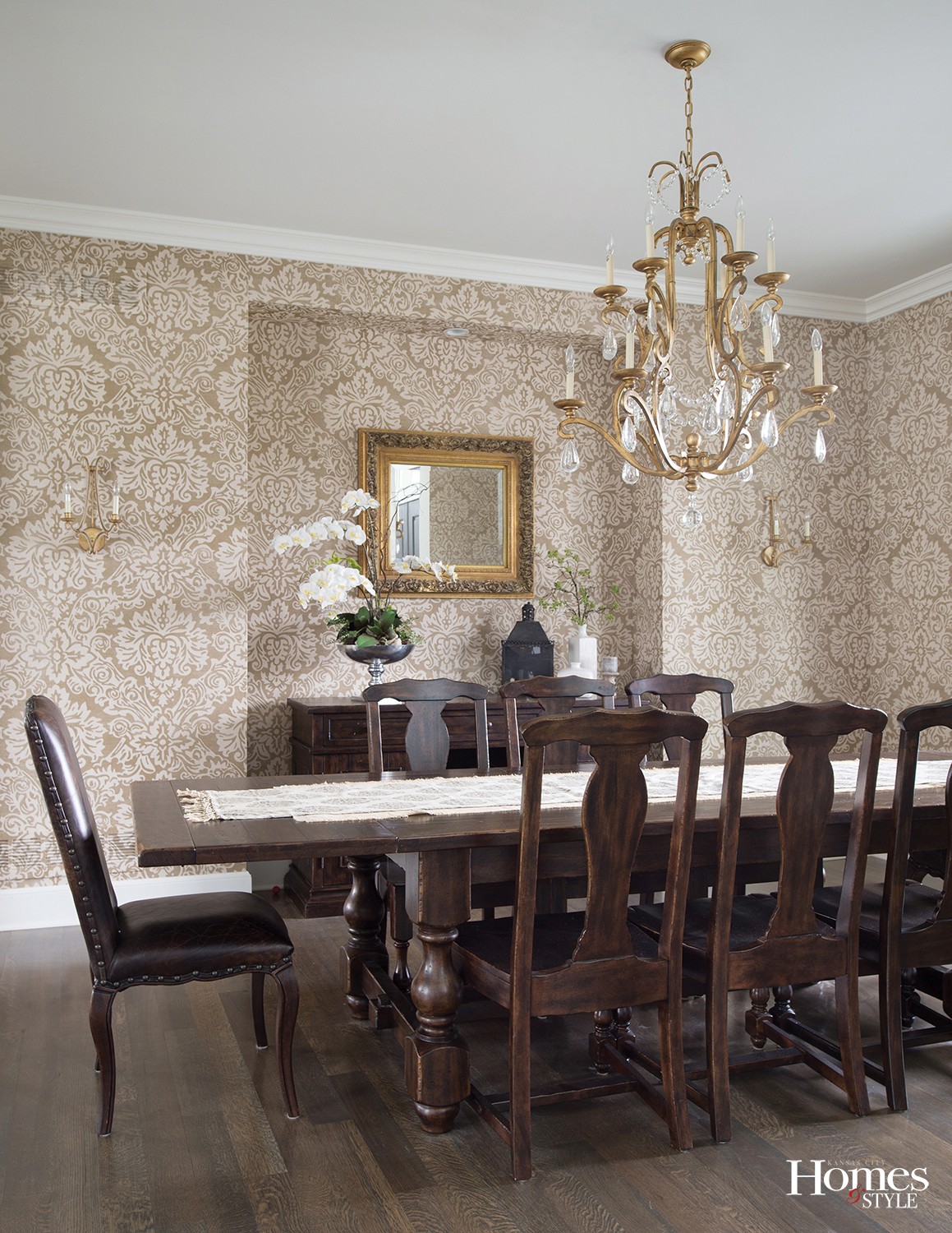
Transitioning into the dining room, a Damask-type wall paper partners well with the elegant chandelier and the Spanish Colonial dining set, which the family brought with them from their former home.
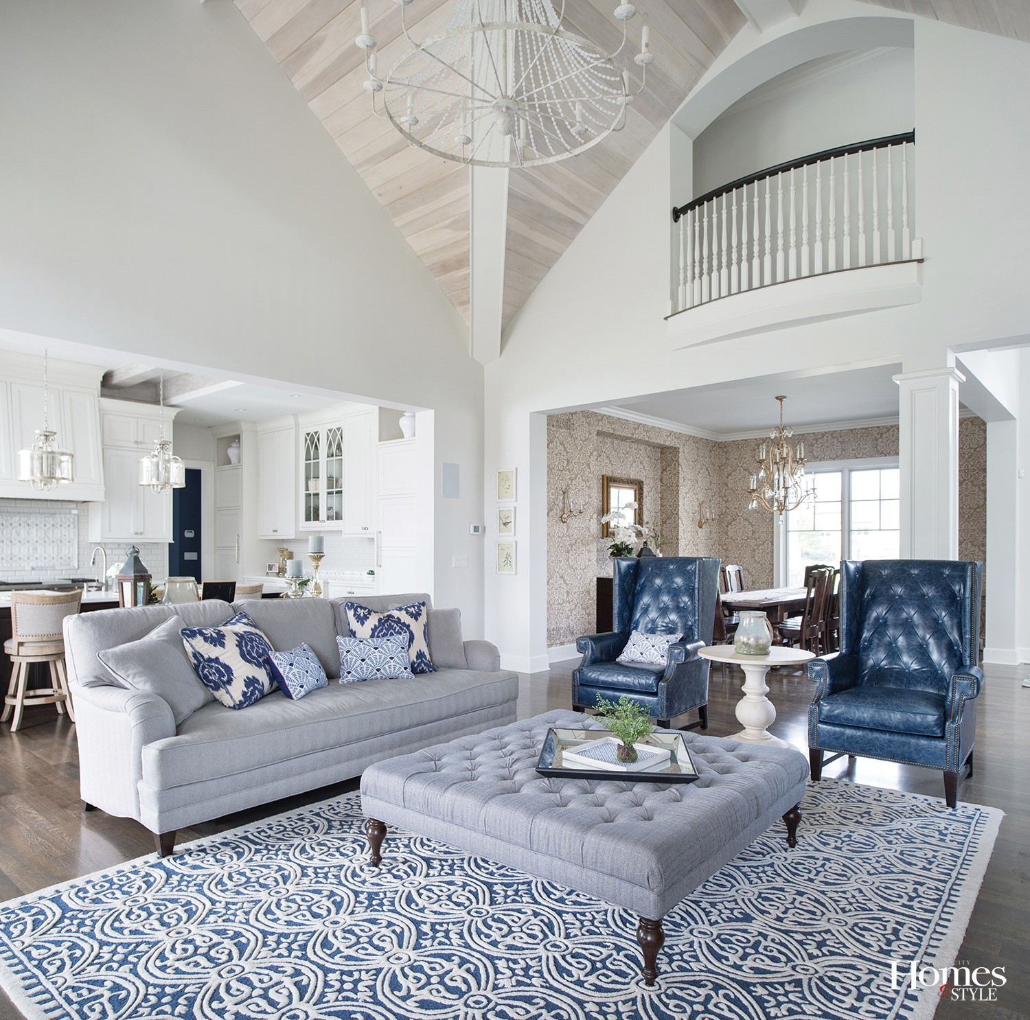
Moving into the great room, this space is metaphorically the headquarters of the home.
According to Emily, the footprint of the home was actually built around the logistics of the great room, as she knew this would not only become a primary gathering spot but would also seamlessly transition to the outdoor living area, opening up the area and creating optimum space for entertaining friends and family. French doors (a “must-have” for Emily) on either side of the see-through fireplace grab your attention and also direct your gaze towards the vaulted wooden beamed ceiling above, with recessed cans and an elegant chandelier.
In remaining consistent with Emily’s love of navy, her self-professed “all-time favorite color,” Amber found the large painting at an art show in New York that adorns the space above the herringbone, marble tiled fireplace and the area rug with blue accents marries wonderfully with the oversized ottoman, which was reupholstered with a soft navy-colored fabric from its prior look in their former home to accentuate the color scheme of this home. The accompanying area rug creates the perfect foundation for the room’s furniture and provides a workable contrast against the dark hardwood flooring, which enjoys a slight undertone of grey.
The balcony overlooking the great room is not only aesthetically pleasing, but also serves as a great communication dock.
“With the boys’ bedrooms and loft upstairs, I can hear them and communicate with them to and from the balcony,” said Emily, noting that while initially having a master bedroom on the main level away from the secondary bedrooms was a challenge, especially with a baby, she realizes that over time it will create a perfect balance as the boys grow older and demand a bit more privacy while also giving her a bit more peace and quiet in her own quarters below.
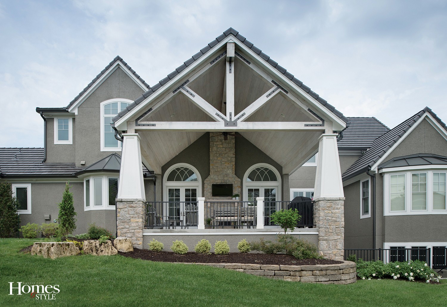
At the end of a long day, Emily and Boyd can relax outside on the covered lanai with its vaulted ceiling, stone fireplace, outdoor flat screen TV, and comfortable seating for everyone. Even Dutch can kick back and relax. Fortunately, the concrete patio, which is cut on the diagonal, and provides an aesthetically-pleasing look, will most assuredly stand up over the years as he and the boys rush in and out of either of those French doors numerous times, reminding Emily and Boyd that they not only designed a gorgeous home, but they have also begun to create a lifetime of memories, and that is one design element that will never go out of style.
Resources
Architect: Bickford + Company | Builder: Tim Cunningham Homes
Designer: Amber Gardner Interiors | Kitchen: Kitchen Studio: Kansas City
Appliances: Factory Direct | Cabinets: Jackson Woodwork | Countertops: Dimensional Stone | Doors: McCray Lumber | Drywall: Wallboard Specialties | Electrician: C-R Electric | Excavation: JAG Excavating | Fireplace: Complete Home Concepts | Flooring/Carpet: Leon Flooring & Carpet | Flooring/Hardwood: Kimminau Wood Floors | Flooring/Tile: ProSource | Foundation: JG Creten | Furniture/Dining Room: Pottery Barn | Furniture/Great Room: KDR | Furniture/Kitchen Table: Restoration Hardware | Furniture/Outdoor: Pottery Barn | Garage Doors: Radio Controlled Garage Door | Glass and Mirrors: Complete Home Concept | Hardware: Locks and Pulls | Heating and Cooling: United Heating & Cooling | Home Theater: Elevated Electronics | Landscaping: Land Design Group | Light Fixtures: Wilson Lighting | Lumber: McCray Lumber | Masonry: Rock Solid Masonry | Outdoor Stone Work: Rock Solid Masonry | Painter: BW Quinn & Gecko Painting | Plumbing/Plumbing Fixtures: Miller Plumbing | Refrigerator/Cooktop: Roth Design Center | Roofing: Century Roofing | Sprinkler System: Heritage Lawns | Tile: Integrity Tile and Remodeling | Windows/Window Coverings: Pella

