Story by Ann Butenas | Photos by Matthew Anderson
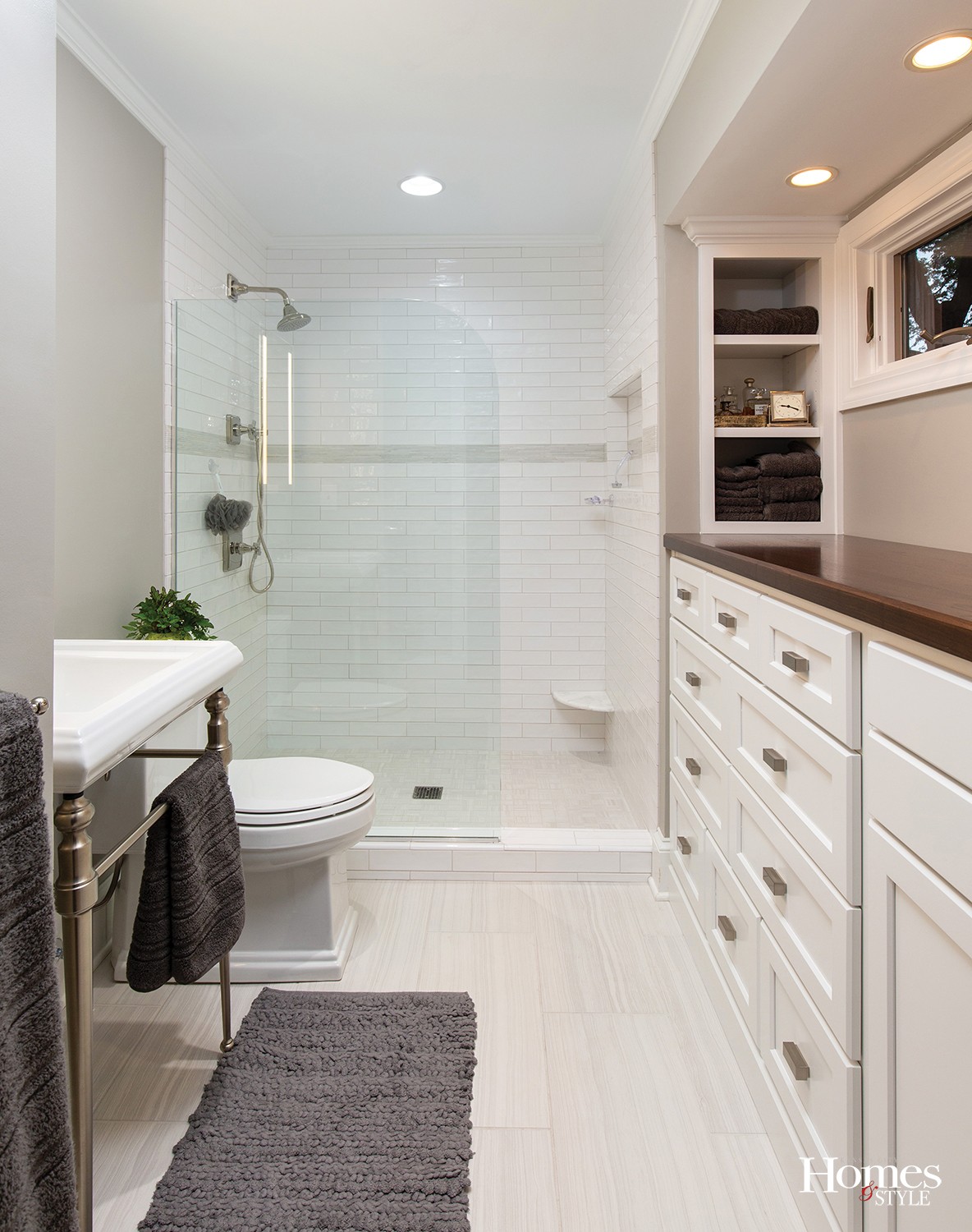
Despite its limited footprint, this cozy bathroom has been called upon to provide a lot of services to the homeowner, and its new, sleek design allows it to easily live up to its purpose. A complete bathroom remodel, this space was formerly occupied by darker finishes, making it appear quite small. It was subsequently brightened up to appear roomier, as well as provide continuity with the lighter color schemes of the rest of the home. In order to give the appearance of a larger space, Shawanna Meeks, store manager of Kohler Signature Store, relied on a variety of unique design elements.
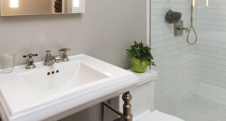
“Lighter cabinetry and linear tiles on the floor were used to make the room appear longer,” she noted. “We also used a pedestal sink top to avoid cluttering the floors with additional cabinetry for the vanity. Additionally, we used a partial glass piece in the shower to eliminate more bulk in the room.”
Meeks’ goal was to make the room appear bigger while still maintaining a spa-like atmosphere. Adding to that ambiance is a mirror with built-in lights, along with a wood top to provide a beautiful contrast to the built-in armoire. Open shelving was used for increased storage and added matching trim around the window to allow an abundance of natural light to enter the space and further brighten it up.
“We removed the trim around the window and added a lighter tone around the frame,” stated Meeks, who emphasized the white and warm gray colors dominating this bathroom are key players in making the bathroom seem larger than its actual square footage.


