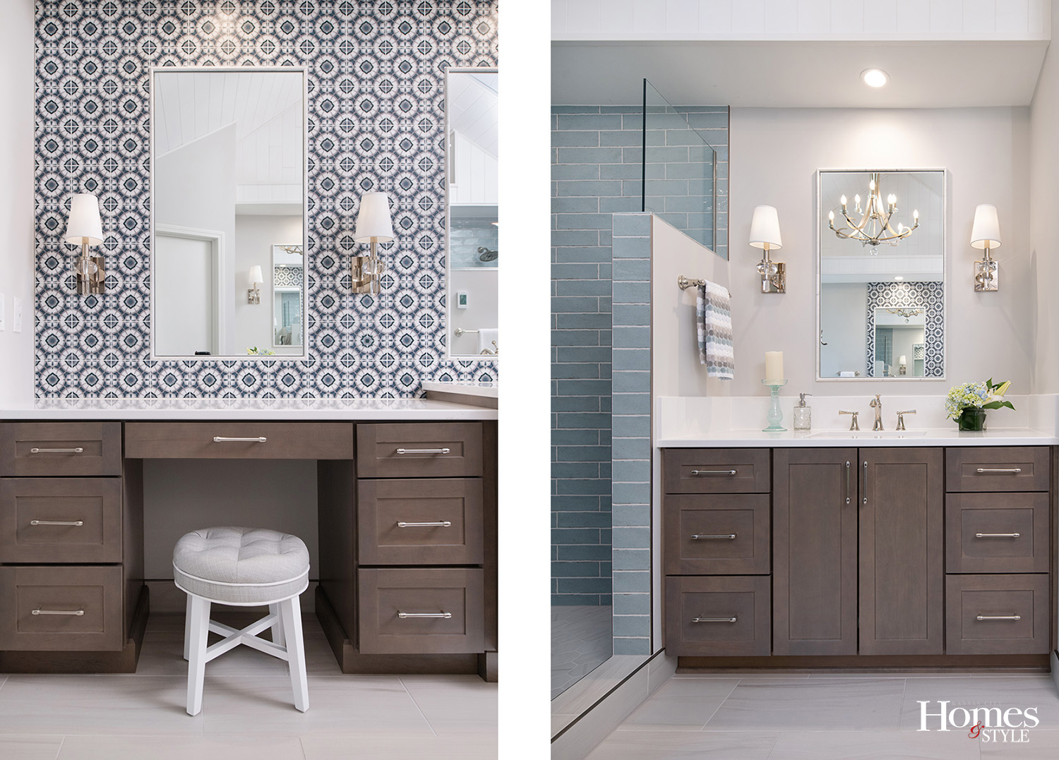
A home’s interior designs are transformed to have a beautiful but subtle coastal theme.
Story by Michelle Mastro | Photography by Matt Kocourek
Who doesn’t want a day at the beach any time they choose? To get a beach-house vibe, adding a coastal décor theme to a house makes a home feel like a person is always on vacation. That’s what the homeowners of this abode wanted, so they reached out to Laura Suhr of Suhr Interior Design to create transitional meets coastal designs.
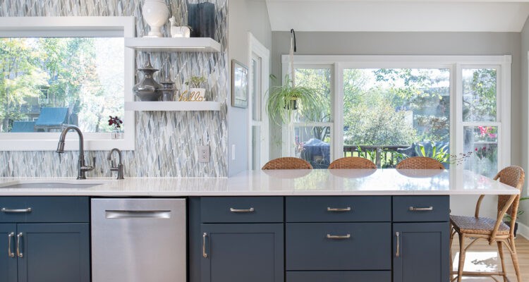
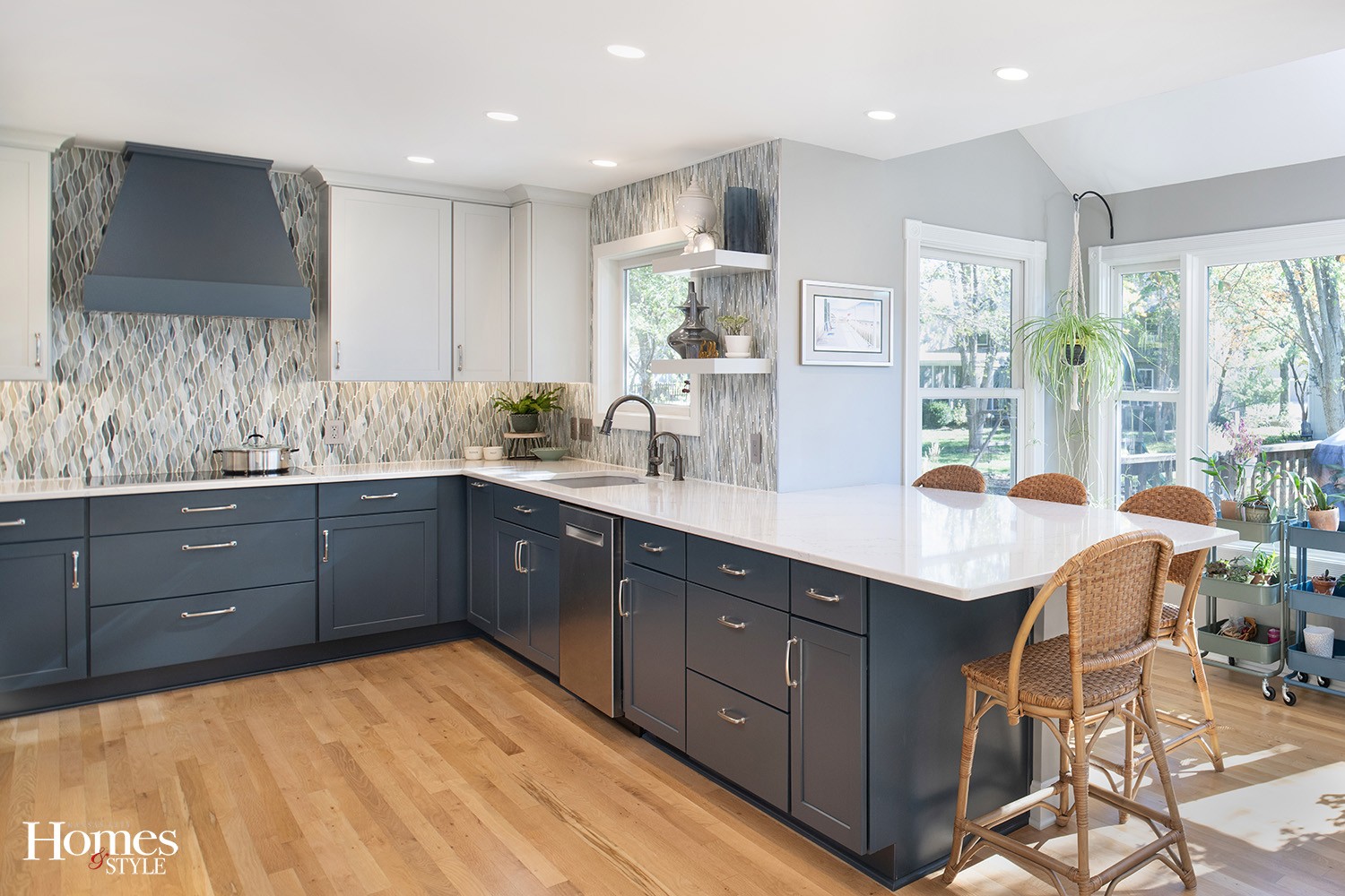
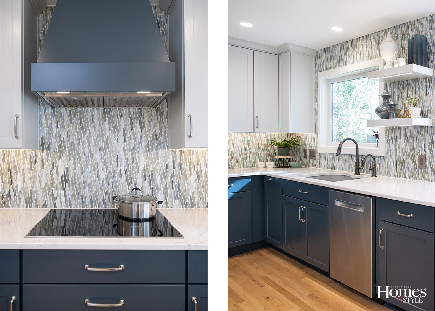
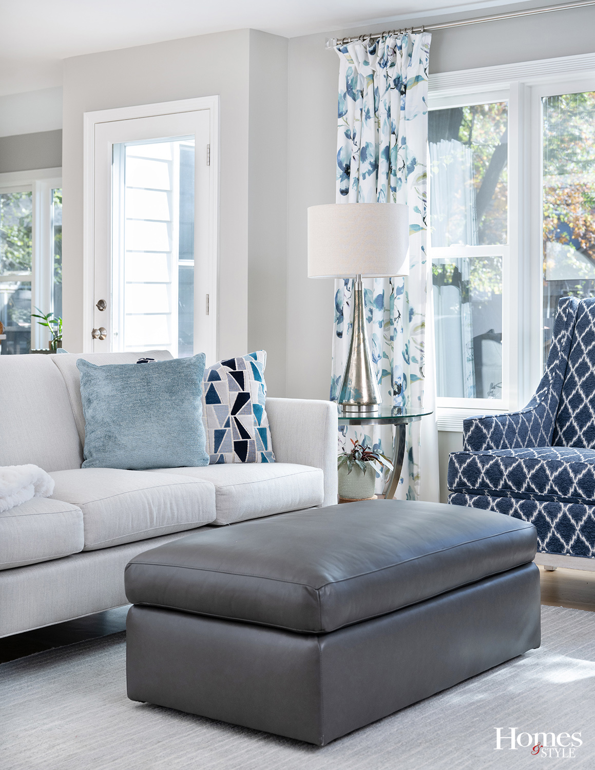
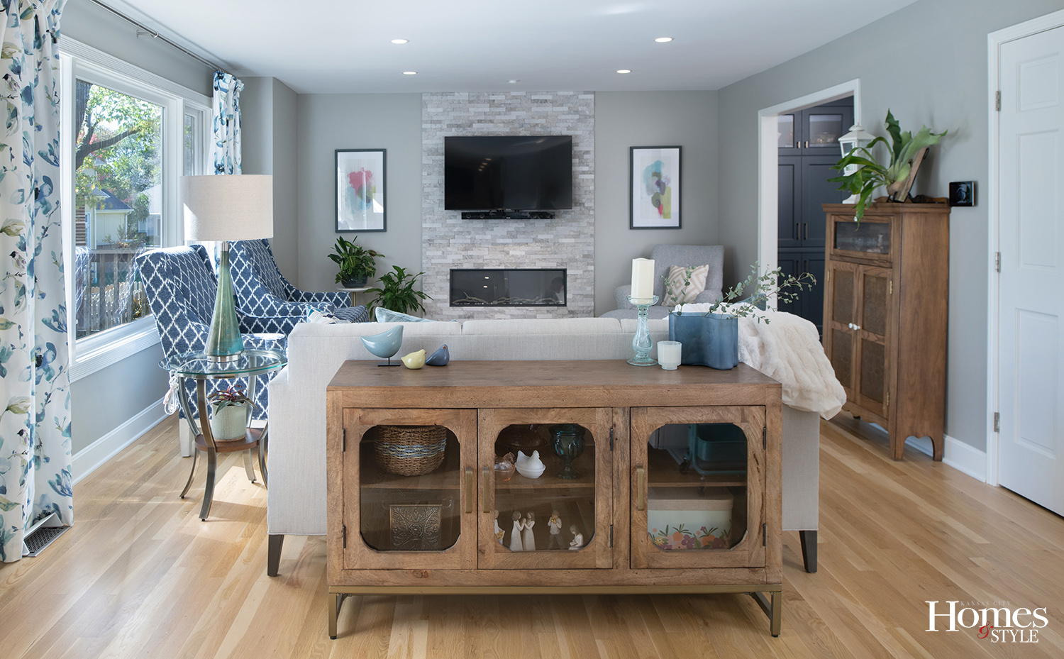
When it comes to a coastal-inspired interior, many people might think of seashells and blue hues. But Suhr managed to usher in a subtle ode to the beach life aesthetic instead. Hence the home would rely on clever nods to the beach. For the floors, Suhr chose a light finish on the white oak to mimic beach sand for example, and then picked a water-like handblown glass backsplash cascading down the walls in the kitchen. And of course, the home’s colors are light and airy overall, as these various shades of blue add to an ocean vibe.
But although Suhr proved an expert on coastal design, this wasn’t a typical style she’s done before. “This was a first-time request and a fun challenge,” Suhr explains. “I had to thoughtfully work on beachy coastal elements, while also considering other preferences my clients both had.”
To start things off, Suhr focused first on the kitchen, the heart of the house. “It has the most permanent finishes and sets the tone for the rest of the home,” she says. “For me, it was keeping the overall palette and feeling light and breezy.” She opted for a light natural white oak floor finish and juxtaposed this against the deep blue cabinets. Then she layered in some natural elements, like wicker barstools, to complete the look. “The glass backsplash is what really pulls it all together and gives this kitchen a special look,” she says. “It’s hand-blown glass and has an iridescent quality like when sunlight hits the water, and the fluid abstract shape adds to that effect of water cascading down the wall.”
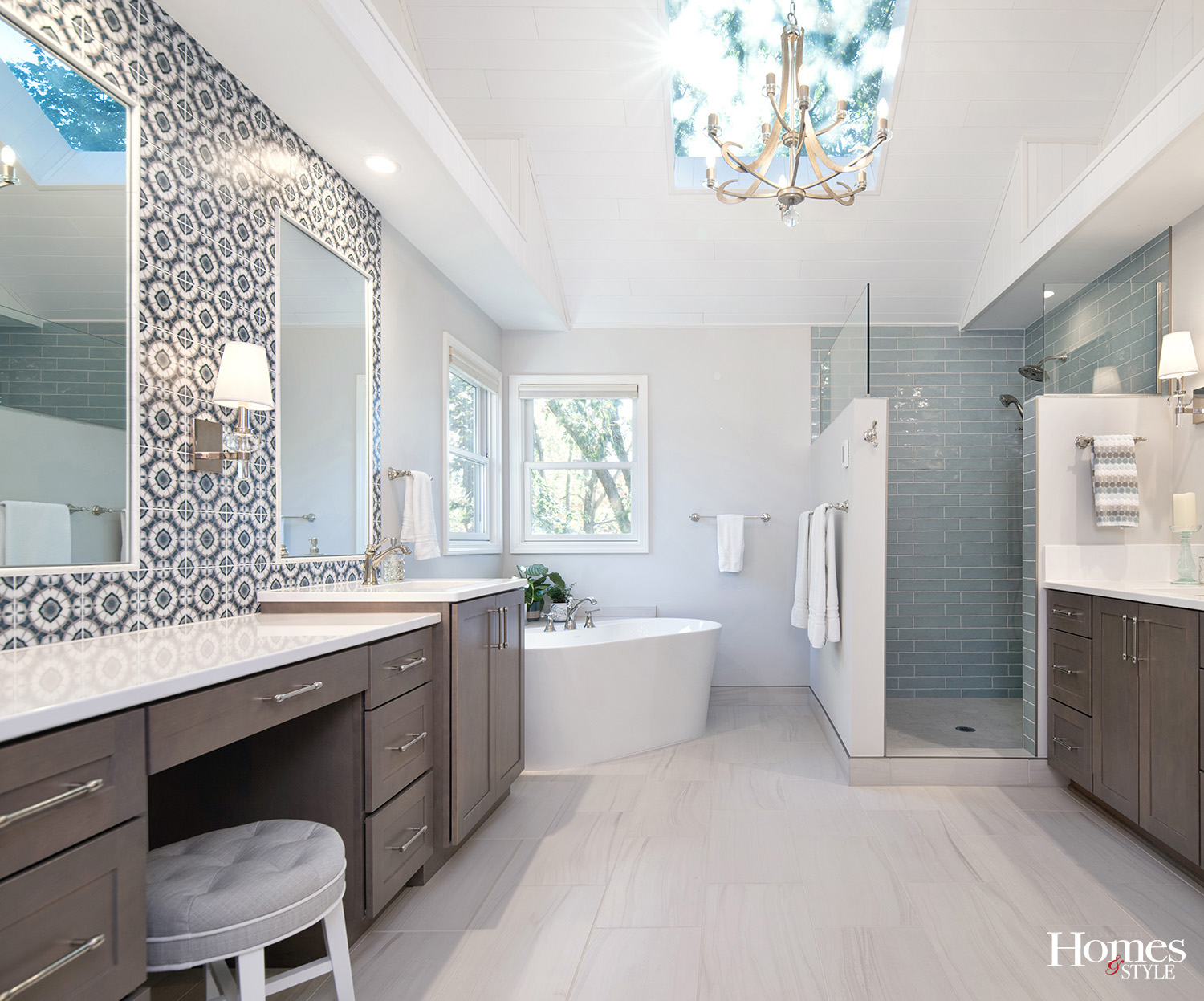
Next, she turned her attention to the primary bathroom. “The smooth and flowing pattern in the large format floor gives the feeling of white sand,” she says, “while the aqua tile in the shower — one of the homeowner’s favorite colors — pulls in the aqua tones in the ocean.” Then Suhr used polished nickel fixtures and a printed marble tile to unite all the tones in the bathroom into a cohesive mix. “[The marble] was a splurge that created a big moment and elevates the whole space.”
All in all, the beachy feel Suhr created was a significant departure from the home’s original interior designs. The home had a lot of golden oak from the 90s, lots of antiques, and a formal dining room, which Suhr would transform into a laundry room, she says. “They raised their three boys in this home and had done some updates themselves through the years,” she explains, “but the couple wanted to redesign the main floor to work for their empty nest lifestyle and to hopefully see them well into retirement.”
This meant making some of the spaces bigger. The kitchen was on the smaller side, for example. It had a corner sink and an angled range, limiting the available counter space. “To capitalize on every square inch, we squared off the range corner and extended their countertops into the breakfast nook to create a peninsula and seating for four,” Suhr says.
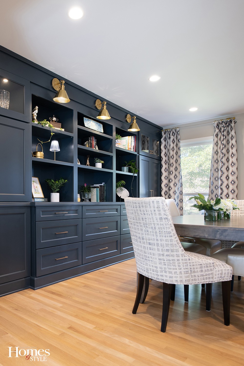
But just as importantly, the owners wanted Suhr to weave in a beachy feel in a way that didn’t feel out of place in Kansas. “It’s not a super strong theme, but when you walk through their home, it’s woven throughout — particularly the kitchen, living room, study, and primary bath.” Hence the brass accents with the sconces and hardware in the study and dining rooms offer subtle nautical or coastal motifs.
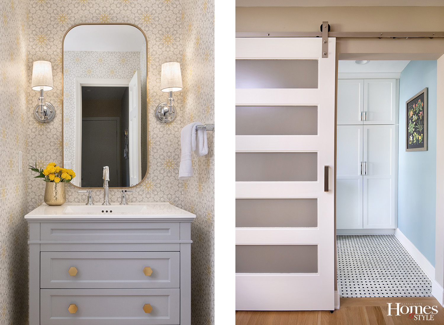
Meanwhile, the powder room and primary bath, two of Suhr’s favorite spaces in the house, tie into the beachy theme while also weaving in the client’s love of floral motifs and yellow. “The powder room’s wallpaper has a medallion, floral-like pattern that pulls in the gray tones from the adjoining spaces while surprising you with a hit of yellow-gold,” she says. And in the primary bath, Suhr marvels at the marble. “When I first found [the marble], I knew it was special and something my clients would love,” she says. “It perfectly pulls all the beachy colors together, creates a ‘wow’ moment, and caters perfectly to my client’s traditional leaning style.” Plus, the polished nickel fixtures balance well against the taupe-toned maple cabinetry and adds a layer of elegance and sparkle. “It’s elegant-beachy,” Suhr explains.
The result of the home’s transformation is an eye-catching and beach-inspired design that guests won’t soon forget. “The deep blue-gray cabinets [in the study], with the brass accents against the light wood floors, is a very striking first impression when you enter the home,” Suhr says. “It’s one of the features most commented on when family and friends see the newly designed home.” But all the areas of the home certainly shine under Suhr’s beautiful designs. “This design project was really fun and challenged me to channel my client’s tastes, and in the end, we created something I’m truly proud of.”
Resources
- Interior Designer: Suhr Interior Design
- Contractor: RWS Remodel
- Appliances: Factory Direct Appliance
- Cabinets: Blossom Spaces
- Countertops: CKF
- Furniture: Suhr Interior Design
- Hardware: Hardware Resources
- Light Fixtures: HVL Lighting Group
- Paint: Sherwin Williams
- Plumbing Fixtures: Grandview Winnelson
- Tile: ASMI (Sunderland Bros), Jaeckle Distributors

