Story by Ann Butenas | Photography by Matt Kocourek
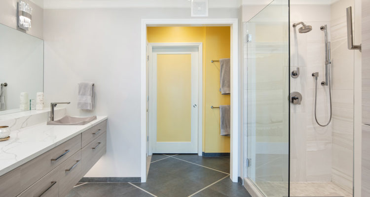
This fabulous Union Hill neighborhood condominium got a dramatic bathroom facelift, thanks to the incredible design talent of Heidi Harrison, CKBD with Kitchen Studio: KC. Formerly a rather dark and dated space, Harrison breathed exciting new life into this master bathroom, giving it a unique contemporary styling with a dash of transitional flavor delightfully blended within.
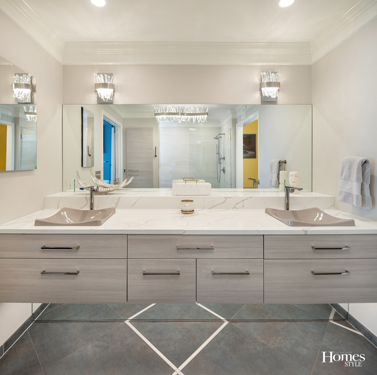
While Harrison stuck with the original crown molding and integrated traditional light fixtures with elegant crystal appointments, the entire space enjoys sleek lines and simple colors contrasted with dark tiles and textured cabinetry to elevate the overall design.
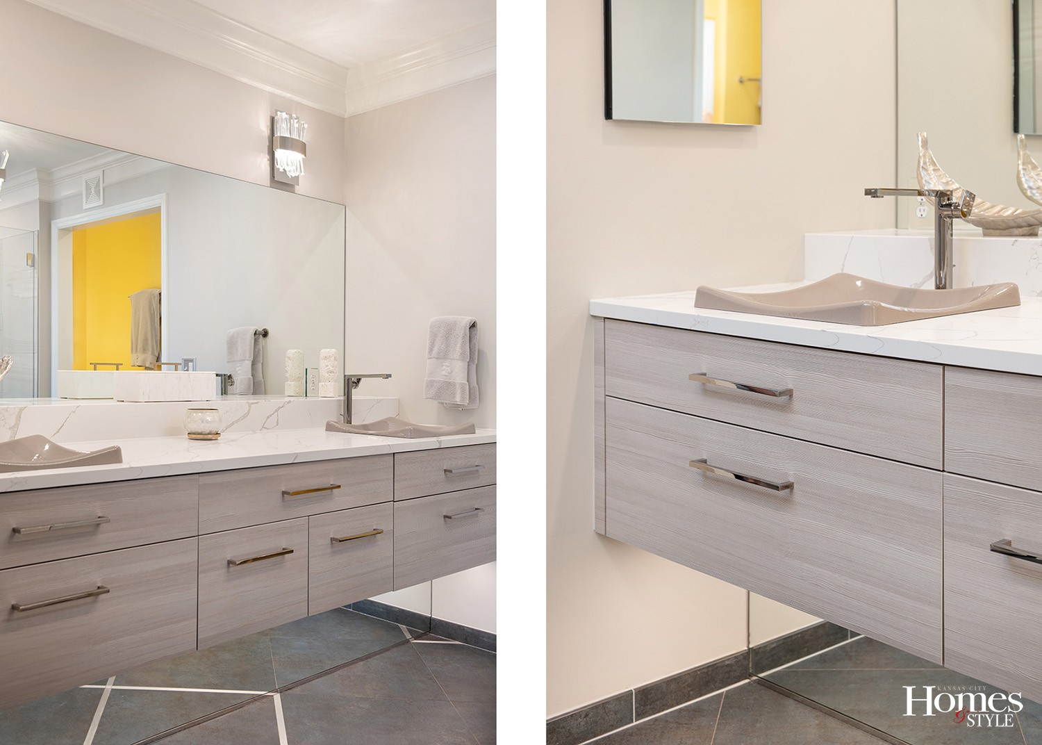
Harrison set the stage with myriad noteworthy elements that have brought this master bathroom to a whole new level. She enhanced the contemporary vibe through the utilization of horizontal wood grain on the cabinets instead of a vertical grain.
“Horizontal flows with the long and linear look that is contemporary,” she said.
The cabinets are comprised of foil, which is a type of wood-looking laminate with texture pressed in, giving a 3-D value to the wood grain.
The client wanted slabs of tile for the floor, but because those could not be brought up to the condominium via the elevator due to their sheer size, Harrison opted to use large format tiles fashioned with larger grout lines between sections with subtle grout lines between individual tiles to give the illusion of a larger piece of tile.
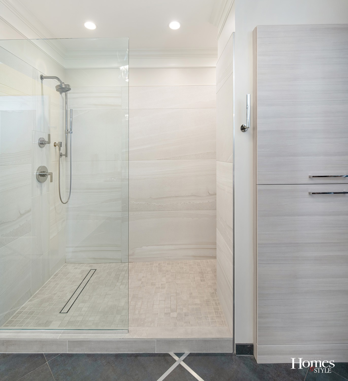
Large ceramic tiles comprise the expansive shower while smaller scale 2”x2” mosaic tiles accent the shower floor. Harrison incorporated a linear drain to make the slope of the floor look more aesthetically aligned and less noticeable.
The stunning floating vanity with a quartz countertop enjoys two matching sinks which Harrison described as hybrids between vessel sinks and undermount sinks. The linear pulls on the cabinetry further support the contemporary design. Harrison also added a mirror underneath the vanity for added visual effect.
“Because this space is long, the mirror makes it look deeper,” she explained. “Plus, it makes the tile easier to clean and the mirror is less likely to get dirty because it sits 18 inches back from the front of the vanity.”
The toilet area resides near the yellow wall and opposite the toilet on the other side is a linen closet.
“The clients wanted a pop of color to accent the space,” noted Harrison, who also designed the contiguous pocket door that leads to a closet, an area that was originally open to the bathroom.
Resource
Designer: Kitchen Studio: Kansas City


