This is a space where purpose, function and warm ambiance blend seamlessly together
Story by Ann Butenas | Photos by Matt Anderson
When the owners of this 14-year-old home in Olathe, Kansas decided to remodel their kitchen, they turned to the experts at Heartland Kitchen & Bath to help them spice up this fabulous cooking and entertaining space. Despite its limited footprint, the kitchen boasts plenty of charm, style and class.
As part of a complete lower-level remodel in which a couple of walls were torn out to open up the space, this kitchen undoubtedly steals the show. With low-key and relaxed colors of white and grey dominating its palette, it has a feeling of refreshed and relaxed written all over it, coupled with an attitude of culinary purpose.
Attending to numerous details, Barringer Hansel and Nick Chrissan, co-owners of Heartland Kitchen & Bath, guided this project from its former builder-grade presentation to the warm and welcoming ambiance it offers today.
Among the many exciting new features include the cabinets, which not only provide a soothing visual, but also offer expansive storage options.
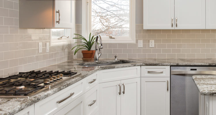
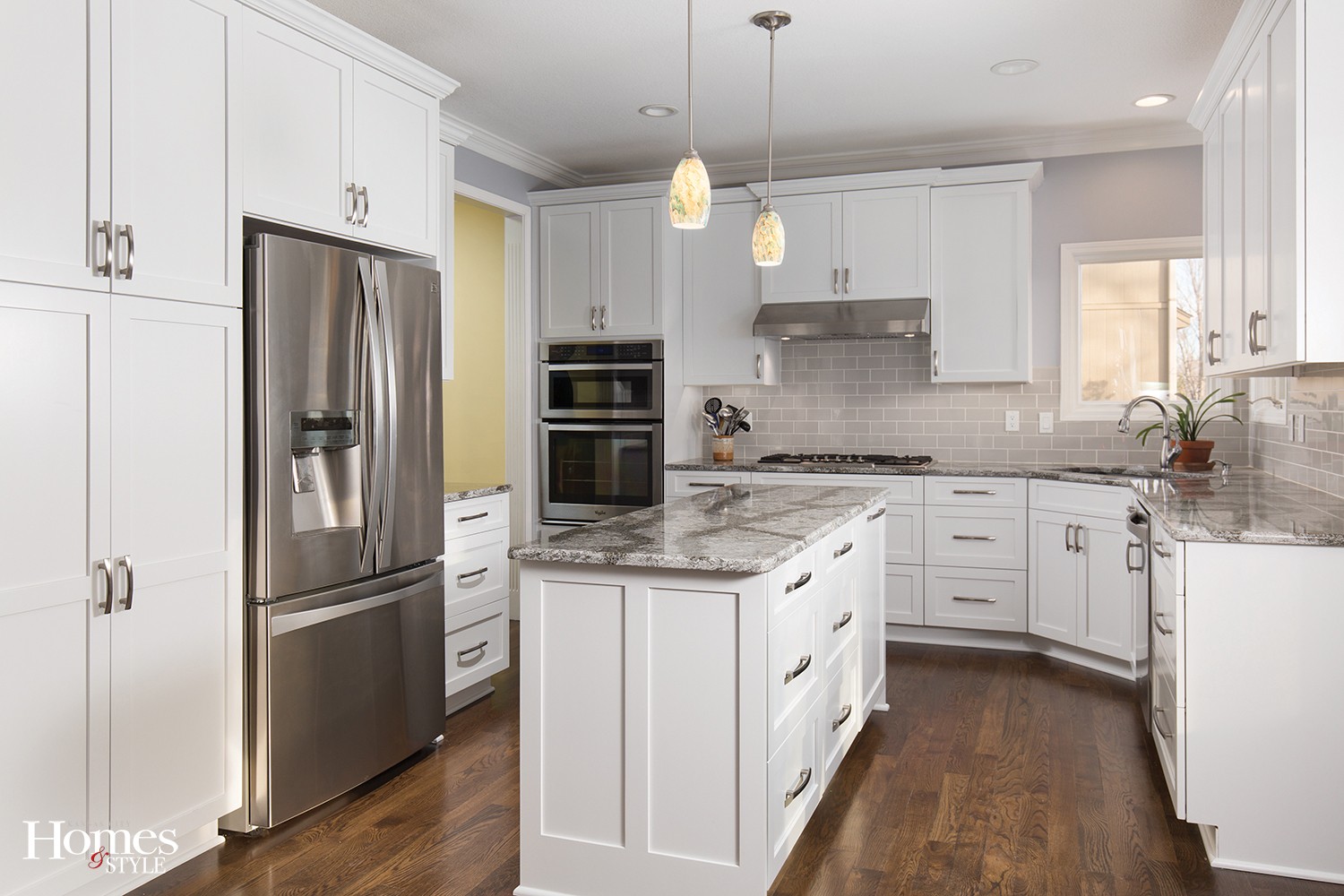
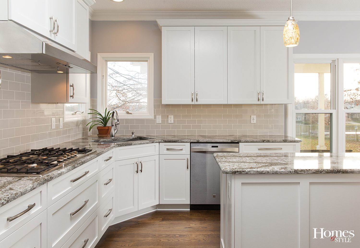
“We replaced the standard golden oak cabinets with shaker cabinets,” noted Hansel. “The crisp, clean look of the cabinetry provides a more modern and timeless style, along with the newly-installed crown moldings.” Brushed nickel hardware on all drawers and doors complete the classic look. It is certainly visually pleasing, but so much functionality is built into them.
“Because this is a small space, we focused on the cabinetry to provide optimum storage,” noted Hansel, referring to the drawer stacks that are all full-extension and soft close drawers, allowing for ample storage and ease of access.
One of the other highlights of the kitchen is the 36” gas cook top and double oven, one with convection capabilities.
When it comes to the fabulous center island, perfect for food preparation, there is more to it than initially meets the eye. The quartz countertop with its gray and white vein-like appearance adds an artistic appeal while its highly functional non-porous façade means it is impervious to stains and scratches. The stylish pendant light fixtures hanging directly above the island have a hint of blue in the actual globe for just a shimmer of color. The island also has additional storage space and a double-trash rollout.
Exquisite new hardwood white oak flooring replaced the former vinyl flooring, adding a new layer of detail without overwhelming the space. Further, the gray painted walls stand in perfect harmony with the Dorian Gray subway tile on the backsplash.
“It was a pleasure working with the clients on this project,” said Hansel. “They had a vision and we had the privilege of making that come to fruition for them. Seeing a client’s dream come true is what it is all about for us.”
Resources
Project Designer: Heartland Kitchen & Bath
Countertops: Cambria (color Galloway)
Cabinetry: Heartland Kitchen & Bath
Sink: Blanco
Faucet: Moen


