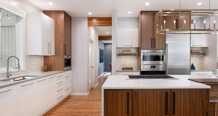
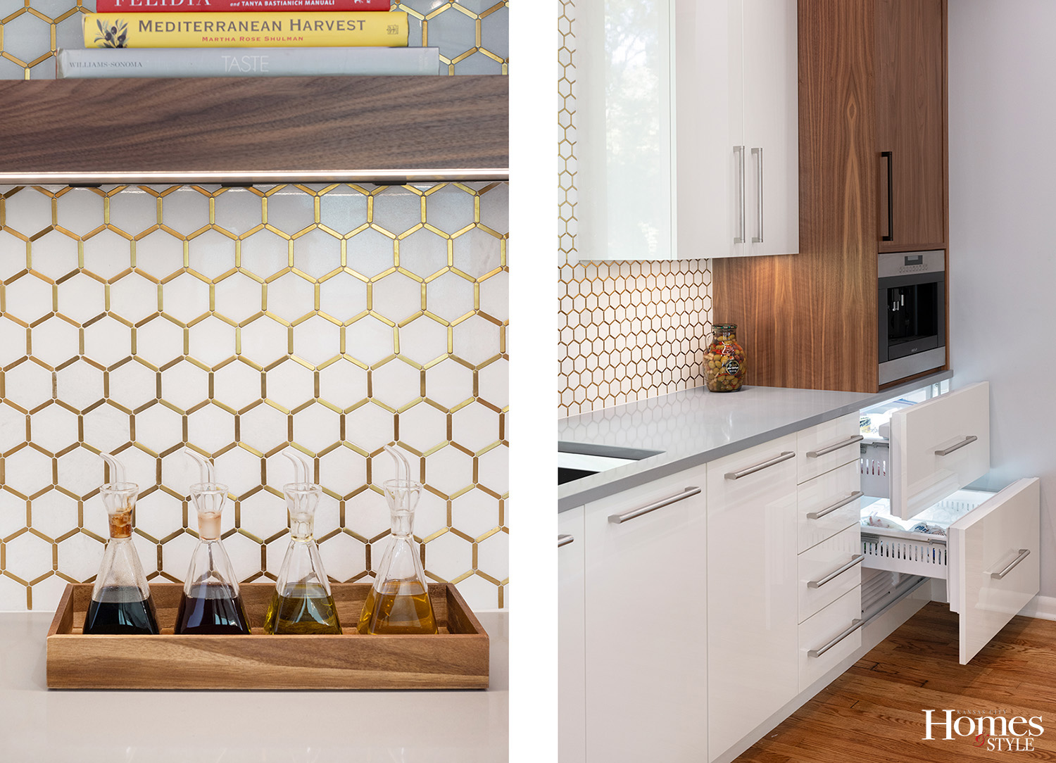
Keeping in alignment with the architecture of the home, this Northland kitchen remodel is top brass with its elegant new design.
Story by Ann Butenas | Photography by Matt Kocourek
It has been over three decades since the kitchen in this home has undergone a well-deserved remodel. When Sue Shinneman, CKD and owner/designer with Kitchen Studio: KC stepped in, however, this space got the breath of fresh air it needed in terms of style and function. Working in partnership with Heidi Harrison, CKBD, the pair stylishly transformed the previously dated kitchen into a functional and stylish work of art.
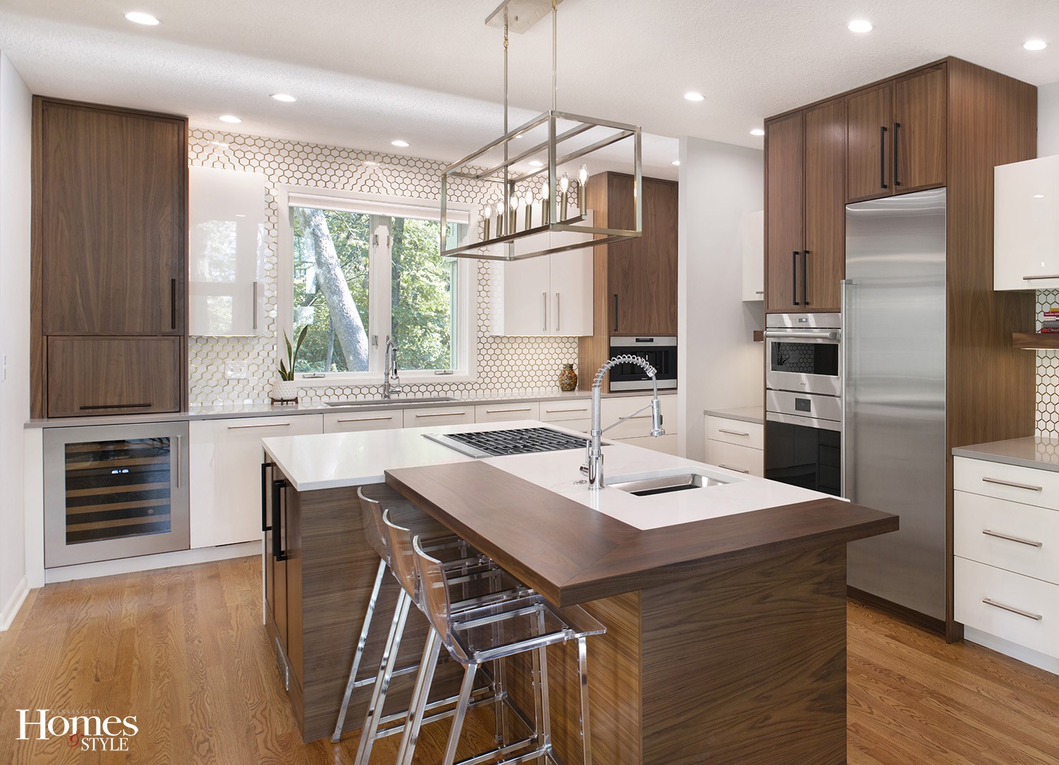
“We kept things in similar locations except the wall with the sink,” noted Shinneman. “That was previously in an L-shaped design, which made the space too tight between that area and the island. So, we took out the extension in that space.”
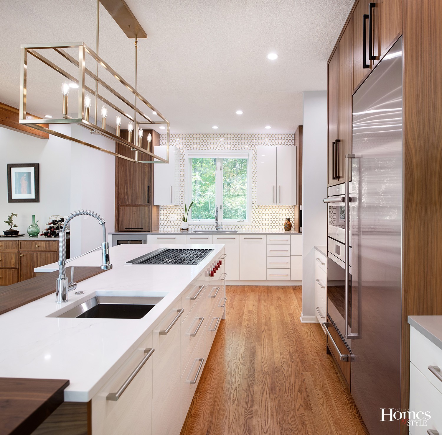
The new color palette associated with this design is brighter and warmer than the previous, builder-grade motif. Shinneman and Harrison incorporated high-gloss acrylic lacquer cabinets with natural walnut cabinets. The hexagonal backsplash tile illuminates the space with an eye-catching brass border around each tile piece. This creates a distinctive and beautiful layout when mixed in with the other colors in this kitchen.
“The brass gives it a lot of pop and really sets it off,” reflected Shinneman. “Plus, it picks up the brass light fixture above the island.”
Shinneman and Harrison opted for finishes in the kitchen that included a warm array of mixed metals. This translated to the stainless appliances, the brass elements, and the brushed nickel for the fixtures. The coordination of these finishes provides a nice and inviting visual aspect to the space.
Further, the designers added more length to the island and adorned it with a walnut bar top for the dining section as opposed to using one solid piece of stone for the entire island. The stone application in the island is a quartz Calcatta Sole. As a result, the island ties in well to the perimeter counters which enjoy quartz Shadow Grey countertops.
In addition to providing great style to the kitchen, the island also houses a second sink and deep drawers, ideal for storing pots and pans.
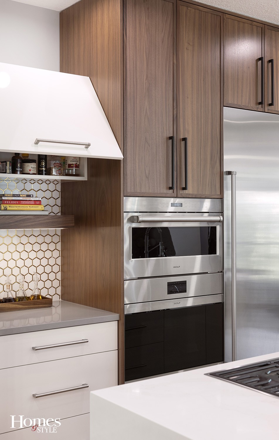
This kitchen is a chef’s dream, too, as Sub-Zero Wolf appliances populate the space.
“We installed a contemporary gas cook top with knobs on the front and not on the top,” noted Shinneman. “This allows the cooktop to sit flush in the stone.”
Additionally, there is a Wolf coffee machine to the right of the perimeter sink. The two drawers beneath that area include Sub-Zero freezers. This design element then allowed for a 30” tall refrigerator to stand next to the oven and microwave.
“The owners do not use a lot of freezer space and wanted more refrigerator space instead,” explained Shinneman. “This allows the refrigerator to become more of a statement piece without the freezer component to it.”
Another great use of space and design innovation include the lift-up doors to the left and right of the oven and microwave.
“These are handy to use while cooking, as you can just lift them up and get in and out while working,” said Shinneman. “This also keeps an open door from being right in your face.”
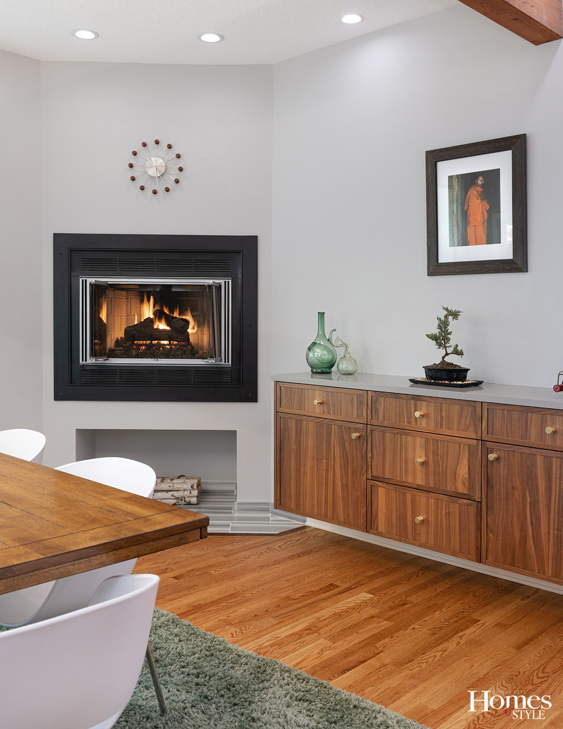
Shinneman and Harrison also streamlined their design ideas into the adjoining living space that has a floating walnut credenza by the fireplace.
“This is a great place to store napkins, candleholders, service pieces and more,” stated Shinneman. “It’s a beautiful furniture piece that ties back to the kitchen finishes.”
Overall, the brass accents standing in contrast to the primarily white color scheme offer an elegant and timeless appeal to this kitchen.

