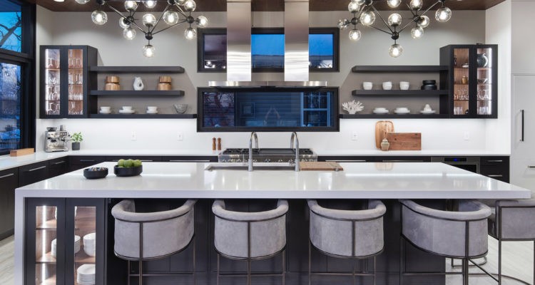
What sets this Lake Lotawana kitchen apart from the ordinary can be found in the details.
Story by Ann Butenas | Photography by Matt Kocourek
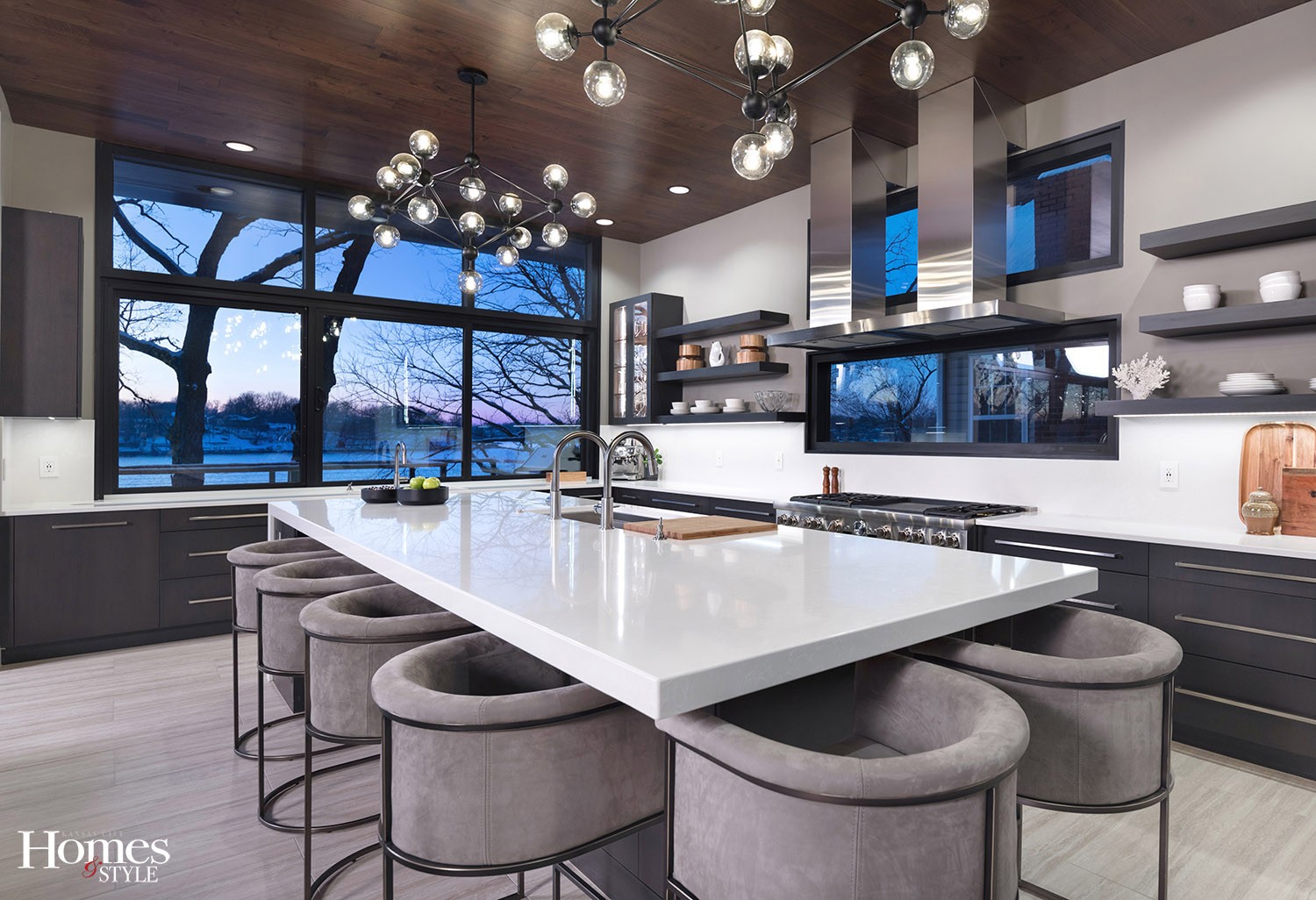
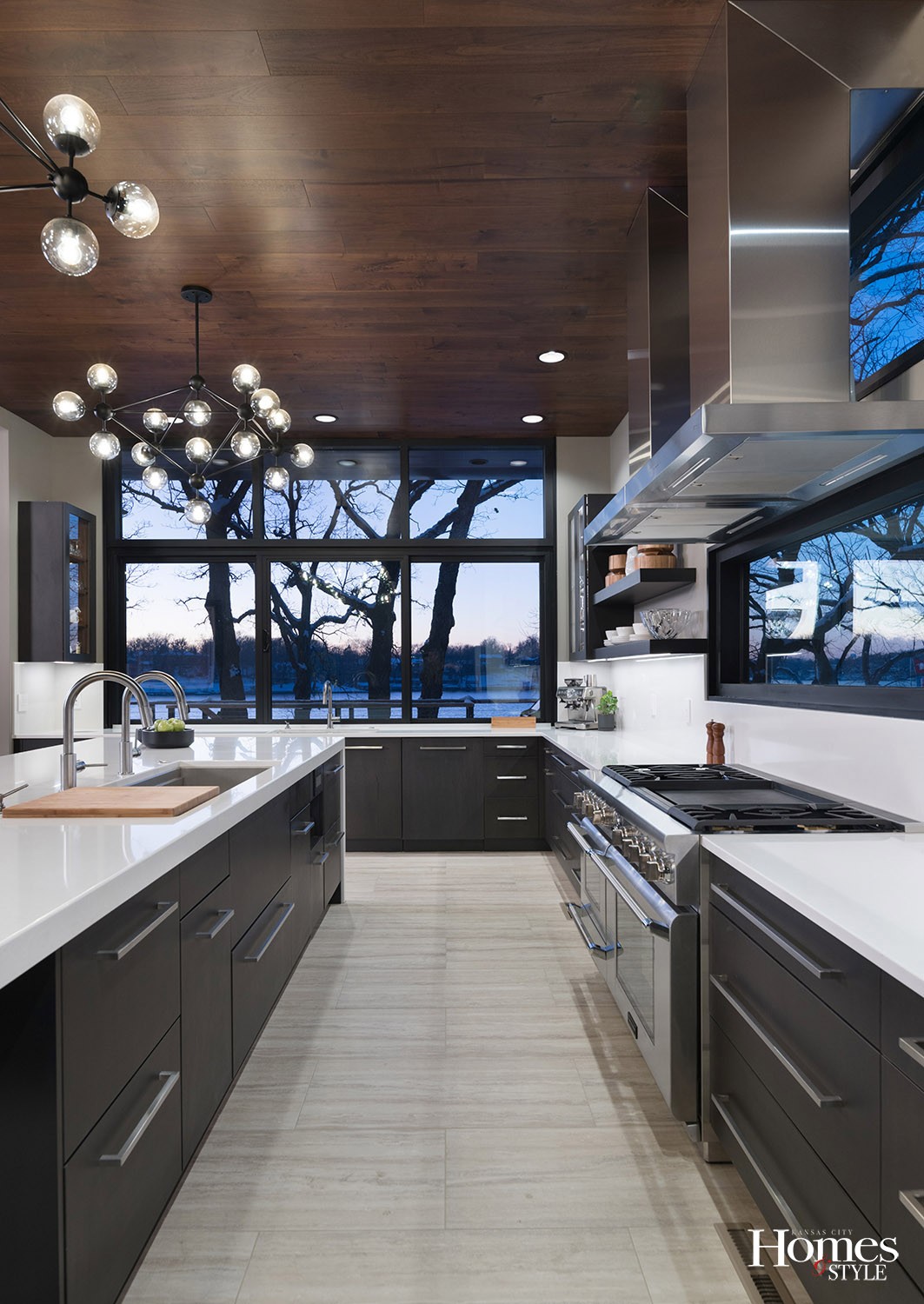
When contemplating a new kitchen, it is important to keep in mind traffic flow, storage, functionality and, of course, aesthetics. This complete kitchen makeover creates a durable and useable environment while also giving an appreciable nod to the exquisite design elements that promote its overall appeal and inviting ambiance. As part of a larger tear-down and rebuild project, the homeowner, Beth Nill, approached Lisa Otterness, CKD of Classic Kitchens Design Studio, with a sketch of how she wanted the space to look and function, with an emphasis on framing the amazing lake views.
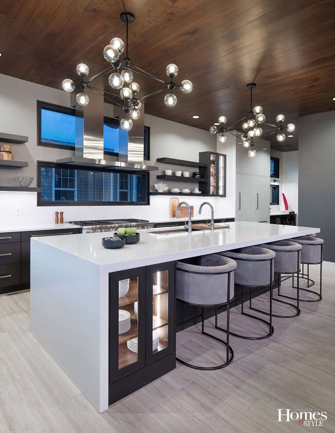
“She came to us with larger brush strokes in place in terms of layout and the general feel of the space,” noted Otterness. “I then came up with some refinements, such as the spilt windows above the range and the two separate vent hoods, which float away from the wall and from the windows.”
Using 3-D design tools, Otterness and the client were able to gain a clearer visualization of how to lay out the space as well as address any potential issues prior to construction, creating a smoother, easier and more efficient overall process. Creating a kitchen of this magnitude for a family who loves to entertain was no easy task, yet it was approached with an abundance of creativity and ingenuity.
“This is absolutely an entertainer’s kitchen,” noted Otterness.
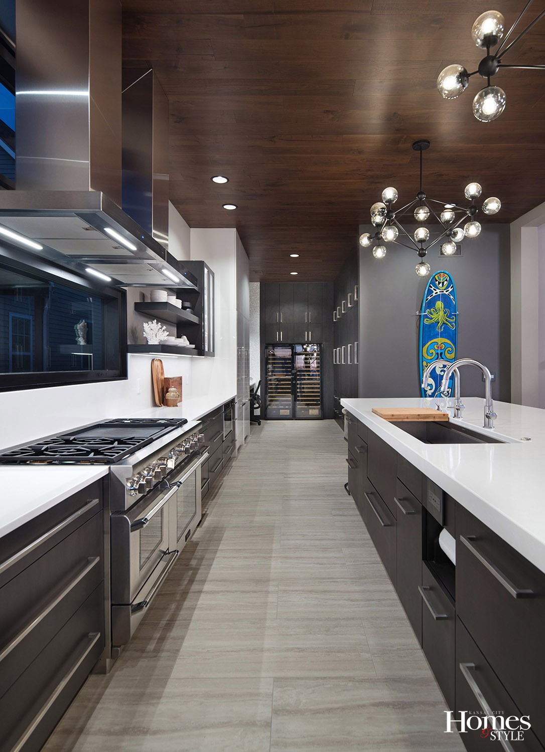
A beautiful play of sheen abounds throughout the kitchen. Otterness installed custom kitchen cabinets with a matte twilight finish in conjunction with a white high-gloss lacquered finish on the refrigerator.
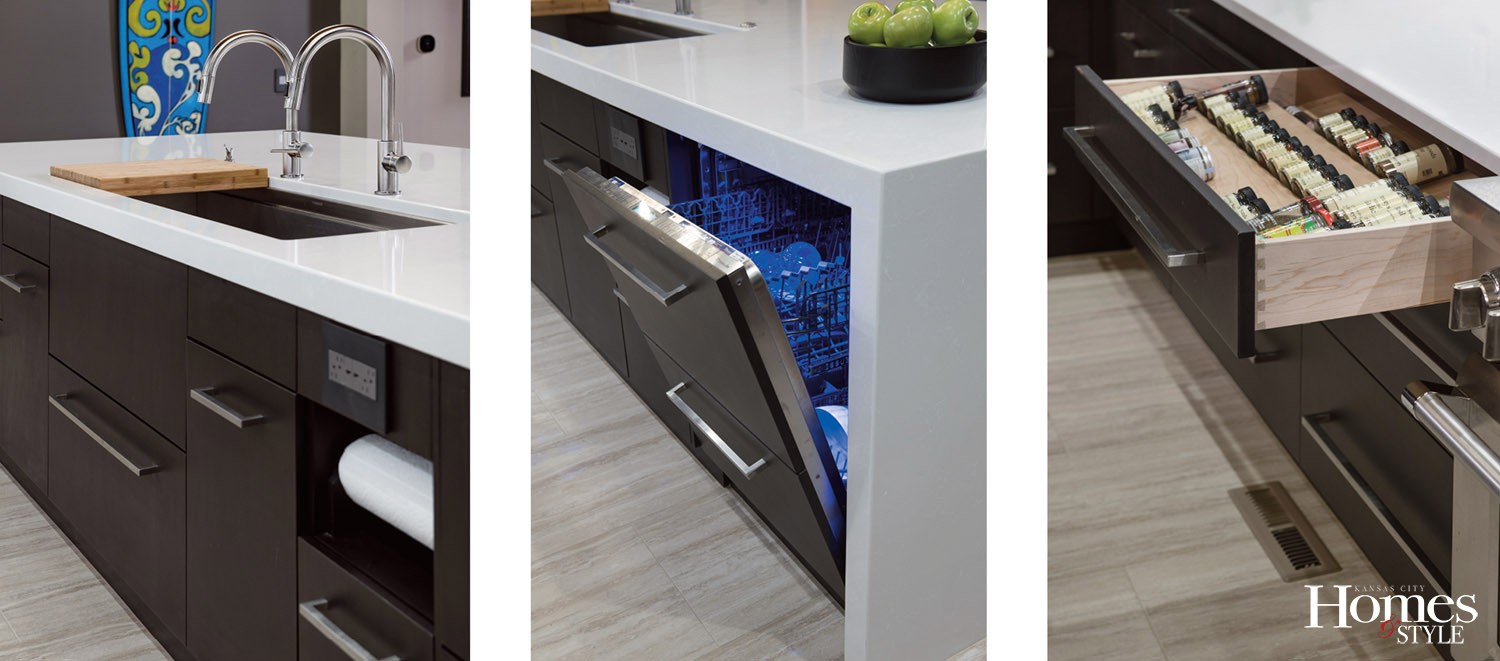
“There are two, 36-inch refrigerators side-by-side, creating ample storage when getting to the grocery store is not always convenient,” she noted. Other appliances include a Thermador dual fuel range and two built-in dishwashers – one by each sink and both covered by cabinet doors.
Two Galley Workstation sinks – one three-foot on the perimeter and one five-foot on the island – provide cutting boards and drain boards that slide across. The Perla white quartz countertops offer the perfect contrast to the darker colors in the kitchen. The countertop on the island is two-and-a-half inches thick, and the same countertops are used as a full height backsplash, which runs seamlessly up the wall. Floating shelves provide a unique aesthetic.
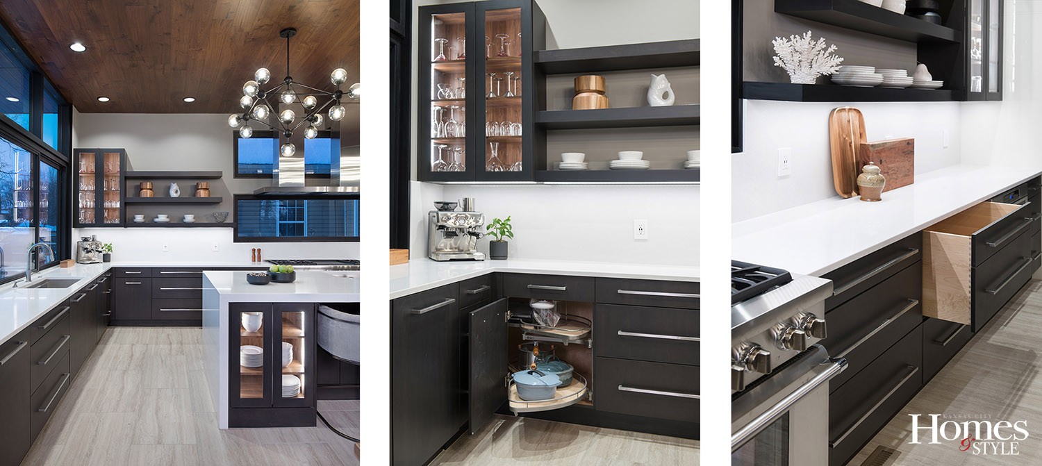
“We used special brackets on these shelves that also involved steel plates and steel rods. The wood fits over those like a sleeve,” stated Otterness, further empathizing the shelves are 60 to 68 inches long. The bottom shelf also has built-in LED lights underneath.
The client wanted a countertop waste disposal – a commercial application, actually – into one of the countertops underneath which rests an industrial trash can.
“This allows for easy clean up and is where guests can put their trash,” stated Otterness. “There is another trash can located in the island.”
Other surprising details include an angled spice drawer so all of the spices can be readily seen. There is another drawer that appears to be two drawers but is one full height drawer. Additionally, there is a blind corner cabinet that pulls out and provides storage for pots and pans.
Adorning the celling is tile that looks like hardwood. The nearly 11-foot ceiling required more commanding light fixtures. As such, two chandeliers now dance above the island.
“We saw these first in 3-D so we could scale them to size,” explained Otterness. “Instead of using three smaller ones, we decided two bigger ones would work instead.”
Storage space will never be an issue in this kitchen. Otterness integrated multiple cabinets throughout the area, with an expansive unit adjacent to the two wine refrigerators on the far end. The storage unit has maple doors with a matte twilight finish and a translucent stain, allowing the grain to maintain a subtle presence. The interior of the wall cabinets are lined with walnut, as are the glass-paned ones in the island and on the perimeter wall. There is also a built-in desk area opposite the storage area, gently tucked away yet still operating as a confident command center with a fabulous view.
“I am proud of our installer, Paul Short,” expressed Otterness. “He makes the design look its best, and his attention to detail allows me to do the additional detail work I want to do. This is full-on contemporary design here, so there is no room to hide. Everything is clean and crisp. All elements need to meet perfectly, panel to panel.”
Otterness expressed appreciation for her client, as well, whom she indicated was very inventive and passionate about the design.
“There was a lot of planning involved with this project,” stated Otterness. “We looked at what was going into every cabinet, and we put that on the elevations of the drawing. This eliminates guess work and lets the client think about how she will use the space.”
Otterness referred to the overall design as a zonal kitchen, where the steps needed to take from one area to another is taken into consideration. In other words, efficiency is at the heart of the design.
As another fun element, the client hung a surfboard near the kitchen as a reminder of their holidays in Hawaii.
“The family spends part of the year in Hawaii, and this is a piece of art from a Hawaiian artist. This represents a great hallmark of contemporary design wherein most elements are peaceful in presentation and then suddenly you are offered a “pop” of fun.”
Resources
- Kitchen Design: Classic Kitchens Design Studio – Lisa Otterness, CKD
- Cabinetry: Wood-Mode
- Countertops: MSI Perla White
- Floating Shelf Brackets: Gieske
- Sink: The Galley Workstation 3’ and 5’
- Appliances: Ferguson Bath, Kitchen & Lighting Gallery

