A Kansas City homeowner and a dream team of architects, builders, designers, and craftsmen take a Brookside renovation above and beyond their greatest expectations.
Story by Jeanne de Lathouder | Photography by Bob Greenspan
As with any collaborative project, each one takes on a life of its own. But when a team really clicks, it creates a kind of magical momentum like no other. Undoubtedly this was the case for an extraordinary Brookside restoration that exceeded the expectations of everyone involved. Built in 1913 by James Guthrie, a Kansas City judge who relocated from Kentucky with his wife and young daughter, the home included a lower level that was originally a carriage house — complete with coal-burning stoves — used to store horse-drawn carriages. The horses were once turned loose in the linear park adjacent to Brookside Boulevard.
After purchasing this historic Oak Street property in June of 2015, homeowner Dan Lumma and his family moved into their rustic stone house and began settling in. The previous owners had started a renovation, but with an unexpected job change during the project, some things were left unfinished.
“After living here a few years, we decided we loved the feel of the house and the beautiful and developing South Plaza art district area,” says Dan. “I decided to finish restoring the rest of the space, and began working with Kansas City architect Rick McDermott, owner of RDM Architecture, in March 2017. Rick walked us through every stage of the conceptual design development process, and none of us could have really imagined in those early meetings what we would finally end up with,” he recalls.
An impressive endeavor, the project included restoring the lower level walkout — formerly the old carriage house — renovating the original wooden porch with stone-edge porcelain tile, installing a new ceiling and coffers to accommodate ceiling fans and lights, and adding steel railings for both the porch and a martini deck.
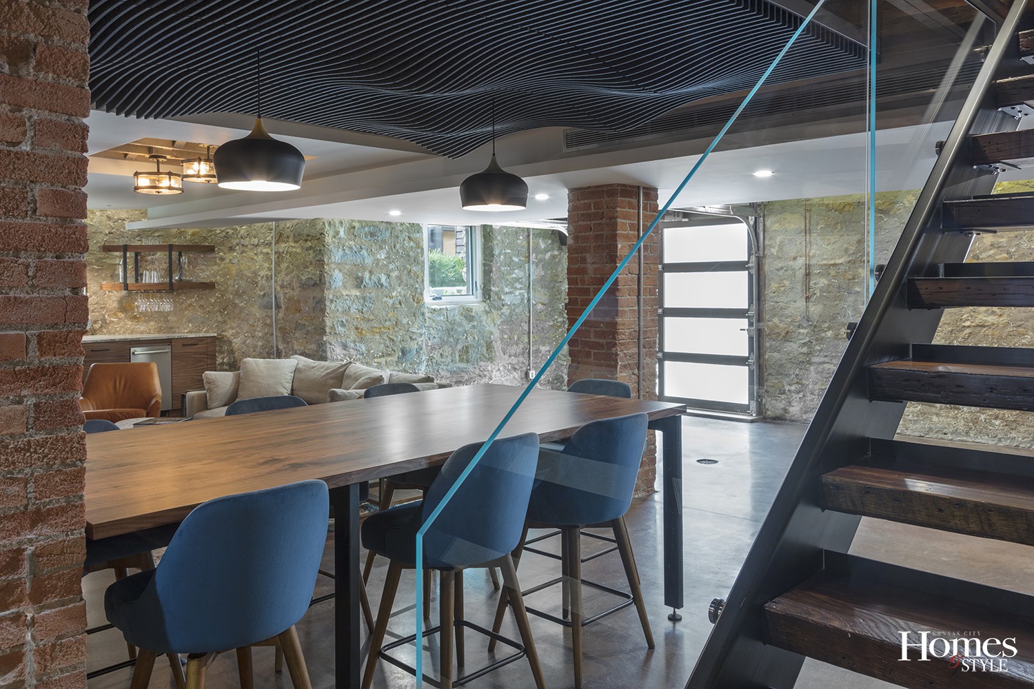
“What Dan really wanted to do was preserve the history of this property and make the new space more connected to the existing house,” says Rick. “What we aspired to do was to make it more welcoming — so it really flows — by opening up the stairs with open risers, glass railings, and lighting to enhance the space and make it more inviting. We couldn’t have asked for a better client. Dan has great energy, enthusiasm, and was open to ideas. He is well organized, thoughtful, a good listener, and has a true appreciation for craft quality and creativity,” he notes.
After nailing down a conceptual design, the team invited Ian Hurst of Hurst Construction to come out and take a look at the project to give them an indicative estimate and schedule. At that time, the plan included lowering the floor by 8 to 12 inches, sandblasting the foundation walls down to the original stone, and rewiring, re-plumbing, and replacing more than 100 years of existing and abandoned utilities — all while the family would still be living in the home during a year of construction.
“When Ian first saw the space and looked at the conceptual design, his face literally turned white given how ambitious the project was,” laughs Dan. “Through some really innovative and creative design, construction planning, and teamwork, we ultimately developed a schedule and budget that were all achieved to perfection,” he says.
The team started with the porch and martini deck renovation in July 2017. The remainder of the project, which included fully finishing the lower level, implementing all new HVAC and utilities, and an additional room off the garage, was finally completed in the fall of 2018.
“When we started, the existing space was a hodgepodge of wires, ductwork, and structure with cracked concrete floors,” recalls lead designer and project manager Matthew Lero of RDM Architecture. “Once the ceiling plane was cleaned up, the existing floor was removed, lowered, and leveled. The style of the existing house and the style and finishes in the rest of the house informed the design of the lower level. Additionally, from the outset, knowing that we were going to expose the stone and brick guided the choice of new materials and finishes,” he adds.
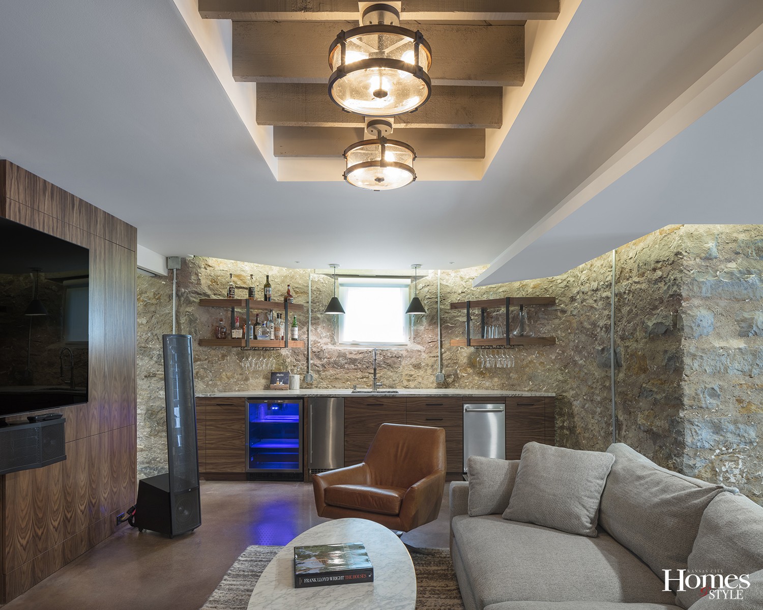
“I really wanted the space to have plenty of headroom, so we lowered the floor, which required the removal of 20 truckloads of concrete and dirt carried out by wheelbarrow,” says Dan. “I wanted to highlight the existing stone walls and brick structures — including pillars and flue structures — so we sandblasted those to expose the original beauty of the masonry,” he notes.
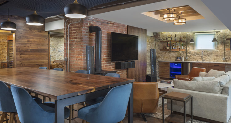
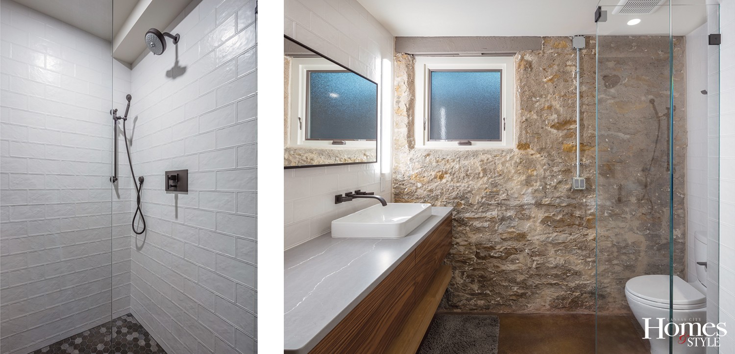
The lower level now includes two bedrooms, a full bathroom, a wine and cigar room, a movie room, a bar area, and an open living area. The original renovation style of the home is Mid-century modern, so the new furnishings were selected with that aesthetic in mind. A color palette of cool neutral shades including blue, sage, and gray complements the original rustic stone foundation walls, exposed brick, and the rich patina of walnut woodwork. The homeowners worked with Houston interior designer Katie Rezabek, who collaborated with RDM Architecture and was an essential part of the team.
“This was truly a collaborative process with a rockstar client, contractor, interior designer, and all of our craftsmen,” says Rick. “For a dramatic transformation of this magnitude, it takes everyone being on board to create something this special. Fitting a project like this into an existing space filled with plumbing and ductwork takes a great deal of creative problem solving and that is always a rewarding process,” he adds.
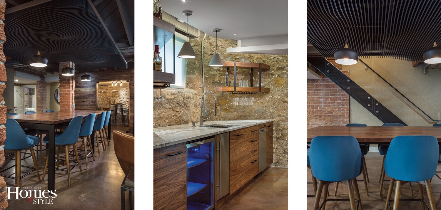
Filled with unique custom features and finishes, the space exudes a warm and eclectic contemporary feel that blends seamlessly with the existing Mid-century modern elements. Clear finished walnut, glass, and both blackened- and stainless-steel pair perfectly with sandblasted stone and brick as well as stained polished concrete. A custom steel stair structure and table base was handcrafted by Pascal Meya of Meya Metalworks, and custom walnut cabinets were made by Bootlace Design Build. Egress windows were added for the new bedrooms, and a mason disassembled the opening and relocated the existing sill. Concealed LED strip lighting was used throughout the space and is both dimmable in the main space and the bedrooms.
“Our guiding principles were to maximize the beauty and character of the original classic structure,” says Dan. “The entire team really focused on maintaining the design style and feel of the rest of the home and ensuring smooth transitions between the spaces. The new renovation is absolutely beautiful and has ended up being even more functional than we ever imagined,” he adds.
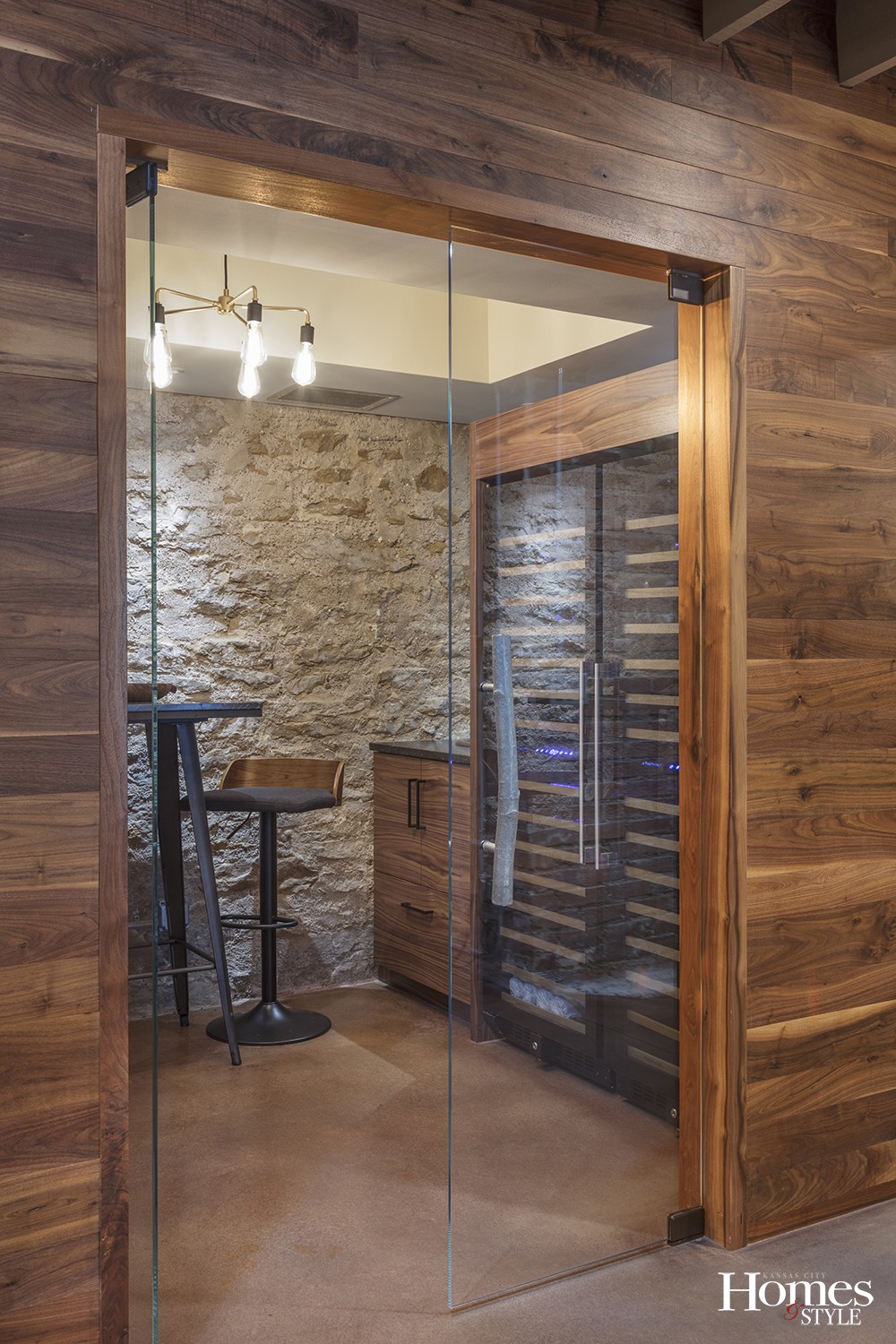
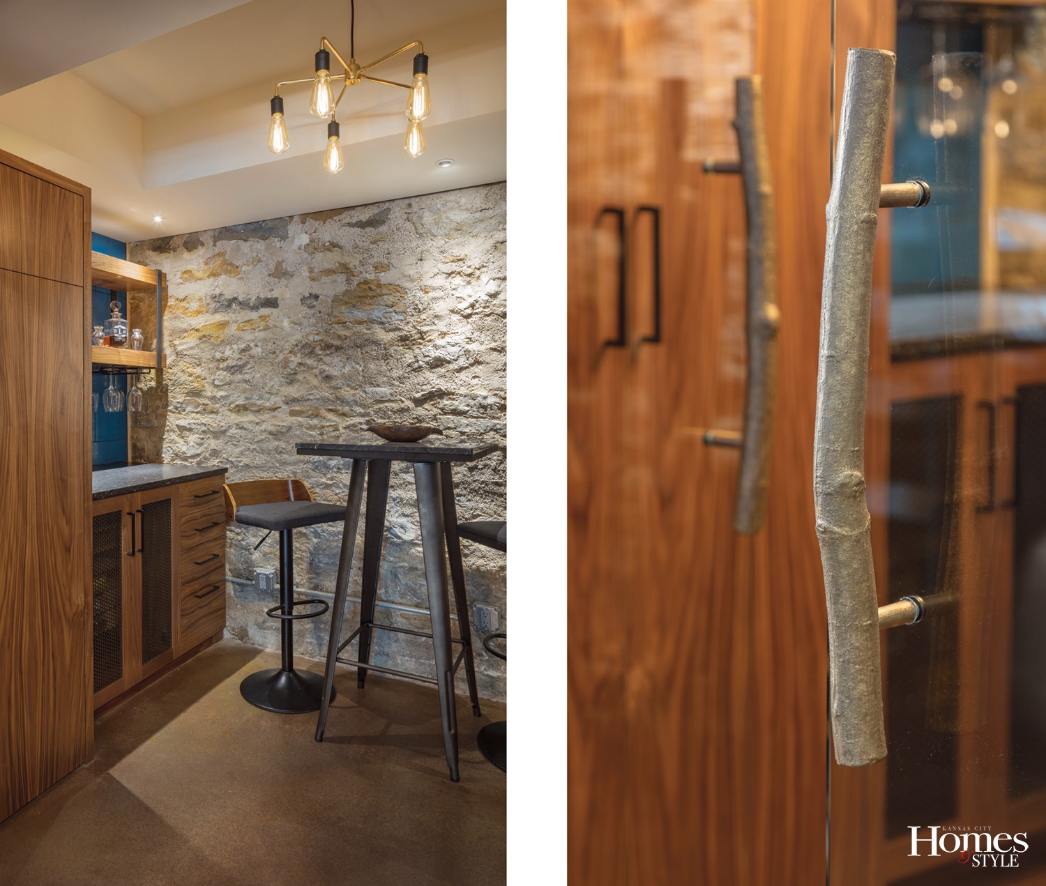
Other standout features that made this restoration truly exceptional include the 3-inch-thick stair treads leading from the main level to the lower level that are made of reclaimed hardwood from a centuries-old burned warehouse in Kansas and sourced from Elmwood Reclaimed Timber. The lower level includes a garage door originally used for the carriage house that leads to a pool and patio in the private tree-lined back yard. The original flue for the fireplace was re-surfaced and a wood-burning stove included along with the existing upstairs fireplace. Sustainably harvested walnut shiplap siding, also salvaged from Elmwood Reclaimed Timber, accents the wine and cigar room, which also features a ventilation system that exhausts smoke efficiently leaving zero residual smoke, even with multiple cigar smokers. The handles for the glass doors leading to the wine and cigar room were custom made by Martin Foundry and are actually brass castings of two oak branches cut from a tree in Dan’s yard. Sliding wood barn doors close off the movie room for privacy, and a charcoal gray felted PET architectural ceiling panel made from recycled milk jugs from Turf Design creates a stunning artistic design element over a custom walnut table positioned near the living area. An eye-catching conversation piece, the acoustical ceiling provides a noticeably quieter space around the table.
“We enjoy the very cozy feel of the space, as well as the modern yet classic design style,” says Dan. “It is fantastic for entertaining — with the lower level garage door open leading to the pool and plenty of open entertaining space in the living area. Kids can also be watching a movie in the movie room and not be disturbed by others in the open living area,” he adds.
“Dan truly cared about making this renovation as great as it could be,” says Rick. “This team was just incredible to work with, and there was amazing design integrity, surprise, wonder, and joy throughout this entire project,” he adds. “The outcome went above and beyond what we could have ever imagined — it was magic.”
Resources
Architect: RDM Architecture
Interior Designer: Katie Rezabek
General Contractor: Hurst Construction
Cabinet / Casework: Bootlace Design Build
Metalwork: Meya Metalworks
Reclaimed Wood: Elmwood Reclaimed Timber
Felt Ceiling: Turf Design – Swell Ceiling

