Even though it encompasses a small footprint, this kitchen’s use of creativity is expansive.
Story by Ann Butenas | Photography by Matt Kocourek
Looking around this veritable masterpiece of a kitchen, it is a challenge to focus on just one single element that truly makes a statement. After all, the beauty of this space is nearly beyond description. This kitchen has it all: style, elegance, personality and total functionality.
“This is a ranch home built in the 1970s, and the kitchen design was part of a whole house remodel,” noted Lisa Otterness, CKD and Lead Designer with Classic Kitchens Design Studio. “When I came on to the project, the kitchen was a blank slate, as the original one had already been torn out. We then worked with the homeowner to reconfigure the kitchen and dining area.”
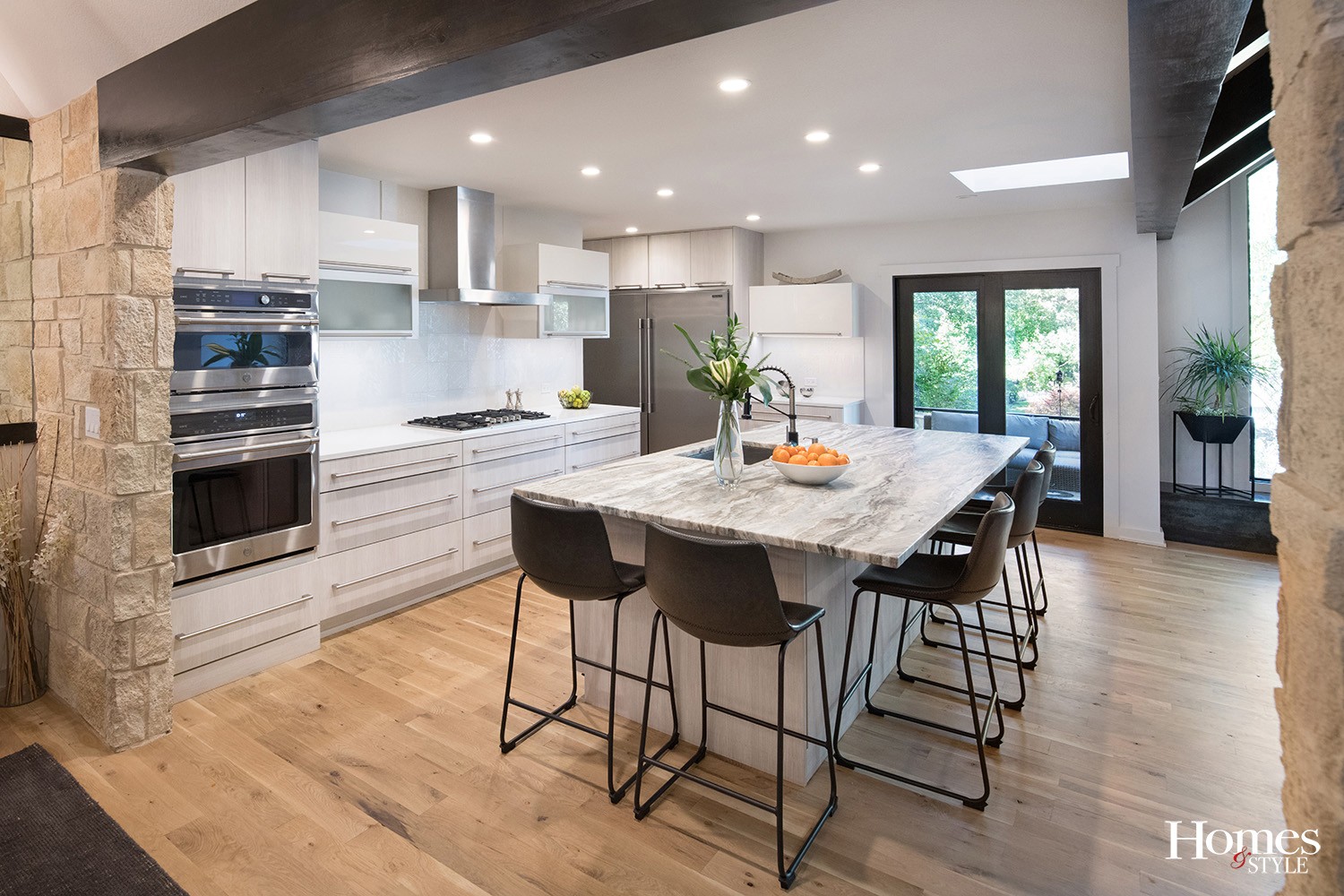
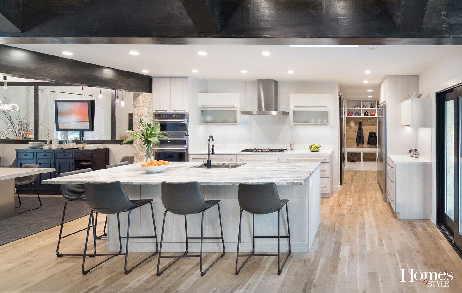
Otterness and her team opened up the area with layers of interesting textures and materials. The accompanying beam work above indicates where walls once existed but were removed to create a much grander presence.
“There was a wall between the dining room and the kitchen and a wall between the living room and the kitchen, both of which were removed,” said Otterness.
Since the homeowner works with one of the suppliers, she was able to bring in elements to incorporate into the design. One of those was the stone wall, which adds a welcoming ambiance to the space.
“We had to make accommodations around the oven to incorporate it,” explained Otterness of the veneer stone wall.
The homeowner brought the European aesthetic of her roots to this design.
“She had a vision for what she wanted, which included refined details and good functionality,” stated Otterness.
All new appliances were brought into the kitchen remodel, but not without a bit of a challenge.
“It is tricky adding built-in appliances to a space, as the manufacturers specifications aren’t always clear. One of these appliances was a bit bigger than the specs indicated, but we were able to be responsive to that and fix it. That is our job as designers,” emphasized Otterness.
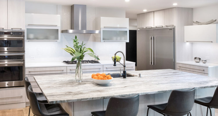
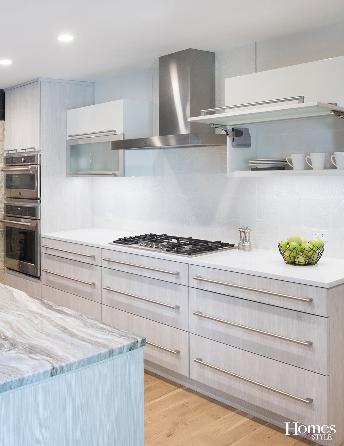
The high-gloss wall cabinets work well in conjunction with the surrounding textured laminate cabinets. The quartzite countertops on the island and along the perimeter complement the stainless steel linear pulls throughout, adding a sophisticated touch to the space. The uniquely-designed backsplash adds textural interest. The grain on the island and on all the base and tall cabinets is an Italian laminate.
“The backsplash texture is subtle, not something you would notice from a distance, and it is very easy to clean,” stated Otterness.
Storage was of great priority in this design, so Otterness made sure it could be found in abundance. Not only does the perimeter of the kitchen allow for ample storage, but the island plays a vital role in doing the same. In addition to the dishwasher, the island offers full size doors that open up to 13-inch deep storage spaces with shelves. A trash can pull-out is located just under the sink.
“In every place we could, we put in drawers,” noted Otterness, who also indicated a walk-in pantry stands behind the range wall. “During the planning stage, we made detailed notes and labeled the cabinets for specific needs to cover our bases and ensure we had the space for what the client needed.”
A door leading to the open air patio from the kitchen expands the use of the space and invites the homeowner to enjoy some al fresco dining on nice days.
“This kitchen is a very thoughtful remodel,” expressed Otterness. “It doesn’t feel jarring and this is one design where everything just meshes really well. The existing architecture was modern enough to support this design.”
Resources
- Kitchen Design: Classic Kitchens Design Studio – Lisa Otterness, CKD
- Contractor: Noblit Didier Design + Build
- Cabinets: Wood-Mode
- Counterops: Rock Tops
- Stone Veneer: Canyon Stone
- Tile: The Tile Shop


