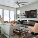
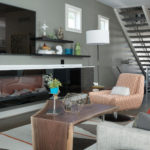
This West Plaza home, with a healthy balance of mid-century influences, will first catch your eye at the curb and when you cross its initial threshold, it will undoubtedly capture your heart.
Story by Ann Butenas | Photos by Matt Kocourek
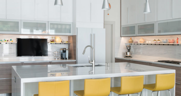
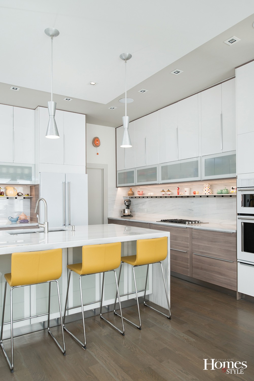
If ever the proverbial “wow” factor was written all over a home, this one has it. Just a quick glance at all of the amazing interior photos not only provides a warm embrace upon all of your senses, it makes you realize that so many layers of personality and charm can comfortably decorate and add just the right amount of fun and whimsy while still giving a strong nod to character and integrity. Although this is a new home, these walls can definitely talk and they have so many stories to tell.
Designed by NSPJ Architects, this 2,900 square foot home located in the West Plaza area boasts two complete living levels in addition to a basement and a rooftop gathering spot that could easily be the talk of the neighborhood.
“It was interesting to see this go from just a foundation and garage slab when we first bought it to what it is today,” said the owner. “The former home was torn down and we worked from a clean slate.”
After construction was completed, the owners moved in two months ago and enthusiastically put their fingerprints all over the place with some of the most imaginative ideas in terms of design, artwork, accessories and style.
“This is a departure from anything we’ve had before,” noted the homeowners, who previously lived in a ranch-style home with a pool and large yard near Meyer Circle. “This time around I wanted something that was low maintenance and more energy efficient.”
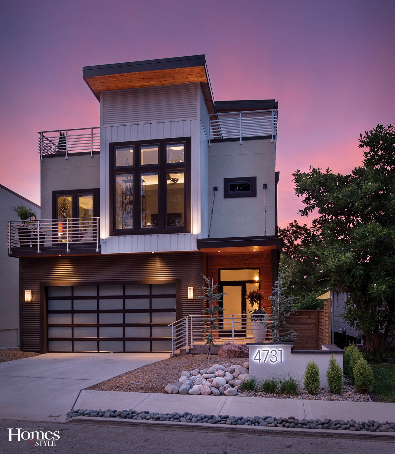
This modern home, with a healthy balance of mid-century influences, will first catch your eye at the curb and when you cross its initial threshold, it will undoubtedly capture your heart. Of course, the owner jokingly refers to the front yard as “postage stamp size,” but that is just fine with him, as it trends with his desire for a low maintenance abode. The remaining perimeter of the yard enjoys casual and comfortable landscaping of minimal impact but still of great personality. The Missouri exterior siding of the home does its job by offering a warm and modern look.
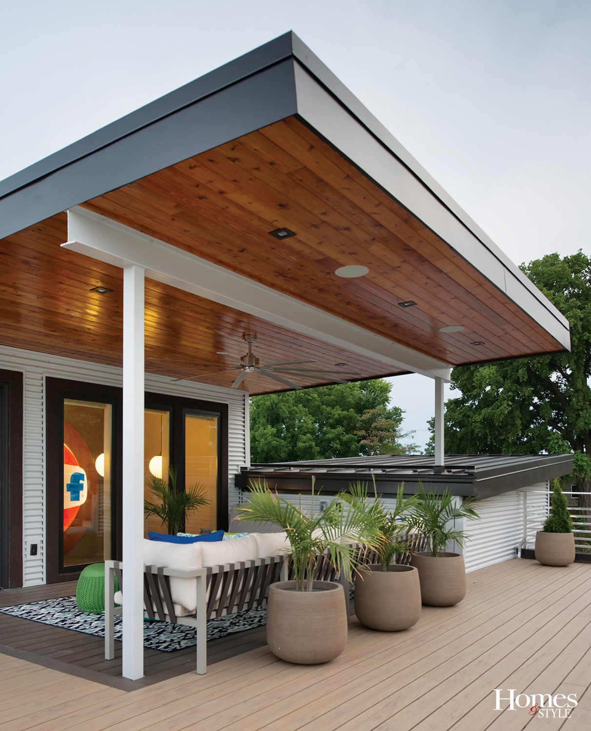
“The wood lends texture, color and warmth under the eaves of the roof,” stated the owners. Other materials include stucco and two kinds of metal – brown corrugated metal on the lower part and white metal on top.
Besides the home itself, the owners are thrilled with living in an area of town that is growing in a sort of Renaissance style, close to the Plaza and Westwood Park, which is the perfect spot to walk their two Boston Terriers, Noodles and Maiya.
The journey to get to this point, however, did require a roll-up-your-sleeves mentality as forces came together to complete the look, and, invariably, the couple did encounter a few differences of opinion, but it is their own unique tastes that seem to work so compatibly together.
“Our prior home was not truly a reflection of the two of us,” expressed the owners. “And when we sold that home, we not only sold the house, but also most of the furnishings to the buyer. We basically just took with us our personal effects and certain pieces of artwork.”
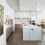
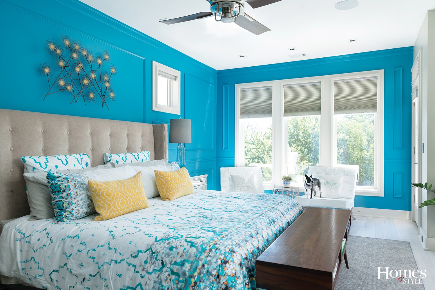
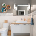
Yes…a clean slate…from top to bottom, and what a perfect platform from which to create a space that blends the couple’s tastes, and it is interesting to move about the home and begin to understand which eye and style had a hand in the shaping of each room. With three bedrooms (one of which doubles as the office), two and one half bathrooms, all floors are either tiled or hardwood, except for the master bedroom, which has distressed and washed bamboo flooring and warm accent tones throughout of grey and French blue.
“My taste tends towards excess,” noted the homeowner. “I tend to think about all of the details, whereas my partner excels at editing me and pulling me back when needed. It was definitely a fun process, but not without its frustrations on occasion.”
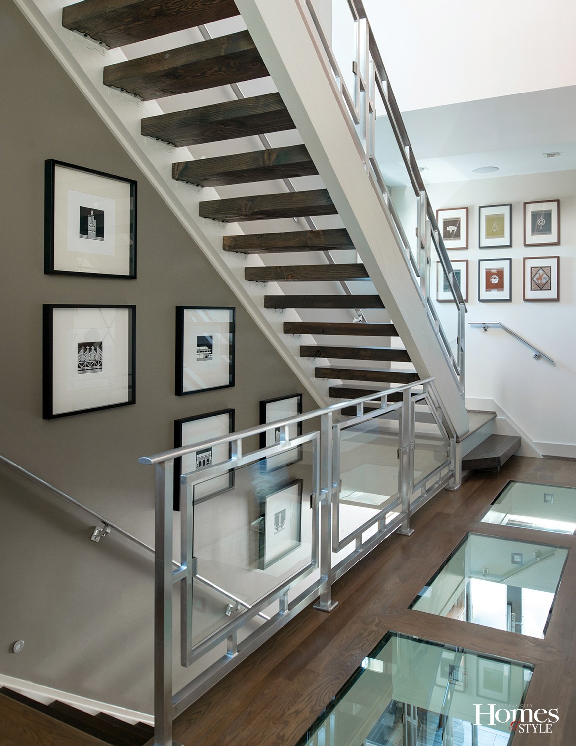
Among the many focal points of the home include the three inset glass floor panels made of half-inch tempered safety glass in the upper hallway. Not only do they provide that initial jaw-dropping expression, they also turn up the volume on functionality.
“This is a long, narrow home that can get dark in the middle,” explained the homeowner. “These panels serve to harvest the light from the penthouse level and bring it down to the lower level.” Additionally, the panels have accent lights beneath them to enhance the area once the sun goes down.
So….do you actually walk across them?
“While we have obviously gotten used to them, it is interesting to note that when guests come over, they initially tend to walk around the glass,” laughed the owner.
The see-through staircase is made of aluminum and glass in a mid-century pattern.
“I left the aluminum raw, as I like the distressed nature it gives,” said the owner.
Most of the artwork within the home is locally sourced and Kansas City inspired.
“That was very important to us,” noted the homeowners. “We have many beautiful things in Kansas City that need to be celebrated.”
Among the many personal touches that you most likely won’t see in any other home are the pieces of both owners’ past that still have a heartbeat today.
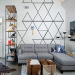
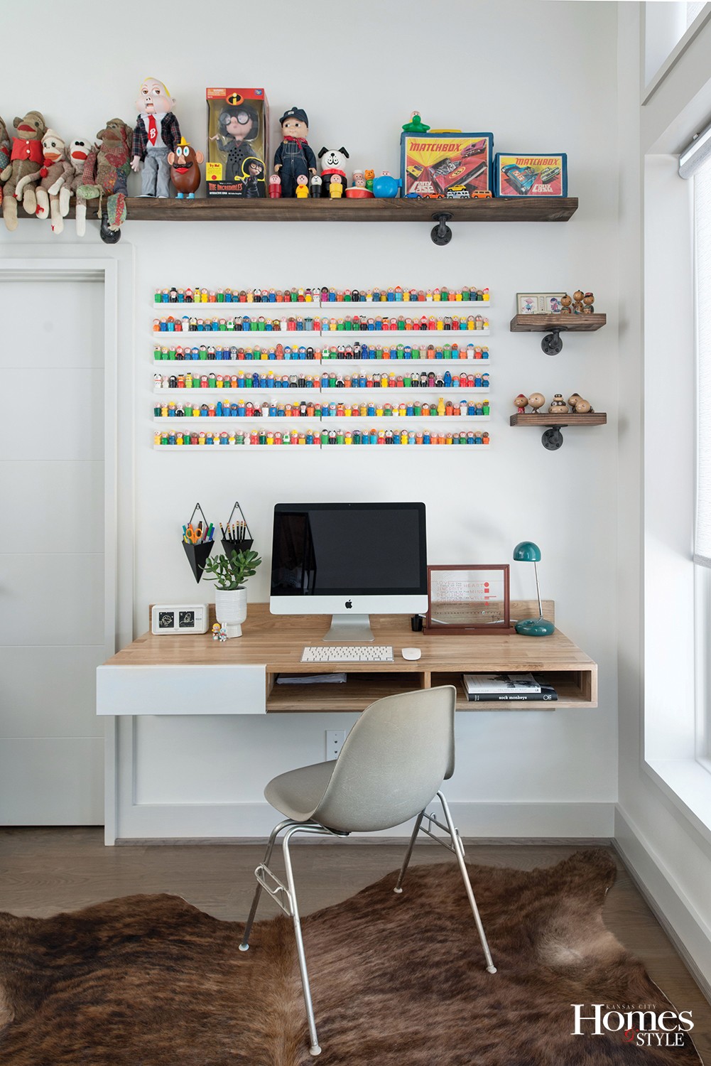
For example, the mid-century collection of salt and pepper shakers, once put away in boxes because of lack of space in which to display them, now enjoy their new home in the dining area. Moving into the office, there is a grand collection of toys, from sock monkeys made by an aunt and mom many years ago to a seemingly endless collection of little people that line the shelves. From a distance, they bring a pop of color to the space, and when viewed up close, you eventually realize that they are cleverly placed and displayed toys from days gone by. An old drum made by one of the owners when he was in Boy Scouts holds its own on a side table and the triangular wall mural gives the room added character.
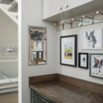
Other fun touches include the highboy cabinet with eclectic mid-century lines in the entry way accented by a collection of circle mirrors above; a KCP&L historic tower tile mural with an actual blinking red beacon light at the top made by the owner; and the pièce de résistance – the “can’t miss” Gulf sign that adorns the wall going up the stairs.
“I had a love of vintage, large scaled signs for years and when I found this at a place called Retro Inferno, that re-inspired me,” he said. “It is 72 inches in diameter and has backlit LED tape lighting and a frame built around it to match the wood ceiling in the penthouse.
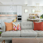
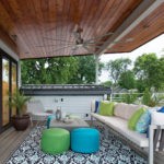
The upstairs penthouse level is the perfect lounging spot after the end of a long day. The coffee table doubles as a gas fire pit with volcano rock. There are hookups in place for an outdoor TV and a hammock with accompanying umbrella is the perfect spot for that late afternoon weekend nap. The simple approachability of the space can certainly make anyone feel comfortable enough to kick off his shoes and sit back for a bit.
“We definitely feel at home here. This place has so many opportunities to talk,” smiled the owners.
Resources
Architect/Home Designer/Interior Designer: NSPJ Architects, P.A.
Appliances: Nebraska Furniture Mart | Cabinets: Ikea | Cabinets Install: Jacob Grace Cabinetry | Countertops: Braco Stone | Custom Cabinets & Closets: AEC Cabinets & More | Custom Furniture: Brass Tacks KC | Custom Tile/Half Bath: Betona Tile | Fireplace: Midwest Fireplace | Flooring: SVB Wood Floors | Furniture: Erdos at Home | Furniture and Linens: West Elm | Glass & Mirrors: Westport Glass | GULF Sign: Retro Inferno | GULF Sign Install: Artworks KC | Home Security and Theater: Wire It Up Electric | Interior Stair Handrails: Heckert Systems | Landscape Architect: NSPJ Landscape Architects | Landscape Installation: Three Trails | Landscaping Materials: Suburban Lawn & Garden and Soil Service Garden Center | Light Fixtures: Wilson Lighting | Paint: Sherwin Williams | Painter: Robbins Precision Painting | Realtor: Jim Duff: Re/Max Premier | Roof Deck Furnishings: Blu Dot | Tile: JSM Tile Works | Trim Work: Architectural Solutions | Window Coverings: The Blind Broker

