Tour a stunning new home that brings the idea of aging in place to a whole new contemporary level.
Story by Ann Butenas | Photography by Matthew Anderson
When you hear the term “aging in place,” your thoughts may turn to a place where older adults can live independently, comfortably, and safely. For one metro couple, aging in place also means the ability to live in style, creating a home that will definitely meet their potential needs in the future, but one that also uplifts them, inspires them, and makes this next chapter in life a page-turning adventure. As soon as you enter this spectacularly designed home, your whole attitude on growing older may instantly change. Who knew it could be so exciting, spirited, energizing, and inviting?
When owners Kim and Jeff discovered this empty Westside lot, they just knew they had to have it. Besides contemplating what type of home they would build here, they were equally excited about having so many attractions within walking distance: the Crossroads, the River Market, the Plaza, and the West Bottoms, for starters. What they were looking for in their forever home included less square footage, low-maintenance design, and high quality, high durability materials.
Great consideration was taken when creating this home, as Kim and Jeff wanted something that would accommodate them as they traveled through the afternoon of life, as one never really knows what the later years might have in store for them from a mobility standpoint.
The couple had previously lived in a traditional story and a half home in Fairway that had lots of steps. After selling that home, they initially moved to a loft in the Crossroads, where all of their living space was on one level. That inspired the idea for this home. Every detail within its construction took into consideration the aging in place ideas.
“This home has 4-foot-wide hallways with high ceilings, so it feels spacious,” noted Kim.
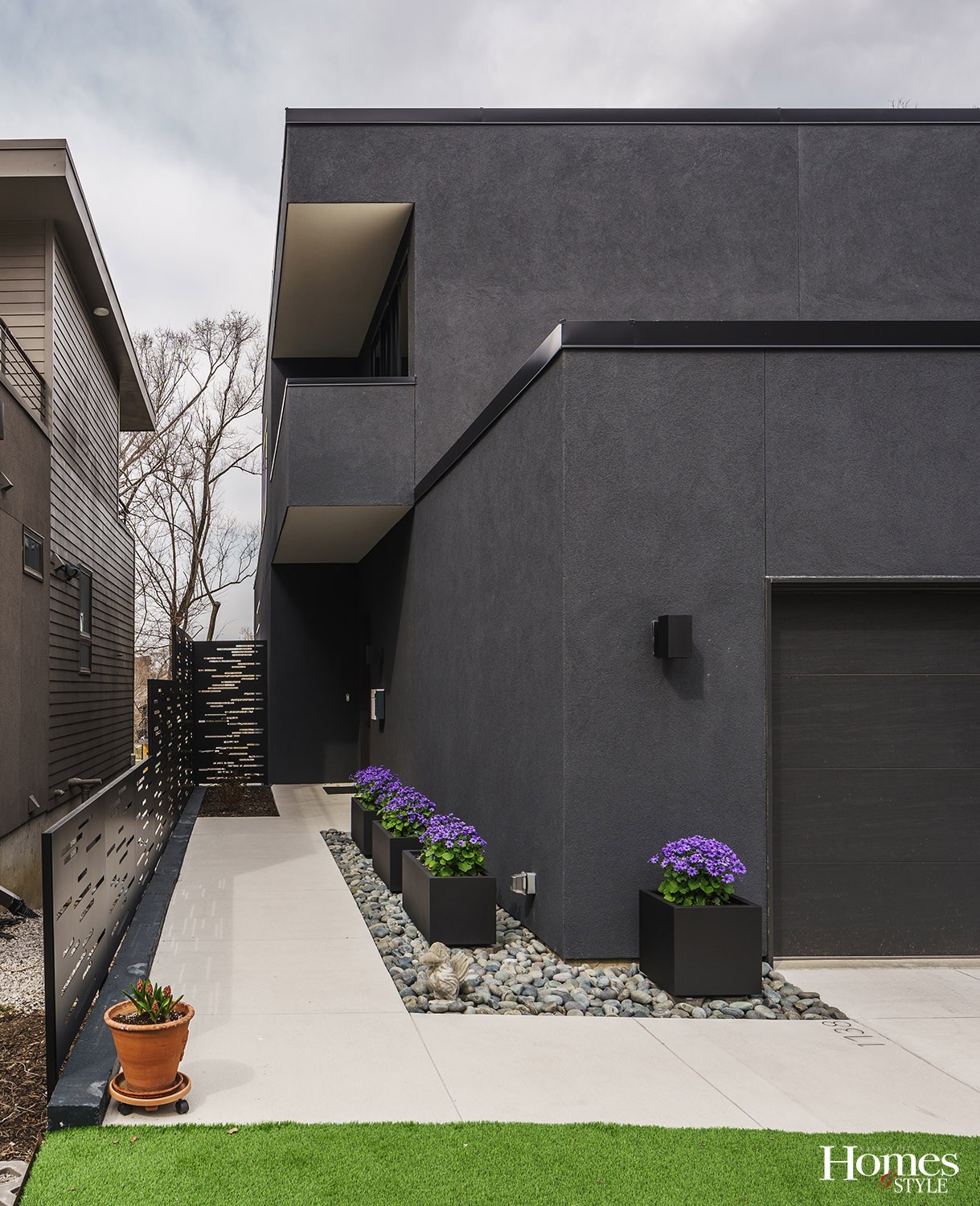
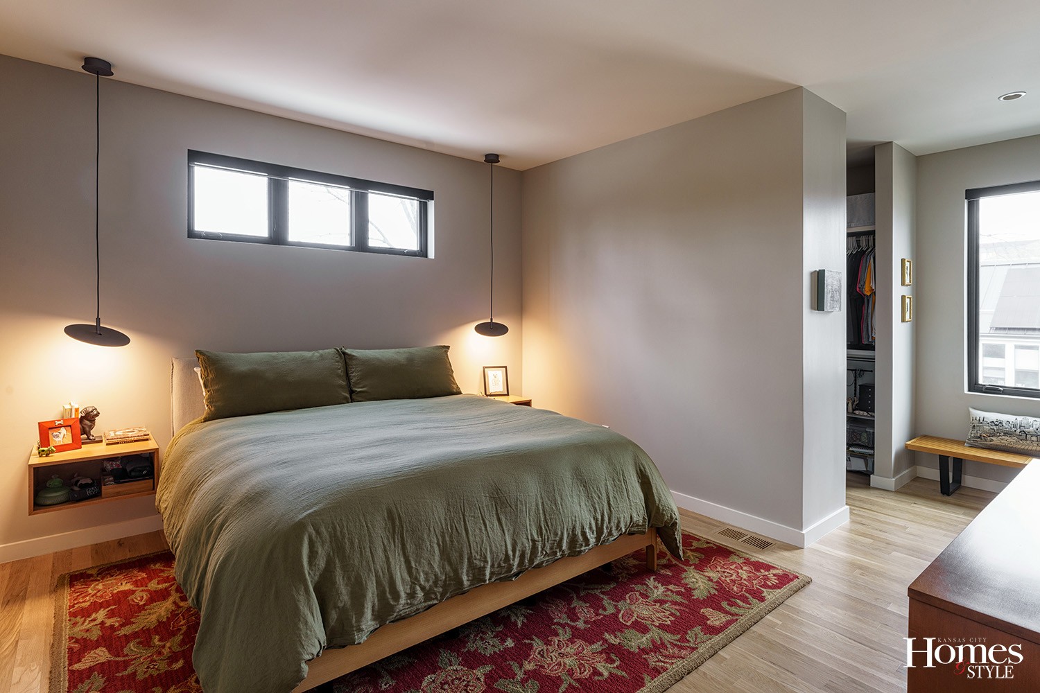
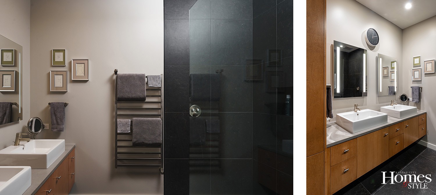
Added Jeff, “From the sidewalk to the driveway through the garage and into the main floor and out to the terrace is all one level with no thresholds. This allows for accessibility should either of us need a walker or a wheelchair when we are older. Even all of our showers have linear drains and zero entry thresholds for ease of use.”
However, due to the narrow and deep lot, there was no way to get everything they wanted all on the main level, including a bedroom, so they put some ingenuity to work.
“We had this home built with an elevator-ready shaft,” explained Kim. “Where we have three stacked closets now, we can transform into an elevator by removing the floors in the closets.”
the overall layout
The home features two bedrooms, both of which are upstairs, and two-and-a-half baths, along with a small basement and storage area. Altogether, the home consists of less than 3,000 square feet of space. Additionally, it features a two-car garage, although this active couple probably won’t rely on their vehicles nearly as much as they did in the past.
“We enjoy walking to things and can walk just about everywhere from here,” said Jeff.
However, if they do drive anywhere, they can enjoy their oversized garage, again, designed with the idea of accessibility in mind.
“We can pull into the same level, open the car doors, and walk 10 steps into the kitchen or pantry area and easily put everything away,” said Kim.
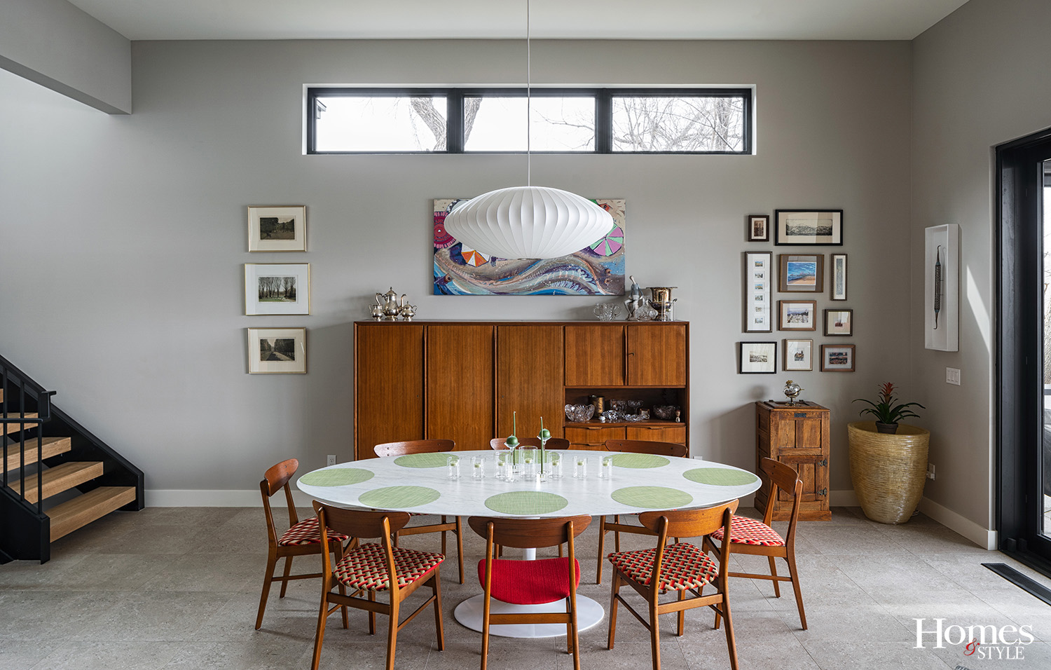
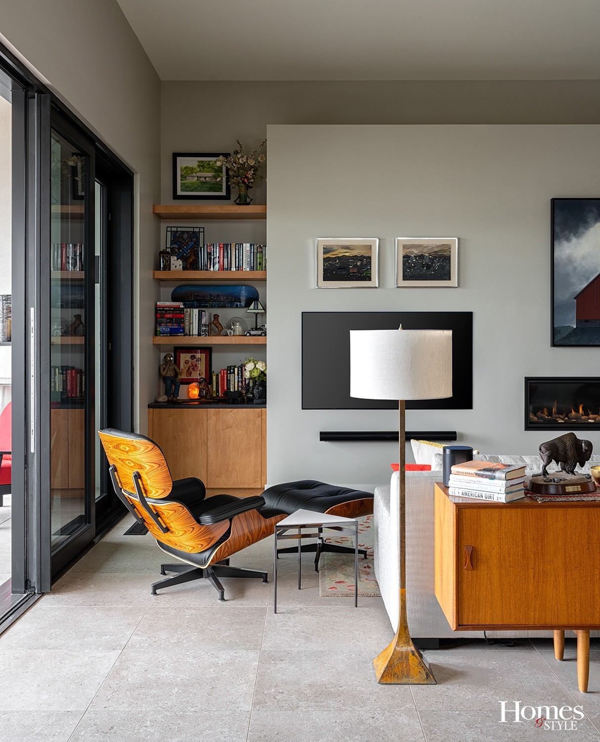
Aside from its overall functionality, this home is definitely not short on style, finesse, and delightful amenities. This is a place where rooms were put together with class but also to nourish one’s well-being. Just being in any room here makes one feel good. The owners describe it as contemporary with Danish modern décor, which includes simple, clean lines with a minimalist bent and not much in the way of ornamentation.
“There is no trim except on the baseboards and around the doors,” said Kim. “And the ornamentation we have is in the form of artwork and fabrics.”
cooking in style
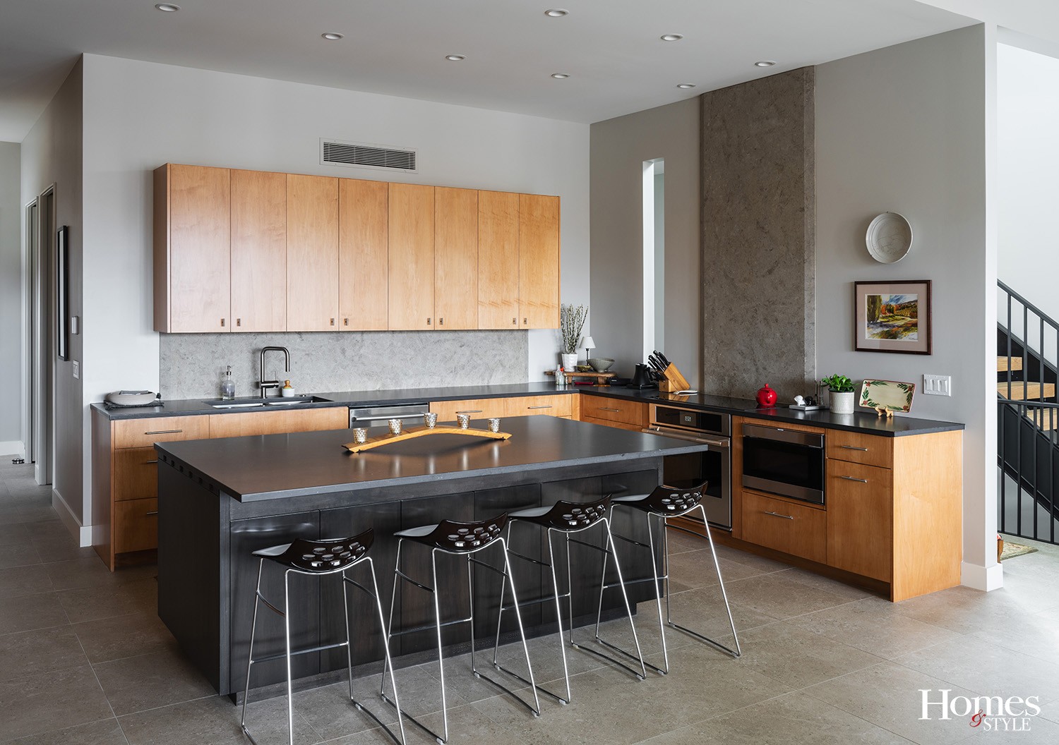
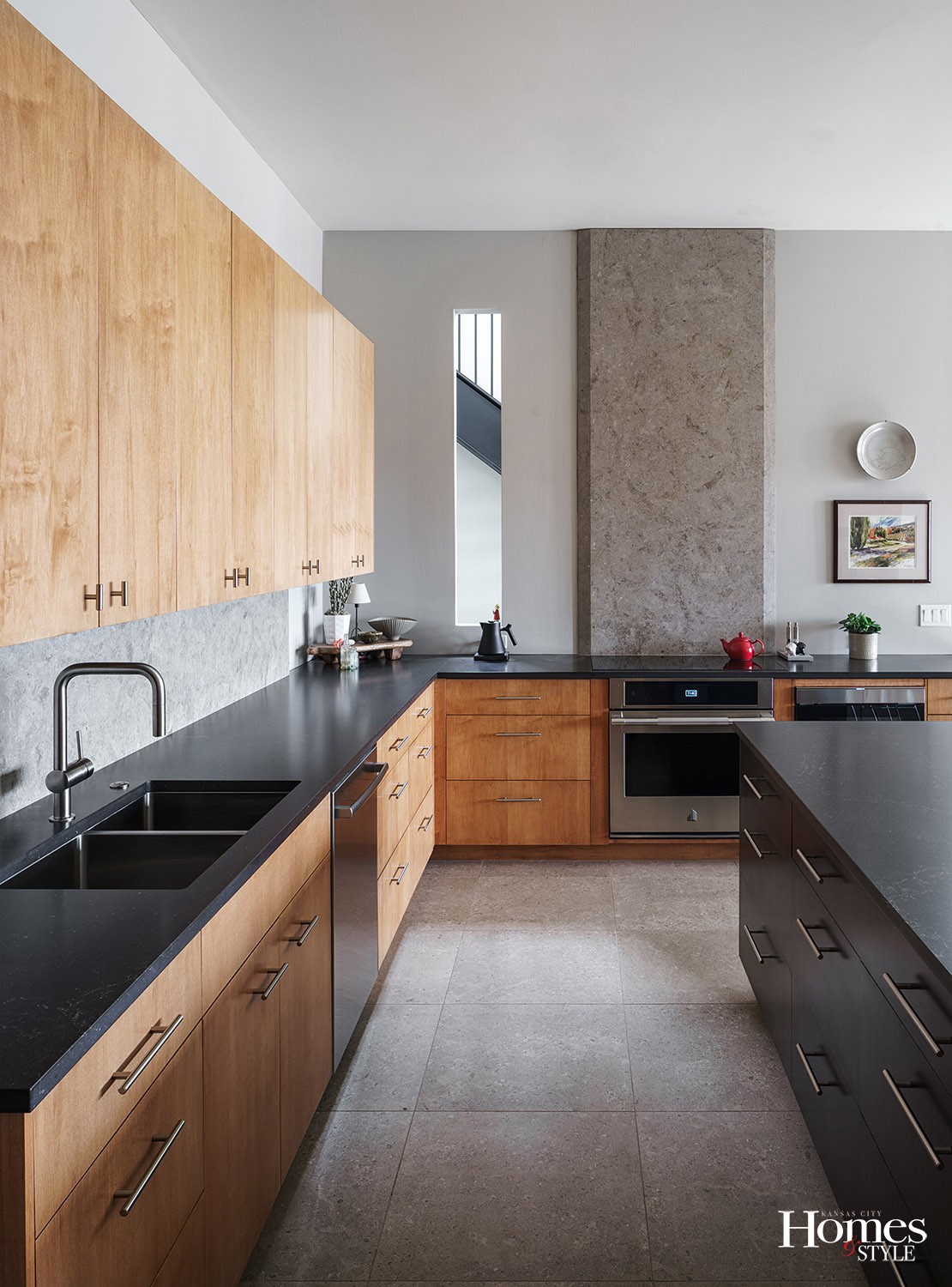
The kitchen in this home enjoys flexibility in design while still maintaining its flow to the rest of the home. The slab of Kansas limestone on the wall behind the cooktop is a focal point. Presenting as work of art, it functions as a backsplash, so it does hold practical value. However, it also holds its own as noteworthy composition to the area.
“Aesthetically, it looks like artwork, as it fills the space and definitely has interest to it,” said Kim.
Beautiful quartz countertops accent the kitchen and follow the purpose of low maintenance coupled with durability.
Kim and Jeff were also specific about the lighting in their kitchen.
“We didn’t want anything hanging above the island that would obstruct the view of the outside, so we used can lights instead of pendants,” noted Kim.
all decked out
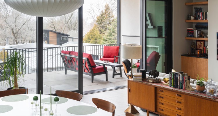
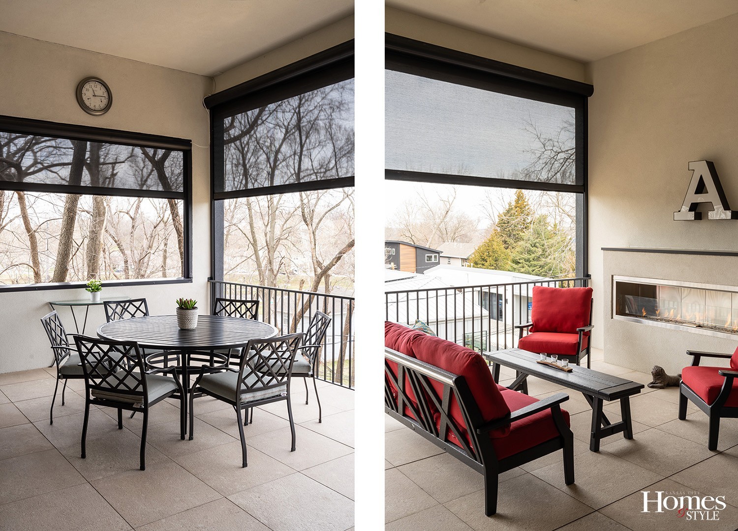
In order to fully maximize their living space, Kim and Jeff enjoy spending time on their expansive covered terrace, complete with a gas fireplace and a 16-foot-wide opening from the living area, completely changing the feeling of the living space when open.
“We have a 28-foot-wide shade to completely enclose the terrace,” said Kim. “The entire terrace easily becomes an extension of our indoor living space. The large format tiles extend both inside and outside for one continuous floor.”
Heating this home during the winter months offers quite the cost savings, too.
“Since our house is open plan, the warm air rises to the upstairs,” said Jeff. “Plus, we have hydronic heated floors. We didn’t even have to use our furnace this past winter due to the design of the home.”
Upstairs, a separate balcony exists just off the office nook next to the guest bedroom, which features smaller, bi-parting doors.
the “art-beat” of the home
More than just a stylish and functional home, this beautiful residence rivals the most exquisite of small museums. Art enthusiasts, Kim and Jeff enjoy patronizing local artists and have added their treasures to prominent focal points within their home, all of which delight and capture the true personality of the couple and of the home. They indicated they don’t buy art that matches their chosen color palette, however. Instead, they defer to pieces of work that have meaning to them and that speaks to them in some way.
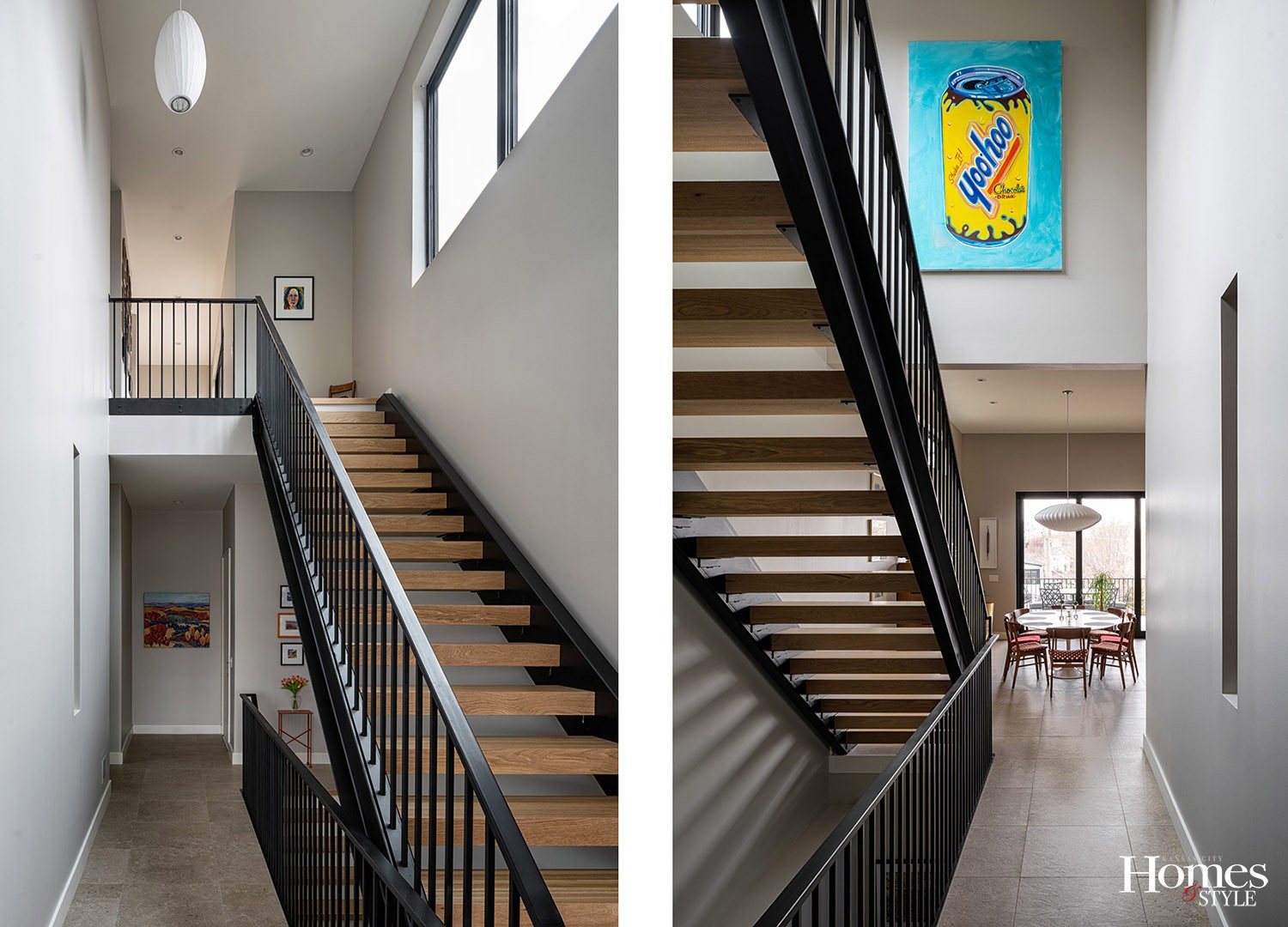
Among their esteemed collection includes the Yoo-Hoo painting, one of the most notable pieces.
“Jeff and our son love the drink, and we also had a Pug named Huey whose registered name was Yoo-Hoo, so this Wes Benson painting has a lot of meaning to us,” expressed Kim. “When we built this house, we made sure this six-foot by four-foot canvas fit that particular wall.”
A couple of other cherished pieces in their collection include a pair of paintings depicting the Denver skyline, painted by Jeff’s dad and a barn painting by Kansas artist Louis Copt that graces a wall within the living room.
Bright colored paintings tend to populate their décor, along with pieces that spark conversation, such as the mid-century modern floor lamp with a vinyl record diffuser.
no hard work in the yard
“I don’t mind yard work. I just don’t want to do it,” expressed Jeff. As such, artificial turf was installed in the front of the home, with plans to put some at the back of the home. The driveway was by design, as well, with its head-turning features of paver blocks with turf inserts. Again, a nod to a low-maintenance home.
“This home was designed specifically for our needs and lifestyle,” noted Jeff. “We wanted a home designed the way we would use it.”
Resources
- Builder: Koenig Building + Restoration
- Architect: KEM STUDIO
- Appliances: Ferguson Bath, Kitchen & Lighting Gallery
- Cabinets: Cabinets by King
- Countertops: SCI Surfaces
- Backsplash Fabrication / Installation: Carthage Stoneworks
- Doors: Teague Lumber Company
- Drywall: Northeast Kansas Drywall Co.
- Electrical: Teague Electric
- Engineers: Apex Engineering
- Excavation: Koenig Excavation
- Exterior Entry Screen: Elliot Werner/ARC Welding
- Fireplace: Midwest Fireplace
- Flooring: FPF Flooring
- Framing: Deitchman Construction
- Garage Door: Renner Supply Company
- Glass: Westport Glass
- Hardware: Teague Lumber
- Heating & Cooling: United Heating and Cooling
- Insulation: InsulUSA
- Light Fixtures: Ferguson Bath, Kitchen & Lighting Gallery / Lumens
- Lumber: McCray Lumber
- Paint: Sherwin Williams
- Painter: Millenium Painting
- Plumbing: Miller Plumbing
- Plumbing Fixtures: Grohe
- Roofing: Gentry Roofing
- Staircase/Railings: Austin Ironworks
- Steel Beams: Steal Beam Services
- Stone: Sturgis Materials
- Stucco: Excel Plastering
- Terrace Shades: Awnings by Haas
- Tile: ProSource Floorcoverings
- Tile Installation: Diamond Tile and Stone
- Trim: Scott Swift Custom Trim
- Windows: Teague Lumber Company / Marvin
- Window Coverings: M&M Draperies
- Art: Wes Benson, Louis Copt, Steven Dragan, Tim Jaeger, Mike Savage, Michael Schwegman and Pam Peffer

