Story by Ann Butenas | Photography by Matt Kocourek
When the homeowners purchased this home about 18 months ago, there was one room in particular they wanted to provide with a complete makeover: the master bathroom. Built in the 1970s, this home definitely has a story to tell, but the bathroom was ready to turn the page to a new chapter.
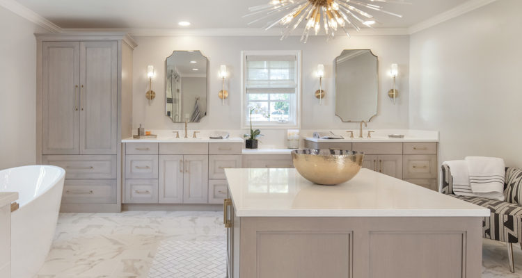
“We basically gutted the entire space and started over,” said Lisa Otterness, CKD and Lead Designer with Classic Kitchens Design Studio, who creatively rearranged elements within this expansive footprint and accented it with a warm gray and white color scheme.
“Originally the vanities were in a peninsula and presented a rather awkward layout. It was inventive but did not function well,” noted Otterness, whose design also included closing up a doorway to a closet.
“I proposed three layouts to the homeowners based on their top priorities, the top one being storage,” noted Otterness. “They ultimately chose this design, which eliminated the closets and incorporated the vanity along the wall.”
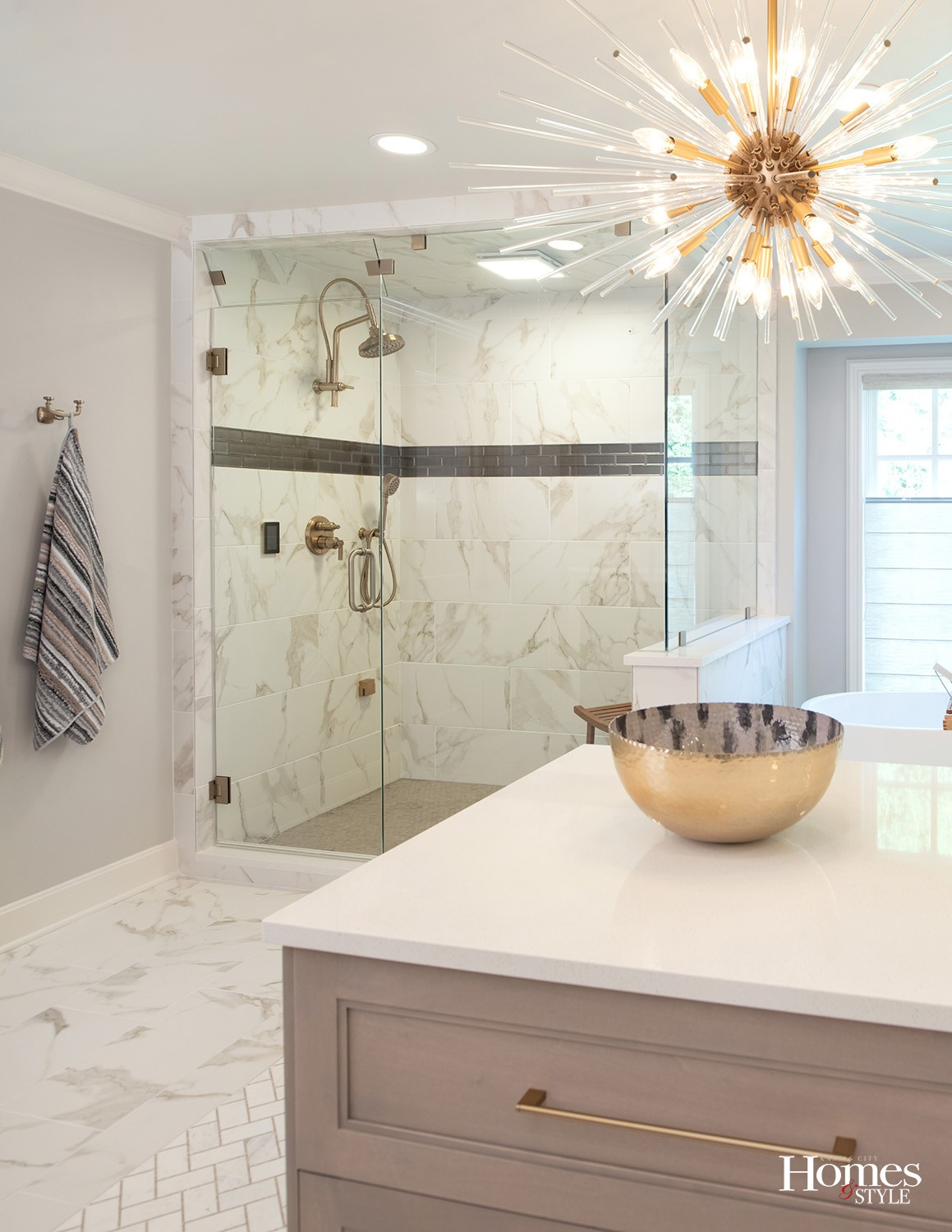
A strong focal point in the room is the tile rug with its beautiful gold mosaic as the grout line running through it. Large format tiles surround that design, adding yet another elegant layer with beautiful brown veining. The tile continues into the nearby steam shower which has the added detail of a glass louvered vent. The maple cabinetry has a matte shale finish in a brownish grey tone and the corresponding countertops are white quartz.
Otterness, who worked in collaboration with contractor Nate Fritz and with Marsha Marsden of Madden-McFarland Interiors, who selected the lighting, tile, and fixtures.
“Marsha brought me into this project, and I designed the cabinetry and overall layout, moving the tub by the window and placing the wardrobe where the shower formerly stood,” said Otterness, who also had the inspiration to put a dresser in the middle of the room.
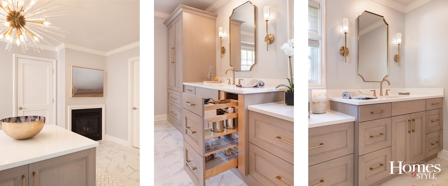
“We had previously talked about putting a lounge chair there but the owner wanted more functionality to the space,” explained Otterness, who indicated the dresser provides storage for linen and undergarments in the front and shoe storage in the back with its generous 13” storage space.
Another key element necessary to balance the room is the half-wall between the shower and the tub.
“This visually divides the spaces but functionally acts as a plumbing wall,” stated Otterness.
Other design features include a fireplace and a private toilet room. Otterness took great care in designing this bathroom, especially in light of its size. The tall storage cabinet contiguous to the vanity is the husband’s closet/wardrobe.
“With a larger space you have to limit the design palette or it will feel very busy,” she emphasized.
Resources
- Layout and Cabinets: Lisa Otterness, Classic Kitchens Design Studio
- Interior Design: Marsha Marsden, Madden McFarland Interiors
- General Contractor: Nate Fritz, Fritz Building Company
- Cabinets: Wood-Mode
- Flooring and Tile: Central States Tile
- Plumbing: Kitchens & Baths by Briggs; Ferguson Bath, Kitchen and Lighting Gallery
- Lighting and Mirrors: Wilson Lighting
- Accessories & Art: Madden McFarland Interiors
- Windows Shades: Comfortex/ KDR
- Towels & Bath Accessories: Annabelles
- Quartz Countertops: Blue Valley Granite
- Hardware: Locks & Pulls


