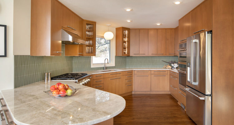
While uncomplicated in design and presentation, this kitchen remodel pulls out all the stops in functionality while engaging the unexpected.
Story by Ann Butenas | Photography by Matt Kocourek
When you think of a pocketknife, what do you think of? According to Lisa Otterness, CKD with Classic Kitchens Design Studio, this kitchen remodel comes to mind. While that might seem like an intriguing analogy, it makes perfect sense. After all, a pocketknife, while minimalistic in appearance, holds a cornucopia of handy gadgets on the inside. This Leawood kitchen remodel operates in a similar manner. Built in 1988, this is the first kitchen update the home has undergone since the current owners, Rick and Deena Schaffer, took possession in 2004.
On the outside, the kitchen presents as very neat, clean, and crisp, unburdened with the weight of heavy ornamentation or excess appointments. Instead, it displays confidence through its unique assortment of functional amenities. In the end, that is where its true beauty lies.
This mid-century modern home in Leawood, Kansas, reflects a true representation of the owners’ unique style. Rick, an architect/owner with Populous Architects, brought the layout and specific minimalist vision for this kitchen to Otterness when preparing for the update.
“Lisa and I worked very closely on the layout,” noted Schaffer. “The island was already in the existing kitchen, where the range and cooktop used to be. However, it was always a mess, as it often became a landing spot for various items. Plus, when we were cooking, it would just create more of a mess. As such, we moved it to the side, which was Lisa’s idea.”
Otterness and Schaffer then decided to reconfigure the ovens, which were formerly in a corner on a diagonal, which took up space. They chose to slide those around a bit and subsequently combined them with the island.
“We entertain quite a bit, and I am usually the chef for these events, so this new layout works well,” expressed Rick.
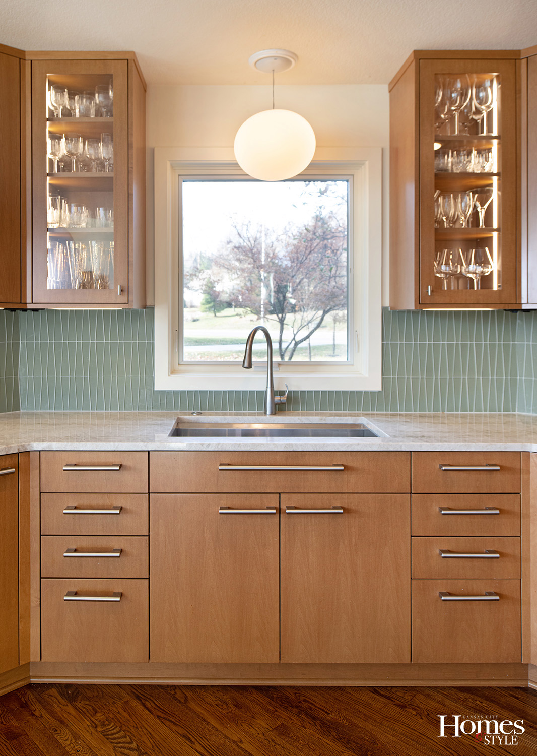
The window above the sink had always been in that particular space. Otterness just made it smaller this time to allow for the integration of two glass cabinets with LED lights to flank the window. At night, the backlit displays provide a warm and cozy ambiance to the kitchen.
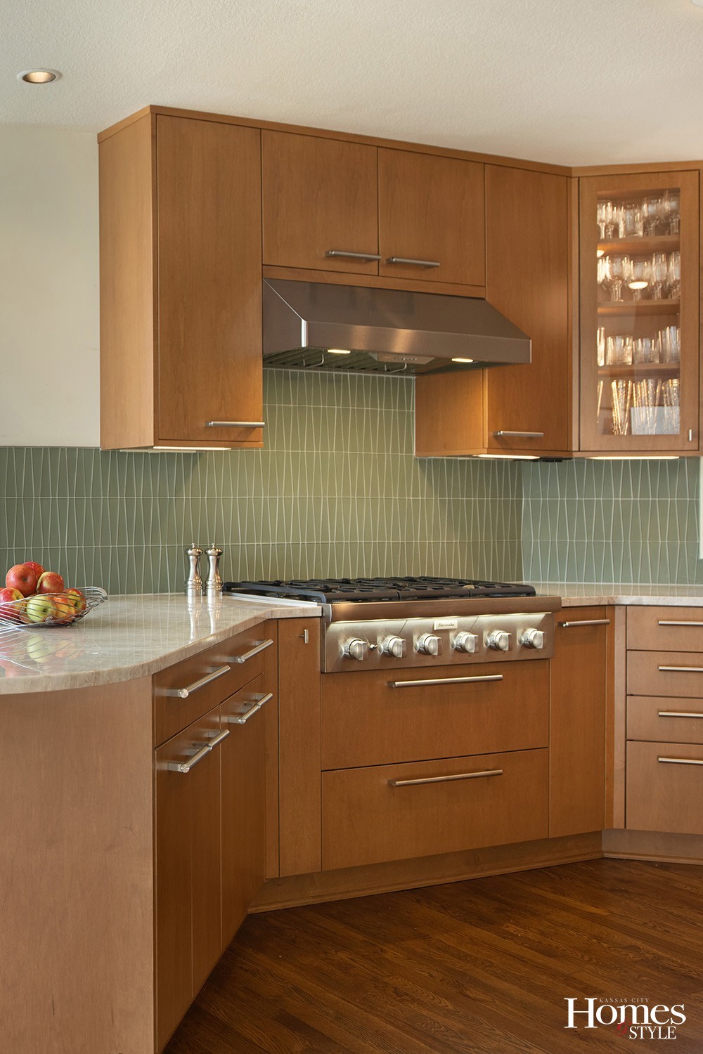
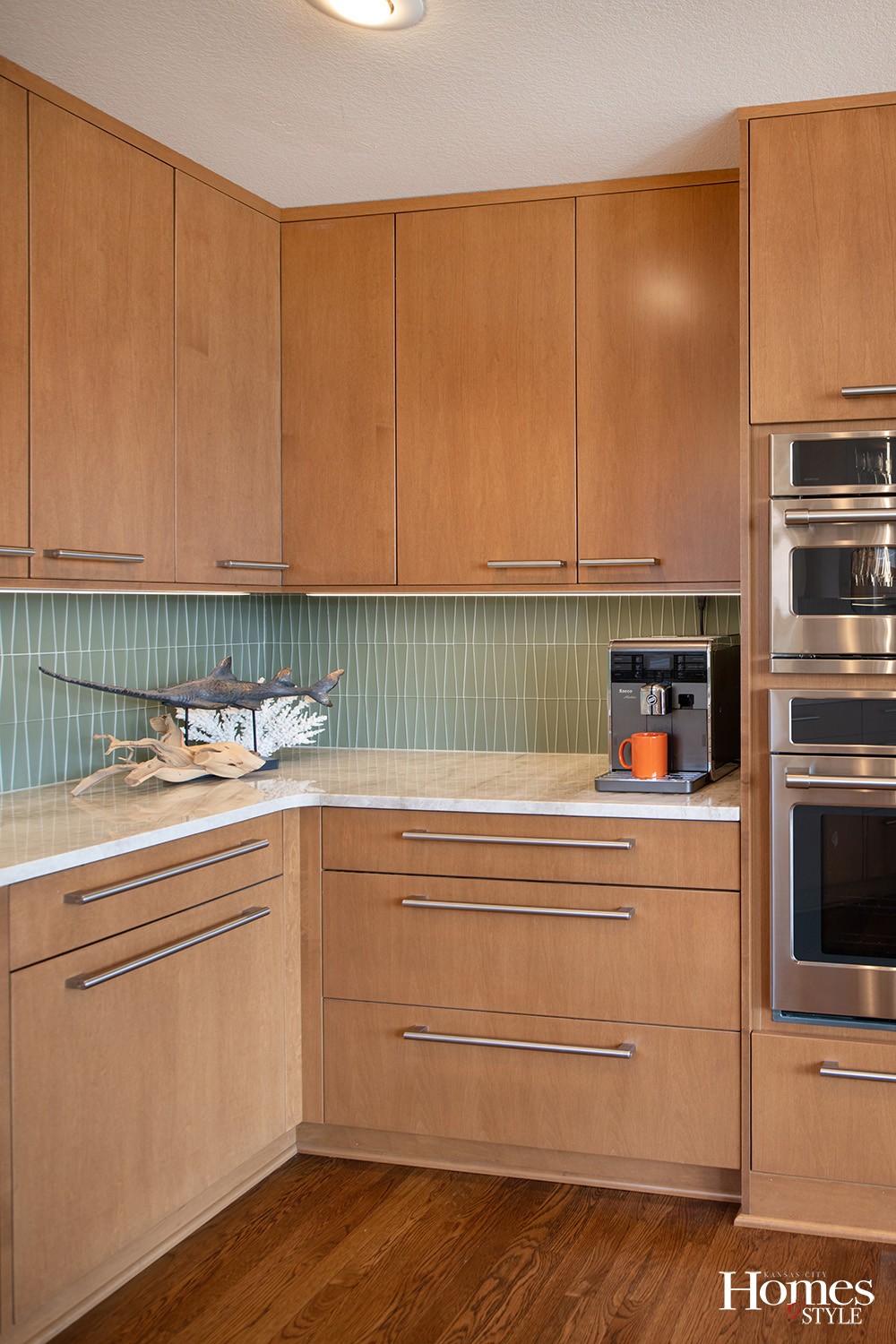
The backsplash in the kitchen is also a wonderful design element. Comprised of flat, glass tile with highly durable epoxy grout, it provides a retro vibe to the space.
But the crème de la crème of this kitchen exists in its storage capacity. Truly unique and extraordinarily fundamental to this kitchen, all of its storage units provide just a visual whisper from the outside, but function in grand through their performance. The Kohler Workstation sink is one such example of great utility that has been integrated into this kitchen.
“This is a full-width sink with a center drain and no dividers,” explained Otterness. “You can slide attachments across it, which are kept in a special drawer underneath the sink, that also has roll-out cabinets. There is a pull-out on the other side of the sink that provides additional storage. The unit on the left of the sink looks like four drawers but pulls out as one unit for trash storage. This was designed in this manner to achieve wonderful symmetry in design with the other side of the sink and it allows for dual functionality.”
The opaque globe pendant light hanging directly above the sink gives a nod to the mid-century look of the design palette of the home.
Under the range are additional pull-outs, perfect for storing pots, pans, and lids. A cookie sheet divider cabinet stands about the microwave. Spice drawers further elevate the storage prowess in this kitchen. These well-designed drawers allow for keen organization and visibility of all spices.
Further, Otterness integrated under cabinet plug (wire) mold, which is a hard-wired outlet strip.
“This avoids having to display visible outlets on the wall,” said Otterness.
There is also a shallow band of drawers on the back of the peninsula island which includes a charging station drawer.
“My wife appreciates this piece,” joked Schaffer, who admits to being somewhat of a slob, so this particular drawer is a great landing spot for his keys, wallet, and phone when he comes home.
The former kitchen offered minimal storage space, so this new design truly fits the bill for the homeowners.
“We have the same amount of space,” noted Schaffer. “However, the previous design did not take accessories into consideration.”
“What we really like the most about this kitchen is how easy it is to keep clean and organized,” smiled Schaffer. “There is a place for everything to be stored. We love how this kitchen design turned out and how it blends well into our hearth room.”


