
Calling all tastemakers, the color marketing gurus present the bold and the beautiful color trends for 2024.
Story by Gloria Gale | Intro photo courtesy of Dutch Boy
Color forecasting is somewhat like flying a plane…we don’t know how it stays afloat, it just does.
Identifying future color trends is similar. Spin the color wheel and hues are analyzed to create a universal language that affects everything from retail and health care to manufacturing and branding.
As a result, annual trends in the world of color are considered a significant cultural barometer. Currently, the zeitgeist in the world is so uncertain there’s a need for reassurance. The paint and stain brands are asking us to try these shades to refresh ourselves and our homes with a sense of optimism.
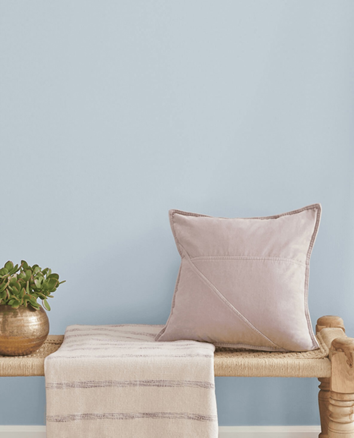
Photo courtesy of Sherwin-Williams
 Sherwin-Williams
We’ve long bid farewell to those ‘earthy’ tones. Now, Sherwin-Williams wants us to meditate on Upward, (SW6239). This uncomplicated celestial blue with slight gray undertones is non-intrusive. Sherwin-Williams describes their choice as chic, serene, misty, and meditative. This color resides in the space where blues converge in harmony with nature. It’s a comfort color of contentment and peace. Just like the sky.
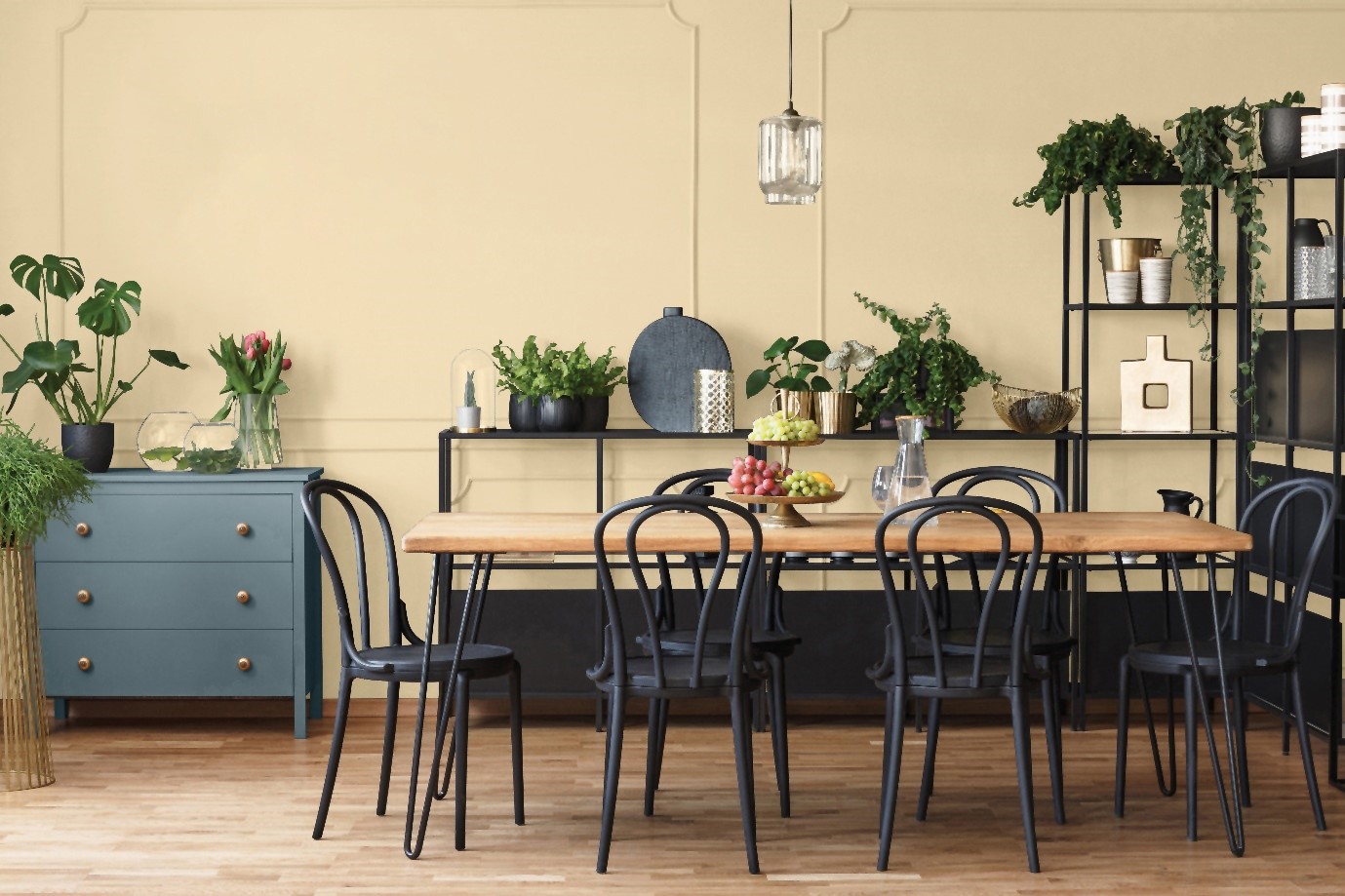
Photo courtesy of Glidden by PPG
 Glidden by PPG
Who doesn’t want a “Glow-Up”? So says, the color team experts at PPG who give us a yummy buttercream shade called, Limitless (PPG 1091-3). The name says it all, a bubbly, beachy shade – not yellow but much more versatile. This shade plays well with both warm and cool tones without overpowering a space. Ashley McCollum, PPG color expert says, “Think of Limitless as a neutral, then visualize it complementing your existing furnishings.” It’s a workhorse.
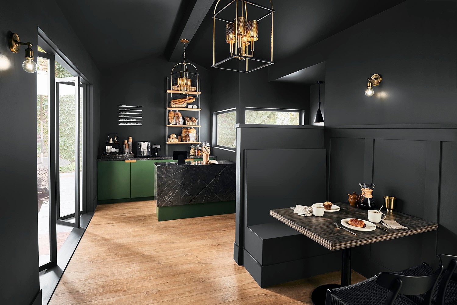
Photo courtesy of Behr
 Behr
Behr
Cracked Pepper (PPU18-01) a practical title that’s conjured up effortlessly. Confidence coupled with individuality are the two words Behr uses when explaining this soft black that grounds a space. Dark and comforting, it works as an anchor color that’s meant to define. Behr shows using darker colors gives a room a bold, designer look. This is definitely not a cookie-cutter color. Sarah Fishburne, The Home Depot’s director of trend and design says, “Cracked Pepper is just like the seasoning it’s named after – it’s a staple.”
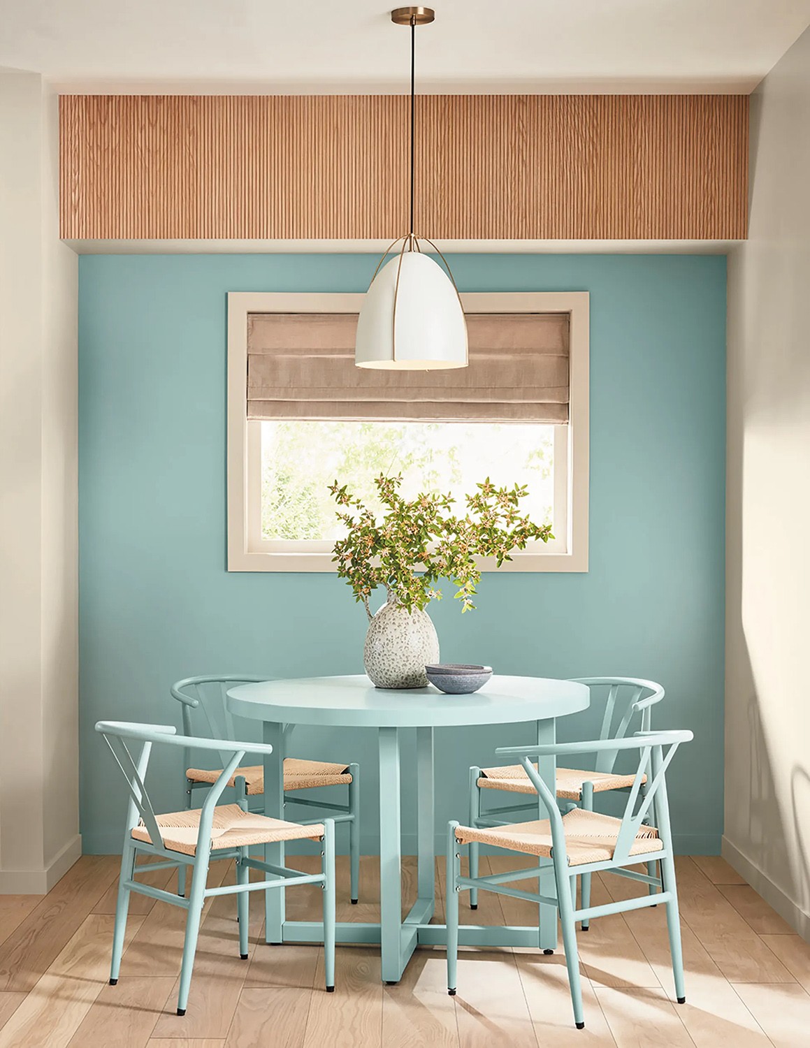
Photo courtesy of Valspar
 Valspar
Merging two harmonious hues, blue and green, the color crew at Valspar blends together a rich, comforting tone called Renew Blue. “This is a balanced blue with a touch of grayed sea-green. The embodiment of utilizing more nature inside our homes,” says Sue Kim, Valspar’s director of color marketing. Valspar wants consumers to use this shade as a neutral. Renew Blue keeps wellness and comfort in mind and as a base for a design aesthetic.
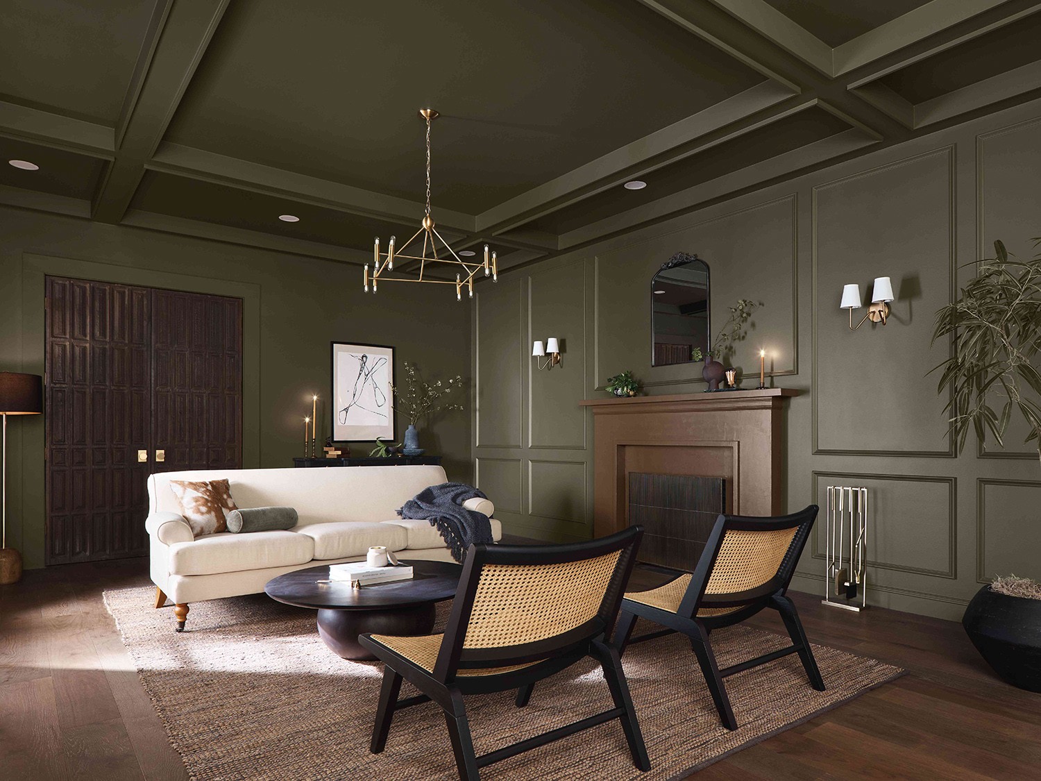
Photo courtesy of Dutch Boy
 Dutch Boy
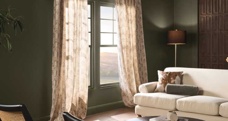
Dutch Boy’s daring but decidedly comforting deep, olive green shade is Ironside. They tout this color as a one-coat application steeping a room in quiet elegance. “There’s a reason we comfortably live with nature enveloping us in shades of green – it’s easy on the eyes, promotes wellness and reminds us of a sanctuary,” says Ashley Banbury, color marketing manager for Dutch Boy Paints.
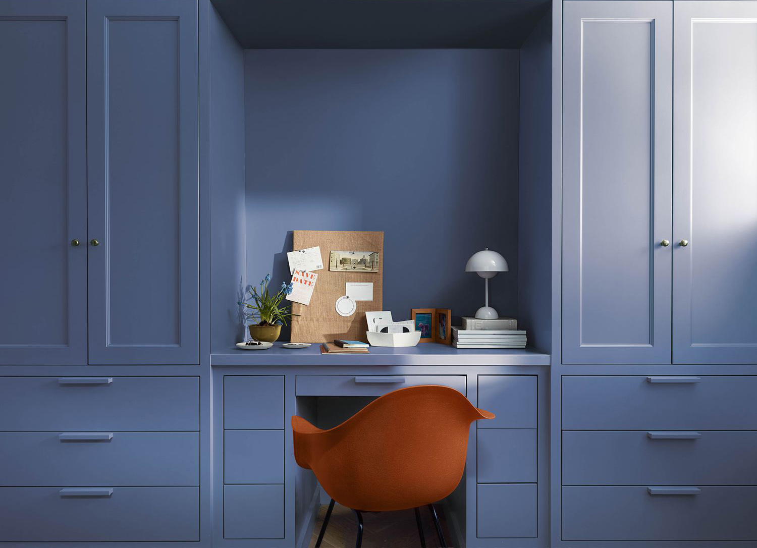
Photo courtesy of Benjamin Moore
 Benjamin Moore
The experts at Benjamin Moore candidly declare their Blue Nova (825) should be used sparingly throughout the home. This daring blue boosted with purple undertones is dramatic and forward thinking; best on one wall in a dining room or office. This shade of blue is the ideal accent color – when you want to make a dramatic statement, Blue Nova packs a punch.
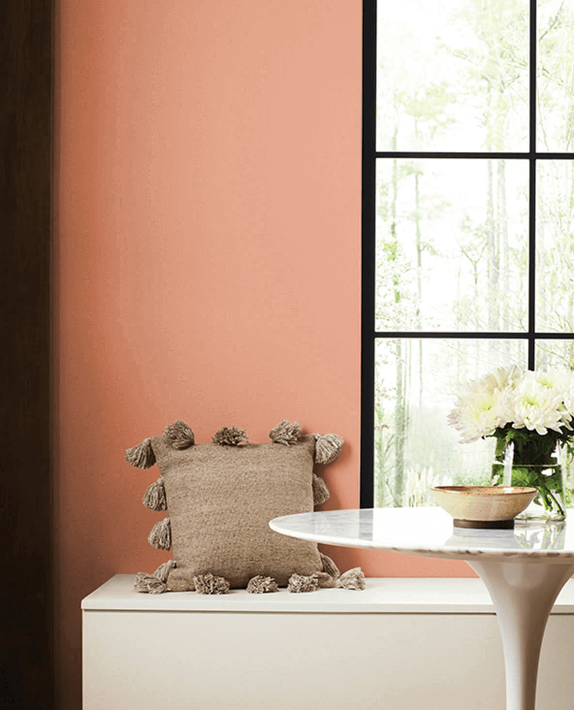
Photo courtesy of HGTV Home ny Sherwin-Williams
 HGTV Home by Sherwin-Williams
Deviating away from the cooler blues towards warmer shades, Sherwin-Williams Home of the Year presents Persimmon (HSW6339), a lively tangerine shade that inevitably produces a smile. This boost of color will uplift with its affinity toward the hues of a sunset (think coastal). Persimmon is designed for any room but imagine it in a kitchen or living room – spaces that encourage conversation.
Photo courtesy of Graham and Brown
 Graham and Brown
In sync with quiet landscapes, Graham and Brown delivers their muted green Viridis. Reminiscent of grassy knolls and lush hillsides, this shade evokes a calming background. It’s uncomplicated and tranquil. Perfect in the quiet spaces like a bedroom or reading nook, Viridis sets the tone for hushed comfort.