A Coastal-style rebuild brings new life to an old neighborhood.
Story by Andrea Darr | Photos by Matthew Anderson
Established neighborhoods, with their large tree-lined streets and charming facades, are beloved for these characteristics, but age is not always desirable when it comes to houses. Especially in Prairie Village, where the housing stock is nearing a century old, some homes just can’t be saved. When maintenance hurdles become too high to overcome, tearing down and rebuilding seems the safest, most cost-effective tack.
Andrew Marten of Marten Construction has done both remodels and rebuilds in the area. His most recently completed rebuild is directly across the street from one of his remodel jobs, completed in 2006. The differences are striking in scale and style, yet both have allowed residents to enjoy comfortable living near the city’s best retail shops and restaurants.
Andrew points out that tear downs have been happening all along 71st Street in Prairie Village for more than a decade, specifically around the Indian Hills Country Club, but the signs of new construction are starting to expand south of 71st Street and west of Roe Avenue as more buyers and existing residents see the benefits of starting fresh.
The owners of this Hamptons-style home, a young professional couple with a baby daughter, decided a new home in an old neighborhood met their desires in the middle.
“We love it because of the variety of houses in the neighborhood and you can walk to places,” the husband says.
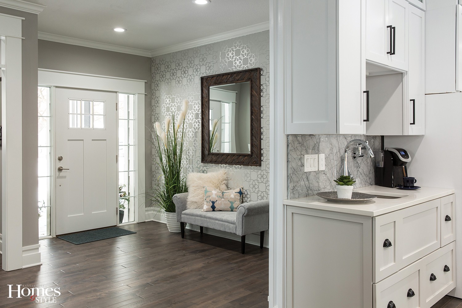
The house’s floor plan is traditional, with the master and other bedrooms upstairs, plus a mother-in-law suite on the main level. The flow moves easily from the front entry to the the main feature of the house: a connecting kitchen, dining and living space.
“We wanted 3,000 square feet to feel like 5,000 square feet; the openness achieves that,” Andrew says.
While a spacious feeling is a defining characteristic, the house zeros in on functionality. It dovetails with Andrew’s motto — building lifestyles — in which he looks at how people truly live and tries to build in conveniences.
When it comes to style, he generally follows market trends — with open floor plans, luxurious master suites and outdoor living — but then spins it all with his own unique point of view. His wife and business partner, Katie, specs out the finishes with the same goal.
“We toured a lot of places and took notes about what we liked and what we didn’t,” Andrew says. “We asked ourselves what we could do to make it different.”
And that’s where this home really shines: in thoughtful details.
For instance, in many newly constructed houses, the dining room is separated from the kitchen, usually located by the front door. Instead, they used that front space for a luxe home office and mother-in-law suite, leaving the back half of the home as one unified space, defined by a drop down ceiling light box above the dining table, and a soaring 18’ tall vaulted ceiling in the living room.
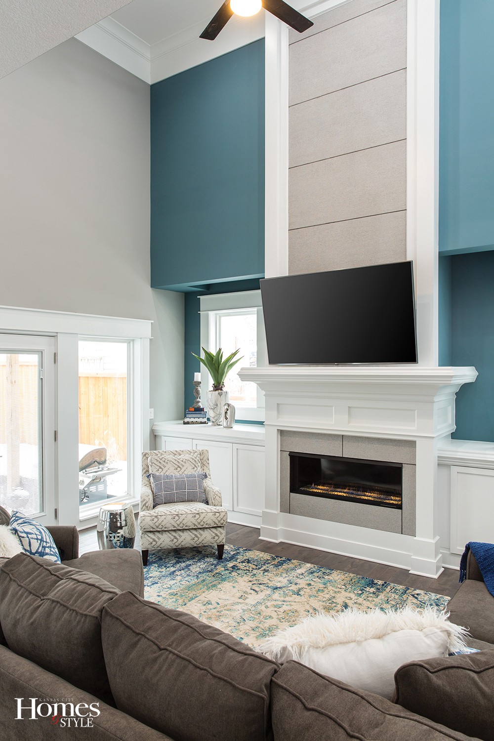
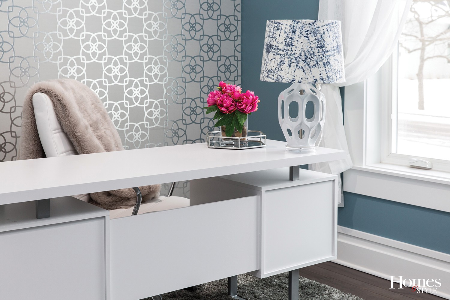
While the palette is mostly neutral in gray and white, color plays an attention-grabbing role in this space, too. Refuge by Sherwin-Williams, a modest teal, pops against the white trim and balances the natural light flooding the room.
“Everyone is doing navy as an accent right now, and I like navy, but I like this better. It’s is off the beaten path a little,” Katie says.
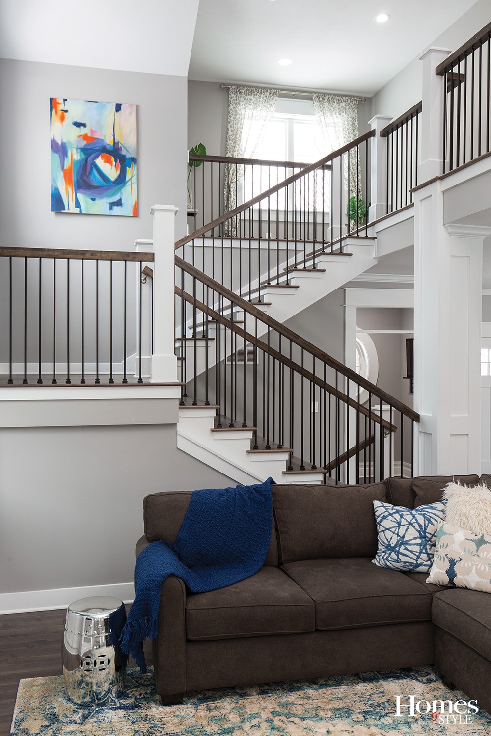
The simultaneously grand yet cozy space is surrounded by an open gas fireplace (that doubles as a heat source) and a view of the floating staircase, carefully made by Andrew using scrap lumber glued to make structural treads.
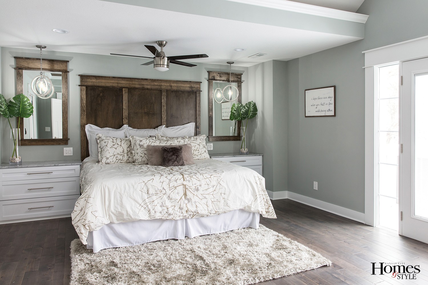
Upstairs, the master suite is a standout for numerous reasons: built-in headboard, nightstands and mirrors; vaulted ceiling and backlit “cloud” dropdown; his-and-hers vanities and central sit-down vanity; separated walk-in shower (with Kohler automated technology) and jetted tub; walk-in closet with island; and connecting laundry room.
The homeowners particularly enjoy the privacy of the tub in a space of its own, with a built-in TV nook. “I’ve never liked tubs out in the open where you feel like you’re on display,” the husband says.
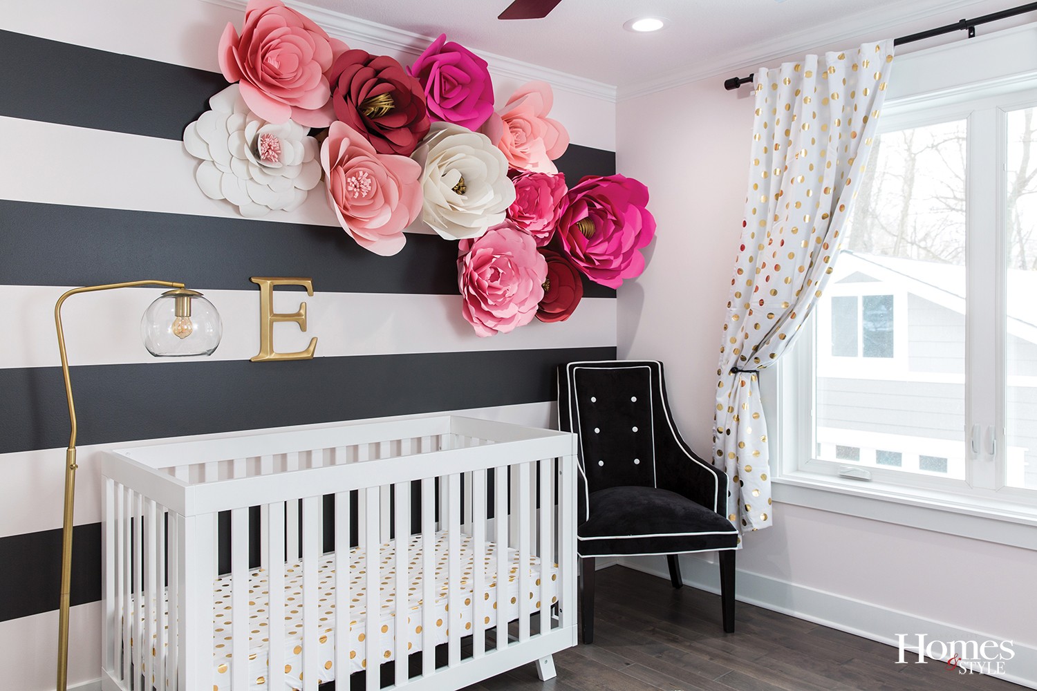
Even the baby’s room features special hand touches. Marten Construction used ideas from the homeowner to craft large-scale paper flowers to highlight an accent wall painted in alternating pink and black stripes, with a black decorative mirror and tailored black nursing chair rounding out the decor. In an effort to create a room made to grow with their daughter, the homeowner was inspired more by Kate Spade than Mother Goose.
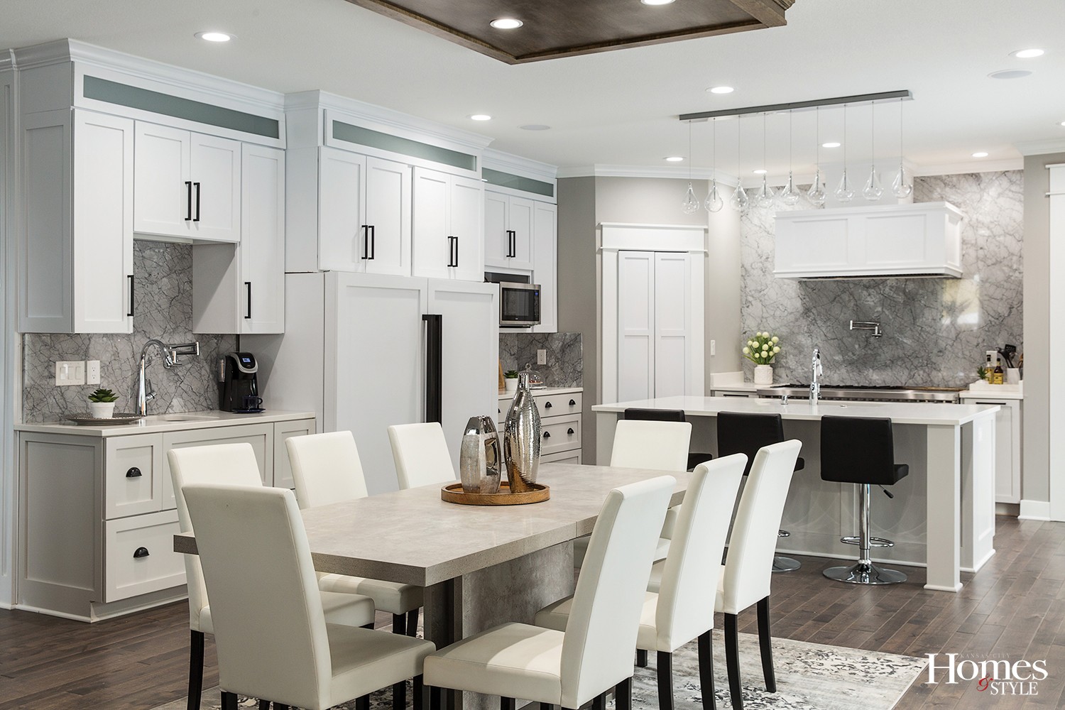
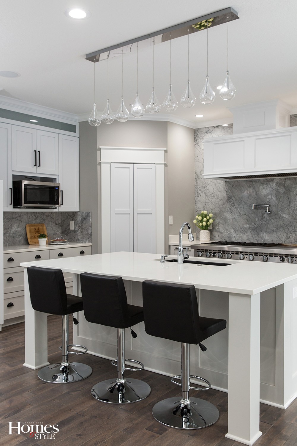
One place the homeowners want the opposite of privacy — family togetherness — is in the kitchen, where they tend to spend the most time. It, too, comprises a number of interesting highlights. Custom cabinetry is a focus here, as it is throughout the house, with plenty of storage, lighting and counter space. The coffee station has a pot filler that directly fills the Keurig. The range is a true commercial variety that took 10 men to install and for which Andrew had to install a beam underneath to support its weight. The Carrara marble backsplash has more gray than the typical white version. The white quartz countertops are low-maintenance for the busy young family.
Outside, the old lot’s odd shape didn’t stop the homeowners from working in a complete outdoor living environment, including a screened patio, hot tub covered by a pergola, small pool with built-in bar stools and a sunken fire pit.
Beyond that is a “detached” two-car garage that is technically part of the main house, connected by an underground tunnel. Currently unfinished, it has many possibilities both upstairs and in the basement, where the homeowner muses about a future casino room and memorabilia hallway.
There is simply no possible way to get all these features in old housing stock. While following the city’s requirements to a T, this home offers a balanced compromise of adding to the collection of charming facades, while on the interior, providing a superiorly functional lifestyle.
“Coming from a little ranch before, this is a major upgrade,” the homeowner says.
Resources
Architect/Home Designer: Webster Architects | Builder/Contractor/Interior Design: Marten Construction | Cabinets: Marten Construction | Countertops: SCI Surfaces | Doors: Kansas City Building Supply | Flooring: Weber Flooring | Furniture: Nebraska Furniture Mart | Garage Doors: Renner Supply Company/Delden Manufacturing | Hardware: Locks & Pulls | Landscaping: Serenity Landscape Design | Paint: Benjamin Moore | Plumbing Fixtures: Ferguson Enterprises | Tile: Key Distributors | Windows: Columbia Glass

