A Kansas City couple boldly break the rules to preserve the perfect eighties time capsule.
Story by Jeanne de Lathouder | Photography by Matt Kocourek
Poised high on a hillside overlooking the Blue River, a stunning light-filled house tucked within the picturesque River Ridge neighborhood of Overland Park turned out to be well worth the wait for this design-savvy couple. Transplants from San Francisco, Nick May, an architect and realtor, and his husband, Lynn DeMarco, a ceramics artist, vowed they would happily vacate their 1950’s Old Leawood ranch home if ever they found the “perfect 80’s modern,” a style and design era that had always attracted them. After several years of searching, a property suddenly popped up on the local listings that Nick just had to see. Built in 1979 in a subdivision that allowed for large properties, this custom-designed home featured 2.5 sprawling acres and spectacular views.
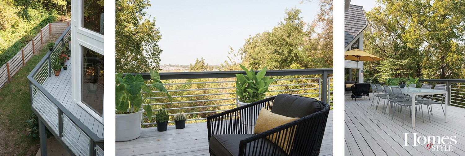
“We walked in the front door and the first thing we noticed was the wall of windows looking over the hillside,” says Nick. “The view took our breath away. Not many homes are built on hills with views like this in Kansas City. The light was extraordinary…coming from every window on every exposure, and the angles of the house made for really beautiful shadows and play on light. It was a perfectly preserved late 70’s time capsule,” he notes.
The home had been well maintained by the previous owners who lived there for more than 35 years and raised their family there. The overall spatial quality of the house was amazing, though covered in finishes that desperately needed updating. The white oak floors had been treated with an oil-based varnish that had turned yellow over the years, and every wall was painted in a different shade of warm creamy white and grey.
“We knew we had our work cut out for us,” laughs Lynn. “The ceilings were thick popcorn as far as the eye could see, so we decided we had to do the updating before we moved in.”
The couple called on designer Kathy Weiss of Midwest Design & Remodel to help with the renovations. Nick had worked with Kathy in the past and knew they both had a passion for perfection as well as modern design.
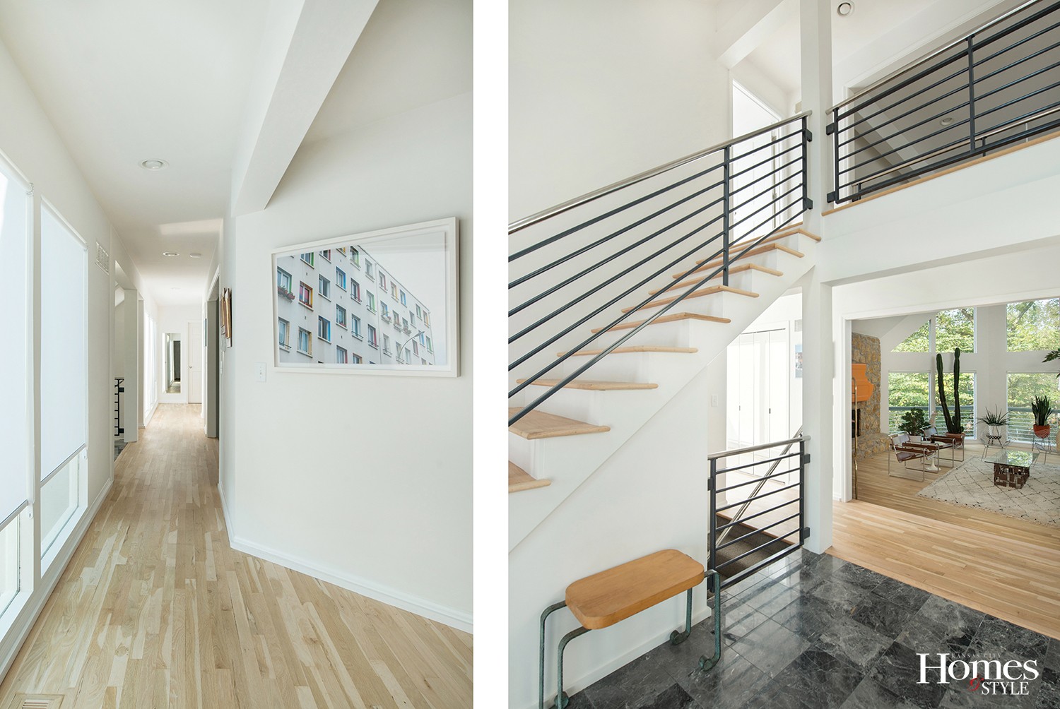
“Nick and Lynn have exceptional tastes and love the mid-century modern look, which is also my favorite style,” says Kathy. “Since the house had modern architectural features, we wanted to give it a clean, crisp vibe, so we painted all of the ceilings, walls, and trim white,” she notes.
They also opted to refinish the hardwood floors, leave them in their natural state, and then apply a new water-based finish to create a more modern feel with warm tones. In the family room, they wrapped two structural beams with sheetrock since they couldn’t remove them, to generate a more contemporary, sleek design.
“Our goal was to create a bright blank canvas for our art and furnishings,” Nick says. “We stripped the wood floors bare for a raw, natural look, and we used a fantastic product from Bona that sealed the wood without giving it a glossy sheen. They look and feel like matte raw wood – very Scandinavian,” he adds. “They are incredible to walk on barefoot.”
The popcorn ceilings – all 5,000 square feet of them – posed the greatest challenge and took the longest to renovate, with two crews working for three months to scrape and skim. And finally, for the finishing touch, every interior surface had to be painted the same shade of white – Sherwin Williams Snowbound.
“In my experience as an architect, it’s the best white paint around” Nick says. “And a good shade of white paint – and gray for that matter – is very hard to find,” he notes.
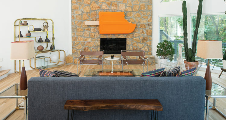
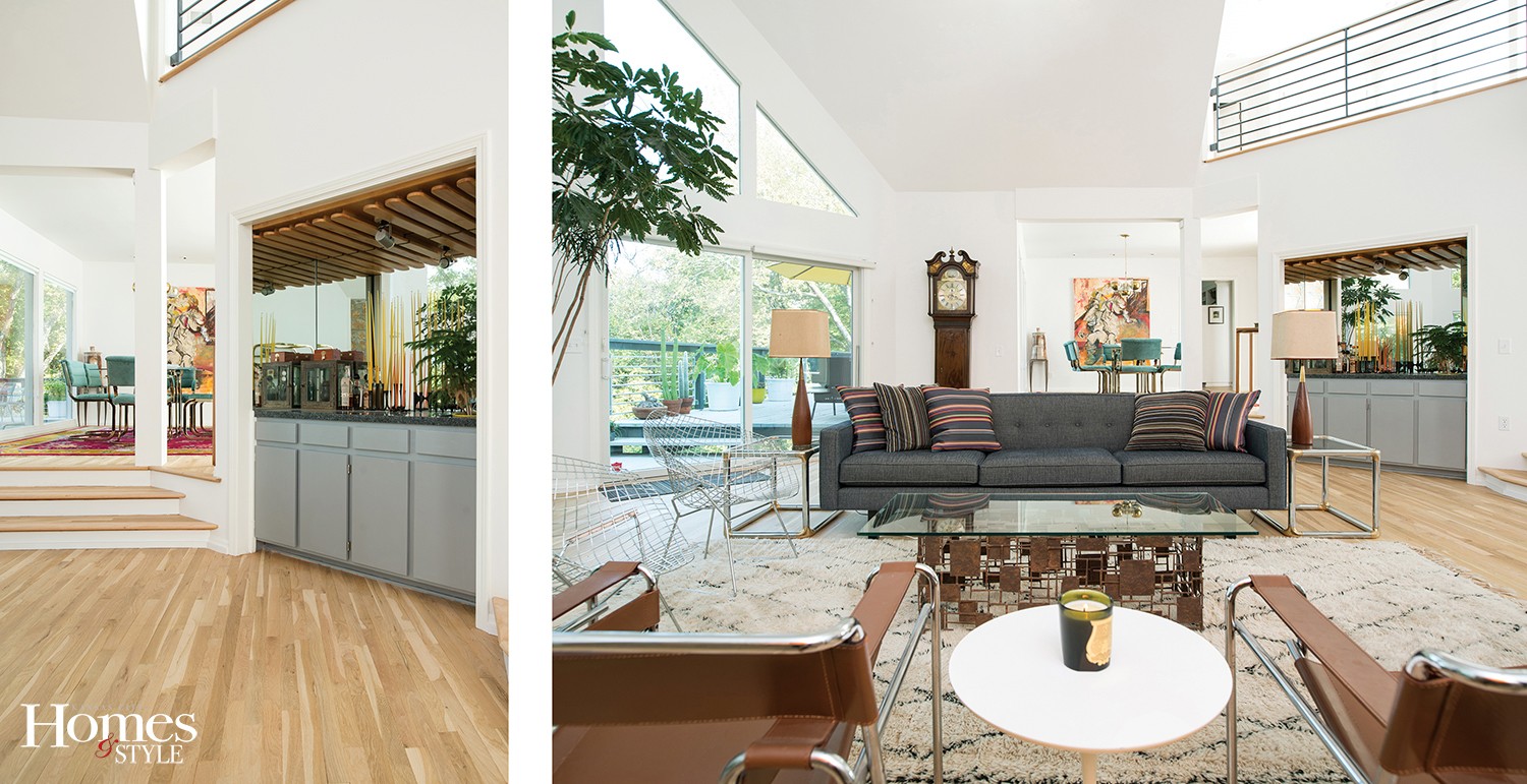
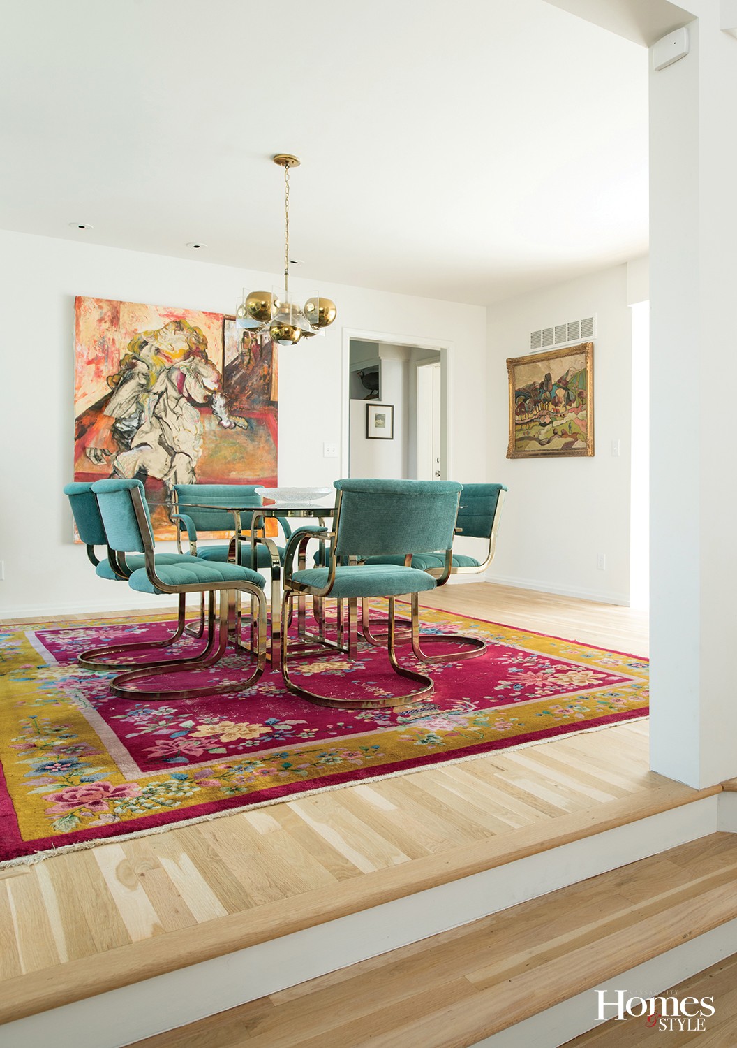
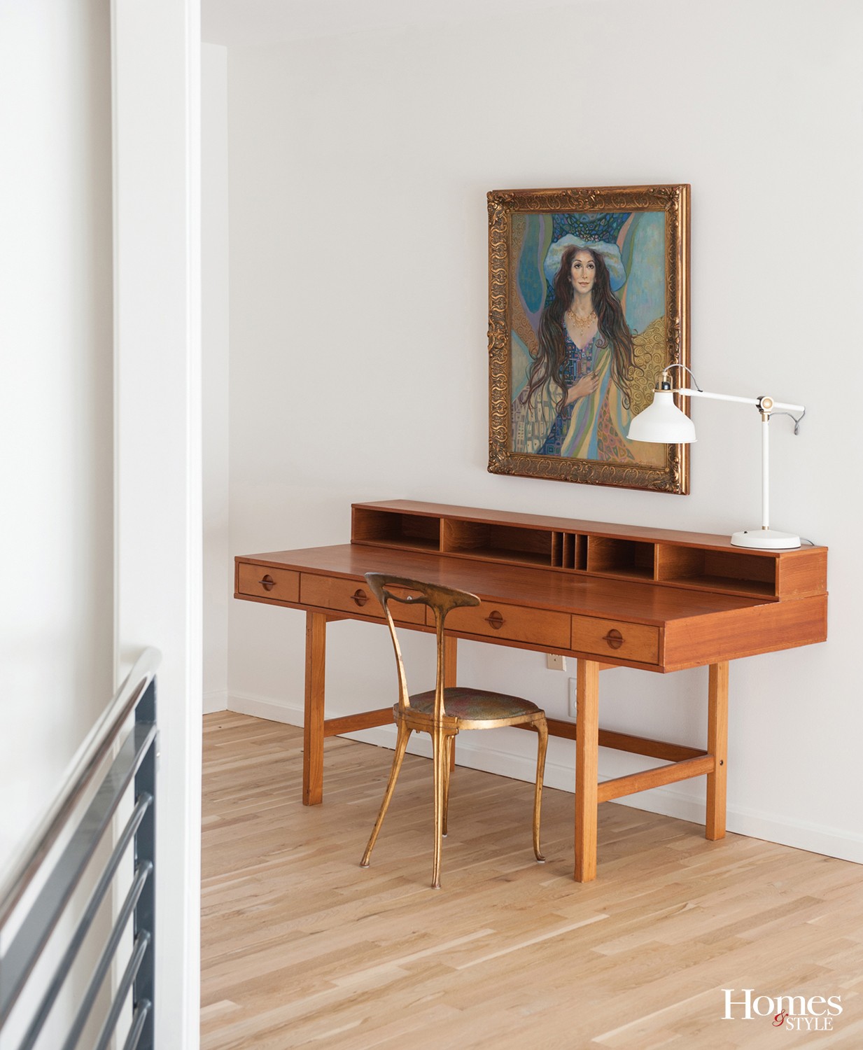
Throwing caution to the wind, Nick and Lynn followed no rules as they furnished their new home. A thought-provoking mixture of mid-century modern, brutalism, Art Deco, and flea-market finds, the couple’s design aesthetic turned out to be decidedly spontaneous and refreshingly eclectic.
“We’ve filled our home with a blend of many different styles – including an incredible 80’s brass and glass dining room set I found at a garage sale for fifty dollars,” says Nick. “We have no design filter. If something speaks to us, we find a way to incorporate it. To hell with design rules,” he laughs.
Realizing they were both avid collectors when they first moved in together, the couple were pleasantly surprised by how their tastes seemed to merge. They both love ceramics and display works that were handcrafted by Lynn as well as other ceramic artists including Ken Ferguson, a local artist who taught for many years at the Kansas City Art Institute, pieces by their niece Dianne, and random objects they’ve collected over the years.
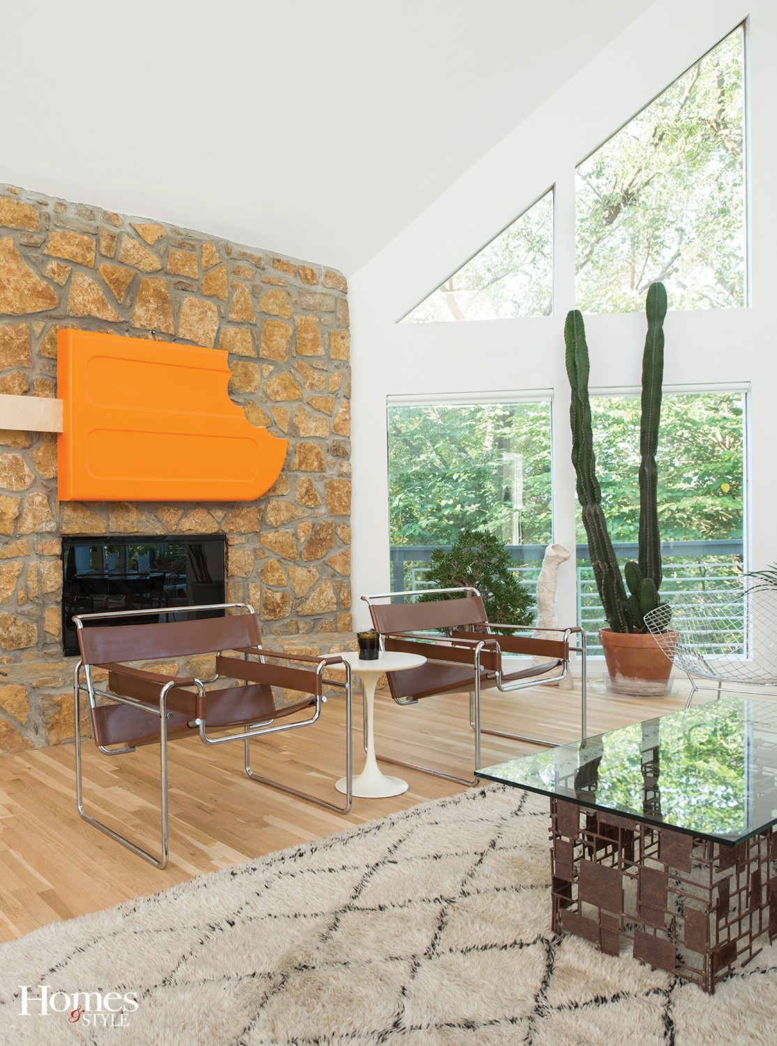
“We love art and furniture,” says Lynn. “Our walls are covered in everything from German Expressionism, mid-century works, pieces by local painter (and friend) John Kline, and – our absolute favorite – a giant 3-D creamsicle from a department store display,” he laughs. “Again, no rules.”
A blissful display of natural light, space, and depth, the house seems to transform at different times of day as well as with the seasons. Rooms are flooded with light from the east in the morning and then flooded with western light in the afternoon. Almost every night, Nick and Lynn are gifted an incredible sunset that changes the color inside the house – due largely to the expanse of white paint from within.
“We love to relax on the deck with a glass of wine and watch the sunset before we get to cooking dinner,” says Nick. “The oranges and pinks that are cast on the walls inside create a strikingly beautiful effect,” he adds
“My favorite moment of any project is seeing the final finished product,” says Kathy. “I loved working with Nick, as he and I are both perfectionists and are very picky about the way things look. A pair of vintage wire Bertoia chairs that Nick and Lynn purchased are definitely the eye candy of the furnishings, but my two favorite features in this house have to be the natural wood floors and the orange creamsicle pop art above the great room fireplace,” she laughs.
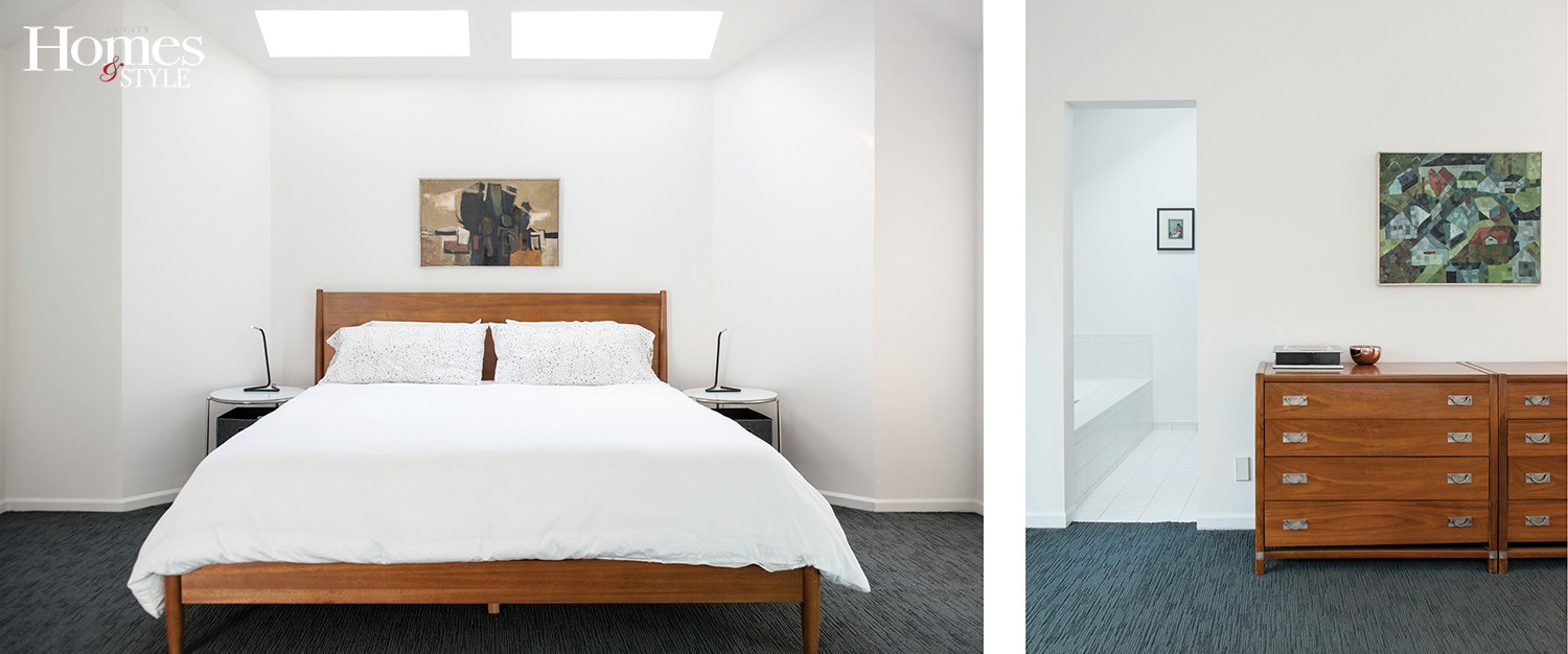
Perhaps the most serene space in the house is the bedroom, which Nick intentionally designed to be a very minimal, white-hued place of calm. The room delivered exactly the results he was after and turned out to be an amazing space to sleep with no distractions, no television. It’s akin to a cocoon with few furnishings other than a comfortable bed.
“We wanted a home that expressed our personalities,” he says. “Our goal wasn’t to create a perfectly decorated showhouse – we aren’t into homes that look like they were plucked from a catalog. We like the reaction we get from friends and family when they walk in for the first time. It’s a love it or hate it kind of house,” he laughs, “but either way, we think it makes an impression.”

