
Color psychology and how to use it to reduce stress and bring inner peace, health & wellness into your home.
Story by Carol Way Cisco | Photos courtesy of signature design + studio
Let’s start with the basics. Did you know the interior design of your home can have an impact on your overall health and frame of mind? Believe it or not, it can and does!
For example, have you ever been in a room that is painted or wallpapered floor to ceiling in a heavy saturated color? Did you feel closed in, uneasy or combative? That’s the psychological effect of color on your emotions. Think about trying to deal with the stressors of life and solve problems in such a room. Impossible, right?
Extensive use of red in floor to ceiling application is one color that will elevate your blood pressure which in turn can lead to other health issues. It creates anxiety and has negative effects on your mental health. However, used in moderation as accents will have a positive result.
The first step is knowing and recognizing the impact of color on you and your family’s emotions and health. There are colors that are soothing. They can bring calm and stability to your home. This is what your sanctuary needs.
Green is one color that will do just that. Through evidenced-based design green can accelerate recovery from an illness and better yet lower your stress levels. Nature is a great way to bring green into your interior environment. Its association with growth and renewal has a therapeutic and positive outcome on your mental and emotional well-being. The evidence also shows that improved cognitive outcomes are also possible such as improved memory and problem solving.
Physiologically purple has a calming effect on the body and mind depending on the shade you use. It can set a mood for inspiration and be uplifting.
Do you love blue? That’s a great color for your sanctuary. Like green it brings calmness in addition to peace and encourages orderliness. It also can lower your blood pressure by lowering your heart rate and allows you to relax. Painting your kitchen blue or serving meals on a blue plate will serve to lower your appetite.
While we can go through the entire color spectrum, let’s talk about the most important color; the invisible color. The invisible color is the color you can’t see because it is blocked. There is no negative space, only lots and lots of possessions filling the room where color could or should be. Some call this “clutter”.
Only where orderliness and space has been designed into your home can you see color. The corollary is a room packed with furnishings, nick naks, and stuff with little visible wall or open space can dull your senses and create stress not only in your mind and emotions but physically as well.
Think for one moment. Consider this, your mind takes pictures of your environment every millisecond of the day and night. That’s your memory bank. The file cabinet where you can recall any moment in time. For example, that hilarious moment you can describe to a friend about how your dog runs zoomies and more zoomies around the house, jumping on and off the furniture, because he was so excited to see you when you returned home. Sometimes you can recall it in vivid color and with great detail. But you can get a mental image picture of that specific occurrence.
When your environment is cluttered, packed with possessions and disorderly, your mind becomes exhausted, overtaxed having to take in every detail of that room. The filing cabinet gets overwhelmed. The placement, color, size, and location of every single item will affect your physical and mental health by sheer volume and disarray. And even if nicely arranged, less is still more and healthier.
This is the invisible color. No space, wall or otherwise to use and place color.
From this research we found that interior design is more than just aesthetics. For your sanctuary we need to consider this and all things during the design process. And that does include beauty. So let’s not leave that out. It is important because beauty is a therapy in itself. It brings resilience to your life.
While we have not discussed all the core principles of health and wellness design we have enough to get a head start on Creating Your Sanctuary!
Get Ready, Here We Go!
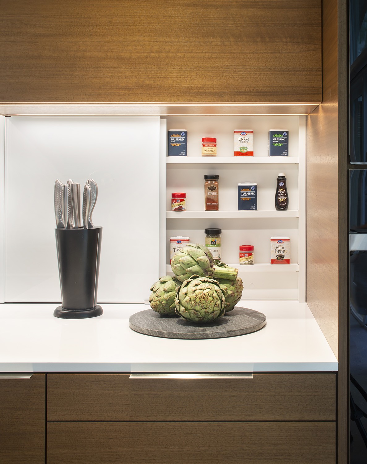
Let’s start with a cream color canvas. In the course of the design process we’ll add splashes of color and geometric blocks of color with the furnishings.
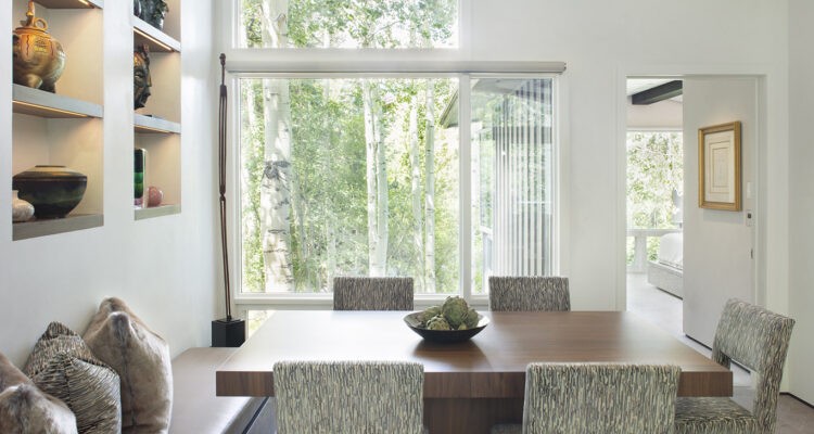
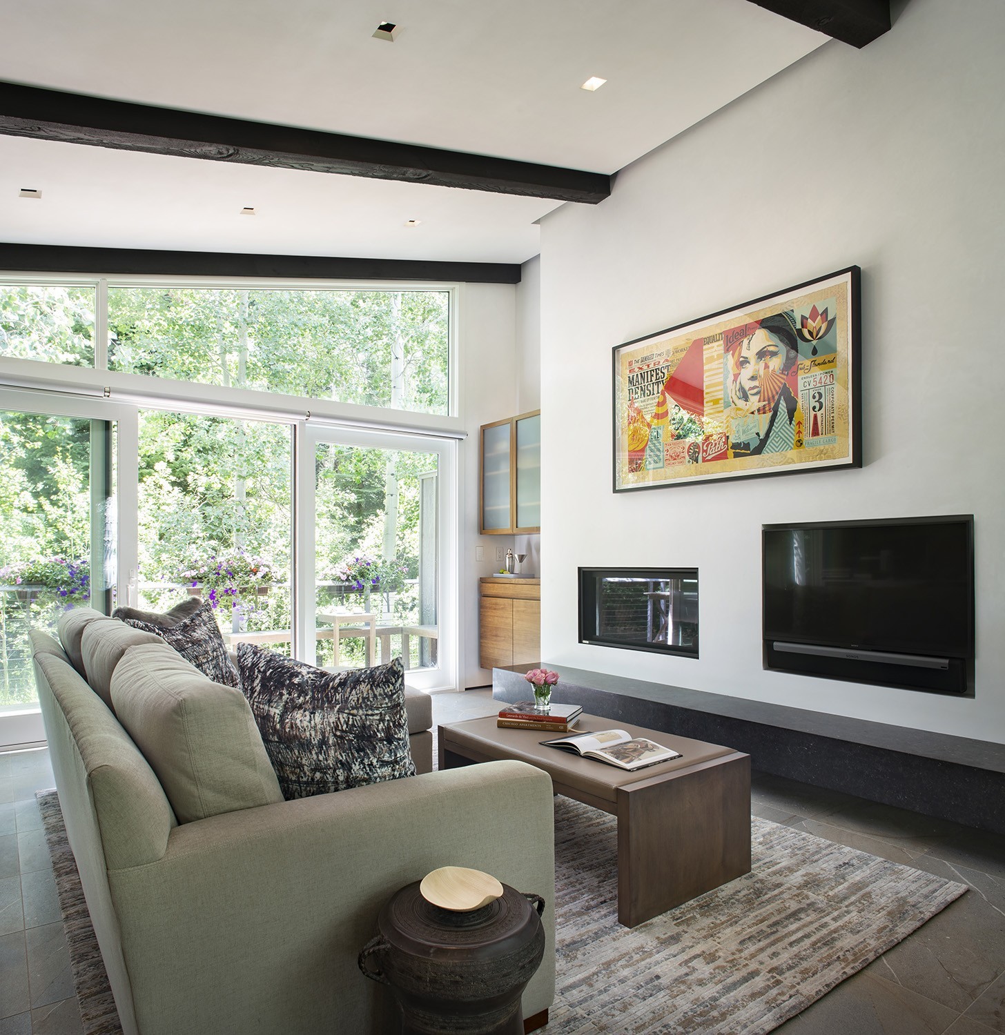
We need a place to display your artwork, special vases, books, and other items you treasure. You’ll want to feature them so they do not get lost among other items grabbing for your attention. We’ll select art that have splashes of red for accent to bring life to the environment.
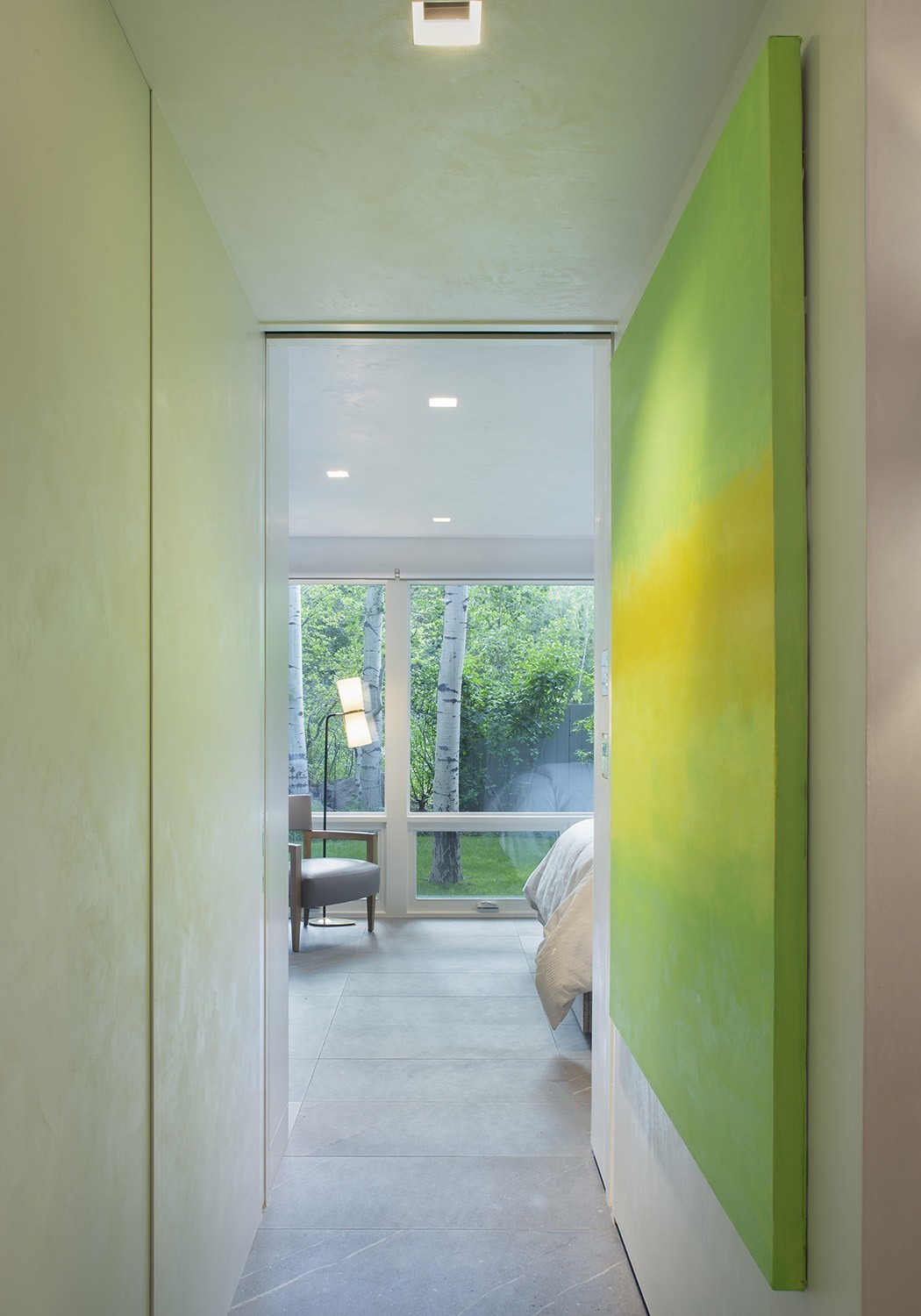
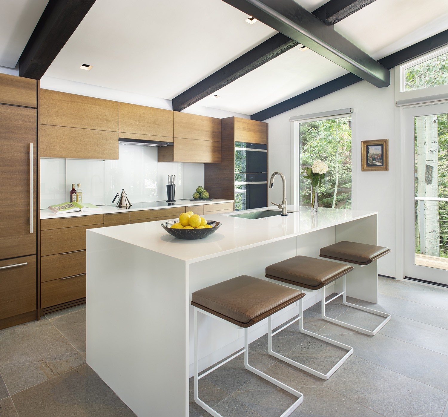
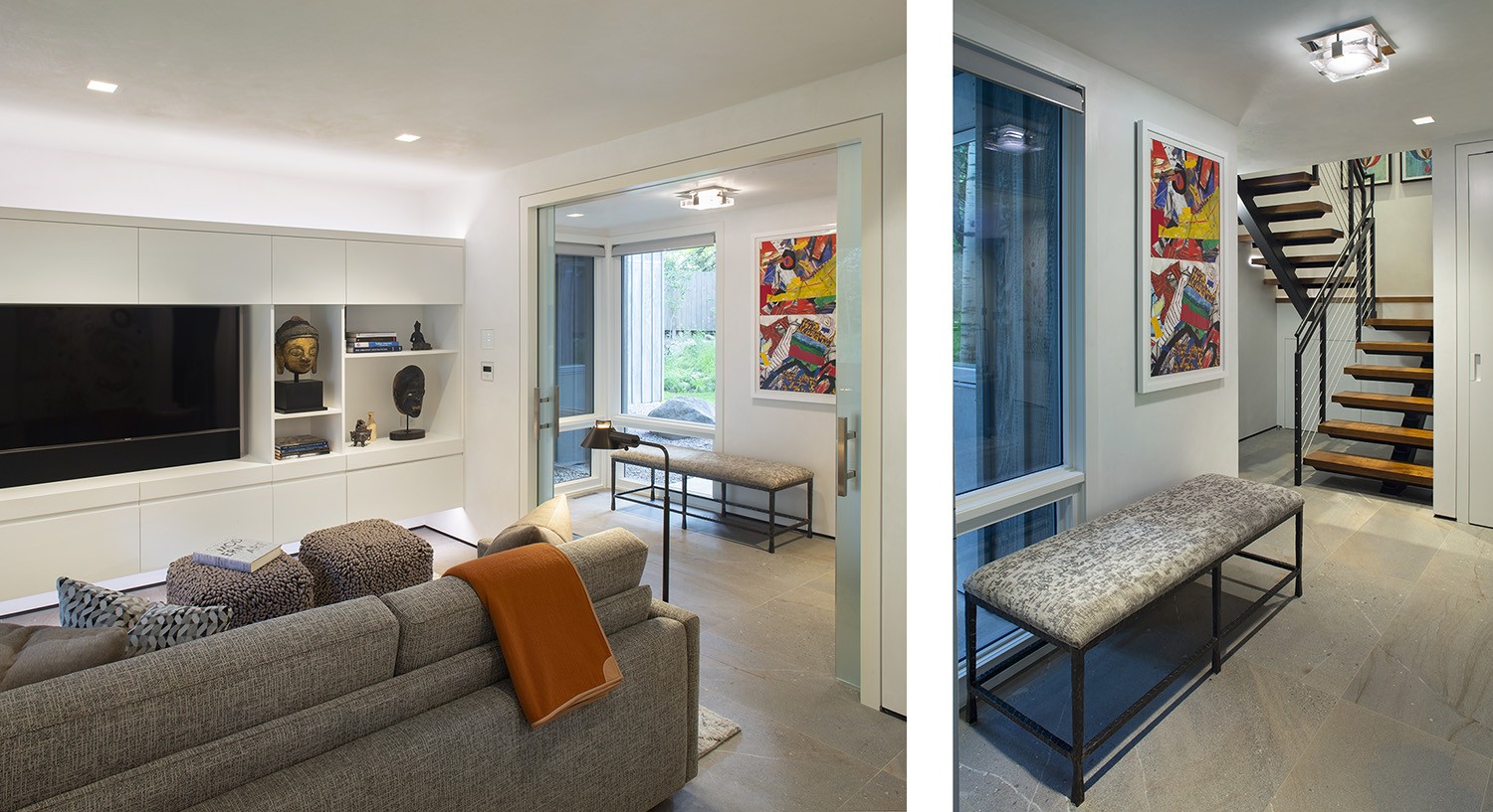
Green is a definite in the color palette bringing Mother Nature in. Let’s give her a seat at the table; up close and personal. In this case, windows that were small will be enlarged from floor to ceiling to accomplish this. And will be done throughout the home.
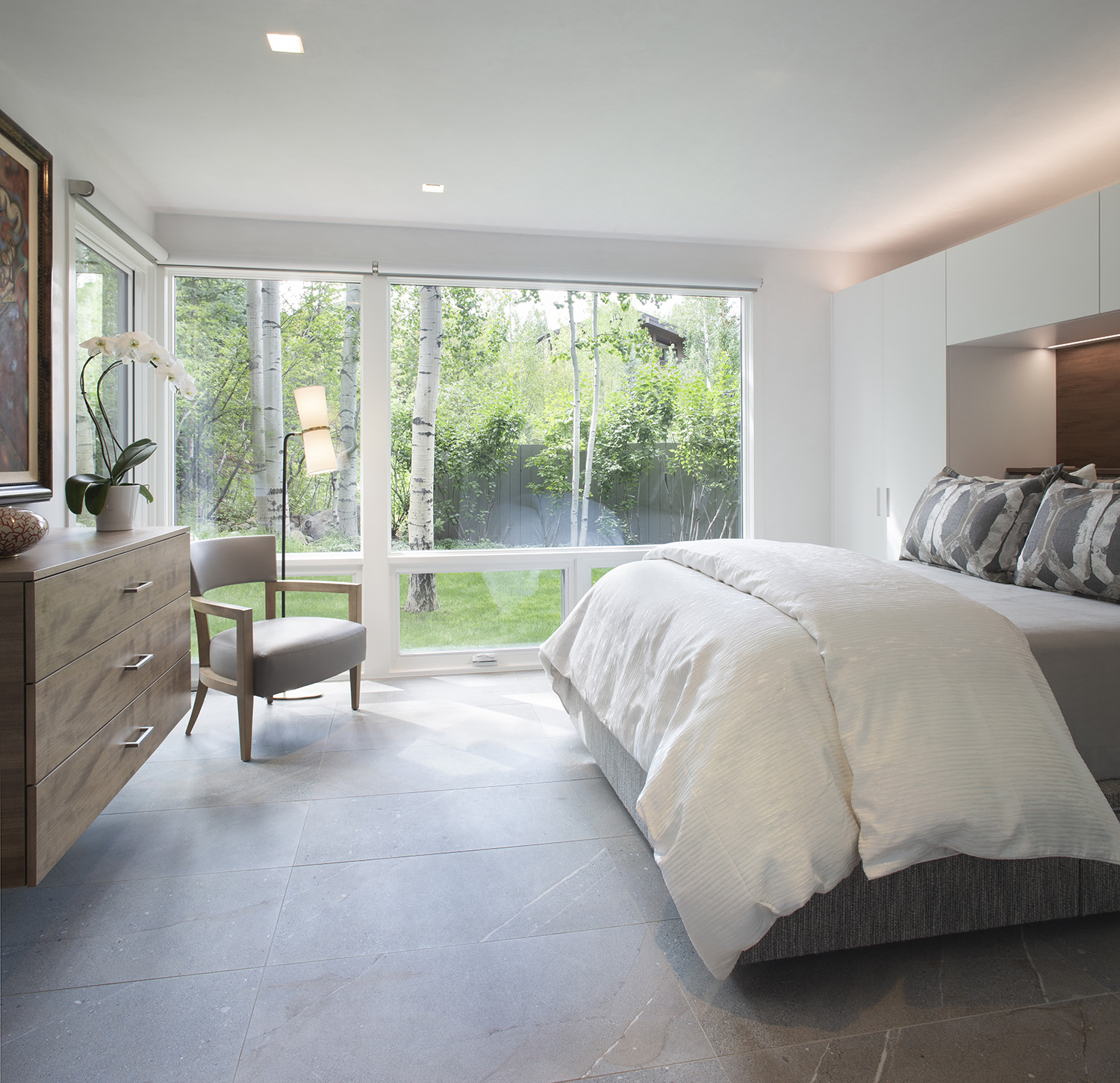
To complement the green we’ll use earth colors in flooring and furnishings. Use of walnut adds warmth and color to the canvas. These design elements will help us connect to nature and create a feeling of serenity and stability.
Making sure we have plenty of negative space to bring calm and relax the mind is a must. And while the color will be white it is nonetheless color. It brings calmness, comfort and hope. It gives life a sense of order helping to declutter the negative aspects.
Rather than drapes we’ll do roller shades. The kind that looks beautiful when exposed yet barely seen. That will minimize the “noise or cluttered” look and be easy on the mind.
The result, is beauty and delight! A sanctuary that will bring inner peace, health & wellness to you, your family and home.