A Midcentury Modern-era home gets an updated kitchen that expertly weaves together a Mid Mod aesthetic with contemporary tastes.
Story by Michelle Mastro | Photography by Angier Photos
Interior designs from the Midcentury Modern era are slowly coming back into fashion. For today’s homeowners, the midcentury modern aesthetic offers simple, minimal design choices that feel simultaneously chic but also warm and cozy. This was part of the style’s appeal for the homeowners of a Prairie Village Modern home. The couple wanted a modern, clean, midcentury modern inspired kitchen renovation that fit their 1950’s ranch style home’s style. But on the other hand, they didn’t want their new kitchen to go overboard with bold Mid Mod hues or kitschy era centric décor.
Enter designer Kara Kersten of Kara Kersten Design. In addition to styling more traditional and classic homes, Kersten has worked on several midcentury modern abodes and knew how to work with the aesthetic well. “The homeowners had seen my work and knew I could handle this style,” she says. “But they also knew I would listen to them and that I don’t push clients towards any niche design choice.”
Therefore, when helping renovate the couple’s kitchen, Kersten was able to expertly tread the line between midcentury modern-inspired looks and her client’s more modern-day tastes. In other words, there would be no atomic orange painted cabinets or tulip chairs in this kitchen. Instead, Kersten took the Mid Mod aesthetic as a general guide and carefully combined it with the homeowner’s more contemporary preferences.
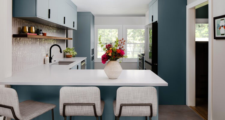
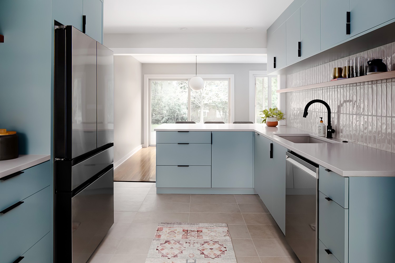
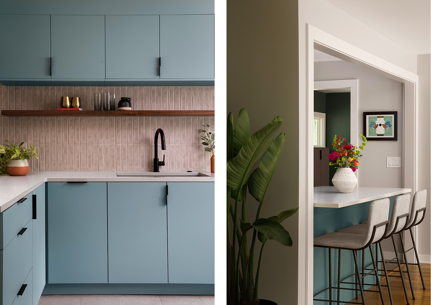
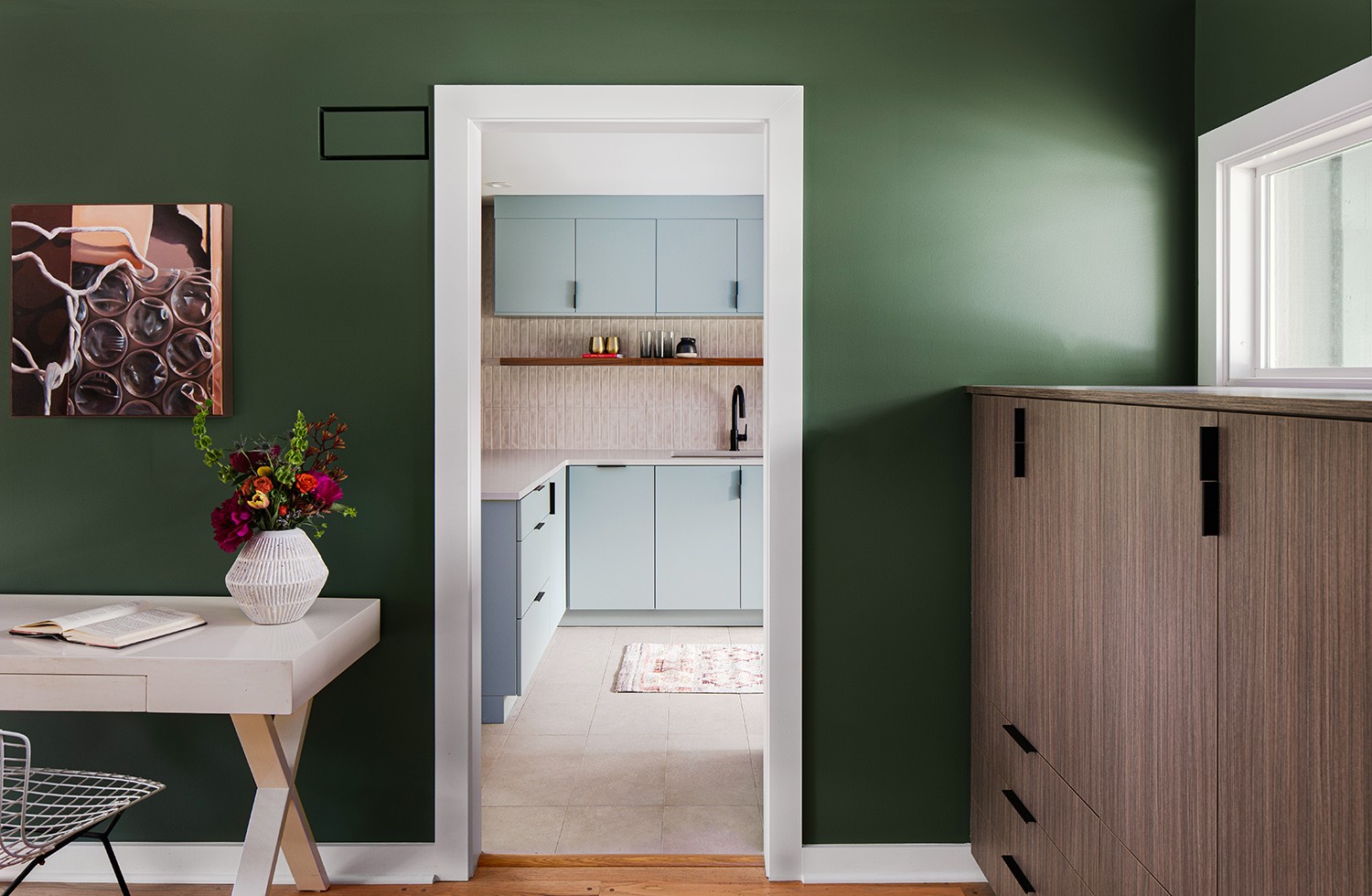
For example, blues and greens have long dominated contemporary kitchens’ color schemes. And these are also colors the couple likes to use in their home. “The colors the homeowners tend to gravitate to have more of an earthiness in them,” she explains. “Their bathrooms have green colors. So, I was trying to find a more nature-inspired color palette for the kitchen that wasn’t as bright as typical MCM colors.” Together, she and the couple landed on cabinets that came in a blueish-gray hue. “Everyone stops by and likes the color’s simplicity,” says the homeowner.
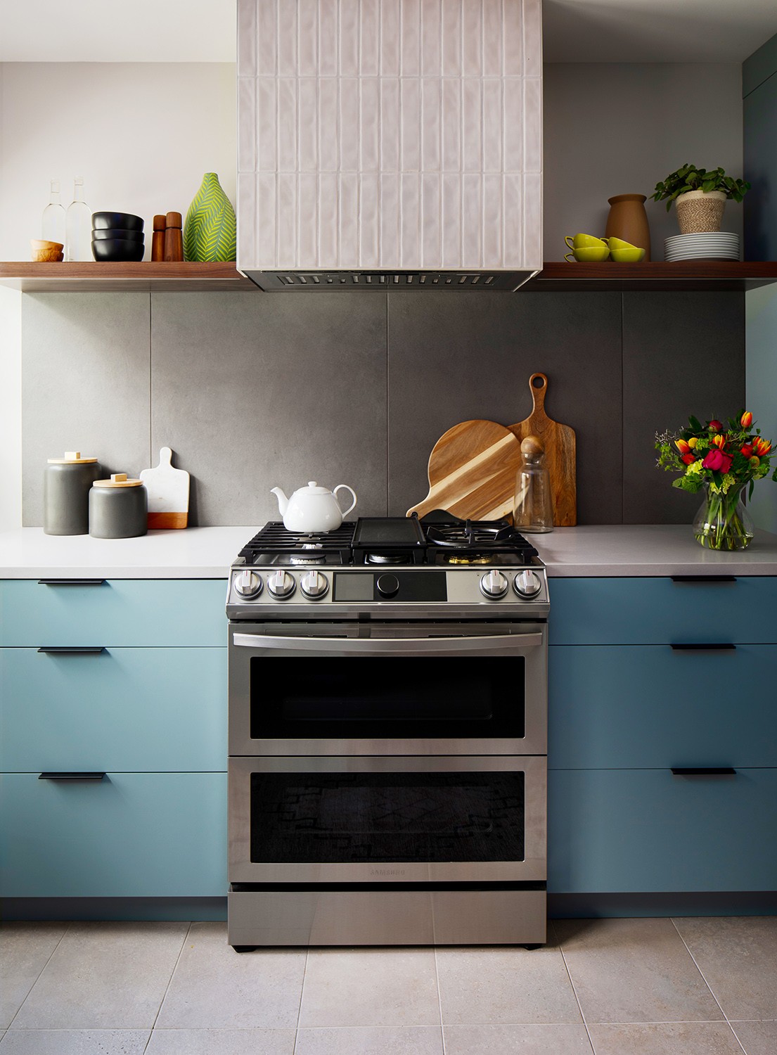
Meanwhile, hints of walnut, a favorite material among midcentury modern enthusiasts, can be found in the room’s floating shelves. But the material and color feel more pared down and minimalist when presented in this way as opposed to the typical all-walnut cabinets or furniture traditionally used in midcentury modern homes.
Nearby, the backsplash also leans Mid Mod but with an updated look. “The tile backsplash we chose offered clean lines but nothing loud in color,” she adds. The tile color is a light cream, perfectly complementing the kitchen’s other subdued shades like those in the newly refinished floors, now stained a bit lighter. All the while, the homeowners deferred to Kersten’s expert advice. “The homeowners were very trusting,” she says. “They felt that I understood what they wanted.”
While the couple preferred this careful fusion of old meets new, Kersten points out that leaning too far into MCM wouldn’t have fit the home anyway. “Their house was built in the midcentury, and it’s a ranch, but it’s not the kind of Midcentury Modern era home with the exterior that screams that style,” she says. “Outside, the home looks subdued and inconspicuous, and with interior design, you always want the inside to match the outside.”
At the same time, the kitchen had to adopt some major changes in terms of its floor plan. “The homeowners wanted a more open layout where they could mingle with their guests while entertaining,” Kersten says. Thus, the wall where the countertop now sits had to go. “Before the flow was very boxy and the kitchen felt closed off,” says the homeowner. With the wall gone, sunlight from the front windows can now flow through the house, brightening the once cramped and dark kitchen and filling many other spaces with its natural light.
The removal of the wall also allowed for more cooking space. “The homeowners cook a lot,” says Kersten, “so we really wanted it to be a practical kitchen with countertop space that is really useable.” Before, there had been no countertop space next to the range hood. Other functional problems were fixed by a tall cabinet that now serves as pantry storage complete with rollout drawers and a hidden microwave.
Now, with ample countertops, the couple can linger at the kitchen’s peninsula throughout the day. “We all tend to gather at the countertop peninsula now,” says the homeowner. “My husband cooks a lot, and now me and [our daughters] can sit at the counter while he cooks.”
According to the homeowners, none of this could have been possible without Kersten, who they say repeatedly helped steer them in the right direction. “She walked us through everything,” says the couple. “The whole design process can be overwhelming at times, and so she helped by narrowing a lot of the design choices down for us to choose from.” The resulting kitchen exemplifies a perfect union between a midcentury modern aesthetic and today’s fashions.
Resources
- Interior Designer: Kara Kersten Design
- Cabinets, Tile, Structural Framing, Beam & Trim Work: RWS Remodel
- Countertops: Countertops Direct
- Electrician: Xtreme Electric
- Flooring Hardwood: Aeon Hardwoods
- Hardware: Berenson
- Heating & Cooling: Cates Heating & Cooling
- Light Fixtures: Kara Kersten Design
- Paint: Sherwin Williams
- Painter: Platinum Painting
- Plumbing: Greg’s Plumbing
- Plumbing Fixtures: Ferguson Bath, Kitchen & Lighting Gallery
- Windows & Doors: Owen Lumber

