2025 Color Forecasting Casts a Wide Net Filled with Surprises.
Story by Gloria Gale
Part soothsaying, part sophisticated science, the alchemy of color trends relies on the spirit of culture and creativity.
The nature of the forecast drives fashion, home furnishing, even what color car we drive – all designed to influence consumers. Those across the spectrum in business and industry keep a close eye on seasonal color trends.
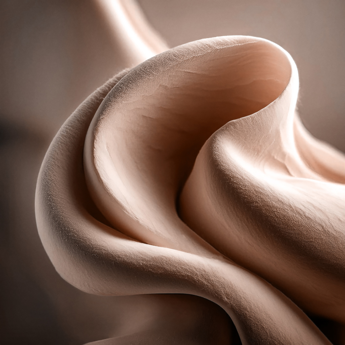
Photo courtesy of Pantone
In particular, the 2025 Color of the Year with its encompassing effect, has professionals watching Pantone, the global authority on color for the design industries.
It seems brown is having a moment. Pantone’s choice in 2025 is Mocha Mousse, a warming brown hue imbued with richness – it nurtures us with its suggestion of the delectable qualities of chocolate and coffee, answering our desire for comfort.
One Shade At A Time
With so many hues whirling around the color wheel, after much due diligence, color marketing professionals are generally spot on. Let’s take a look a 8 companies who bring color into our lives.
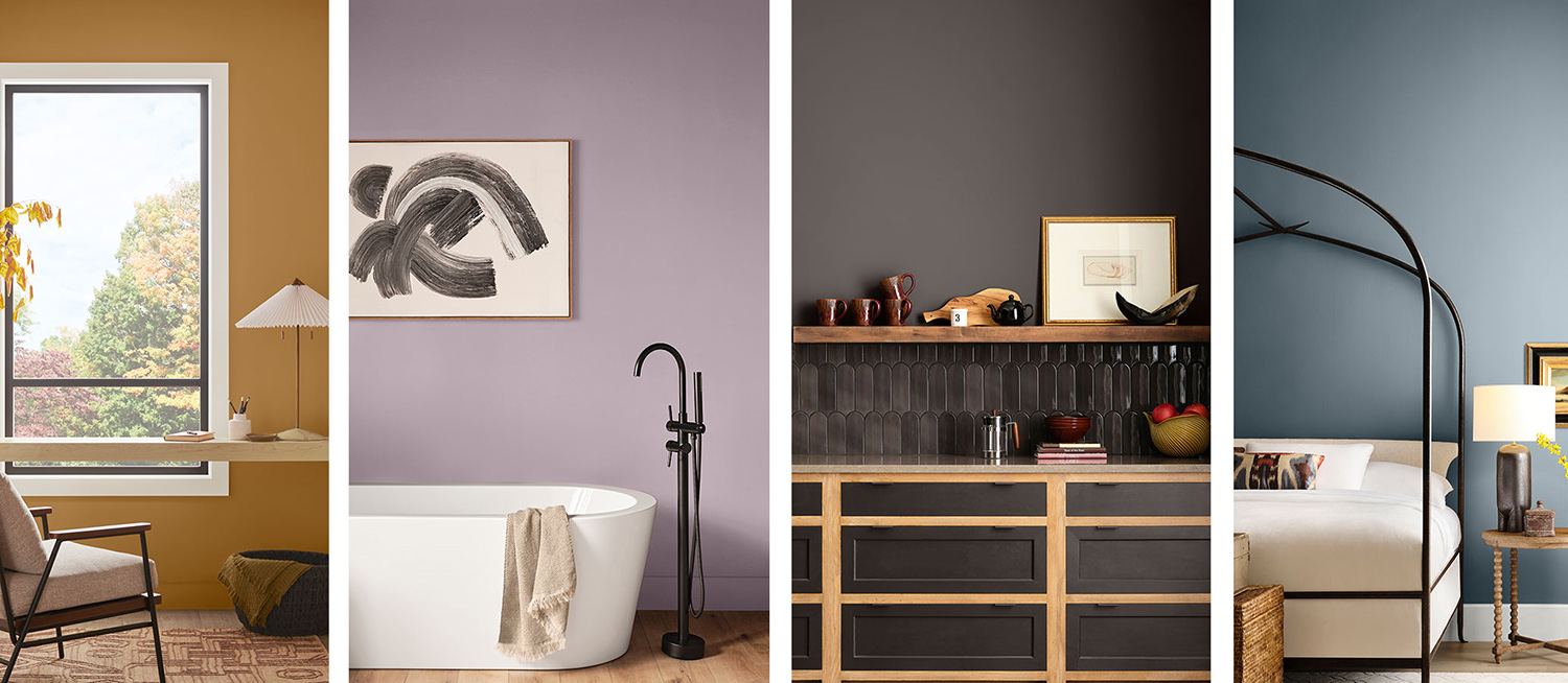
Photos courtesy of Sherwin-Williams
Sue Walden, Director Color Marketing for Sherwin-Williams, distills the 2025 trends into 4 Capsules that inspire, innovate and illuminate the future of residential and commercial design.
Chrysalis – a palette evoking the essence of climate change as its core value. Yearning for the sanctuary of intentional living that elicits planetary empathy, Chrysalis presents colors of drifting mist, the subtlety of clay or windblown dunes.
Paradox – relies on the unexpected. Think youthful whimsy or the surprise of ‘glimmers’, or mini spikes of joy. This color group is full of sensory and playful color. Paradox is a candy-coated universe.
Two additional capsules, aptly named Wellspring and Kindred use color to capture our shared heritage and communal well-being. Both capsules present color with the hope they’ll promote kindness and belonging.
Photo courtesy of PPG Glidden
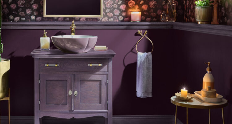
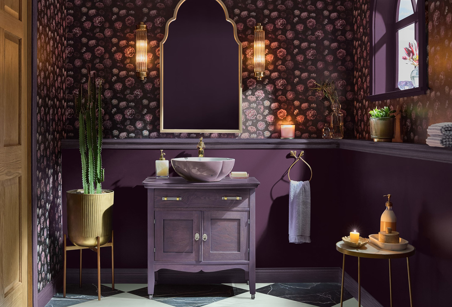
Purple Basil transforms into a deep hue from PPG Glidenn’s 2025 Color of the Year.
Referring to this color as, “A jewel tone, this color is both opulent yet homey. Its versatility delves into quiet contemplation as an accent color or boldly drenching an entire room,” says Ashley McCollum, PPG Color Expert.
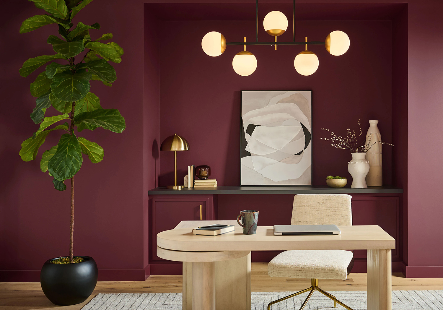
In 2025, Behr paint presents Rumors, a sultry red with rich brown undertones to impart an earthy, inviting ambiance. It’s an especially calming color and appropriate for today’s environmental awareness. Its very nature as a gem-like color is one of quiet drama that harkens back to the 90s.
Photo courtesy of Behr
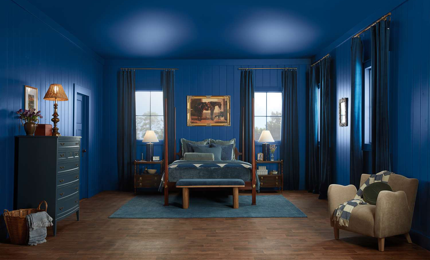
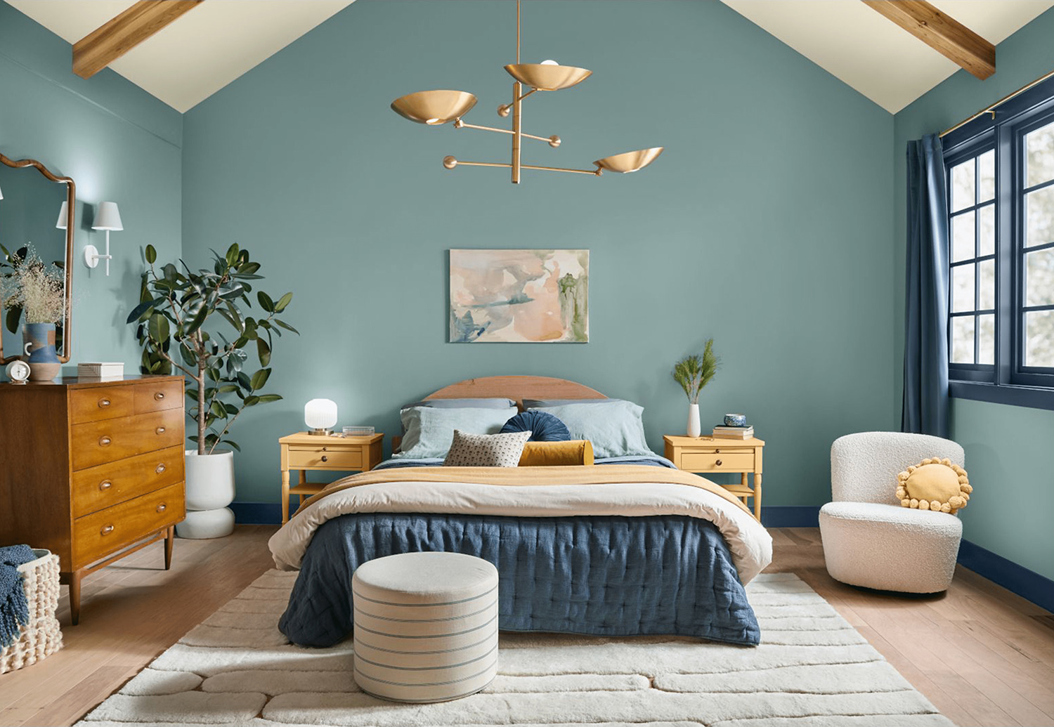
Goodbye bland neutrals…hello vibrant hues. This is how Valspar is welcoming Encore, their lively shade of blue. Merging Old World clarity with modern furnishings, this is a timeless blue. “Encore is highly saturated but will be easy to live with,” says Sue Kim, Director of Color Marketing for Valspar. The company is banking on this lively hue as a fitting welcome in your home.
Photo courtesy of Valspar
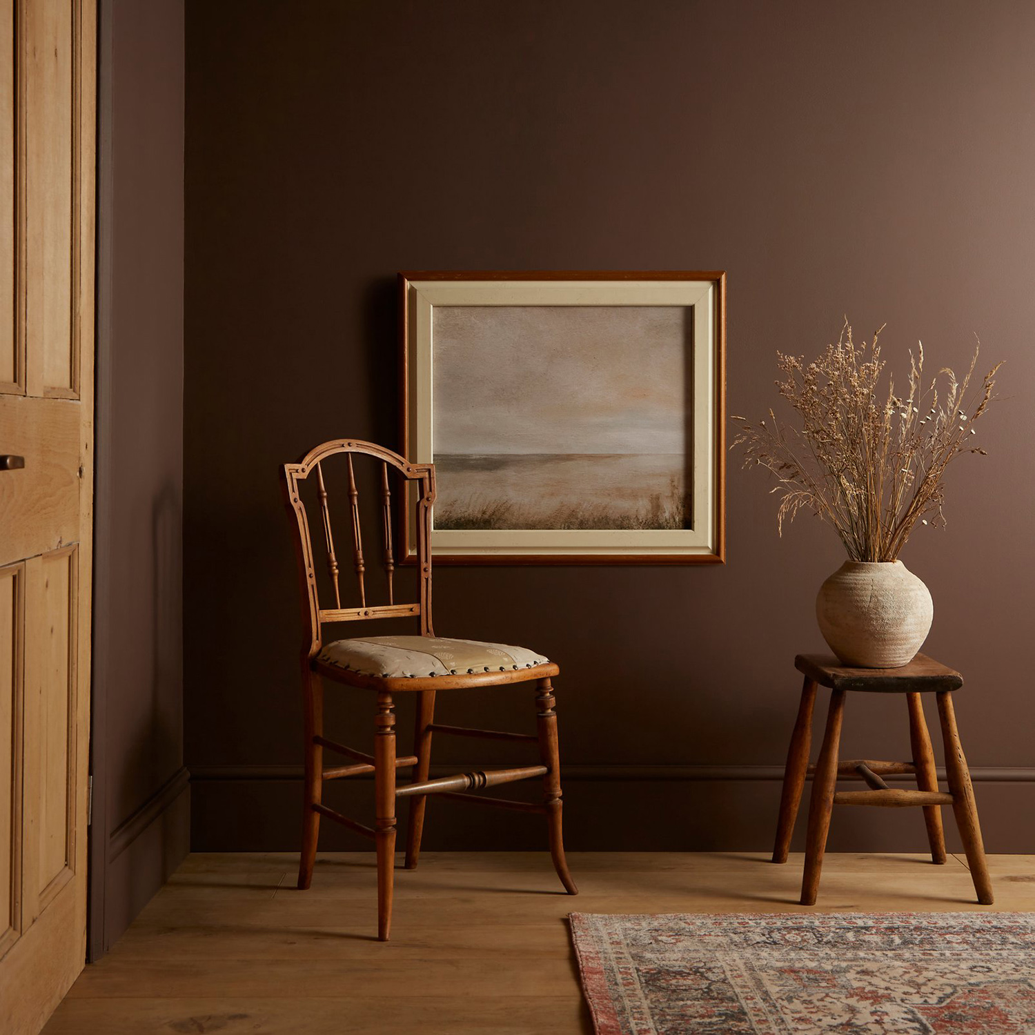
Graham & Brown, family run since 1946, is one of the UK’s most notable purveyors of paint and wallpaper. Their heritage designs finds Elderton, a soothing brownish tone, as their 2025 Color of the Year.
Imagine deep cinnamon or milk chocolate, this muted brown wraps a room in hushed comfort – just the ticket to accompany solace and a good book.
Photo courtesy of Graham & Brown
Minwax has settled on Violet as their stain color of the year. It captures the essence of the calming blue family slightly tinged with red. Pair the stain with natural wood tones to elevate a piece of furniture or give a boost to hardwood flooring. Because this stain is semi-transparent, Violet is an alternative to traditional opaque paint applications without sacrificing wood grain.
Photo courtesy of Minwax
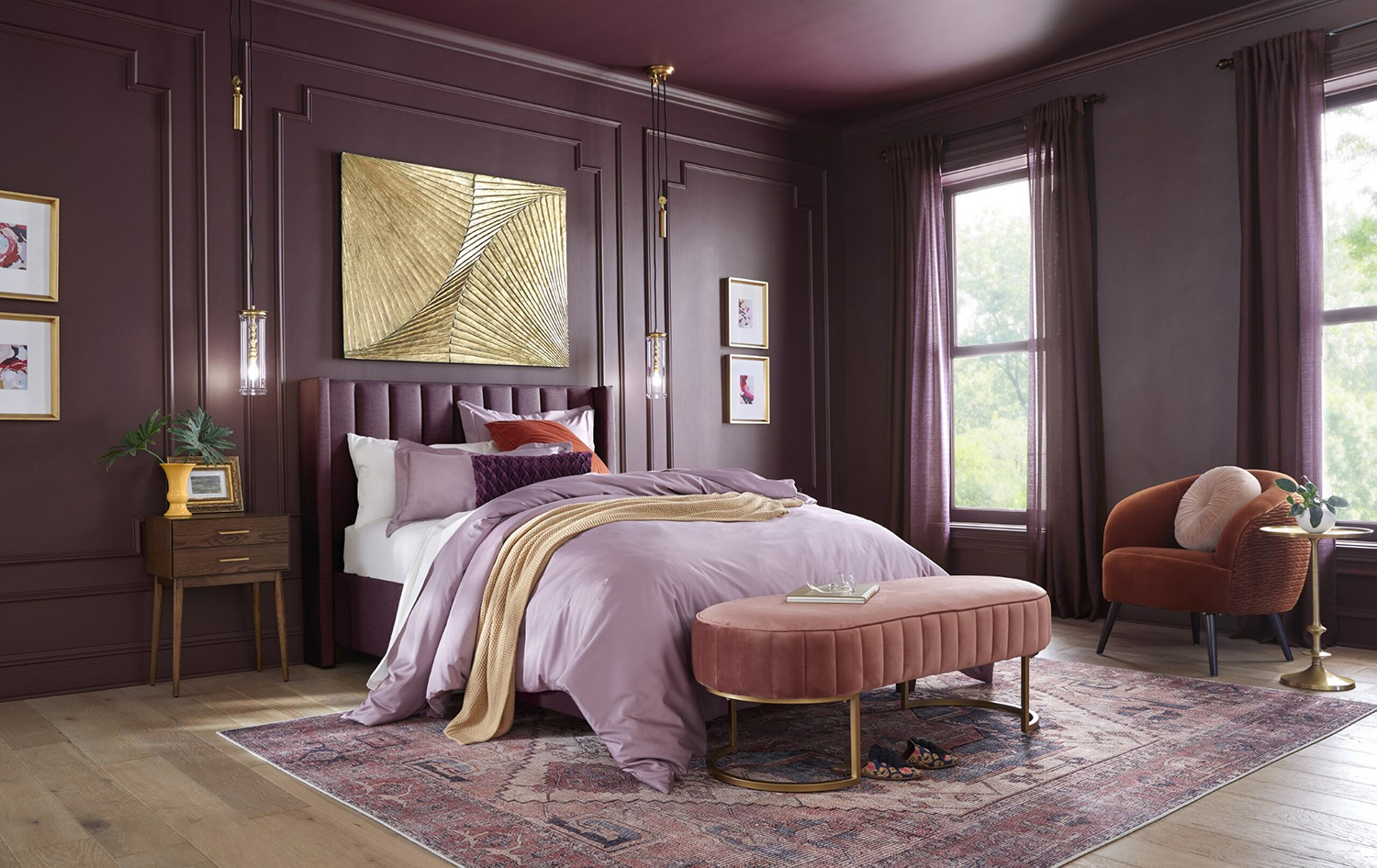
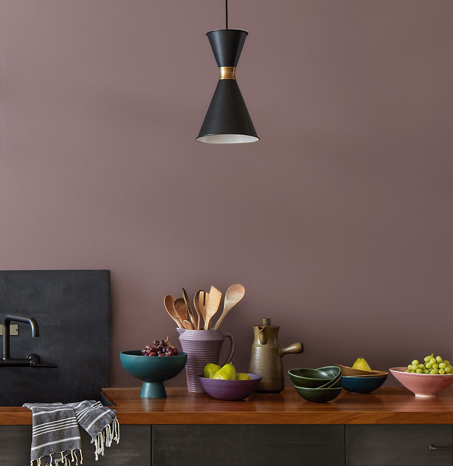
Cinnamon Slate takes a bow as Benjamin Moore’s 2025 pick. This is a feathered plum with a slight brownish overtone that will easily bring a soothing familiarity to any room. This modern, velvety brown-purple tone is non-intrusive, designed to enhance spaces for seasons to come.
Photo courtesy of Benjamin Moore
Even the name Dutch Boy engenders an upbeat curiosity. Since 1907 this company is an experienced source for paint that’s fresh and on-trend. Mapped Blue, evokes modern charm with a cheerful medium blue with yellow undertones.

