This couple paired with Laura Suhr to refresh their Lake space.
Story by Judy Goppert | Photography by Matt Kocourek
Weatherby Lake is the site of this ranch style home where homeowners Joe and Michele landed when they moved to the area from Northeast Ohio in 2002.
“We sought out an area with access to some water since we had lived along Lake Erie our entire lives. We liked Weatherby Lake since it was near our employment and still affordable,” Michele noted. On why they decided to remodel, she continued, “The home needed updating as well as an improved floor plan for safety as we enter retirement. The kitchen is our favorite room. The configuration is very user friendly, and it is now a pleasure to cook and even clean!”
Laura Suhr, Suhr Design, was recommended by a client who she had helped remodel a basement and primary bathroom for. Laura explained, “I had worked with one of their co-workers at the hospital where they both work, and they asked about her recent remodel and what designer they hired. So, she referred me to Michele for their remodel. It’s always wonderful to get client referrals and I was thrilled to work on their project with them.”
Initially, they wanted a full kitchen remodel and primary bathroom refresh which grew into a whole-main level redesign. In addition to the kitchen and breakfast room, Laura and her team revamped the study, living room, laundry/mudroom, hall bathroom and guest bedroom, primary suite with bedroom and even brightened the exterior paint on the home!
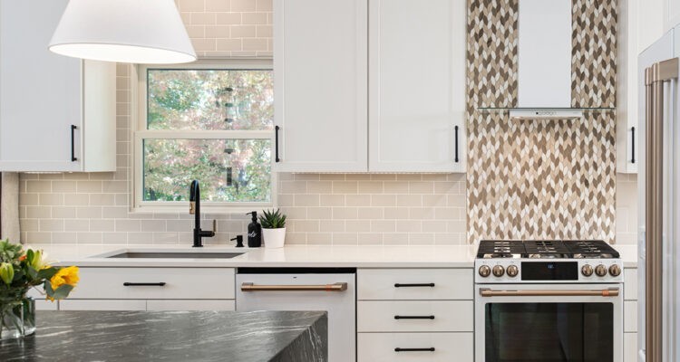
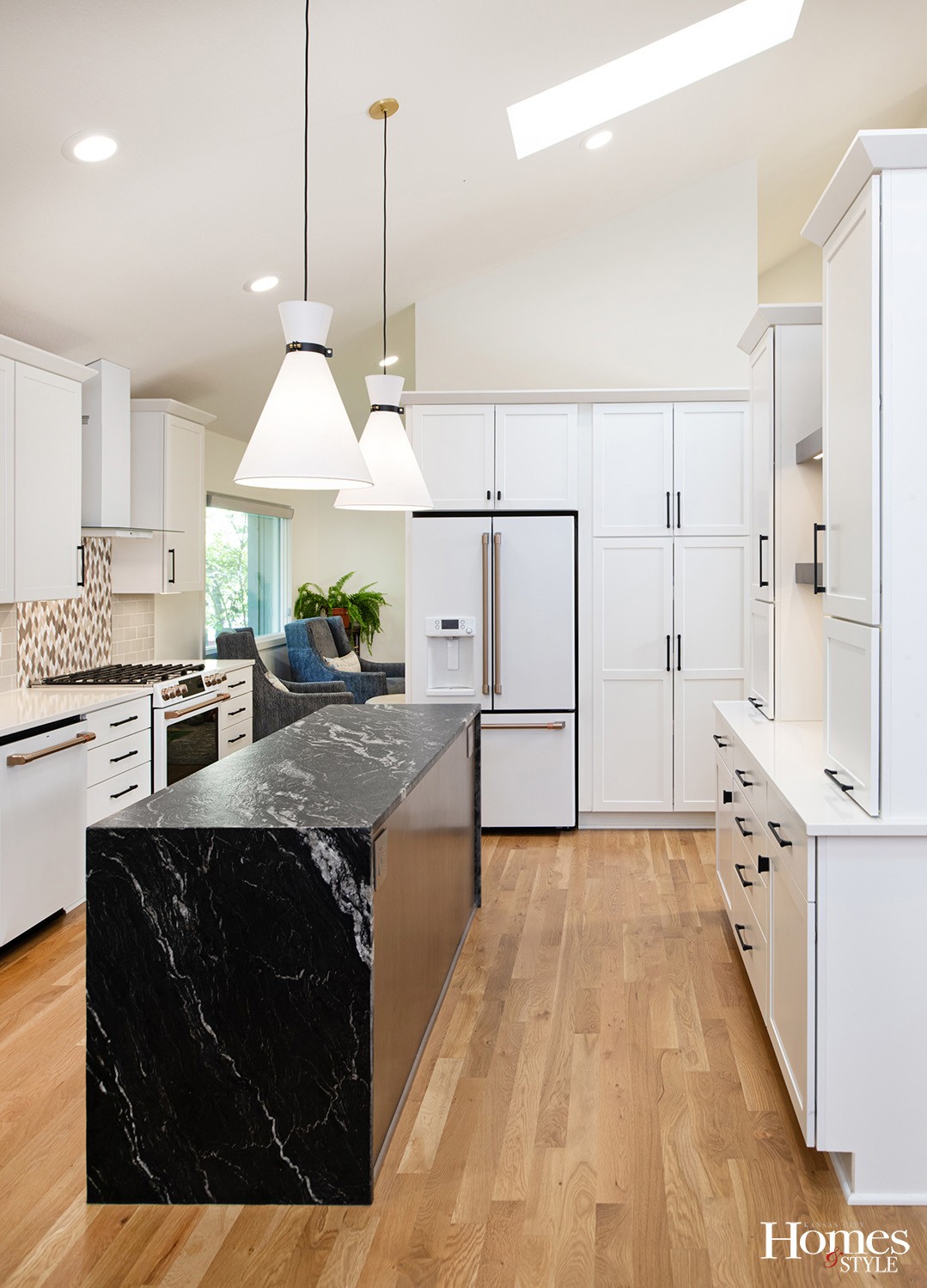
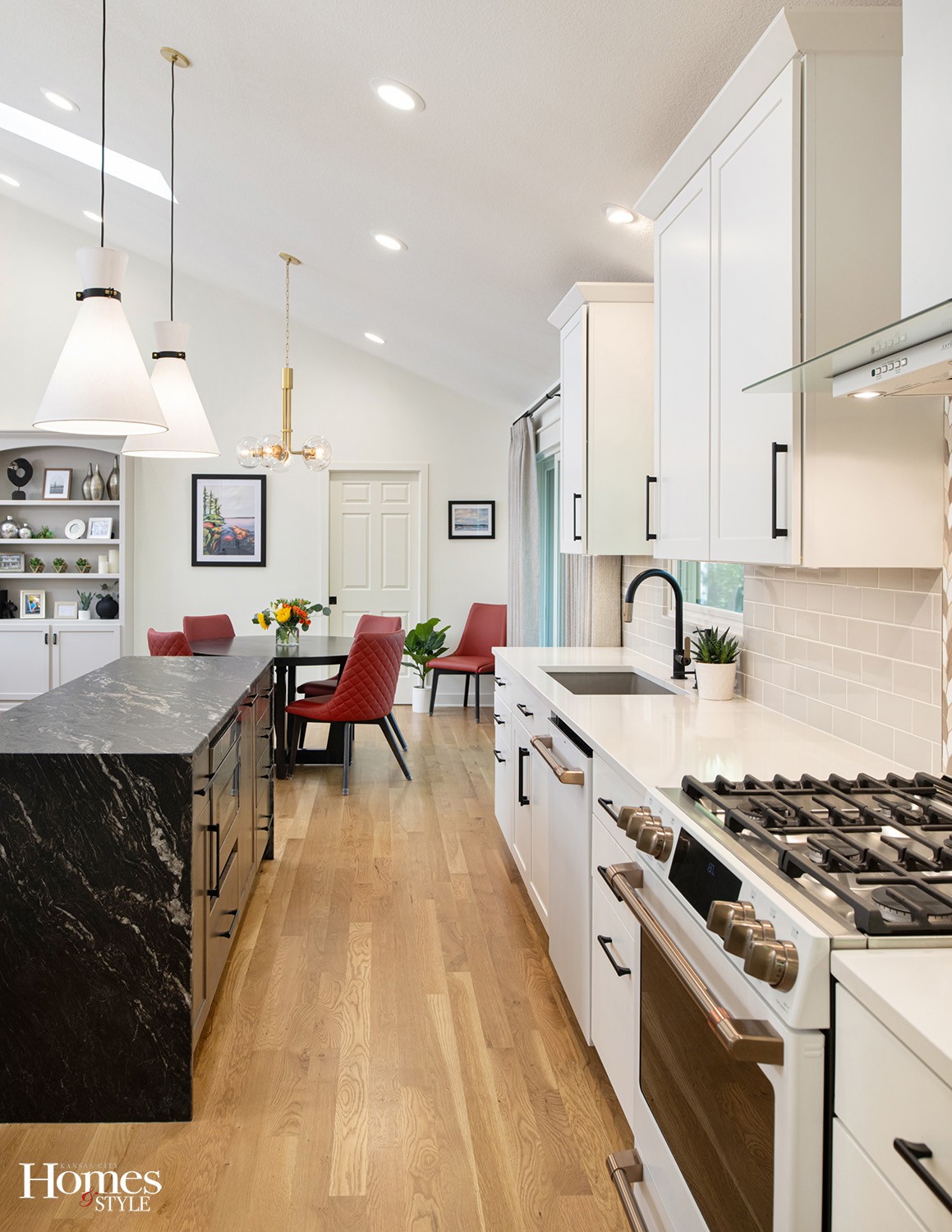
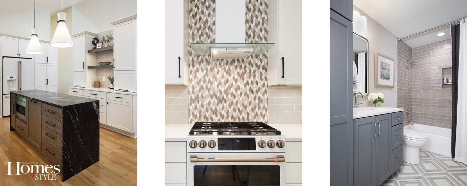
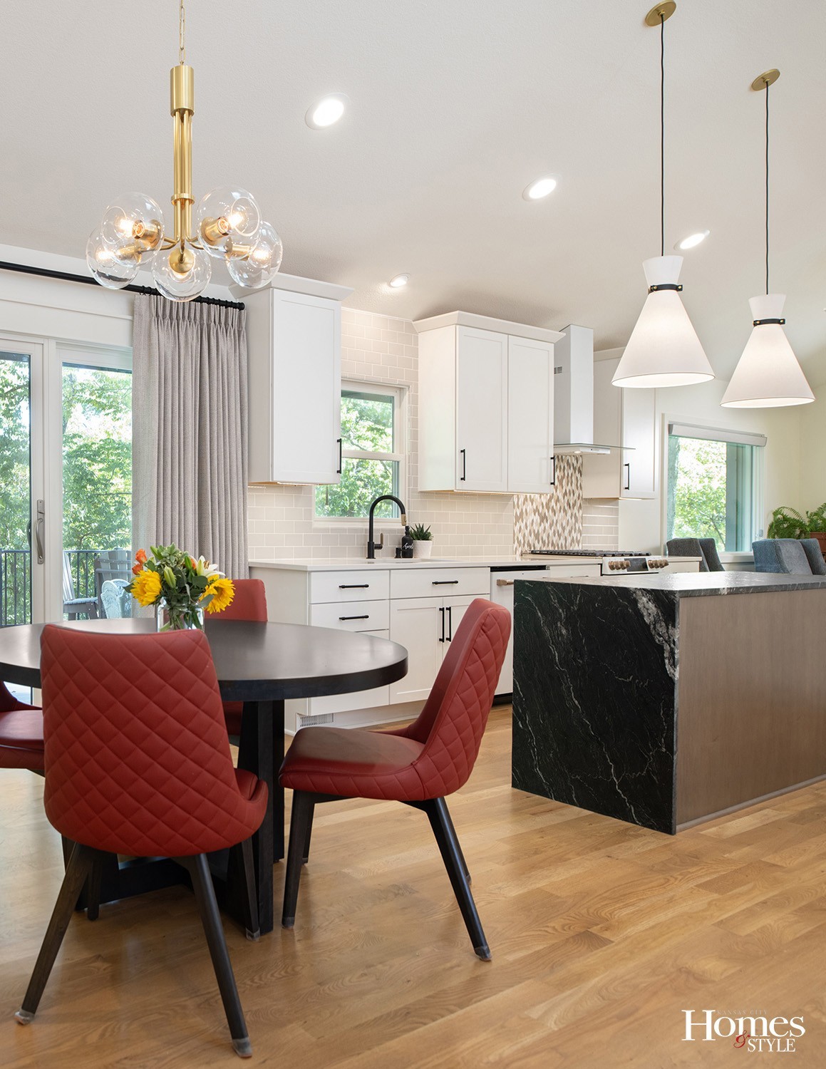
“Kitchens are my favorite spaces to design as they are an intricate puzzle. This kitchen was completely closed off and was not taking advantage of the vaulted ceilings. We played up the natural light, tall ceilings and respect for the natural surroundings at the lake,” Laura noted. “The leathered granite waterfall island is the star! I found it in a showroom and fell in love. There is no appliance interrupting the countertop so it’s a wonderful working space for my clients and anchors the whole space. We kept it light, bright with white cabinets along the perimeter and took full advantage of the natural light pouring through the skylights for an open and airy feel.”
There are floating wood shelves, recessed can lighting, pendant lighting and under cabinet lighting for even more brightness.
The architecture of the home is clean and open, while the kitchen did not connect to the ceilings above, there was a dark soffit and no connection to the front of the house and just a pass-through window to the formal dining room. Plus, three different kinds of flooring.
“The challenge was that there were no limited walls to place cabinetry. We completely reconfigured the space and created a new wall and made it look like it belonged,” she noted. “Now, we have sight lines from the kitchen to the front door, and you can walk on both sides of what is now a study with an open flow to the breakfast room.”
The pendant lights and hardware feature accents of black, gold and wood which gives contrast, depth and interest. They installed all new appliances including a microwave drawer neatly tucked in the island, and two appliance garages which open upward to conserve space and minimize clutter. White oak flooring throughout offers a nice flow and expands the space visually.
“Michele shared with me about halfway through the project that orange is her happy color! We hadn’t selected the chairs yet, so instead of going with neutral upholstery I went with a rich burnt orange,” she continued, adding, “We pulled more touches of orange in with pillows and other design elements.”
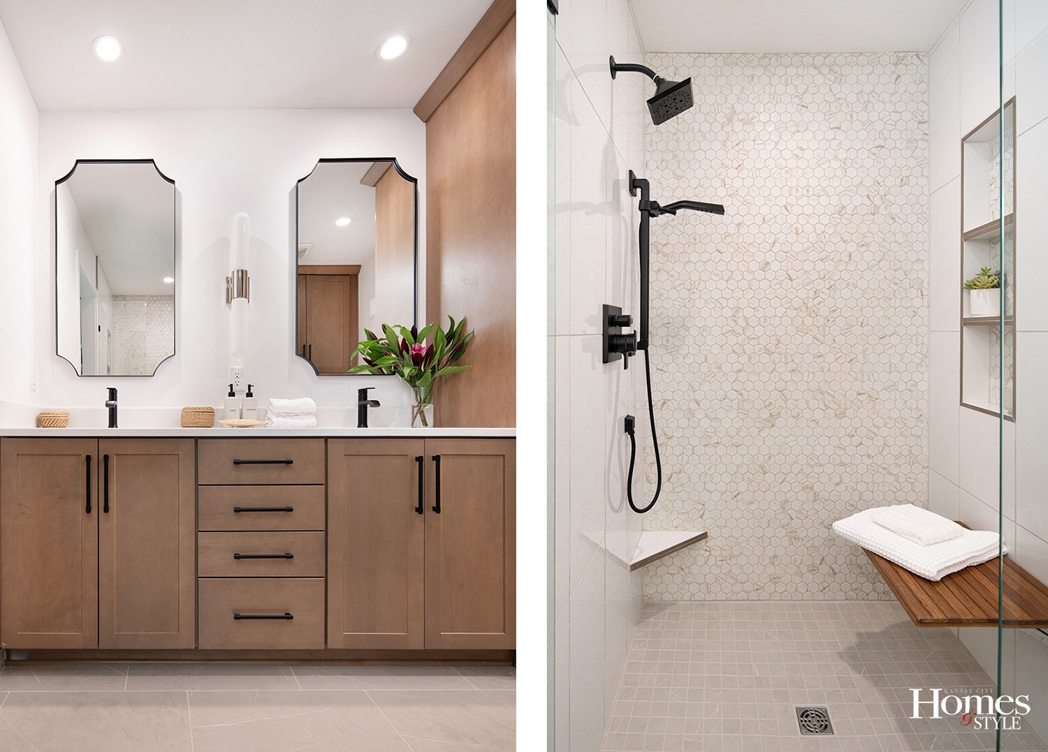
In the master bath, she stole space from the closet to make a larger shower. She removed the closet and soffit and added double sinks.
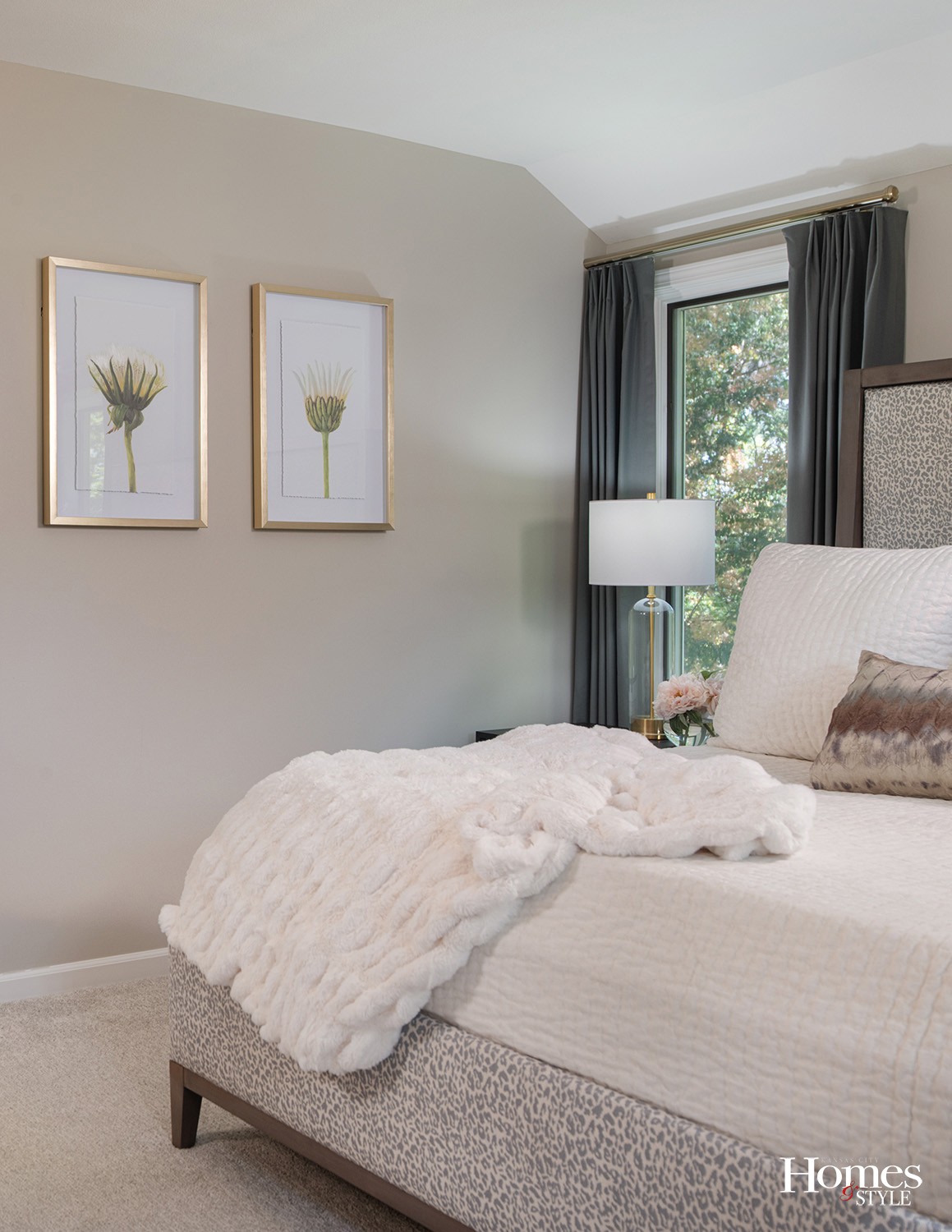
“I tried to maximize every square inch for storage. I put in a tall linen cabinet which takes up less space and has rollouts to access everything inside. The big thing was making the shower a zero-entry walk-in shower which will be accessible in the future. I went with a fold-down teak bench to keep it feeling open with built-in shampoo storage. And a hand shower!” she smiled. “We made their very small space feel luxurious through packing in function and layering in finishes that create a relaxing spa feel. We carried those tones into their bedroom. It feels like a big hug and a place to retreat after a long day at work.”
She explained that they were open to the overall style, and from the first appointment, they discussed what colors they were drawn to and what their vision was. She noted that it is a balancing act to make sure each was heard throughout the process.
The end result brought the function and desired aesthetics desired by both Joe and Michele, creating a home not just for today, but for years to come.
Resources
- Interior Designer: Suhr Interior Design
- Contractor: Coulston Construction
- Cabinets: Blossom Spaces – Hong Sievert
- Plumbing Fixtures: Brizo & Delta
- Flooring Carpeting: Carpet Source
- Appliances: GE Cafe – Matte white and gold
- Plumbing: Grandview Winnelson
- Hardware: Hardware Resources
- Light Fixtures: Hudson Valley Lighting Group
- Tile: Key Distributors
- Countertops: Rock Tops
- Paint: Sherwin Williams Duration Home
- Window Coverings: Suhr Interior Design – Custom
- Art, Furniture, Glass/Mirrors: Suhr Interior Design – Studio 160
- Flooring: SVB Wood Floors
- Linens: Villa and Custom

